

Ir directamente al contenido
Ir al contenido principal

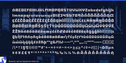
Romantic Jets

por Typodermic
Estilos individuales desde $69.95 USD
La familia tipográfica Romantic Jets fue diseñada por Ray Larabie y publicada por Typodermic. Romantic Jets contiene 2 estilos. Más información sobre esta familia

Sobre la familia


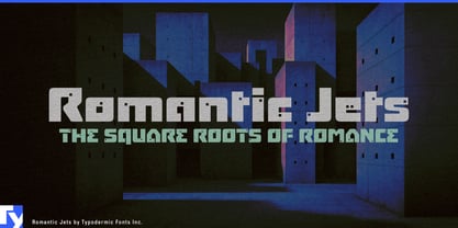
Romantic Jets began with buildings. Its heavy modular forms were inspired by brutalist architecture around Nagoya, with small square openings conceived as miniature windows cut through otherwise solid structures. The result is a display face whose letters can resemble compact pieces of architecture: thick walls, clipped corners, repeated modules and tiny voids.

That construction has acquired an unexpectedly contemporary context. Data centers, power systems and other infrastructure are increasingly assembled from prefabricated modules. Server pods, cooling units, edge-computing hardware and containerized equipment can use Romantic Jets for product-family names, enclosure graphics, trade-show displays and large facility identifiers while a quieter sans handles specifications and operational information.

Containerized energy systems offer a closely related application. Battery-storage units, microgrid equipment and inverter stations arrive as large rectangular components assembled into larger sites; Romantic Jets can make their names feel built from the same visual language as the hardware.

Prefabricated architecture brings the idea directly back to the font’s origin. Modular housing systems, precast concrete products, facade panels and factory-built rooms can use Romantic Jets for component names, project titles, catalogues and exhibition graphics. Brutalist preservation, postwar architecture and concrete-building exhibitions provide a cultural branch where its original architectural reference remains especially clear.

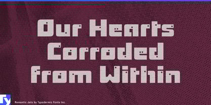
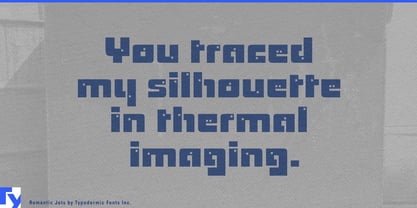
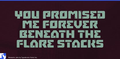
Romantic Jets works best when a short name needs to feel built rather than written: a server module, battery container, prefab system, building component or architectural exhibition. Its small square details reward generous scale, making it better suited to product names and large identifiers than ordinary text.

Diseñadores: Ray Larabie

Fundición: Typodermic

Fundición original: Typodermic

MyFonts debut: May 18, 2011

Romantic Jets

Acerca de Typodermic

Welcome to Typodermic Fonts, a spirited type foundry rooted in Nagoya, Japan, started by the Canadian typeface designer, Raymond Larabie in 2001. Our library brims with 500+ diverse typefaces to fuel creativity in graphic design, advertising, web, and app development. As digital type pioneers, we adopted web fonts and app licensing early, consistently pushing the design envelope. With Canadian heart and Japanese precision, we're your global partners in extraordinary typography. Explore Typodermic Fonts—where creativity meets character.

Seguir leyendo

Leer menos
