Hello, and welcome to the REN FONT foundry!
REN FONT has steadily built its reputation by repeatedly earning accolades in the Typeface category of the “Yearbook,” an exhibition organized by the Japan Typography Association (NPO). Founded in 2001 with the aim of bringing a fresh breeze to the font industry, REN FONT continues to create distinctive typefaces that stand out.
The hand-drawn-style fonts crafted by REN FONT’s type designer, Kazuo Kanai, have received high praise from professional designers and typographers for their exceptional quality.
A Message from Kazuo Kanai
With the exception of our comprehensive typeface Waon, our company has been particularly dedicated to producing kana fonts in the traditional Mincho and Gothic styles. Most of these fonts have been developed as multi-weight families — and there’s a good reason for that.
In Japanese text, kana characters account for roughly 70% of the total. Even so, kana fonts have little significance on their own; it is only when combined with kanji that they take on “meaning” and come to life.
Most vendors offer font weights in seven to nine variations, from “Light” to “Ultra,” but there are no universal standards for these weight categories — each vendor defines them differently. As a result, a “Light” weight from one vendor may differ subtly in thickness from another. For kana fonts to pair harmoniously with such variations and truly come alive, a finer gradation of weights is essential.
This is why our kana fonts feature such detailed weight variations.
Simply changing the kana can greatly enrich the expression of a typeface.
We hope you will make the most of our kana fonts, blending them freely with other typefaces to create combinations that perfectly suit your taste.
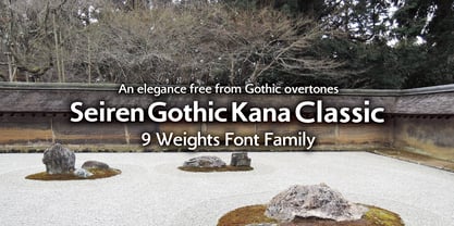
Elegance Beyond the Gothic Style
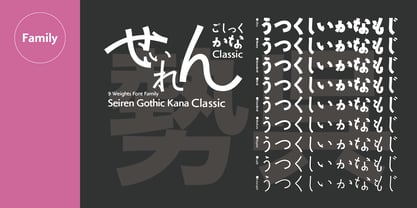
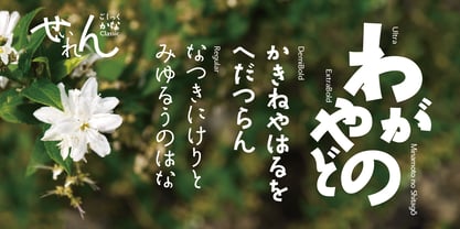
Seiren Gothic Kana Classic 9-Weight Font Family
The 勢蓮呉竹仮名Classic (Seiren Gothic Kana Classic) family is based on the refined framework of “Seiren Mincho-M,” an award-winning typeface in the Typeface Category of the “Japan Typography Yearbook 2001” contest hosted by the Japan Typography Association (NPO). This structure was enhanced by incorporating Gothic typeface characteristics and expanding it into a full multi-weight family.
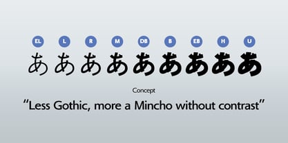
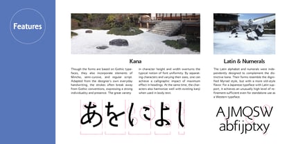
The design draws from the everyday handwriting of our type designer, Kazuo Kanai, blending the complex form impressions of Mincho, Gyosho, and Kaisho styles. It comprises nine weights in total, from the lightest “L (Light)” to the heaviest “U (Ultra).” While retaining an old-style feel, the kana are designed on a large scale, unconstrained by traditional concepts, giving the typeface versatility suitable for modern typesetting.
Although fundamentally Gothic, it retains a distinctly Japanese atmosphere along with a sense of cleanliness. In defiance of the digital font trend toward uniform character width and height, it intentionally introduces irregularities, bringing rhythm and lightness to the text. The lighter weights convey delicacy, while the heavier weights express boldness. Across all weights, the graceful flow of the letterforms adds a sense of sophistication and luxury.