






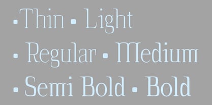

Webfonts le permiten incrustar la fuente en una página web utilizando la regla @fuente-face, de modo que los párrafos y encabezados de texto pueden tener el mismo estilo que la fuente web. Usted servirá el kit webfont para su propio sitio y lo enlazará en el CSS.
Webfonts puede utilizarse en un solo dominio. Las agencias responsables de varios sitios web, por ejemplo las agencias de diseño web o los proveedores de alojamiento, no pueden compartir una misma licencia de webfont entre varios sitios web. o proveedores de hosting, no pueden compartir una misma licencia de webfont entre varios sitios web.
Si el propio archivo fuente no se va a incrustar en el sitio web (por ejemplo, si fuente se utiliza en una imagen gráfica estática, como un logotipo), deberá adquirir una licencia de en su lugar. estática, como un logotipo), deberá adquirir una licencia de Desktop .
La mayoría de las fundiciones en MyFonts ofrecen su webfonts con el modelo de licencia anual. Haga clic aquí para más información.
