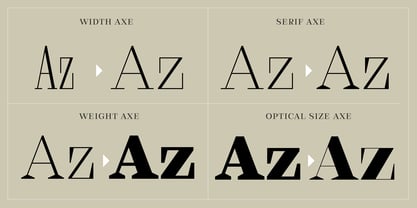
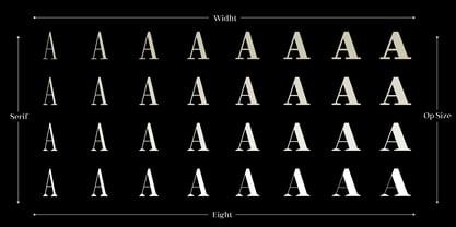
Slabdon Regular VF
Slabdon Italic VF
Slabdon Light Condensed Fine
Slabdon Light Fine Srf
Slabdon Light Condensed Fine Srf
Slabdon Light Srf
Slabdon Light Fine
Slabdon Light Condensed
Slabdon Light Condensed Srf
Slabdon Light
Slabdon Light Italic
Slabdon Light Condensed Srf Italic
Slabdon Light Condensed Fine Italic
Slabdon Light Fine Srf Italic
Slabdon Light Fine Italic
Slabdon Light Srf Italic
Slabdon Light Condensed Italic
Slabdon Light Condensed Fine Srf Italic
Slabdon Book Fine
Slabdon Book Condensed Srf
Slabdon Book Fine Srf
Slabdon Book Condensed Fine Srf
Slabdon Book Condensed Fine
Slabdon Book Condensed
Slabdon Book
Slabdon Book Srf
Slabdon Book Condensed Italic
Slabdon Book Condensed Fine Srf Italic
Slabdon Book Italic
Slabdon Book Fine Italic
Slabdon Book Condensed Srf Italic
Slabdon Book Condensed Fine Italic
Slabdon Book Srf Italic
Slabdon Book Fine Srf Italic
Slabdon Regular Fine
Slabdon Regular Condensed Fine
Slabdon Regular Condensed
Slabdon Regular Condensed Srf
Slabdon Regular Fine Srf
Slabdon Regular Condensed Fine Srf
Slabdon Regular
Slabdon Regular Srf
Slabdon Regular Fine Italic
Slabdon Regular Condensed Srf Italic
Slabdon Regular Italic
Slabdon Regular Condensed Italic
Slabdon Regular Condensed Fine Srf Italic
Slabdon Regular Condensed Fine Italic
Slabdon Regular Fine Srf Italic
Slabdon Regular Srf Italic
Slabdon Semi Bold Condensed Fine
Slabdon Semi Bold Fine
Slabdon Semi Bold Srf
Slabdon Semi Bold Condensed
Slabdon Semi Bold
Slabdon Semi Bold Condensed Fine Srf
Slabdon Semi Bold Condensed Srf
Slabdon Semi Bold Fine Srf
Slabdon Semi Bold Condensed Italic
Slabdon Semi Bold Srf Italic
Slabdon Semi Bold Condensed Fine Srf Italic
Slabdon Semi Bold Italic
Slabdon Semi Bold Fine Srf Italic
Slabdon Semi Bold Condensed Fine Italic
Slabdon Semi Bold Condensed Srf Italic
Slabdon Semi Bold Fine Italic
Slabdon Bold Srf
Slabdon Bold Fine Srf
Slabdon Condensed Fine Bold
Slabdon Fine Bold
Slabdon Bold
Slabdon Bold Condensed Fine Srf
Slabdon Condensed Bold
Slabdon Bold Condensed Srf
Slabdon Bold Srf Italic
Slabdon Bold Condensed Fine Italic
Slabdon Bold Fine Italic
Slabdon Bold Condensed Srf Italic
Slabdon Bold Italic
Slabdon Bold Condensed Fine Srf Italic
Slabdon Bold Condensed Italic
Slabdon Bold Fine Srf Italic
Slabdon Heavy Srf
Slabdon Heavy Fine
Slabdon Heavy Fine Srf
Slabdon Heavy
Slabdon Heavy Condensed Srf
Slabdon Heavy Condensed Fine Srf
Slabdon Heavy Condensed Fine
Slabdon Heavy Condensed
Slabdon Heavy Fine Italic
Slabdon Heavy Srf Italic
Slabdon Heavy Italic
Slabdon Heavy Condensed Fine Italic
Slabdon Heavy Fine Srf Italic
Slabdon Heavy Condensed Srf Italic
Slabdon Heavy Condensed Italic
Slabdon Heavy Condensed Fine Srf Italic