
Ir directamente al contenido
Ir al contenido principal

Subroc

por Typodermic
Estilos individuales desde $69.95 USD
La familia tipográfica Subroc fue diseñada por Ray Larabie y publicada por Typodermic. Subroc contiene 1 estilos. Más información sobre esta familia

Sobre la familia


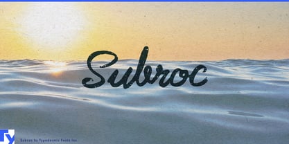
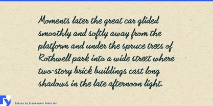
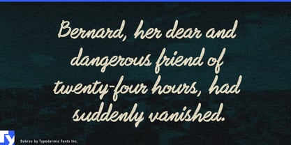
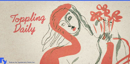
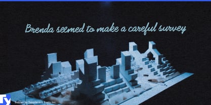
Handwritten typography has an odd problem: the more beautifully it is drawn, the less it resembles something someone actually dashed off with a marker. Subroc takes the less polished route. Its connected strokes, ordinary handwriting rhythm and grainy texture give layouts a handwritten element that looks written rather than carefully lettered.

That makes Subroc especially useful as the second voice in an otherwise controlled design system. A clean sans or condensed grotesk can handle the brand and information; Subroc can carry the flavor name, product nickname, limited variant, short instruction or scribbled remark. The contrast makes the handwriting feel like a human intervention rather than another layer of branding.

On packaged foods, Subroc can distinguish varieties across sauces, condiments, snacks, prepared meals and refrigerated products while the rest of the packaging stays consistent. In automotive and workshop settings, it suits detailing products, restoration supplies, performance parts and garage equipment, where formula names, special editions and product nicknames can borrow the character of paint-marker notes and parts labels without resorting to nostalgic sign-painter styling.

The same approach works on surfboards, skate and snow equipment, wetsuits, workwear and streetwear. Model names, capsule titles, wash names, hangtag notes and short inscriptions gain the feeling of something written directly onto the product. Racing and workshop games can use Subroc similarly for vehicle nicknames, garage notes, object labels and handwritten environmental details.

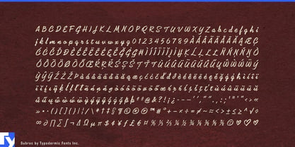
Subroc is a single-style display script, best used for names, notes and short phrases where its connected marker rhythm and textured surface remain visible. Pair it with something orderly and the division of labor becomes clear: one typeface builds the system; Subroc looks like somebody reached into it with a marker.

Diseñadores: Ray Larabie

Fundición: Typodermic

Fundición original: Typodermic

MyFonts debut: Jul 2, 2010

Subroc

Acerca de Typodermic

Welcome to Typodermic Fonts, a spirited type foundry rooted in Nagoya, Japan, started by the Canadian typeface designer, Raymond Larabie in 2001. Our library brims with 500+ diverse typefaces to fuel creativity in graphic design, advertising, web, and app development. As digital type pioneers, we adopted web fonts and app licensing early, consistently pushing the design envelope. With Canadian heart and Japanese precision, we're your global partners in extraordinary typography. Explore Typodermic Fonts—where creativity meets character.

Seguir leyendo

Leer menos
