Ir directamente al contenido
Ir al contenido principal

Superline

por Kavoon
Estilos individuales desde $10.00 USD
Familia completa de 6 fuentes: $22.00 USD
La familia tipográfica Superline fue diseñada por Anton Didenko y publicada por Kavoon. Superline contiene 6 estilos y opciones de paquete familiar. Más información sobre esta familia

Sobre la familia


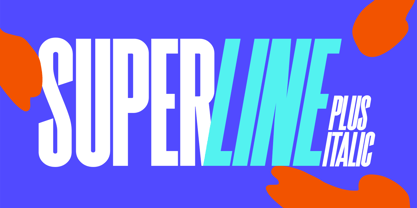
SuperLine Typeface. A striking modern display font in three styles.

SuperLine is a modern, all caps display font. Specifically developed for contemporary design styles and applications, it is supplied in three styles; regular, lined and outline.

Although it can be used at smaller sizes, it has been designed primarily for use at larger scales. Perfect for branding projects, striking posters and as a unique display font for web or app development, you can make a statement with SuperLine.

Extensions shape backgrounds are included. Designed to compliment the angles in the SuperLine typeface, these shapes are perfect for using as masks, image overlays or solid color background fills. They are supplied in Illustrator (ai and eps) vector format.

Whats Include:

  • Meticulously designed
  • All uppercase display
  • Comes in 3 styles, Regular, Lined and Outlined
  • Allows for a vast range visual styles
  • Webfont kit included (created via fontsquirrel)
  • Licensed for Personal or Commercial use (OFL)
  • Vector Extensions included (In Illustrator vector format)
  • As ever, drop me a message if you have any questions.

Diseñadores: Anton Didenko

Fundición: Kavoon

MyFonts debut: Feb 19, 2020

Superline

Acerca de Kavoon

My foundry is focused on creating distinctive typefaces with personality, atmosphere and a strong visual voice. I design fonts as more than functional tools: each typeface is built to create a mood, shape an identity and bring character to the projects it becomes part of. The collection explores a wide range of influences, including expressive display typography, handmade forms, editorial elegance, vintage references and historical lettering. I am drawn to typefaces that feel memorable at first sight while remaining practical for real design applications. My process is driven by curiosity and experimentation. I pay close attention to proportions, rhythm, unusual letterforms and the small details that make a font feel individual. The goal is always to find a balance between expression and usability. These typefaces are created for designers working across branding, packaging, hospitality, editorial design, campaigns and visual identities, with a focus on projects where typography is meant to be seen, felt and remembered.

Seguir leyendo

Leer menos