ITC New Veljovic
ITC New Veljovic: Optimization and extension of a classic font by Jovica Veljović
Thirty years after its first appearance, Prof. Jovica Veljović has produced ITC New Veljovic, a revised version of his first typeface. Skillfully enhanced character forms give the new font a particularly harmonious effect while the extensive additions open up new potential applications for this versatile, readily legible typeface.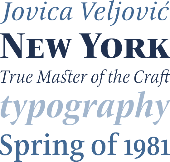 In view of the many and highly successful fonts that Veljović has published to date it is surprising in hindsight that, although he discovered his love of calligraphy and manuscripts after studying at the Belgrade University of Arts, the design of printing type did not at first appeal to him. It was only on the advice of his mentor Henri Friedlaender, the eminent Israeli typographer, and when an invitation to visit him in his New York studio arrived from Aaron Burns, one of the founders of ITC, that Veljović came into contact with type design. He can still clearly remember meeting Burns in his office, where his desk was covered by type specimens. At this point, Veljović began to wonder how on Earth it would be possible to create something new given the existence of this already considerable diversity. Despite these misgivings, Veljović accepted the commission to design a new font for ITC and returned to Serbia where he began to teach himself typeface design. Just over 12 months later, he sent his designs to New York and his first font, ITC Veljovic, was published in 1984.
This antiqua font is characterized by its triangular, sharply pointed serifs that, together with the clearly defined forms, give the impression that the characters have been carved in stone. The uppercase letters have a Roman elegance and monumental grandeur. Calligraphic details are subtly distributed throughout the typeface and provide an interesting contrast to the more formal architecture.
Designer Interview
-
Jovica Veljović
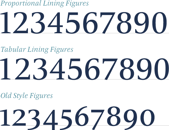
 Veljović has also extensively added to his font. ITC New Veljovic offers a Regular weight that supplements the four existing styles from Book to Medium. Moreover, Veljović has designed variants with reduced tracking and a display version with spacing and contrast that take account of the special requirements of setting text in larger point sizes. All variants are accompanied by genuine italic versions. The range of glyphs not only covers the needs of most Western and Eastern European languages, but also includes oldstyle and lining figures, small caps and numerous ligatures. The format sets help with the conversion of Latin characters to Cyrillic characters and vice versa.
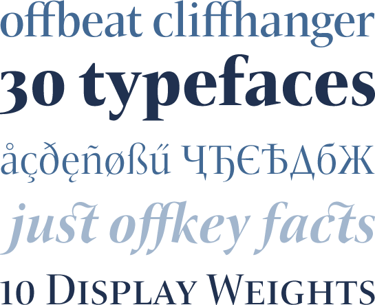
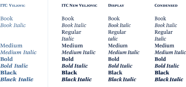 Jovica Veljović has done an outstanding job so that the optimized and considerably extended versatile font ITC New Veljovic can now be used in new applications. The new Condensed style saves considerable space when it comes to setting longer texts and the Display versions show off the crystal-clear forms of ITC New Veljovic at their best in larger point sizes.
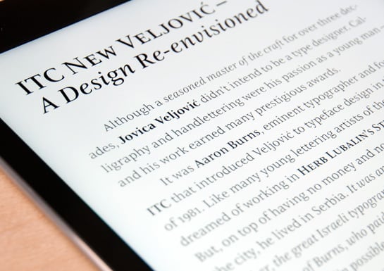
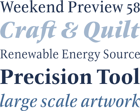 The stable serifs not only enhance the effect of ITC New Veljovic in print but also give it a well-defined and readily legible appearance in images and when used as a web font.
more ... Font in Use
See the following page for examples of ITC New Veljovic in use, designed by Jovica Veljović.


