
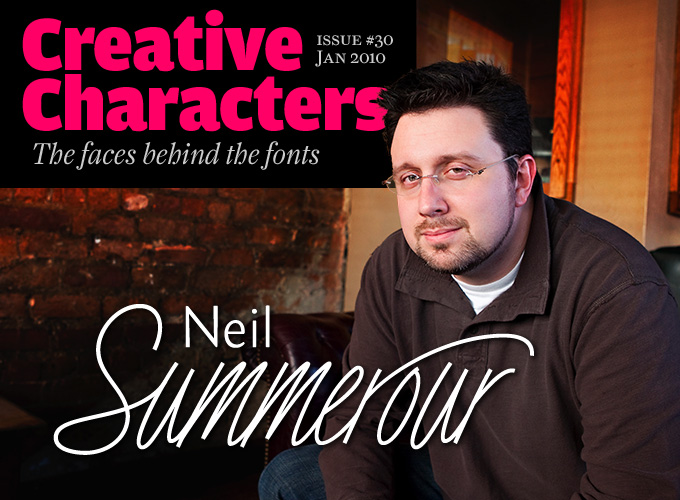
Photo by Heather Maynard
He is a man of many talents: graphic designer, type designer, calligrapher, teacher and owner of a design studio in Georgia. We are told that he also makes great sushi. Having published his first fonts at T-26 less than ten years ago, he has rapidly become a force to be reckoned with on the North American type scene. His microfoundry Positype has published a respectable collection of text and display faces, and with TypeTrust he is into distribution as well. The latest news is that his Fugu typeface has won a “Certificate of Excellence in Type Design” in this year’s TDC2 Awards. Congratulations! Meet Neil Summerour, before he’s off to Japan again.
Neil, you’re a teacher of graphic design; a practicing designer and art director; you also run your own foundry as well as TypeTrust, the distribution venture you set up with Silas Dilworth, and you are quite prolific as a type designer. Would you define yourself as a workaholic?
That’s really hard to answer. By all logical conclusions it really looks like I am a workaholic but I love what I do. Each “creative” thing I do fuels every other part. There isn’t a 12-step program for my creative obsessions, so I run with it. I get very uncomfortable when I am idle and see that time better spent sketching, writing, working on a new typeface. When I am not spending time with my family, I have to be working or doing something productive. I think every designer or creative can relate to this… if an idea hits you, an unexpected solution presents itself or you simply “see” a design in your head, you’re compelled to bring it to completion. It is the process of creating something whole that has never been seen or used before that is intoxicating. For me it’s designing type. It is as much an outlet for my creative addictions and obsessions as it is a way to unwind and relax.
The manifestations of this type addiction have evolved over time. It first started with Positype, my type foundry. Sidenote: a lot of people have asked how I came up with the name, expecting a long winded response, but the primary reason was because I knew “Summerour” is hard to say and to spell :) Positype gave me a foundation. It was years later that Silas Dilworth and I imagined TypeTrust. Silas is awesome – as much a technician as he is an artist – and my respect for him had grown considerably during the connection we had with T-26. As we began to discuss avenues for TypeTrust to exist, the practical and logical solution for it was to operate as a distributor to cultivate great type. Everything fell into place and we were able to create a platform for vetting some amazing designers and their work.
What got you into type design?
The path that led me to type design is as long and winding as a Michael Mann film, but here goes… My first exposure to lettering and fonts came when I was in high school. I landed a part-time job with a company that did work for the monument industry and I was constantly working with matching lettering from rubbings, digitizing old designs and reproducing old into new. When I first started, I was more enamored with the technology and software around me than the implications it had, but over the years the awareness of fonts – how they could be used, who designed them – basically got into my blood. I was hooked.
Later, while at The University of Georgia, I was encouraged to go see Ken Williams, the head of the Graphic Design Department. “Encouraged” is a loose word here. I was basically told I had to because I was “too anal retentive to be an artist.” The moment I stepped into Ken Williams’ office, I knew I had found my future. Ken is an amazing calligrapher and samples of work by him and others were spread out all around his office, along with some of the most amazing lettering pieces I had ever seen. It was after entering the Graphic Design Program that I studied calligraphy from Ken and tried to be as much of a sponge as I could.
Then came Ron Arnholm who had recently returned from a sabbatical he had taken to finish his masterpiece, ITC Legacy Serif. I enjoyed every class, every witticism and every storytelling how he came about the design and why he created the letters the way he did for that font and its companion sans, ITC Legacy Sans (which I still consider one of the most unique and truly authentic sans-serif designs). Seeing the early sketches he did while on vacation that led to this master work changed how I saw the creation of letters. This one-two punch, as it were, of calligraphy and type design laid the foundation.
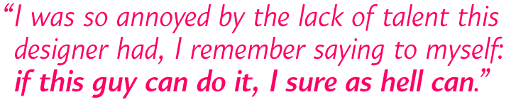
Jump forward a few years. I was invited to sit in on a presentation at the University of Georgia by a visiting designer… a well-known, big name, grunge/deconstructivist designer. Drawn by the name I went. (I’m not going to give names because I do not want to insult anyone.) After the lecture I was so annoyed and insulted by the lack of talent and amazing luck this designer had, I remember saying to myself as I walked back to my car “if this guy can do it, I sure as hell can.” I went home, picked up the Fontographer manual and spent the night sketching my first two type families that would later be released by T-26.
Magneta
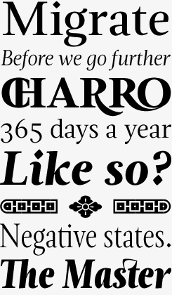
Neil Summerour’s recipe for his latest text family was to take “a little Dwiggins, throw in some Benton with a hint of Austin, wrap it up in a crisp, contemporary package and serve.” Magneta combines the proportions of a renaissance oldstyle with the vertical stress first seen in Baskerville’s type and the Scotch Romans. The designer’s aim was to “simplify, simplify, simplify.” Despite these efforts, the typeface is full of delicate details that will work best in large sizes, such as the terminals on a, c and r, the slightly cursive counter of the roman e, the lozenge-shaped dots, and much more. The family comes in two widths and has a lot of extras, including some fun majuscule ligatures and a smart set of Decorative Ornaments.
Kari & Kari Display
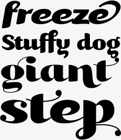
Kari is an interesting mixture: a bold, semi-connected, script-like typeface that comes in an upright and an italic version. With Kari Display, Summerour gave the original Kari some “plastic surgery”. Kari, he wrote, “is very ‘controlled’ and orderly and I wanted Kari Display to break that mold with much more movement, curviness, greater modulation and a more elegant feel on the page.” The result is a splendid high-contrast display script. Kari Display is packed with alternate characters, ligatures, swashes, and more. In TrueType and Postscript formats, these are accommodated in three packages (A, B and C); for those working with OpenType-enabled software, Kari Display Pro is the all-in-one-font solution.
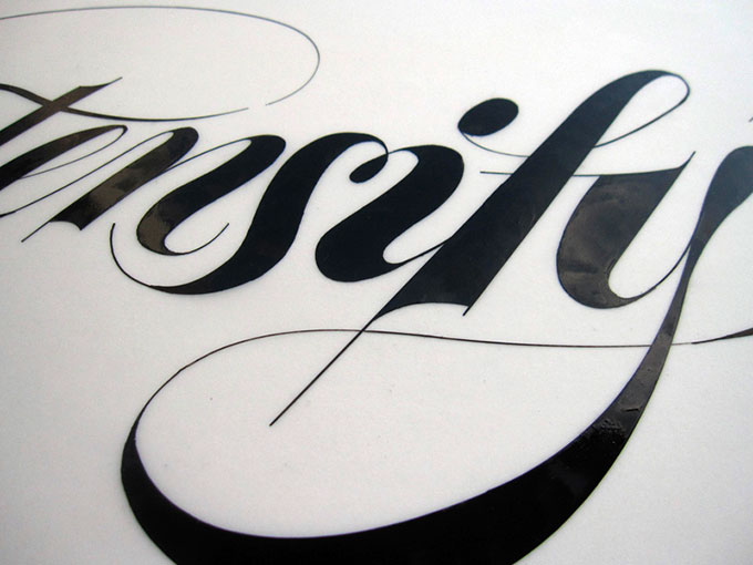
Some of Neil’s hand-inked lettering work.
Some of the early fonts you published with T-26, like Claustrum and Kurosawa Hand, are very calligraphic in character. Were you/and are you still a calligrapher?
Yes. Because of Ken Williams I am. I am not a master nor will I profess to be. For me it is recreational and relaxing. Over the years, my style has become looser and I find myself leaning towards using these self-inking sumi-e brushes from Pilot I picked up while I was visiting Japan. They flow so nicely and respond to the slightest movement. Much of the calligraphy work I pursue is for my own indulgences or those of my friends and colleagues. It’s only recently that I have become comfortable interpreting that work digitally.
Is manual sketching and drawing an important aspect of your design process?
Absolutely. I went to school during the crossroads of the old way (without computers) and new way (with computers). Jumping right onto the computer and quickly prototyping a design has its merits but I feel it is too confining, too quick. There is no substitute for pen, pencil or brush on paper. The process is very forgiving and allows for developing much more of an understanding of the letterforms you are creating. Each new typeface I begin builds upon the maturity I gained with the last round of sketches I performed for the typeface before it. For me it connects artist with engineer, creativity from code.
Angel Script
Among the countless informal script fonts available, Angel Script stands out for its lightness and simplicity. It is narrow and strictly monolinear – all strokes have the same thickness – and some letters connect while others don’t. The 695 glyphs in the OpenType Font, with many alternates, swashes and other goodies, are programmed to combine effortlessly in any layout program with full OpenType functionality, although it never hurts to try out other options in the glyph panel.
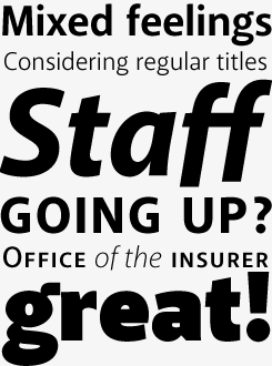
During the past two years, you’ve designed two new families of sans-serifs, Akagi and Organic. Is there an underlying principle to these recent designs? A “philosophy” of type and typography?
When I take on a new design, especially something I feel would work for text-setting, it is often because I am not seeing exactly what I want or would use at that time. My creative juices flow faster when it is an attempt to go against the current creative trend. It is fine to go with the grain sometimes, but when I see the same thing being done again and again, I start craving for something different. Sometimes that means sketching out what I want.
Akagi and Organic were both reactions to this new crop of cold, robot-like sans-serifs. Unlike the stark and unforgiving structure of my Aaux Next families, Akagi and Organic had to have other traits in order to be useful. Akagi was the product of me wanting a “friendlier” sans. The initial sketches were the result of a sleepless 15-hour flight to Japan. Afterwards, a great deal of time was spent to make sure I had a balance between line and curve to show (if to no-one but myself) that a sans could be crisp, clean and legible while keeping a personality. Organic is a much softer, more forgiving sans with a very intentional subtle modulation. It is very much an attempt to create a humanist-influenced typeface. I can see my “calligraphic tendencies” coming out. Both were intended to be used for small and large type and I attempted to balance the available weights and OpenType features to offer a flexible alternative to the designer.
Organic
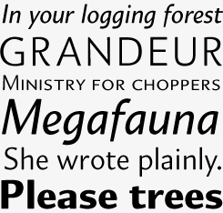
Until a few years ago, Summerour was primarily known for geometric display fonts like Ginza and energetic scripts such as Baka Too; with Akagi and Organic he convincingly demonstrated he was as comfortable designing original text faces. Organic is a sans-serif with a subtle diagonal contrast or stress – which puts it roughly in the same genre as Amira or Le Monde Sans. It is a flexible and highly legible humanist sans in a balanced range of five weights.
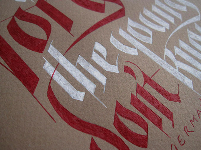
More of Neil’s hand-lettering work.
Unlike many of your colleagues, you don’t seem to have any interest in reviving or reinterpreting typefaces from the past. Or do you?
In my mind, reviving and reinterpreting typefaces are completely different disciplines. It may sound trite and I apologize if it offends, but in the current typographic landscape revivals are a bit “been there, done that.” Does it have a place – absolutely yes. Should it be done by anyone with an old font specimen and a copy of FontLab – absolutely not. Reviving a typeface should be about preserving the typographic traits and mannerisms of the master that originated it.
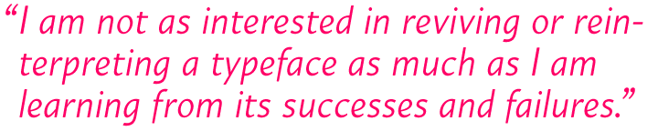
Reviving a masterwork for profit makes me uncomfortable. A reinterpretation of a typeface should not just be a copy of a previous work, but an evolution of the earlier solutions of the master. For me, a good example can be found in Ron Arnholm’s work. His reinterpretation of Jenson’s original, I feel, was fully realized with the creation of ITC Legacy Serif. But it is the knowledgeable deviations from the original that led to the exceptional ITC Legacy Sans, a truly original sans, and his new ITC Legacy Square Serif, which is gorgeous. I am not as interested in reviving or reinterpreting a typeface as much as I am learning from its successes and failures, its solutions and insights; to take those influences and attempt something that is my own – regardless of whether it flies or fails.
As a graphic designer, you cater to a wide range of clients; so I suppose you get input from the “real world” on a daily basis. Do you think that influences how you view the role of fonts?
Absolutely. Each client brings about a different set of challenges. Over time, you develop a set of skills and an outlook that drives the most efficient and painless solution for them. Graphic designers, creative agencies, web designers, every creative is faced with the challenge to produce the next original work… The wealth of typefaces out there, by some amazing designers, really can serve as the first line of defense to combat that challenge. Type is the first and last thing read by your clients’ customers. As cliché as it sounds, it can make or break a project. Developing distinctive, responsive type always rests in the back of my mind now when I sit down to design type. The designer in me influences the lettering guy, and vice versa, and they fight it out in the sketchbook and on the computer screen. This mentality plays out with each custom typeface or private commission I take on as well – and the circle repeats itself.
FUGU
The success of Baka made Summerour think twice before doing another one of those: he did not want to be seen as a “one-trick-pony.” But after a few years he decided to go back to his Japanese-style script doodles and make another Baka variant. His new hand-rendered letters, however, took on a different personality. The new font was turning into something more expressive – smooth and rough, delicate but sticky, and slightly dangerous. That’s what the name Fugu comes from – the (in)famous Japanese blowfish.
Finally, could you tell us something about your special relationship with Japan?
Wow. That’s as easy to answer as it is difficult. I first traveled to Japan when I was in high school as part of an exchange program. I stayed with a family that I can say later became my adoptive family of sorts as the years have gone by. Twenty years later, I have a second family complete with a doting mom, encouraging dad, sisters, brother, nieces and nephews. Outside of the amazing family and friends I have gained over there that equal the relationships I have here in the States, I am drawn to the culture, the art, the attention to detail and the pace of Japan. As a calligrapher and type guy, I am attracted to the lush calligraphic history, the traditional and transitional letterforms and how the two can completely coexist together.
The area I spend the most time is off the main island, on the smaller Shikoku. There, in a little town outside of Takamatsu, is Mure. It’s most known for its granite and for the fact that artist and sculptor Isamu Noguchi kept a studio and lived there. His home and studio have been converted into a museum now. It serves as shrine of sorts for me, a place to recharge my batteries, reflect and be peaceful. I never miss a visit when I’m there. Incidentally, Takamatsu is close to where ILoveTypography’s John Boardley lives. I hope the next time I’m there, our paths will cross.
Because of everything that Japan represents to me, it’s easy for me to see the day when I live there: if not part-time, full-time or pseudo-retirement… but I’ll never stop designing typefaces regardless of the amount of udon, sushi and sake I consume!
Thanks for sharing, Neil. We’re looking forward to the next crop of Positype and TypeTrust fonts!
Akagi
While Summerour’s early sans-serif family Aaux (now Aaux Next) is rather stark and dry, Akagi is friendly and human. “I wanted it to ‘smile’ at you when it’s on the page,” wrote Summerour. The Book and Medium faces are optimized for readability and work well in long texts and small point sizes, while the Thin, Light and Fat weights are elegant, expressive display types.

Who would you interview?
Creative Characters is the MyFonts newsletter dedicated to people behind the fonts. Each month, we interview a notable personality from the type world. And we would like you, the reader, to have your say.
Which creative character would you interview if you had the chance? And what would you ask them? Let us know, and your choice may end up in a future edition of this newsletter! Just send an email with your ideas to [email protected].
In the past, we’ve interviewed the likes of Christian Schwartz, Dino dos Santos, Jim Parkinson, Mário Feliciano, and Underware. If you’re curious to know which other type designers we’ve already interviewed as part of past Creative Characters newsletters, have a look at the archive.
Colophon
This interview was conducted & edited by Jan Middendorp, and designed by Nick Sherman.
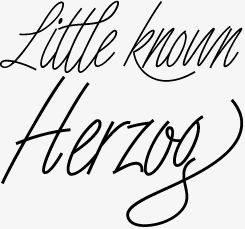
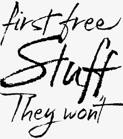
The Creative Characters nameplate is set in Amplitude and Farnham; the intro image features Organic and Angel Script; the pull-quotes are set in Organic; and the large question mark is in Farnham.
Comments?
We’d love to hear from you! Please send any questions or comments about this newsletter to [email protected]
Subscription info
Want to get future issues of Creative Characters sent to your inbox? Subscribe at www.myfonts.com/MailingList
Newsletter archives
Know someone who would be interested in this? Want to see past issues? All MyFonts newsletters (including this one) are available to view online here.