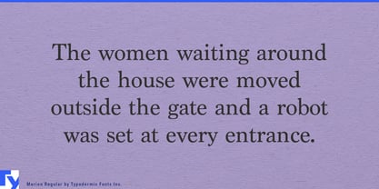
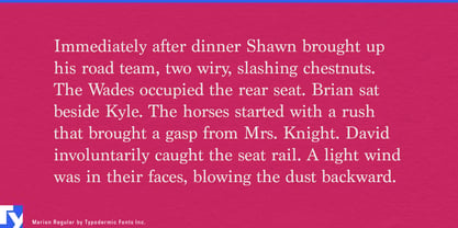
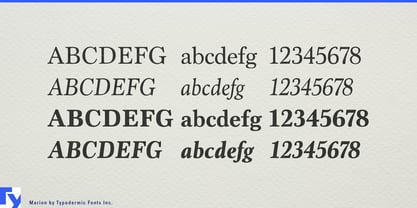
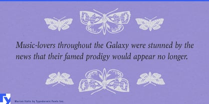
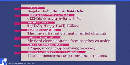
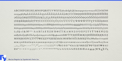
Marion is built on the familiar architecture of traditional book typography, but it refuses to disappear completely into convention. Its proportions and contrast draw on neoclassical serif models, while heavier details and occasional hammer-claw terminals interrupt the polish just enough to give the page an authored character. It can feel historical without behaving like a strict revival.
That makes Marion particularly useful for museum and exhibition publishing. Art museums, archaeology collections, historic houses, decorative-arts institutions, and university museums can use it for exhibition-book titles, catalogue essays, object descriptions, chapter openings, quotations, captions, and collection introductions. It stays restrained in reading text while revealing more of its idiosyncratic detail at larger sizes.
Archaeology, classics, and ancient-history publishing provide an especially natural setting. Classical-studies books, archaeological reports, epigraphy publications, digital collections, and cultural-history projects can combine Latin and Greek material within the same typographic system. Cyrillic support extends the family into publications and exhibitions concerned with Eastern European history, literature, art, and collections.
University presses and serious nonfiction publishers can use Marion across intellectual history, architectural history, biography, philosophy, cultural criticism, history of science, music history, and art criticism. These subjects often benefit from traditional book cues, yet an immaculate historical revival can make the design feel predetermined by the category. Marion retains the expected editorial gravity while giving titles, section openings, pull quotes, and promotional material a more distinctive edge.
Digital archives and humanities platforms extend the same idea into contemporary publishing. Libraries, museums, universities, foundations, and cultural institutes can use Marion for introductions, essays, timelines, transcriptions, collection notes, and contextual material around digitized letters, manuscripts, newspapers, photographs, and oral histories while a neutral sans handles navigation, search, metadata, and controls.
Marion is most useful when a serious historical or cultural subject calls for traditional serif typography but the designer wants something less predetermined than a canonical revival. Its familiar neoclassical structure provides the authority; its blunt, slightly eccentric details keep the result from disappearing into convention.