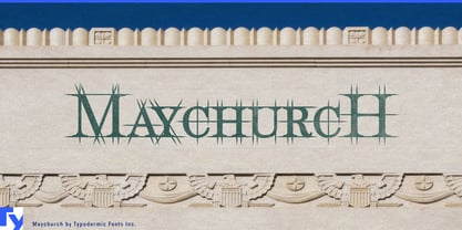
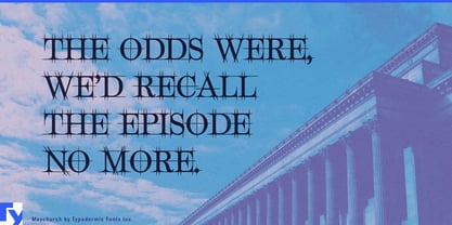
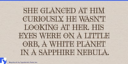
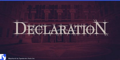
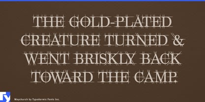
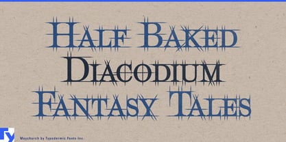
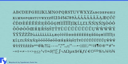
Architectural typography often tries to communicate process by surrounding ordinary letters with grids, circles, dimension lines and drafting marks. The result can feel like decoration applied to a finished headline. Maychurch approaches the problem from inside the letters. Classical serif forms sit beneath a deliberately fictional network of geometric construction lines, making the typography look as though it is still being measured, rationalized and worked out on the drawing board.
That makes Maychurch particularly useful for architectural competitions and major project launches. Architecture firms, developers and visualization studios can use it for project names on competition boards, concept books, planning exhibitions, sales-gallery walls and launch films. The underlying serif structure keeps it connected to architectural tradition; the visible geometry introduces analysis and construction without requiring another layer of faux technical graphics.
Mass-timber systems, modular construction and prefabricated building components provide another strong role. Factory-built housing, engineered timber structures, façade systems and modular assemblies sit between architecture and manufacturing, so their identities often need to communicate both design intent and precise production. Maychurch can handle system names, trade-fair walls, catalog section openers and launch graphics while a restrained sans serif carries dimensions, specifications and technical tables.
Architectural materials benefit from the same hierarchy. Engineered stone, architectural glass, terrazzo, structural timber, metal screens, precision millwork and custom stair systems are sold through sample libraries, specification books and exhibition displays where material character has to coexist with technical credibility. Maychurch can give a collection or product family an architectural voice without pretending to be the technical information itself.
Historic-building conservation offers an especially natural specialist use. Conservation architects, stone-restoration firms, heritage engineers and measured-survey specialists deal with old forms through contemporary analysis. Restoration-project titles, survey reports, scaffold-hoarding graphics and conservation exhibitions can use Maychurch to express that tension directly: classical-looking letters examined through an analytical geometric overlay.
The same idea extends into computational fabrication. Robotic stone cutting, CNC timber production, digitally generated façades, 3D-printed architectural components and experimental pavilions all involve geometry becoming physical structure. Maychurch combines serif forms associated with architectural history with visible construction logic suited to fabrication labs, architecture biennales, pavilion identities and project films.
The geometry is deliberately explanatory rather than literal. It does not reveal a hidden recipe used to construct the letters; it evokes the long tradition of trying to rationalize form through circles, axes and proportion. Maychurch is most useful when a project needs to show not only the finished object, but the thinking, measurement and construction behind it.
