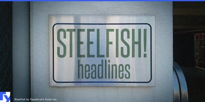
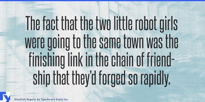
The copy changes; the box doesn’t. Player names, breaking-news headlines, conference sessions, translated campaign lines and program titles all have to enter layouts whose dimensions were settled before the words arrived. When something runs long, the usual fixes are to shrink the type, abbreviate the wording or break the hierarchy. Steelfish provides another option: keep the type large by using far less width in the first place.
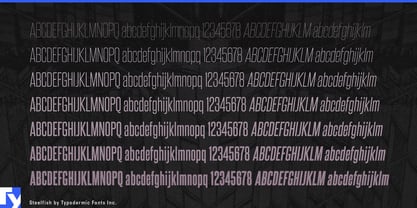
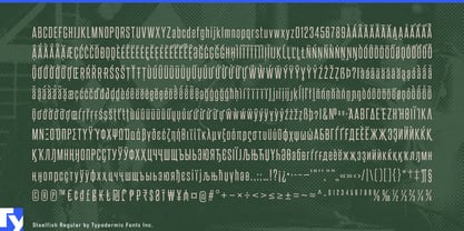
Steelfish is an ultra-condensed sans-serif family whose proportions grew from the narrow headline styles of early-20th-century newspapers. The current drawing is clean and contemporary rather than a period imitation. Seven weights with matching obliques provide a broad hierarchy inside the same economical footprint, from fine secondary display type to emphatic headlines.
Sports media is almost a laboratory for the problem Steelfish solves. Broadcast packages, tournament brackets, starting lineups, match cards, standings, athlete introductions and arena screens must accommodate names that change constantly inside fixed templates. Steelfish preserves headline scale while leaving room for scores, statistics, sponsors and photography. The same economy works for esports tournaments, where handles, team names and event titles compete for limited screen space.
News and factual media present the same challenge at a faster pace. Breaking-news graphics, financial-news screens, documentary titles, vertical explainers and story cards cannot be rebuilt whenever the headline changes length. Steelfish lets unpredictable wording occupy a consistent visual role without forcing every long headline to become noticeably smaller than its neighbors.
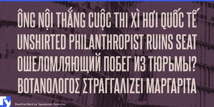
Technology conferences, trade shows, product launches and shareholder meetings create another stream of variable-length information: speaker names, companies, session titles, room identifiers and schedule details for stage screens, digital posters and agenda modules. Multilingual campaign systems present a similar problem when one fixed banner, retail display or social template must accommodate languages of very different lengths. Steelfish supports Latin, Greek, Cyrillic and Vietnamese, extending that width-saving structure across a broad range of markets.
Steelfish is the clean foundation of a larger group of related families. Steelfish Rounded softens the condensed structure with rounded forms; Steelfish Hammer pushes it toward a rougher, battered surface; Steelfish Steeled introduces printed texture; and Steelfish Unleaded applies its own worn, softened treatment. When extreme proportions are needed without an added surface effect, the original Steelfish leaves the visual direction open.
Steelfish is built for variable-length information inside fixed-width design systems. The wording can get longer; the type does not immediately have to get smaller.