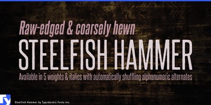
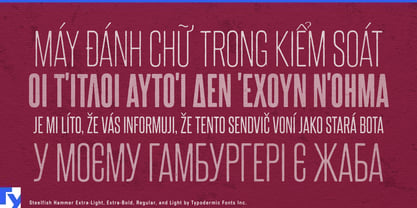
Plenty of distressed fonts can make one rough headline. The problem starts when the headline is only the beginning. Festival lineups, tour campaigns, endurance events and merchandise systems need artist names, dates, locations, categories and secondary messages to share the same battered visual language. Steelfish Hammer extends distress beyond the hero title into a usable typographic system.
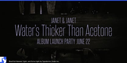
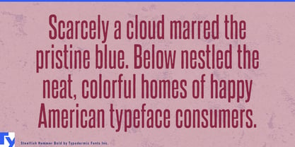
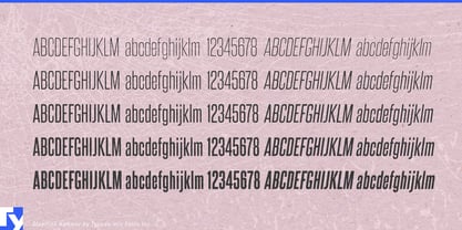
Its ultra-condensed Steelfish proportions are roughed around the edges and broken across the surfaces, but the family retains enough structure for more than isolated words. Five weights with matching italics create hierarchy without abandoning the texture: heavy styles can carry an event name or headliner, lighter weights can organize supporting acts, venues and dates, and italics introduce movement within the same family.
Large-scale live music is a natural setting. Festival identities, international tour campaigns, multi-stage events and venue programs often have enormous amounts of information competing for limited space. Steelfish Hammer can keep long artist names prominent, compress dense lineups and continue the same rough treatment into city lists, stage names, dates and ticket information. Its narrow proportions also suit vertical tour-shirt backs, sleeve graphics and tall venue displays.
Trail races, obstacle events, mountain-bike competitions and climbing festivals present a similar system problem. Event titles, race distances, categories, course zones, athlete names and sponsor information must work across signage, digital promotion, merchandise and event materials. Hammer’s battered surface can suggest terrain, impact and physical use without relying on industrial machinery clichés.
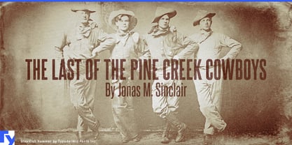
Tour shirts, festival capsules, artist hoodies, patches and licensed entertainment apparel can carry album names, venue lists, dates and supporting copy across chest prints, oversized backs and narrow sleeves. Documentary and factual-entertainment promotion can use the same texture for music history, extreme sports, labor history, outlaw culture and industrial communities.
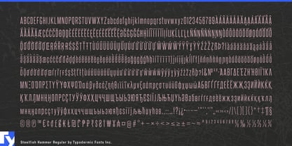
Repeated letters and numerals can automatically receive alternate forms, helping the distress avoid obvious digital duplication in long lineups, city lists and dates.
Steelfish Hammer is one branch of the wider Steelfish group. The original Steelfish keeps the ultra-condensed structure clean for dense information systems; Steelfish Rounded softens it for narrow consumer-facing surfaces; Steelfish Steeled brings controlled printed wear to tools, parts, workwear and product branding; and Steelfish Unleaded applies a softer worn treatment. Hammer is the branch for campaigns that need the roughness to continue after the headline.