







Ir directamente al contenido
Ir al contenido principal
Estilos individuales desde $18.00 USD
Familia completa de 36 fuentes: $450.00 USD
La familia tipográfica Venera fue diseñada por DC Scarpelli y publicada por The Ampersand Forest. Venera contiene 24 estilos y opciones de paquete familiar. Más información sobre esta familia

Venera Complete Family

36 fuentes

¡Mejor Precio!

Por Estilo:

$12.50 USD

Paquete de 36 estilos:

$450.00 USD

Véase 26 más Ver menos
  • Venera Regular

  • Venera Regular Italic

  • Venera Bold

  • Venera Bold Italic

Por Estilo:

$16.25 USD

Paquete de 4 estilos:

$65.00 USD

Narrow Basic

4 fuentes

Por Estilo:

$16.25 USD

Paquete de 4 estilos:

$65.00 USD

  • Venera Condensed Regular

  • Venera Condensed Regular Italic

  • Venera Condensed Bold

  • Venera Condensed Bold Italic

Por Estilo:

$16.25 USD

Paquete de 4 estilos:

$65.00 USD

Sobre la familia


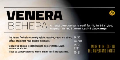
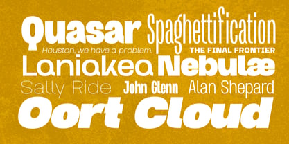
Inspired by the industrial brutalism behind midcentury space-race designs and built for strength and versatility, Venera is a neogrotesque sans serif family in 36 styles at Regular, Narrow, & Condensed widths. It supports all Western European languages, and most Eastern European languages, Latin i Kирилиця.

The Venera family is extremely legible, readable, clean, and strong, with stylistic alternates for some of the more idiosyncratic characters.

And, as always, it's made with love in The Ampersand Forest!

Diseñadores: DC Scarpelli

Fundición: The Ampersand Forest

MyFonts debut: Jul 7, 2026

Venera

Acerca de The Ampersand Forest

The Ampersand Forest is DC Scarpelli. And probably vice versa. I am a wholly inveterate Type Nerd. I’ve been in love with letterforms my whole life, and, for 16 years, I taught type history, type design, and typography as a college professor. Type is voice, and I love giving people a voice. A variety of voices, actually, so that they can choose whichever one is best for them for a particular context. And I don’t just mean designers, either! Type’s for everyone, and every typeface has a purpose and context.For me, deliciousness—flavor—is key. Not all type has to be “good type,” whatever that means. It should be designed with thought and care and craft. It should be supremely usable. But it should aim beyond usability toward (trust me: this is the right word) yumminess.

Seguir leyendo

Leer menos