
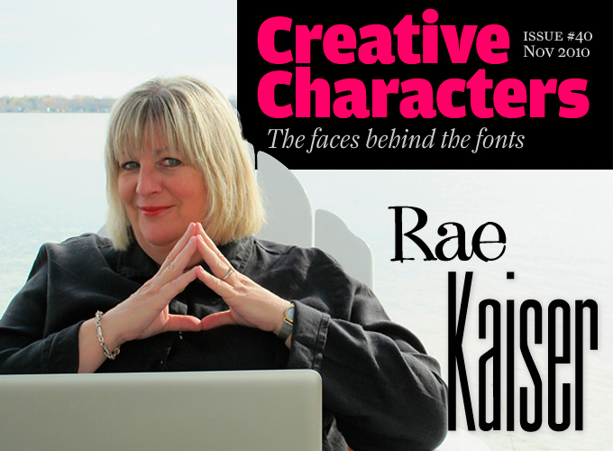
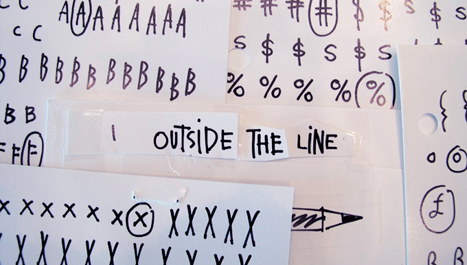
Before setting up shop as Outside The Line, she was a design director and art director overseeing the corporate image of various companies. After she discovered the possibilities of desktop font design, her life took a new turn. She now specializes in witty, wonderfully usable picture fonts and handwritten script fonts. From the shores of Lake Monona, Wisconsin: meet Rae Kaiser, the Lady of the Line.
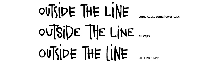
Rae, the Outside The Line collection consists of picture fonts as well as alphanumeric typefaces. Would you say you’re more of an illustrator than a designer — or doesn’t that matter much?
I don’t think it matters. I’ve made a lot of doodle fonts and picture fonts… but I see the next year spent on more alphabet fonts. It just depends on what my latest ideas are.
Your drawings have a distinctive style that recalls 1950s–’60s illustration for magazines and advertising. Is that a conscious reference? Have you researched or collected stuff from that period?
This is probably an unconscious reference, but then I was born in the ’50s, and took high school art classes in the ’60s; I went to art school to get a degree in Commercial Art in the ’70s.
I remember as a little kid that we got two daily newspapers, one weekly paper, a monthly paper and the Sunday paper. Print was very big then and I would pore over all the comics. I would study how they were drawn and how the type was hand lettered. And I would only follow the ones that I found visually pleasing.
At some point my mother gave me my childhood scrapbook. When I was in first or second grade I would cut out things from the paper or magazines and paste them in the scrapbook all in layout form. Each page was themed with all of one item or all things the same color or all the same style of artwork. There was no trapped white space and oddly these layouts looked very much like my early work when I went to commercial art school and actually learned about layouts. Apparently I have always had a grid system in my head.
Could you tell us a little more about your art and design education? Was there ever a moment when you realized: That is how I have to draw those things?
I’ve had light bulb moments along the way. When I was in first grade the nun held up the drawing done by the little girl at the next desk and praised her work. I remember thinking that although her work was better than mine, the teacher should have held mine up because I was going to grow up and be an artist. And I just knew that was what I was going to do from that moment on.
Probably the thing I was most grateful for was the great high school art teacher I had. I was taught and praised and told that I was certainly good enough to go on in that field. I was so formed by those four years of art classes. I am sure that teacher — Dan Story — did this not just for me but for many of us in that small, rural, farming community. I am concerned that there are so many cuts for art in schools here in the United States. Without those art classes and the confidence that was instilled in me I am not sure I would be here now.
And then there were the ’70s… an amazing time to be young and going to school for art. Everything just seemed larger than life. I remember studying record album cover art, loving Peter Max and Andy Warhol, black light posters in bars… art and type were everywhere, you were bombarded by it. And I was a sponge.
And now I feel like I lead a charmed life. I wake up every morning and think about what creative thing I will work on that day. And thanks in part to MyFonts, who has sold my fonts for nine years, I can do that.
Justine and
Diva Doodles
Justine is a handwriting font made in collaboration with Justine Childs, another of OTL's contributing artists. With possibilities beyond personal messages, it will look great in point-of-sale graphics or on textile prints that require an extra touch of girlie character. Here we’ve complemented it with OTL’s Diva Doodles — a pictogram font stocked with chic petite bits and pieces — for a loose and informal combination.
Christmas Doodles
and Christmas Doodles Too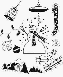
Christmas Doodles and Christmas Doodles Too will add a refreshing twist to gift labels, party invitations, cracker inserts, seasonal food gifts — in fact, anything that would benefit from looking like it didn’t come from the same place everyone else did their shopping at. Also available for festive scribblers is Yuletide Doodles.
How about type and lettering: were there any eye-opening events that made you realize how type works? Did you have teachers or mentors that guided you?
In design school I remember in an early class adding lots of borders and colors to a layout and a teacher calling me on that and wondering what that was all about. On the next several assignments she would not let me have anything in the layout that I could not justify being there. It was drilled into me that more was not better. More was just more. And that was eye-opening for me. I have been a “less is more” designer in every sense since then. It is my creative approach to everything from how I dress to how our home is furnished to how I draw doodles or make type. I try to tell my story in the cleanest, simplest manner. I think that early experience taught me how to see things differently.
That helped me develop an eye for typography. I studied how type was set and used. Years ago type was set and you spec’d the size and leading. And you needed to be very close the first time because if not you almost started over. I remember when the world was going from typesetting to setting type on a Mac that I initially thought Macs set bad type. That was certainly not true but through the defaults on a Mac someone with little or no typographic skills could set passable but bland type. How many documents set in 12 pt. Arial do you see? But then that also leads to people thinking that because they can buy a Mac and the Adobe Suite they are a graphic artist.
I imagine there are other illustrators like you who wonder how on earth one goes from drawing something on paper or on screen to getting it to work as a font… How did you learn how to do that? And what would you advise artists who are curious but intimidated by the technology?
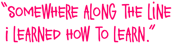
Somewhere along the line I learned how to learn. I am self-taught when it comes to font making. I have never found a class to take on FontLab or Fontographer. I wish there was one somewhere. I started using Fontographer when it came out and then switched to FontLab and now will probably use Fontographer again from time to time since it has been upgraded. The learning curve can be steep if you want to make a really good font. I enjoy the drawing part of a font more than I enjoy the technical part of the font making. But my sweet husband is quite capable technically and will help out on that end from time to time. I always buy the tutorials and technical manuals, read them and keep them close for reference. My advice to anyone who wants to make a font is to just do it. It can be very rewarding.
Many young designers start out wanting to be fine artists, then realize they are more at ease making things with a well-defined purpose, and become graphic designers or illustrators. It seems you were immediately drawn to commercial art — was that because of a particularly practical mindset?
I could easily have been a fine artist. I have painted off and on over the years. Someone, probably my dad, made me think about being an artist while still being able to support myself. I remember thinking that if I chose to be a fine artist I would probably also need to teach. I didn’t really want to teach (although I have recently guest-lectured on font design and didn’t hate that).
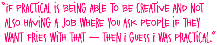
So if practical is being able to be creative and not also having a job where you ask people if they want fries with that — then I guess I was practical. I ask young people in high school who want to be a great artist how they plan to eat. Artists need to make money so they can afford to travel so they can see the world. You need to be able to go to great museums, sit in little cafés in Paris, see that the world is a bigger place.
Most of your fonts have a hand-made feel to them. Do you draw everything by hand before digitizing it? What’s your production method like?
I have only made one font that I have not drawn by hand. I had a hard time going from working by hand to moving to the computer until it occurred to me that I could draw and scan things to keep the same feel which is important in my work. My font Dearest John, for instance, came into existence because I needed a new header for my blog/website so I lettered it. I liked the look so much that I drew the rest.
Fondly Yourz
Essentially a pen-drawn version of classical Didone lettershapes, Fondly Yourz is a formal display face with a spontaneous character, well suited to large, attention grabbing executions — it wouldn’t look out of place in white on red in the coming Jau sales. Also try it to add subtlety to editorial headlines or to take the edge off advertising copy.
Frames and Borders
and Frames and Borders Too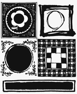
Between them, these two pictogram sets provide imaginative and creative frames and ornamental touches for designs and documents needing a handmade atmosphere — after all, anyone can draw a straight line, right?
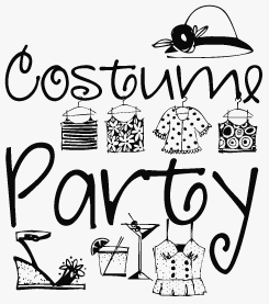
Plz Script & Print w/ Blobs,
Brushstrokes and Balloons
Plz Script and Print (with Plz Print Brush and Bold Cond also available) are a set of rough, ready and spontaneous hand lettered fonts perfect for that wildly creative look always associated with artistic genius — especially when matched with OTL’s collection of random splats, splodges and splashes (also known as Blobs, Brushstrokes and Balloons) as we have done here.
Development sketches and test settings for Dearest John
Before you decided to concentrate on type design you worked as an art and advertising director. What was that like — did you work at an agency? Do you ever miss that type of work? The group process?
I never worked at an advertising agency, but I did head two in-house art departments. The first one was Seiferts, a group of 250 retail women’s clothing stores. I then did the same type of work at Frontier Herbs, an organic herb, spice, coffee & tea company out in the country on 60 organic acres. In both cases over time I ended up managing people instead of actually doing the work I enjoyed. I always preferred to take a project from concept through execution. That led me to freelancing, which turned into type design.
I had discovered Fontographer shortly after switching to the Mac. In May of 1998 I won honorable mention in U&lc’s type design competition in the Picture category with my font Doodles. And that was it, a whole new world opened up for me.
While I am very happy working from home alone I do miss having that person at the next desk when you get stuck or just want another opinion. I have just started a coffee group with three other graphic artists so I can have that kind of interaction.
curly-q
There’s plenty on offer here besides playful twists and wobbly hand-drawn characters: Curly Q has an organic and inventive feel that will enhance everything from food and drink brands to children’s publishing; or for more homey use, try it out in your kids’ photo albums or holiday projects.
Many of your picture series ooze a sense of tremendous fun. What are the things that inspire you?
I spend most of my time living in my head. So I am always thinking, looking, absorbing. We recently moved to a city I love, Madison, Wisconsin. It is a creative city as well as a college town so there is a good energy here. I find that living somewhere good helps me be creative.
We live in this funky, old hippie neighborhood in a lakeside condo that I stalked for 20 years. There are lots of sweet little cottages here that made me decide to make House Doodles. It was a little creepy, skulking around my neighborhood in the early dawn hours taking photos of people’s houses. Sometimes my poor husband would drive the get-away car.
As much as I like living in my head, travel really helps with inspiration. I have carried a tiny camera in my purse long before I got an iPhone so I could record bits and pieces of anything and everything.
We went to Paris several years ago and I knew that would be a life-changing trip for me (a psychic told me that I had three happy lives there). I knew I would do something creative so I took pens and paper and watercolors with the romantic notion that I would spend afternoons sitting in little sidewalk cafés painting. Instead I was quite taken with the wrought iron balconies I saw everywhere. So I took photos that in turn inspired Fleurons of Paris and Ornaments of Paris and then later Paris Doodles.
I make fonts that I think don’t exist. I try to think about how a font will be used… I made Frames & Borders because I always hated having to stop in the middle of a job to draw a border. And I wanted that hand-drawn look — not a clip-art look. I assume other people did too.
I also blog most days… that keeps me on my creative toes. It’s fun to have a place to talk about the clutter in my head.
Your alphabetic fonts are pretty diverse. Do you have any favorite type styles or genres, historical or contemporary?
That is kind of like asking me what my favorite book is. I like any and all fonts that are well designed. That means I like Helvetica. I like fonts that when I look at them make me wish I had made that font. I guess I am drawn to all things hand lettered. And almost all my work is hand-drawn. I am always trying to be different. I have a new brush font in my head with a slightly different twist.
The style you use in your picture fonts and samples would be perfect for large scale illustrations, book covers, even wall paintings for shops or cafés. Do you have any unfulfilled ambitions in that direction? Or any fulfilled ones that you’d like to share?
Actually when I managed the in-house art department at Seiferts I did many large, graphic window posters over the years. We would come up with a theme for that season or collection and my staff or myself would create the 3'x4' window posters. I loved doing those because you were given a color palette, a theme and a phrase. I always started those posters by poring over the type catalogs, then I would make the weight and feel of the graphic repeat the weight and line of the font. Then add the color. I loved making those posters because they felt like pure design, they were big and full of type and color. That theme was then carried out throughout the store. It was exciting to see a bright, nicely merchandised store filled with my work.
Wedding Doodles
and Wedding Doodles Too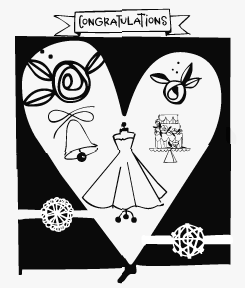
These two font sets bring a sparkly sense of deshabille to any formal occasion, although weddings are where their hearts naturally lie. Think beyond the invitation and use these fonts to add personal touches to the seating plans and place names, gift lists, photo albums, web pages and anything else within range of your design software.
Architectural Lettering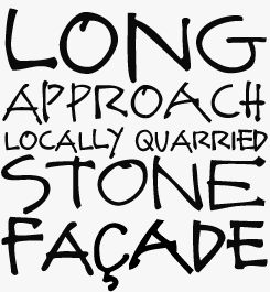
OTL's Architectural Lettering faithfully captures the adventurous engineering spirit of schemes, plans and blueprints everywhere, with this rough-hewn but nevertheless tidy all caps handwriting font.
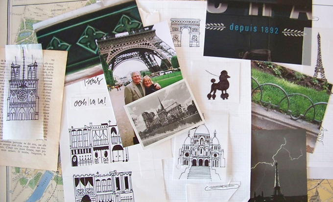
Rae Kaiser’s Paris scrapbook
Through your fonts, your drawings and alphabets have now become tools for other designers to make beautiful work and to stand out. Do you get to see a lot of the work that people make with your fonts? Any wonderful or bizarre surprises?
I wish I got to see more of my work in use but I don’t. People who recently bought my fonts live in Austria, Australia, Finland, the Netherlands, Bolivia, the UK, New Zealand, Israel, Japan, Belgium and the USA. Occasionally I see something online.
Nothing would please me more than to go to Paris and see something there with one of my Paris fonts on it.
Having been an art director, I imagine you spent quite some time browsing catalogs and websites looking for fonts and other visual components. Do you still browse font sites like MyFonts sometimes? What are your impressions of the current typographic scene?
Absolutely! I am always checking in at MyFonts. And I always find something new and exciting. The advent of Fontographer and the Mac made it possible for anyone with typographic skill to become an indie font designer. I think that is wonderful. I remember the day when I knew the names of almost all of the fonts I saw. That day is long gone. This is a case where more is better.
What would you say are the main changes you’ve witnessed in the way illustrations and pieces of clip art are being used in commercial and editorial design?
Times are tough. Clients seem to have less to spend. I remember when I would hand letter a piece of type or do a spot illustration for a job. I think that designers now rely on a reasonably priced font to do that for them. That was why I made the Frames & Borders fonts. My clip art fonts are priced at $29 and always have 30 or more pieces of art in them. I think that is good value and generally affordable for the client.
Do you like being active in the 21st century or would you rather have been working, say, in New York in the 1950s–’60s during the heyday of illustration?
Well a psychic told me that I was an artist in Paris in the 1800s. I’m sure that was interesting… I am also fascinated by bibles hand-lettered by monks… But actually I am pretty pleased with my creative life right now.
Thank you! We're pleased too that you are here!
Hodgepodge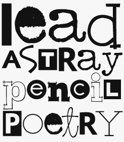
An arbitrarily yet artfully chosen mishmash of contrasts, textures, forms and characters, Hodgepodge is simply a mess – and perfect for those occasions requiring a more, shall we say, eclectic tone of voice.
paris doodles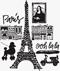
With Paris Doodles, Rae Kaiser capured the atmosphere of the French capital in a series of simple, effective sketches.

Who would you interview?
Creative Characters is the MyFonts newsletter dedicated to people behind the fonts. Each month, we interview a notable personality from the type world. And we would like you, the reader, to have your say.
Which creative character would you interview if you had the chance? And what would you ask them? Let us know, and your choice may end up in a future edition of this newsletter! Just send an email with your ideas to [email protected].
In the past, we’ve interviewed the likes of Cyrus Highsmith, Nicole and Petra Kapitza, Rian Hughes, Alejandro Paul, Dino dos Santos, Veronika Burian and Jos Buivenga. If you’re curious to know which other type designers we’ve already interviewed as part of past Creative Characters newsletters, have a look at the archive.
Colophon
This newsletter was edited by Jan Middendorp and designed using Nick Sherman’s original template, with specimens and type descriptions by Anthony Noel.
The Creative Characters nameplate is set in Amplitude and Farnham; the intro image features Fondly Yourz and Tall Skinny Condensed; the pull-quotes are set in Dearest John; and the large question mark is in Farnham.
Comments?
We’d love to hear from you! Please send any questions or comments about this newsletter to [email protected]
Subscription info
Want to get future issues of Creative Characters sent to your inbox? Subscribe at www.myfonts.com/MailingList
Newsletter archives
Know someone who would be interested in this? Want to see past issues? All MyFonts newsletters (including this one) are available to view online here.