
Photo by Stephen Coles
Our subject this month is a man with an eye for an unexpected tale and a taste for surprising details. Not unlike his native Sweden’s better known exports, his is a globally focused design practice rooted in Scandinavian heritage. His foundry, MAC Rhino Fonts, has been with MyFonts for just under six months but the story of its name actually predates the emergence of a more famous type of Mac… Meet Stefan Hattenbach, a classically minded type designer with rebellious tendencies.
Stefan, you began publishing fonts around 1997. Did you always have a special interest in type and typography?
It’s always been there in the background. My mom used to take me to art museums and galleries from the age of five. This opened up my interest for colors, forms, patterns and also details (the latter becoming very important to me and a great asset for type design). These experiences made me look at ordinary things from another perspective. I often get fascinated and find inspiration from shop signs, old ads in magazines or just a good-looking set of numbers over a doorway.
While Sweden has a very articulate visual communications culture, its type design tradition seems to me to be rather young — correct me if I’m wrong. Did you feel exceptional when you started out in the mid-1990s?
I would say your observation is quite right about the rather modest typographic tradition in Sweden. I think the fact that Sweden has always been close to many other influential countries, such as Holland, Germany, France and England, has made the domestic type scene “suffer” a bit, historically. Until the beginning of the twentieth century, Sweden imported virtually all of its typefaces from other European countries. There was a slight change when a few Swedish type designers managed to make a name of their own. Karl-Erik Forsberg (1914–1995) released his well known typeface Berling antikva in 1952. As for myself I didn’t feel that exceptional, even if still today there’s only a handful of Swedish designers making some sort of living from designing typefaces. By the time I started out, things had already gone so international and global anyway. But I have always felt very proud to be able to do the thing I like most, and even earn some money doing it!
Designing type can be a tedious and lonesome activity at times. What are the things that make it worthwhile to you?
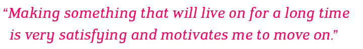
People often say that it is tedious and lonesome. Lonesome to a certain point, but never that boring or tedious to me. As it is a passion and a drug, I just feel happy to do it — no big effort really. And the feeing of having completed a typeface is truly great. Not just for a short while, but also in the long run. If you make something with good style and with a high technical level, it might have the potential to live on for a long time. That is very satisfying and easily motivates me to move on.
Could you mention some type designers and lettering artists that have inspired you along the way?
I believe every artist is influenced by others, for good and for worse. I see it as a part of the “artistic evolution”. Barry Deck, Neville Brody and Emigre were my early sources of inspiration. Also Karl-Erik Forsberg inspired me, and two of my earlier designs are interpretations of his work and sketches (Lunda Modern and Remontoire). Now, being more established as a type designer, I love to see others making great designs. This is another thing that motivates me to do even better myself. What I also find very positive and welcome, is the fact that several new designers are women! I think that is good for the business overall. They add another perspective and style, which I think will benefit the whole type industry.
Stalemate Pro
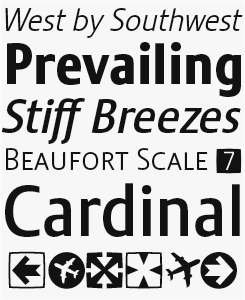
A crisp and clinical sans serif, Stalemate Pro began life as one of Hattenbach’s custom typeface designs for a German IT firm. It goes from an airy Light to a substantial Heavy in just three weights (plus italics), but this compact family is fleshed out with complementary icons and small caps. Designed from the outset to function well both on screens and in print, this is a corporate-flavored microfamily with a scale suited to all sizes of enterprise.
Luminance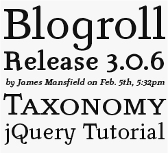
Like Graficz, below, Luminance is a product of Hattenbach’s fascination with eastern European typography. Based on work by Czech designer Carl Pracht, Luminance has equal utility as a text or display font, and has great potential for use in headers, by-lines and secondary info panels to add a quietly spoken classic atmosphere to text-heavy layouts.
Some of Hattenbach’s custom made typography, plus marked up proofs for Sophisto.
How would your describe your attitude as a type designer?
Focused and dedicated. I hate to do something “half good”. As with many other designers, I started out with more funky designs to begin with. Then bit by bit, I have worked my way back through history and have ended up with much more traditional typefaces than my first ones. By going through this long process, I have learned the basic and classic “rules” of typography. I’ve also taken the time to study some of the history behind the evolution of typography. I think this is important if you decide to work with classic styles. As for some of my latest projects I have started to “break the rules” more often, in order to get back to the “uneven feeling” that the older hand-made typefaces had. I sometimes feel that the perfect vector curves achievable today with FontLab, at some point take away the spirit of the typeface. It somehow goes “flat”.
While you obviously have a predilection for serious, traditionally rooted text faces, many of your fonts have unusual details — the frolicking serifs in Luminance, the oblique top serifs on Delicato, the curly italic-style tails on the upright Oxtail… Do you consciously set out to break rules and create unorthodox shapes?
Type design is often about details. For a typeface with characteristic display expression, the details can be more obvious, as I’ve done with the “tails” on Oxtail for example. As for classic text typefaces the details need to be more subtle in order to show a smooth flow for longer copy. I don’t have any rules or special desire to make certain marks. Sometimes it could be a basic idea that is actually working throughout the design. And sometimes it’s more like the end result of a process not intended from the beginning. People sometimes say they can sense a personal style within my typefaces. I take that as a compliment. It feels good if I’m able to add some flavor to the typefaces. I see this myself, with many fellow designers.
Could you give a step-by-step description of your design process?
It often starts with an idea in my head or impulse from some old design, for example a label on some antique bottle. Either it just grows in my mind for a while or I make some brief sketches on paper. The next step would be experimenting in FontLab to find the basic structure of the typeface. Thickness, details, endings etc. Step three is the actual making of a regular weight, making the upper and lower cases together with some of the numbers and other figures.
After that I usually let it rest for a while, some weeks or even a month or two. Step four includes a fresh re-evaluation of the regular weight, usually some design changes and then some initial tests of printouts. Step five: making a full regular weight, complete with spacing and kerning. Then moving on with the other upright weights and eventually italics and ornaments. Along the way come more printouts. Step six… There should be a final typeface family by now.
Has it sometimes happened that you began creating a new typeface, hoping to achieve a certain goal — and then had to turn around half-way because your plan wasn’t working?
Yes, several times. One of my typefaces in progress — “Republicana” has changed serifs several times. I started out quite extreme and now the serifs have become much more low key. This is why you shouldn’t hurry the process of designing a typeface too much. It’s like a good wine, it gets better if you let it mature a bit.
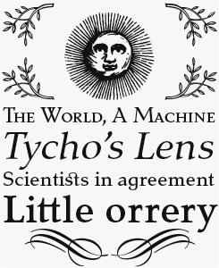
Graficz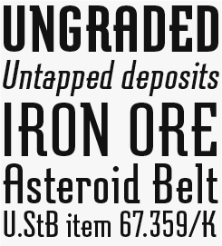
Hattenbach’s source material for Graficz was a 1930s Polish catalogue cover; and there’s a lightness of touch to his interpretation that makes Graficz a great display face for those situations that require a pre-war industrial feel without becoming overtly Constructivist in character. Use freely on posters and in website mastheads; but exercise a little discretion when it comes to headlines because those tall characters will demand a lot of screen real estate.
anziano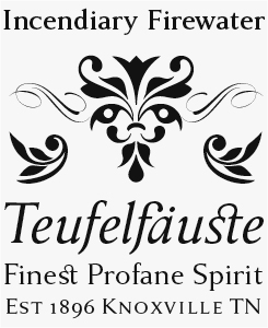
As a text face with excellent legibility credentials, Anziano already has plenty to offer, but it’s in its tastefully understated detailing that it really brings something different to a designer’s type collection. Aside from its inventive (and, in some cases, intentionally ambiguous — is that Hattenbach’s self portrait in our sample above?) fleurons and ornaments, there’s a couple of atypical umlaut ligatures (e.g. “fä”) in addition to the normal discretionary sort. The whole adds up to a familiar feeling typeface with the unexpected incidental detailing of something rather more exotic.
How do you identify what to work on next? Is it a case of following your head and making business decisions about what will sell, or following your heart and working on what inspires you?
In the beginning I was tempted to follow the trends, but I soon gave that up as I think it’s very unwise to focus on just making what’s hot for the moment. My philosophy is therefore, “do what you like as good as ever possible and trust that the audience will find a way to appreciate your work as it is.”
Among your own fonts, which one is your favorite, and why? Are there any fonts you wish you had not published?
I’m always happy with the typeface I’ve just completed. Then as time goes by some feel better than others and surely some of my earlier work is not worth having around any more. That’s why I retired some of my earlier ones originally released through GarageFonts. To pick a favorite typeface from my own ones… is a quite difficult mission. I think Anziano would have to be the one. It still feels fresh and interesting. It has shown good quality and worked well in various projects.
You’re not alone in using a career in art direction as a foundation for becoming a specialist in type. What do you think it is about that agency background that makes for a successful type designer?
For me it wasn’t the natural step to go from being an art director and move on become a type designer. I was just fed up with the commercial aspect of the advertising business after 14 years. I needed to get back to core graphic design in order to restore my hunger and happiness for the creative process. My advertising career did open doors for typefaces and typography overall. So when I started on my own, I soon realized type design was the thing that was closest to my heart. Another very important thing is the fact that my experience from the commercial side did give me tools and knowledge of how to promote myself and build a “brand” around myself as a type designer. I always have a clear picture of where I want to be next year… and how to get there!
The name of your foundry — MAC Rhino Fonts — conjures up visions of a belligerent Apple hardware fan, always at the front of the queue for the newest product… are your tools actually that important to your work? Do you see the way you work changing as our various bits of technology evolve?
The Apple products are important tools for creatives because they think the way I do. Whenever I have to deal with a PC, it’s a real pain. Also the aesthetic aspect is important. If you work with things that are nicely designed, it makes you happier. As for the work changes, I think the process of designing typefaces will not change much for me. Some parts may be easier in the future, but still the machines are not able to come up with the ideas (yet). In reality, the letters “MAC” in my company name originally stood for “Music”, “Art” and “Communication”. I wanted to incorporate those three important things, but then I needed to add something in order to be able to copyright it, so the word “Rhino” just came to me by chance. This was in 1983, then we all know who launched a new product with a bang in 1984!
sophisto
Sophisto is a collaboration between Hattenbach and San Francisco-based PSY/OPS type foundry — a working partnership that has produced an advanced and highly usable family of 21 fonts across five weights, or “gauges.” With particularly interesting applications for display work — the capitals seem a fraction narrower, making for distinctive condensed all caps settings — Sophisto’s all-around appeal also includes decent text face use and supporting fonts of patterns, ornaments and icons.
Sophisto Icons & Patterns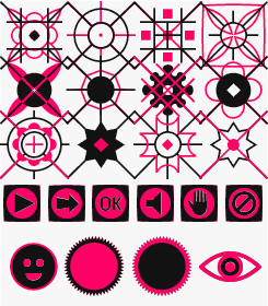
Sophisto Icons & Patterns is a supplementary family of graphic devices, including three types of button, a dingbat font and a set of geometrically based pattern glyphs that make for easily built tessellated backgrounds and textures.
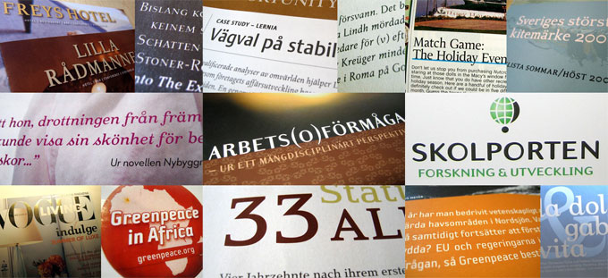
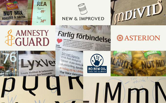
A selection of Hattenbach’s retail fonts in a variety of design executions.
You are obviously not a person to put all his eggs in one basket. Although you’ve consistently used the MAC Rhino brand to promote your fonts, you have worked with other foundries such as Fountain and Psy/Ops (both of which have recently joined MyFonts) and others. Has this strategy paid off? What would you advise a budding type designer to do when it comes to getting fonts out there?
There are many ways to go when it comes to distribution. I’ve enjoyed working with independent foundries and people I trust. The benefit of this way of doing it is all the service included from the foundries. I would hate having to answer questions like, “how to install the typeface”, “where to find the ligatures”, “why this typeface looks bad at 6 point on the screen”… Also my main focus is not technical issues. I’m primarily an artist and my passion is to design typefaces. Another aspect and strategy with choosing several distributors for your typefaces, is that you reach different customers. My advice to younger designers starting out would be to find independent foundries with a strong character and passion. Small foundries sometimes have a wide reputation and many “followers.” Psy/Ops and Fountain are both good examples.
Could you say something about your custom lettering and type work for high-profile clients such as Absolut Vodka, H&M, Jura and others?
Custom typefaces are the other side of the coin. Making retail typefaces for myself are always decided and ruled by me only. Now making a custom typeface is totally different. They should fit a creative purpose. Fill a certain need. As a designer my purpose is to provide the client with a satisfactory product that should live up to the client’s expectation. It’s often a challenge because you will have to do designs you would not normally do. I’ve probably learned more from doing a few custom typefaces than from several of my own ones. Another fascinating fact is that you often have to create a balance of keeping the idea from the client side and make it work together with the design solution and other features. I really like sharing my time between custom type and my own creations.
Apart from boasting such great little foundries as Fountain, T4, Samuelstype and your own, Sweden is also the country of The Pirate Bay, a wildly popular website that facilitates peer-to-peer file sharing and whose founders have been charged with breaking copyright laws. As a fellow Swede and a creator of original content, do you have any comment?
Pirate Bay received a lot of publicity, especially with the lawsuit against the guys who started it. I can’t say I like it when people steal things. But this reflects the fact that digital files are seen by more and more people as having to be “free”. I simply think this is because they aren’t physical things in the same way as “real stuff”. I just have to accept that the better known I get, the more people will be stealing my typefaces as well. But I like to focus on the fact that a great deal of people do appreciate my typefaces and pay for them. That’s good enough for me.
Tarocco
Tarocco is a generously proportioned and richly featured typeface, especially suitable for book designers — and anyone wanting to evoke an atmosphere of well-thumbed antiquity. In addition to a standard set of oldstyle figures, small caps and decorative ligatures, the full family includes an ornaments font with borders, fleurons and a few delightful woodcuts thrown in for good measure.
oxtail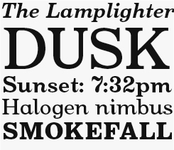
An Egyptienne with a few twists in the tale, Oxtail is a contemporary take on that historic display genre. As with a few of Hattenbach’s designs, extra attention seems to have been given to making the capitals work particularly well together. With Oxtail, setting headlines in all caps isn’t a shortcut to instant impact, but results in something with a more subtle, modulated tone.

Who would you interview?
Creative Characters is the MyFonts newsletter dedicated to people behind the fonts. Each month, we interview a notable personality from the type world. And we would like you, the reader, to have your say.
Which creative character would you interview if you had the chance? And what would you ask them? Let us know, and your choice may end up in a future edition of this newsletter! Just send an email with your ideas to [email protected].
In the past, we’ve interviewed the likes of Michael Doret, Laura Worthington, Jonathan Barnbrook, Rob Leuschke, David Berlow, Ronna Penner and Jos Buivenga. If you’re curious to know which other type designers we’ve already interviewed as part of past Creative Characters newsletters, have a look at the archive.
Colophon
This newsletter was edited by Jan Middendorp and designed using Nick Sherman’s original template, with specimens and type desciptions by Anthony Noel.
The Creative Characters nameplate is set in Amplitude and Farnham; the intro image features Lunda Modern; the pull-quotes are set in Remontoire Bold Italic; and the large question mark is in Farnham.
Comments?
We’d love to hear from you! Please send any questions or comments about this newsletter to [email protected]
Subscription info
Want to get future issues of Creative Characters sent to your inbox? Subscribe at www.myfonts.com/MailingList
Newsletter archives
Know someone who would be interested in this? Want to see past issues? All MyFonts newsletters (including this one) are available to view online here.