
Photo by Pongsak Tangtivaja
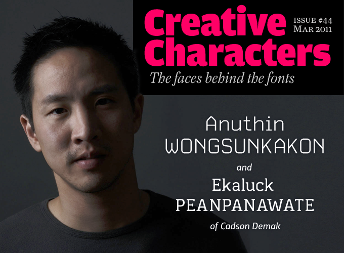
They may not be a household name on a global scale yet, but in their native Thailand, Cadson Demak are a high-profile typographic consultancy. Clients they’ve designed custom Thai faces for include Wallpaper*, Federbräu Beer and Nokia. They recently had a big hit on MyFonts with Kondolar, designed by the studio’s team member Ekaluck Peanpanawate. Their collection of well-made yet affordable fonts — small but versatile text families as well as witty icons — is growing. This interview is a double bill: for our conversation with Ekaluck, scroll down. First we’re giving the floor to Cadson Demak’s co-founder Anuthin Wongsunkakon. A warm welcome to our men in Bangkok.
Anuthin, you are based in Bangkok, but received part of your design education in New York. Could you tell us a little more about your background?
During my undergraduate years in Thailand, I experienced a transition from pre-computer to computer-based, or more precisely Macintosh-based, design. Technology was evolving, even though it was quite slow when compared to the West, and living in this development phase allowed me to benefit from both sides of the design process. Nevertheless, I already owned a Mac at the time so it wasn’t difficult for me to work with this emerging tool.
The newer generations of designers might not be able to imagine how amazing it was to actually leap forward from the pre-computer era. The availability of font menus can even be considered a revolution in typography in the 1980s, and that change certainly fascinated me. Additionally, studying in the US broadened my perspective on design and I began to see it more as a culture.
Having worked within the graphic cultures of both Thailand and the United States, what are the main differences when it comes to the day-to-day working environment?
At Cadson Demak, we tend to work quite swiftly, taking advantage of modern technology and the internet. Other companies in Bangkok are also starting to do the same, especially the smaller ones, since their size allows them to adapt to these changes more easily. In the US, this is nothing extraordinary. In Thailand, however, working and communicating online is not entirely common yet. We still need to talk face to face and attend all those unnecessary meetings. Anyway, I don’t think it’s something permanent. It’s just that our work culture evolves at a pretty sluggish pace.
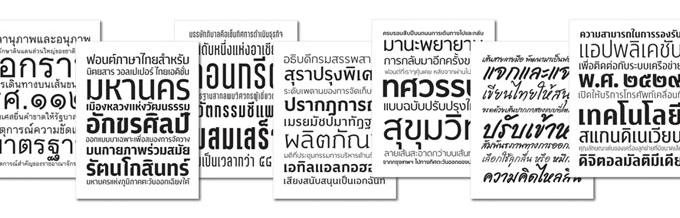
The Thai language has a beautiful script of its own, which dates back to the 13th century. In your practice as graphic designers, do you work with both Thai and Latin scripts simultaneously? Does Thai have special requirements or difficulties?
We actually use both Thai and English on a daily basis, sometimes because it’s a requirement of the project. We tend, however, to promote the use of Thai in lettering whenever possible. For me it comes naturally, but many Thai designers find it difficult to use Thai type. Many believe that it’s harder to make things beautiful using Thai alphabets. It’s an odd belief but it’s still present in our design community. One of the reasons may be that changes in international design trends don’t align with the local ones, and that includes typography. It’s getting better, though. Now the problem basically lies with the act of using Thai typefaces and not the lack of fonts.
In fact, you’d be astonished at how seamlessly modern Thai letterforms blend with the international layout style. I think for many foreigners, Thai alphabets still give them the impression of those old traditional scripts, but we have gone past that. Our ability to comprehend new and more simplified letterforms has improved. Thus, new typefaces are more responsive to global design trends than some would expect.
Amino
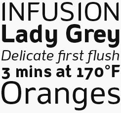
Sharp and assertive, Amino is a great tool for packaging and signage designs as well as editorial work, while its character is comfortably softened by its rounded detailing. Available in two weights and an italic, Amino’s bold will bring a marked contrast to screen layouts, where it would make an interesting companion for the standard system fonts.
Bangkokean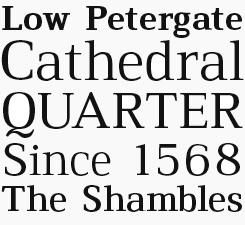
After all the modern, international-style sans serifs that comprise the bulk of Cadson Demak’s library, the serifed Bangkokean is like arriving in a remote country and finding your favorite daily newspaper — it’s an unexpected but welcome touch point with more familiar territory. Which is not to say that Bangkokean is only old world traditionalism; its finely engineered lines and ample x-height mark this as a product of the screen age as much as its sharp contrast has its origins in a more classical era.
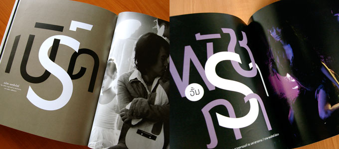
Top: Custom fonts Cadson Demak did for Wallpaper Magazine, CPAC, ThaiBeverage and Nokia.
Bottom: Type play in magazine spreads designed by Cadson Demak, using one of the studio’s own fonts.
How would you describe your attitude to type design, especially when it come to making Latin faces?
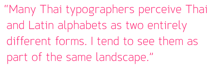
Many Thai typographers perceive Thai and Latin alphabets as two entirely different forms. I tend to see them as part of the same landscape. Perhaps it’s because I started learning typography with Latin alphabets and later on worked with Thai the way I understood it, not how it was traditionally taught. It gave me an alternative way of approaching it as well as solving the problem of bringing Thai alphabets into contemporary design styles. As a result, Cadson Demak’s fonts usually have similar structures to Latin letterforms. Now, whenever I turn back to design a Latin typeface, there are often some Thai essences that come along with it. When you don’t distinguish between the two alphabets, you are likely to see things differently.
You have done a lot of custom typefaces for Thai editions of international magazines and media, from Wallpaper* and Arena to MTV and Men’s Health. Is this common in Thailand? What’s the process like when you translate a magazine’s ‘look’ into a language and culture that is so typographically different?
A decade ago, custom typefaces were just toddlers in the Thai design and business industries. For me though, it wasn’t that they were new but more like forgotten and rediscovered. We used to have custom typeface projects in design school, but that has somehow been lost, both in education and business. The lack of demand from businesses and the lack of promotion from typographers and foundries may also have cut their growth short, and instead of collaborating, type designers work individually, slowing down the development of our type industry as a whole. The consequence? Designers, and design itself, got stuck with just a few good typefaces. That’s why talking about custom fonts now seems like a brand new concept.
Localizing the brand, whether it’s communication design or typography, requires a rather competent art director. Although we work with type, this kind of process demands more than just designing fonts. We have to assist with translating the original typographic direction of the brand into a local one. Just having a font is seldom enough.
On a side note, we have actually designed custom Thai typefaces for many other international brands such as Nokia, Tesco-Lotus, and Telenor/dtac.
Option Sans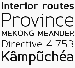
Published by T–26, Anuthin Wongsunkakon’s Coupe has been one of his most successful fonts for years. The four-weight Option Sans is a drastic reworking of that earlier typeface, in the process becoming a more human, legible text face than its squarer predecessor.
CarbonPlus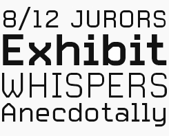
A commissioned reworking of the earlier Carbon (like Coupe, published by T–26), CarbonPlus updates the original’s OCR stylings with the addition of light and bold weights to the existing regular, making it into a solidly usable font for both web and print.
In some of your custom work you have worked with Christian Schwartz. How did this collaboration come about? Do you still work together occasionally?
As a matter of fact, we were introduced to each other by Cyrus Highsmith 15 years ago and continue to remain friends. It was only when Wallpaper* (Thai Edition) needed a Thai version of Amplitude that we got to collaborate. We also worked together on a font called Reform for Psy/Ops. He pretty much suggested and directed on how the italic of Reform should be. Recently, our collaborative activity has been more in the vein of last year’s BITS (Bangkok International Typographic Symposium), which Cadson Demak organized in association with Alliance Française, Goethe Institut, and Japan Foundation.
You published a number of fonts with T-26, then began publishing fonts yourself. What made you switch to that model?
When you are just starting out, you have to begin somewhere. T-26, with all their great designers, gave us that opportunity. But it’s not like we ever actually switched to a new model. In addition to T-26, we have worked with Psy/Ops and TypeTrust for many years now. So I think it’s a matter of what fonts we have and in what way they should be managed, and not about setting up a common model for everything.
Cadson Demak was established to satisfy a group of graphic designers who wanted to do product design. It’s a long story, so just consider it history. Today, we design types and that is what we are known for, both internationally and locally.
Among the T-26 fonts, there are quite a few dingbat and icon fonts, all very simplified, some on pixel grids. Did you make them for a specific purpose? Do you still find them interesting?
Our pi fonts usually have a story behind them. It may be sarcastic or something that requires a little tangential thinking, like Symbloc. This little set of icons should be credited to our designer Supisa Wattanasansanee who was mainly responsible for the project. Occasionally, we just create them as auxiliary graphics for our work, but sometimes we get carried away.
You’ve also worked with another successful young foundry, TypeTrust. Could you say something about that collaboration?
Both Neil Summerour and Silas Dilworth are exceptional type designers. When you get to work with them, you know how much effort they put into their designs, trying their best to push on to the next level. I knew them from before TypeTrust was founded, so collaborating isn’t something new for me. Moreover, we are usually on the same page.
You’ve seen your fonts used by major media, both in North America and your home country. Does it still excite you to encounter your fonts in use? What real-life uses are you most proud of?
Naturally, whenever we see our fonts put to good use, we are excited. From time to time, we are even amazed by how graphic designers adapt it for their designs. Frankly speaking, being a type designer might cause my outlook to be narrower in some situations.
In Thailand, Cadson Demak’s typefaces can be seen in numerous brands, whether they are our two leading mobile service providers, national institutions (CAT - Communication Authority of Thailand), discount stores, food products and restaurants, alcoholic beverages (Chang), and whiskies (Mekong). However, the one thing that we are most proud of is seeing our types being accepted by the design community in Thailand. Last year, Computer Arts (Thai Edition) placed us among the most influential designers/firms of the decade.
When Dutch designer Donald Beekman visited Thailand about ten years ago, he took dozens of photos of election posters, in which all the candidates were shown in colorful military attire. It was explained to him that these people weren’t soldiers, but lawyers, professors, businessmen — that the uniforms simply appealed to the Thai sense of decorum. Is it still like that now, and does this love of decorum transpire into design?
I believe the answer he got was only partially correct. Some of the candidates are former government officials and their uniforms are quite similar to military attire. Or some might have previously been elected as a senator or a member of the House of Representatives, and they might wear their formal uniform, which also shares several common features with military wear. This attire signifies experience, that’s why they are so popular among the candidates.
Actually, this is not the first time someone has approached me with a question like this. Max Kisman asked me the same thing before. Election posters here are really loud and when a person screams, the other screams more noisily. This approach to design is also evident in commercial districts and even the local bookstores. It’s true that most Thai people cannot distinguish between design and decoration. Or you can just look at it as design from another set of values.
Enzyme 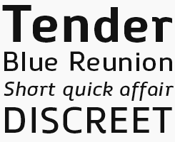
Clean, contemporary sans serif fonts with small understated details and touches of Asian script are clearly Cadson Demak’s modus operandi. A cursory glance over Enzyme’s pleasingly curvy glyphs would reveal nothing too far from this philosophy, but the occasional unexpected tail tells a story of a designer raised in a more elaborate culture.
PalPack & PawPack
It’s not hard to see how the designers at Cadson might carried away creating these sets of characters, icons, creatures and many others – there must be something compulsive in the repetitive making of such simple, unified yet endlessly variable shapes.
Keystone State 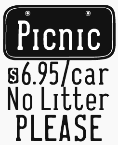
Keystone State is one of Anuthin’s early fonts published at T-26. Inspired by license plates, the font (and its little brother, Keystone State Relative) has several cheeky details to give a page of text a subtle grunge look: rounded stroke endings, a certain unsharpness, minuscule slab serifs, and those missing dots on i and j.
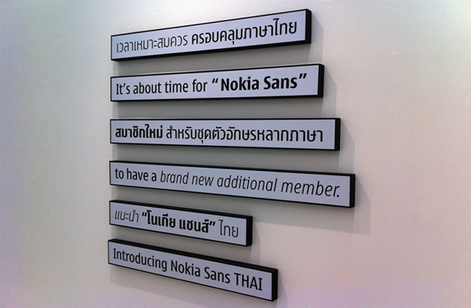
Nokia Sans Thai displayed in the recent Bangkok University faculty exhibition.

Ekaluck Peanpanawate worked for several advertising agencies and independent graphic designers before joining the Cadson Demak design team in 2006. Like Anuthin, he is a faculty member and teacher of Typography and Communication Design at Bangkok University. Ekaluck’s Kondolar has been very successful at MyFonts these past two months — and there is more where that came from.
Ekaluck, unlike Anuthin you have never studied or worked abroad. How did you develop your feeling for Latin letterforms? Who are your examples?
In Thai schools, English is taught as a second language even though we don’t use it on a daily basis, so the Latin alphabet is pretty common for us. Moreover, in design schools, typography courses, and the design community, the use of English type is considered normal. Being so ubiquitous, I don’t see it as any more difficult to approach than Thai. By the way, please note that this conclusion does not mean we Thai can use English flawlessly.
As a teacher of typography, I have to constantly study and be interested in its history. When my students learn classification, they have to draw the types of each class, and I have to illustrate them with good examples, both old and new. Sometimes, I have to make sketches in class to critique and communicate with them. So basically, I tend to see type as type itself, and less as type from a designer.
Nevertheless, I have a long list of typographers whom I appreciate, but only because I’m intrigued by their typefaces, and not because of who they are. Just to name a few: Erik Spiekermann, Adrian Frutiger, Matthew Carter, Christian Schwartz, Jean François Porchez.
When designing a Latin font such as Kondolar, which has some rather unusual solutions, were you influenced by Thai letterforms at all?
I’m not exactly sure whether my solutions are that unusual. I feel they appear that way because it’s most appropriate. Perhaps it’s because whenever I design a contemporary Thai font, it’s usually based on Latin letterforms. This approach of basing one language on another might also be present in Kondolar. A couple of characters really emerged from how I draw Thai letters so it might be different from how others approach their design. Since I have been designing type for many years now, I would say these solutions come naturally without having to think about them.
Do you look at specific models? For instance, was the Aachen typeface something you were balancing your design against when making Kondolar?
When we design, we often base it on something while trying to find a new and different solution. As for Kondolar, it can be traced back to Kridpages, also a font of mine. I took its modular characteristics and combined it with features that I thought would make it more readable.
I basically found those in DIN’s geometric capsule-like forms. While drafting it out, I continued to recheck its readability. In the final stages, some humanist features were added to make it more unique.
In fonts and lettering, which are the cultures and styles you are most inspired by?
Personally, Japanese culture appeals to me. I love its minimalism and calligraphy; the contradiction between quiet, Zen-like graphics and the city; the space; the explosiveness of emotion at the tip of the paintbrush; manga characters and otaku. They all unite together as one.
For Western design, I’m pretty much similar to other Thai designers in terms of absorbing the culture through the Internet, award-winning projects, and other media. I may have to know more than a typical designer because, as a teacher, it’s my job to know the history of typography, and most of it came from the West. There may be times when I am intrigued by certain designs of the past but all in all, I don’t think it has inspired me that much.
Outside typography, what feeds your work as a designer? Music, gaming, sports, street art, film/video?
I love all kinds of movies except horror. I love to read all those imaginative and story-rich manga. And I’m addicted to Japanese TV series. I’m fascinated by the way they promote the values of the characters and their professions. In each series, the protagonist must have a profession and the story doesn’t revolve around him/her fighting a villain but rather the struggle against himself/herself, both in life and work. I believe it raises some issues worth thinking about. Nevertheless, it doesn’t mean I’m crazy about everything Japanese. I see Japanese culture as a Thai, and I appreciate it from an easygoing and carefree Thai perspective.
Thank you very much, Anuthin and Ekaluck, for your insights!
Kondolar
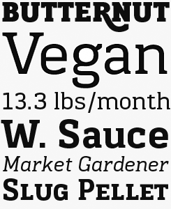
It’s easy to let Kondolar’s occasional swooping descender trip you up, but that shouldn’t distract from what is essentially an uncomplicated, multi-purpose text-and-display slab serif. The four styles (three weights and an italic) will suit most display contexts, while there are a few under-reported variations, particularly in the numerals. And although those extended Ks, Qs and Rs may seem an unexpected detail, considered along with the discretionary ligatures, they make perfect sense for display contexts where their flourish adds a dash of adventure to the workman-like slab serifs.
Kridpages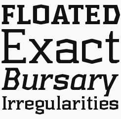
Ekaluck’s source for Kondolar was an earlier font of his called Kridpages, and while there is clearly a relationship between the two in their shared slab aesthetic, both fonts really have their own destiny — with Kridpages finding several niches to call its own in the worlds of editorial, packaging and branding in particular.
Knight Sans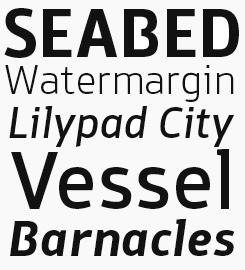
With a rounder overall character than some of Cadson Demak’s other sans faces, Knight Sans would be a good candidate for public facing corporate publications and websites, where it holds up well as a varied, extensive text face possessed of enough character and individuality to escape bland conformity.

Who would you interview?
Creative Characters is the MyFonts newsletter dedicated to people behind the fonts. Each month, we interview a notable personality from the type world. And we would like you, the reader, to have your say.
Which creative character would you interview if you had the chance? And what would you ask them? Let us know, and your choice may end up in a future edition of this newsletter! Just send an email with your ideas to [email protected].
In the past, we’ve interviewed the likes of Michael Doret, Laura Worthington, Jonathan Barnbrook, Rob Leuschke, David Berlow, Ronna Penner and Jos Buivenga. If you’re curious to know which other type designers we’ve already interviewed as part of past Creative Characters newsletters, have a look at the archive.
Colophon
This newsletter was edited by Jan Middendorp and designed using Nick Sherman’s original template, with specimens and type desciptions by Anthony Noel.
The Creative Characters nameplate is set in Amplitude and Farnham; the intro image features CarbonPlus, Kondolar and Knight Sans Italic; the pull-quote is set in Option Sans Light; and the large question mark is in Farnham.
Comments?
We’d love to hear from you! Please send any questions or comments about this newsletter to [email protected]
Subscription info
Want to get future issues of Creative Characters sent to your inbox? Subscribe at www.myfonts.com/MailingList
Newsletter archives
Know someone who would be interested in this? Want to see past issues? All MyFonts newsletters (including this one) are available to view online here.