
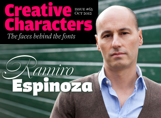
Photo by Rob Becker
This month’s interviewee left Buenos Aires almost a decade ago to study type design in the Netherlands. He put down roots in Amsterdam and set up ReType, one of the country’s most productive and versatile type foundries. An avid reader of books on type history, he is equally inspired by ancient calligraphy, Dutch modernism and vernacular lettering. He has roamed the streets of Amsterdam to research letterforms that few Dutch designers ever paid serious attention to, and digitized some of them into beautifully made and wonderfully usable fonts. Meet Ramiro Espinoza, an Argentinian designer in the land of windmills.
Ramiro, you’re Argentinian born, raised and trained, but have lived and worked in the Netherlands for almost ten years now. How did you end up there?
My father has lived in the Netherlands since the 1970s, so I visited the country several times and made friends there. During these travels I appreciated the local visual culture and became interested in studying at a Dutch design academy. I remember when I was a teen I read an interview with a professional pianist. He had been learning to play the harpsichord but at a certain point Argentina could not offer him the best education in this field, so he decided to go to Amsterdam to learn everything he could about Baroque music.
Around the year 2000 I was working at a financial institution, designing and editing their intranet while teaching typography at the Universidad de Buenos Aires in the evenings. I had also started to experiment with Fontographer and draw modular typefaces. One day I decided that doing a Master’s in Typography in the Netherlands was the way to go. I remember I asked for advice on the TYPO-L mailing list and Jill Bell kindly advised me to contact people from KABK (the Royal Academy in The Hague). I wrote to Lucas de Groot, and he put me in contact with the Academy. It took me a couple of years to arrange everything to apply. I think I’ve always had the story of the harpsichord player in my mind. If you love what you do, you must pursue your dream and learn from the best teachers you can get.
Why did you stay?
I love the Netherlands, really. It is a great environment to live, to learn and to work on projects. I also enjoy the fact that it is a very secular society. It may look like a contradiction, but I appreciate some of the positive aspects of Calvinism as well, like the importance of soberness, frugality, hard work… they go well with the life of a type designer.
What were the most important things you learned at the TypeMedia course in The Hague?
I think one of the most important things is the value of manual skills. The absolute dedication to calligraphy, drawing and the sketching process. I learned also to be much more systematic. Of course Gerrit Noordzij’s way of understanding the rules behind typography, which underlies much of the teaching there, is a powerful tool for thinking typographically and for planning new typefaces. And I should not underestimate the role that the contacts with the rest of the TypeMedia students played. When you are surrounded by talented young typographers coming from different parts of the world, this contact enriches you. You can learn a lot from other students’ projects and abilities. The experience is very intense for the students and many would love the course to last longer.
But no matter how much I appreciate KABK, I also think it was important to keep a critical mindset and develop my own ideas in certain areas. I think the best pupils are not the ones who reproduce knowledge but the ones who use the knowledge they were given to go further.
dulcinea 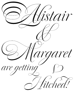
Espinoza’s historical interests aren’t limited to his adopted homeland. His new script font Dulcinea is an exploration of baroque Spanish calligraphy from the 17th and 18th centuries. Rather than a straight revival, Dulcinea is an interpretation crafted for the needs of contemporary design, retaining the spirit of the source material while avoiding becoming too archaic.
kurversbrug
Kurversbrug is based on the lettering found on Amsterdam’s many bridges, which Espinoza credits as likely designed by Anton Kurvers, an industrial designer, lettering artist, book and poster designer working in the Netherlands between 1908 and 1940.
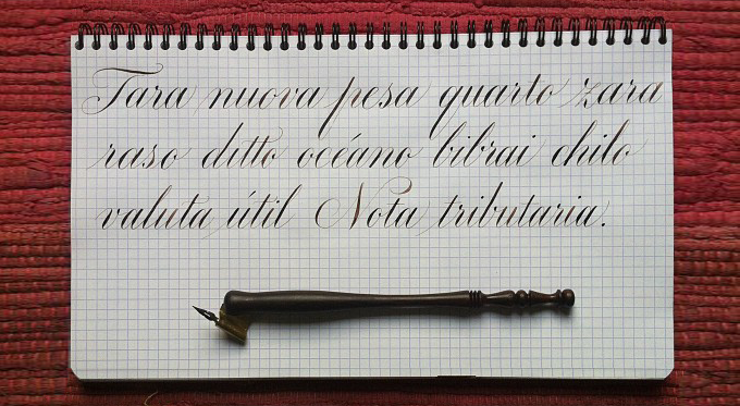
Calligraphy by Ramiro Espinoza: daily exercises.
Apart from the teachings at KABK, do you have a special affinity with other aspects of Dutch visual culture? Any typographers or lettering artists you admire?
The list of Dutch type designers and lettering artists I admire is long and not very original: Bram de Does, Fred Smeijers, Gerard Unger, of course Gerrit Noordzij, Peter Verheul, Erik van Blokland, Lucas de Groot, Underware, Frank Blokland, Evert Bloemsma… and probably many more. The work of the great lettering masters from the 1950s and ’60s is very remarkable and German immigrants played an important role. At the top is Helmut Salden, but also Henri Friedlaender, Susanne Heynemann and Boudewijn Ietswaart.
But aside from the “traditional” type and lettering makers, I hold the Amsterdam School avant-garde in great esteem. I have visited the Museum Het Schip many times because I love what the architects created, together with their philosophy: top design and beauty as an essential part of social enterprise. And they liked to draw letters. It is interesting to see people beyond the circles of typography seriously try to solve the many problems that arise when designing an alphabet. Architects usually get it wrong but if they are good at drawing, the results can be surprising and “out of the box”. In the 1920s and ’30s Amsterdam was covered with these sorts of architect’s letters. It created a rich tradition of modularity that has been revived numerous times through the twentieth century. I love this “Amsterdam modular” school. You can find it renovated and refined in the work of René Knip and Janno Hahn. I see this influence in Wim Crouwel, Max Kisman and Donald Beekman as well.
But I also appreciate a “folk” or vernacular approach to letter making: the work of frequently anonymous sign painters and stone carvers. Sometimes the great Dutch Design Narrative overlaps with gorgeous works of more humble origins. If you go to some of Amsterdam’s cemeteries and spend time walking among the gravestones you will see what I mean.
Instead of submitting your fonts to a large company such as Linotype or FontShop, you decided to start your own foundry. Why did you prefer that?
I started distributing free fonts a couple of years before going to KABK. Even when you do it in a very unprofessional way, the experience of being in charge of maintaining the website, updating the files, fixing problems, etc., is priceless. Then finally, when you are ready to become a more “serious” type designer, you find the percentages offered by established foundries are often not very encouraging. You think “why would I give up such a chunk of my earnings when I am doing most of the work?”
Planning a library is also an interesting experience, as you must learn the rules behind the “culture industry” of typefaces. On occasions big foundries may not be interested in certain styles or trends and reject typefaces you know will work or be valuable to you in an indirect way. Small boutique foundries take more risks and can release typefaces for reasons other than the purely commercial. This attitude enriches the typographic landscape.
But I am not completely against being part of another foundry’s collection. One day I will probably submit a family to one of my favorite foundries to see what happens.
Your typeface Krul is based on a spectacular style of ornamented lettering on Amsterdam pub windows. Could you tell us a little about that project?
Old Dutch pubs are great. The atmosphere in Amsterdam has changed since the ’80s but you can still find places where people of many sorts mingle and have interesting conversations over a glass of jenever. Going to these places in Amsterdam’s Jordaan district I noticed many were decorated with a unique and very consistent lettering style that had never been formally identified. I called it “Amsterdamse Krulletter” (Amsterdam’s Swashy Lettering).
For several years I interviewed people, gathered documents and followed leads that could take me to its authors. Finally this year I managed to round off my research, and started to publish the results. The experience was very rewarding. When I was able to see all the different steps in the evolution of the “Krulletter” I felt freer and more “liberated” at the moment of making my revival, Krul. I could then make a free interpretation with more creative license. After all, that is what every person involved with it before has done.
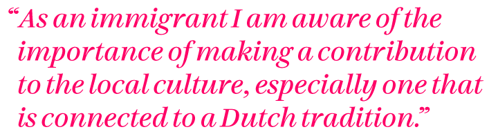
It doesn’t happen so often in life that you have the opportunity to research something no-one has written about before. It is thrilling to reconstruct a story you know has cultural relevance and a special place in the visual landscape of Amsterdam. I am glad I wrote this tiny chapter of the Dutch type design history. As an immigrant I am aware of the importance of making a contribution to the local culture, especially one that is connected to a Dutch tradition.
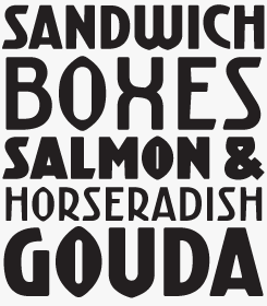
winco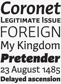
The Winco family is related to that rather rare typeface category called ‘glyphic’ or ‘incise’. While conceiving Winco, Espinoza studied the work of the Dutch and German masters of 1950s and ’60s book cover design. He then designed the typeface from scratch, creating an original, typographically consistent and versatile family in five weights, from Light to Ultra Black. Winco successfully combines the high legibility and seriousness of a text face with the expressiveness and dynamism of hand-rendered alphabets.
Krul
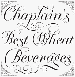
In an age where every designer is a historian and no street corner remains undocumented on Flickr or Tumblr, Krul is the outcome of Espinoza’s own archeological dig for a hidden typographic treasure. Taking a lettering style found in many Amsterdam pub windows, he created an exuberant semi-formal script that comes with a load of ornaments and alternates. Check out Ramiro’s article on ilovetypography for an in-depth discussion of the project. Check the special offer for Krul — ending Nov 20th, 2012.
tomate
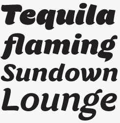
Super-thick, ultra-fat and satisfyingly substantial, Tomate is a display face for posters, packaging and logos that will work great for mass consumption. The four weights of this brush-like script start with the heaviest Light we’ve seen for quite a while and go up to a blacker than black Black. Don’t hold back on the sauce!
You seem to have a rather unique insider/outsider view of Dutch visual culture. As you’ve been away from your home country for about a decade now, does a similar thing apply to Argentina? Do you think you have a different view of the Argentinian/Latin American type scene than designers who remained where they grew up?
Yes, it is inevitable that your way of thinking will change when you settle in another country, especially one you like. I can’t see Latin American designs purely from an Argentinian perspective because I choose to assimilate other influences. But there are still many aspects of Argentinian design education I value: it is very democratic, rather intellectual and debate is stimulated because design is mostly taught at universities. And the state pays you a 100% scholarship. I am aware there are also downsides in this model, but I think it is important to learn from the mistakes and positive aspects of every society you have contact with.
Having designed several text and display families, you recently produced two impressive script families, and a third one is in the making. What makes script styles interesting to work on?
I like calligraphy and I practice it almost every day. I am not extremely good at it but I am always learning and it really helps a lot to design typefaces. I consider calligraphy the “soul” of typography. Because of this formal training I have some familiarity with script typefaces. Sometimes I like to analyze display typefaces from a “sociology of typography” perspective. Many script and display types represent the popular taste while more formal book and editorial typography represents the taste and aesthetic of more educated social classes. It is the traditional Popular Arts versus Fine Arts division reflected in the typographic field. Some type designers prefer to work only within the canon of book typography while others will always create scripts or decorative fonts that are less solemn.
Making script types carries a certain stigma, the stigma of somehow being less serious than people who design text typefaces, but looking at them from a pure — and more democratic — design perspective, script types are equally difficult to design. They can be a real challenge and as serious as the most demanding editorial font family. I admit in the classical canon there is an ideal of beauty and harmony I would like some day to master as well as some of the designers I admire but if you ignore other perspectives you soon become conservative.
Just as classic musicians frequently like to play popular repertories, I think type designers should learn from both the formal and informal letter making traditions. In the past few years I’ve made more classic fonts but it is good to go beyond your “comfort zone”. In every type project you assimilate things and I believe the more you explore styles and traditions the wider your design palette is. I will continue designing and releasing some script families in the future but I am not planning to make a career out of them. There are many other corners I want to explore and styles to experiment with.
Having worked as a graphic and web designer in the past, you’re now a full-time type designer, aren’t you? So it is possible for an independent designer like yourself to make a living doing type design, is it? What kind of mindset is needed to pull that off?
I’ve been a full-time type designer for the last four years, complementing creative work with type production for other foundries. It is not simple or easy but it is possible to make a living out of type design. As in many creative areas, you must be ready to make sacrifices. I don’t think you can be good if you don’t spend an awful amount of time at your desk. You need a lot of discipline. Also friends and a partner who understand your passion and the nature of your activity. But I think it’s worth it.
I possess a certain sense of transcendence about my work that people who spend time creating something will understand. I have a bit of a Pre-Raphaelite mentality, in the sense that I believe crafts are artistic in essence and as such have emancipatory potential.
Lavigne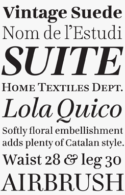
For the use of Lavigne, Ramiro Espinoza has a rather specific target group in mind — editorial designers working in the fashion publishing industry. Of course, this elegant text and display family is an excellent choice for many other purposes as well. Lavigne is a ten font package comprised of two text weights and three display, with italics for each. It bears all the hallmarks of refined typographic haute couture, notably its high contrast and vertical stress. Check the special offer for Lavigne — ending Nov 20th, 2012.
Barbieri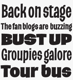
Based on a German lettering style from the 1960s, Barbieri is a casual sans type family that looks lively and informal, yet is clear and readable. The original hand-drawn alphabet was used in a rather peculiar edition of Der Barbier von Bagdad, an opera composed by Peter Cornelius; ReType’s efforts to identify the cover designer have so far remained unsuccessful. Working in close collaboration with Espinoza, Andrés Torresi and Marta Sánchez Marco designed a charming six-weight family. “As fans of informal typography and popular lettering styles, we thought these few thin letters deserved a re-incarnation as a complete type family,” wrote the designers. The result is a typeface suitable for branding, packaging, posters and music covers that conveys a certain ‘Americana’ spirit, though with a Germanic twist.
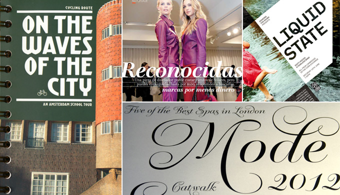
ReType fonts in use. Clockwise from left: Kurversbrug, Lavigne, Kade, Krul.
The ReType collection is not simply a one-man foundry. You’ve published fonts by other designers as well, including David Quay of Letraset and The Foundry fame. Tell us more about those collaborations. Are you hoping to invite more designers in the future?
Well, it is a one man foundry that has occasionally released or worked with other designers. With David Quay I share an appreciation for vernacular letters and we enjoy having long conversations about typography. When he showed me his Kade, I thought it was an interesting addition to the ReType library because it is inspired by local tradition, it has unusual shapes and it could be used to produce contemporary graphic design. It also has this “technical” look you can find in the DIN alphabets but with much more original features. It is difficult to compare Kade to anything else.
Right now, Paula Mastrangelo — a Barcelona-based Argentinian designer — is working on a revival with me and possibly next year we will release a slab serif she designed as her graduation project. But it is not easy for me to find the right people to work with and I feel I should focus more on my own typefaces since I still haven’t done many of the things I have in mind.
So what else is on your wish list or to-do list for the next couple of years?
I would like to spend more time in the development of large type families. The problem is this could easily take two years and during this time you need to support yourself. But as you build a library and a client base, then there is a more or less regular income you can use to finance other families.
And I have the crazy idea of one day renting a cabin in a wood or mountain and spending one whole year practicing calligraphy and lettering. Like a typographic hermit. But I am not sure if my girlfriend will approve of that. :)
We’ll leave it up to you to solve that dilemma. Many thanks for this fascinating conversation!
kade
More of Amsterdam’s architectural landscape is evident is this collaborative release designed by David Quay. Kade (which translates as “quay” and is pronounced as “Kaah-Duh”) is based on lettering found around the harbors of Rotterdam and Amsterdam. More mechanical and industrial than the other typefaces in the ReType library — as Espinoza notes, there’s a touch of DIN here — its mix of corners and curves makes it a more distinctive choice than other industrially inspired types.
MyFonts is on Twitter and Facebook!
Join the MyFonts community on Twitter and Facebook. Tips, news, interesting links, personal favorites and more from MyFonts’ staff.

Who would you interview?
Creative Characters is the MyFonts newsletter dedicated to people behind the fonts. Each month, we interview a notable personality from the type world. And we would like you, the reader, to have your say.
Which creative character would you interview if you had the chance? And what would you ask them? Let us know, and your choice may end up in a future edition of this newsletter! Just send an email with your ideas to [email protected].
In the past, we’ve interviewed the likes of Michael Doret, Laura Worthington, Jonathan Barnbrook, Rob Leuschke, David Berlow, Ronna Penner and Jos Buivenga. If you’re curious to know which other type designers we’ve already interviewed as part of past Creative Characters newsletters, have a look at the archive.
Colophon
This newsletter was edited by Jan Middendorp and designed using Nick Sherman’s original template, with specimens and type descriptions by Anthony Noel.
The Creative Characters nameplate is set in Amplitude and Farnham; the intro image features Dulcinea and Winco; the pull-quote is set in Lavigne Text Italic and the large question mark is in Farnham.
Comments?
We’d love to hear from you! Please send any questions or comments about this newsletter to [email protected]
Subscription info
Want to get future MyFonts newsletters sent to your inbox? Subscribe at myfonts.com/MailingList
Newsletter archives
Know someone who would be interested in this? Want to see past issues? All MyFonts newsletters (including this one) are available to view online here.