
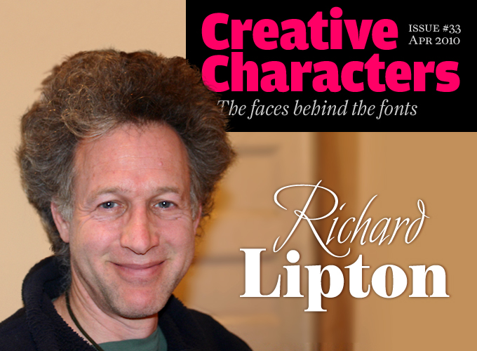
He is one of those rather modest designers who let their work speak for itself. He is not on every student’s list of “great names in type design.” Yet he has been in the business of making letters – be it with a brush, a pen, or a computer mouse – for decades, and has worked for some of the most innovative type companies, including Bitstream and Adobe. Now he is a staff designer at Boston’s Font Bureau, and as productive as ever. Meet Richard Lipton, a master of many scripts.
Richard, during your art and design education at Harpur College, NY, did you receive any dedicated training in lettering or type design?
No, none was offered. I was a studio art major specializing in 2-D design which entailed graphic design, photography and darkroom techniques, silkscreening, gum bichromate printing, anything we really wanted to do; I had my heart set on becoming a freelance photographer and living in Boston or Cambridge.
Ah, but one day, my design professor, Don Bell, showed me an elegant piece of calligraphy he had done… black lettering on handmade paper. It was incredibly beautiful and seemed so simple. I felt that something changed for me at that point in time, some strong visual connection to what I had seen helped me focus on what I needed to pursue. I studied and practiced on my own when I could find time. My mother gave me a copy of Edward Johnston’s book Writing, Illuminating & Lettering, and that was all I really needed to begin. On graduating from college in 1975, not sure of what I wanted to do, I interviewed for the graduate photography program at RISD. I was fortunately talked out of it and turned more of my attention to lettering.
When you started your career in the mid-1970s, the typographic landscape looked completely different from today. Could you describe your work as a calligrapher and sign painter, and the kind of clients you worked for?
Yes, it was very different. There were no personal computers; there was no ready access to fonts for that matter. My access to typefaces came from sheets of press-on vinyl lettering. There were not very many type styles and sizes available and the process of getting the letters off the sheets into a layout was extremely frustrating. My hand lettering was not really accomplished enough at this point to create my own headlines so I kept practicing my calligraphy and I began hanging around a sign painting shop in Syracuse, NY. It’s very impressive to watch an experienced sign painter gently wield a long flexible brush and a maul stick (to steady the hand) and create a flowing river of letters on the flank of a pickup truck. My greatest new ambition was to emulate such talent and decorate all the trucks in Syracuse with ornate flourishes and shadowed 3-D letters with gold leaf outlines. But alas, this to was not to be.
Although I did paint many signs, mostly on wood or card stock, for all kinds of businesses, my lettering instincts led me in a different direction. Calligraphic commissions began to drift in and I did work for the Syracuse Art Museum lettering a large dedication book of donors. I connected with the publisher of a local small poetry press, The Bitter Oleander, and was given the opportunity to design the publications and hand letter the covers, title pages, some interior lettering and colophons. In addition, I calligraphed invitations, envelopes and awards. All good practice. I also took a job for the Syracuse New Times, an alternative newspaper where I worked on advertising layouts and then editorial design. We had an in-house photo typesetting system so I became familiar with many more typefaces and the necessary specifications for their appropriate use for the newspaper.
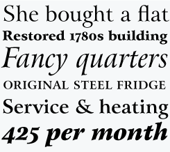
Avalon
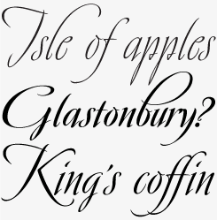
The Austrian calligrapher Friedrich Neugebauer is known for the cutting power of his calligraphic invention. As a prisoner of war in Egypt he wrote with toothpaste when all else failed. His irrepressible style inspired Richard Lipton to capture his calligraphy as a typeface. Avalon plays sweeping freedom in the capitals against the vital regularity of a lowercase. Alternative ascending characters (for l, b, etc.) provide diversity and exuberance.
Sloop
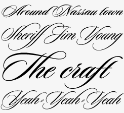
The Sloop family offers the adventurous typographer a wide choice of variant forms in three weights of a classically elegant script. Richard Lipton designed Sloop from the rich variety of styles offered by the contemporary Newport calligrapher Raphael Boguslav. Lipton suggests setting text lowercase in Sloop One or Two, capitals in One or Three. Additional fancy variants of the ascenders and descenders can be selected from Sloop Three, capitals from Two.
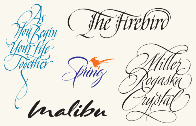
A selection of Lipton’s custom lettering work. Clockwise from top right: Book jacket lettering for the publisher David Godine; logo sketch for a crystal manufacturer; nameplate sketch for General Motors; card lettering for Gibson Greetings; Spring calendar heading.
How did you get from doing custom calligraphy and lettering to designing type?
In 1977, I left Syracuse and moved to Cambridge and found a rich and fertile environment for my interests. I was invited to join The Lettering Arts Guild of Boston which proved to be a wonderful connection to the world of calligraphy. Many talented lettering artists passed through the Guild and I learned much from them all. We put on exhibits of our work, taught workshops, published a quarterly newsletter and had lots of great dinners. I was freelancing at the time and my work covered all the typical commissions of book jackets, logos, packaging, album covers, catalogues, mastheads and greeting cards. I took workshops with Raphael Boguslav and Fud Benson who invited me to spend a week assisting in his Newport stone cutting shop. I worked on the layout and a rough sketch for the inscription on the Robert Gould Shaw Memorial on Boston Common. I think I learned more in that week about classic roman caps and their proper spacing than at any other time in my professional life.
In 1983, a friend and lettering colleague, Jacqueline Sakwa, began working as a type designer at Bitstream, a small digital type foundry in Cambridge. She thought I might be interested, and I began working there as well. I had the good fortune to have Mike Parker, Matthew Carter and many talented type designers (many from Linotype) and software engineers at hand. I learned much about type and digital type production over the next eight years. I designed the type families Arrus and Cataneo (in collaboration with Jackie), the latter being an elegant chancery cursive based on the calligraphic work of the 16th-century writing master Bernardino Cataneo.
After leaving Bitstream in 1991, I began to freelance as a calligrapher once again and got back in touch with David Berlow, who had left Bitstream in 1989 and started The Font Bureau with Roger Black. David suggested I get a Mac, learn Fontographer, design original typefaces and sell them through the Font Bureau.
And that’s just what I did.
In your earliest typefaces, you examined a wide variety of styles, from German Art Deco (Bremen, Munich) and informal handwriting (Alhambra, Avalon and Sloop) to industrial geometry (Shimano). Was this a period of wild experimentation for you?
Absolutely. After leaving Bitstream, which for me was mostly library expansion work — digitizing existing typefaces — I had so many ideas for new type designs that I couldn’t learn the Fontographer software fast enough to pursue them all. I was looking through a book of German poster designs from the early 1920s and I was grabbed by the powerfully graphic display lettering rendered by Ludwig Holwein. I felt I had to turn these wonderful letters into a typeface which became Bremen. Munich followed as an angular variation of Bremen’s forms.
Alhambra, Avalon and Sloop were based more on the shapes that various calligraphic writing tools can create; Alhambra being a synthesis of a variety of calligraphic hands; Avalon was inspired by a lettering style of Friedrich Neugebauer and Sloop was inspired by the elegant lettering of Raphael Boguslav. Shimano might have seemed like a totally different direction for me, and in some ways it was, but I was merely pursuing a certain dramatic effect which you see in all my display designs whether that drama is inherent in the sharp contrast of forms or in the flowing rhythm of the design’s regularity.
nutcracker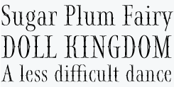
Font Bureau calls Nutcracker its “Christmas typeface”, but of course this ornate display face is much more than that. Based on fanciful calligraphic titling Lipton designed for a book on Tchaikovsky’s ballet from the adventurous Boston publisher David Godine, it was later completed into a display typeface for all kinds of festive occasions — a Font Bureau original.
bremen
In the 1920s and early ’30s, many forms of display typography flourished in Europe, and nowhere more than in Germany and Austria, where poster design was at a high creative level. Lipton found the model for Bremen on a poster drawn by the artist Ludwig Holwein in 1922.
shimano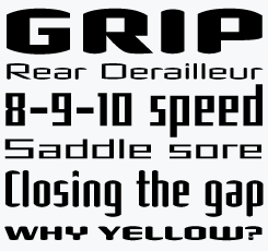
The techno-style Shimano may seem like a radical departure from Lipton’s usual idiom. But as Lipton explains, the typeface was just a different way of achieving a compelling typographic effect. There are two basic variants, Square and Round, each in two widths and two weights. Note the alternate, less modular forms of M, W, Y and other letters.
I read that Arrus, one of your earliest type families, was based on your own calligraphy. To hand-draw upright romans, like some of the 14th-century humanist writing masters did -- that is quite unique. What models did you use, and what tools?
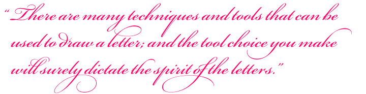
Arrus’ capitals are based more on the brush and its ability to produce certain subtle characteristics that the stiffer pen tool cannot readily make. The examples of brush-drawn capitals in Origin of the Serif by Father Catich are the real source of Arrus Roman and have close ties to the Trajan Inscription. The gently swelling vertical strokes and the dented construction of the serifs are both brush characteristics. Not to say that you can’t make these capitals and create that effect with a broad-edged pen, though you would need to build up the strokes to achieve the desired effect. There are many techniques and tools that can be used to draw a letter and the tool choice you make, whether it is a brush, broad-edged pen, pointed pen, pencil, stick or computer mouse, will surely dictate the spirit of the letters.
I’ve recently completed another Trajan-inspired display family that should be released before the year is out. It will include brush, informal and formal style variations with some lovely swash caps.
You also designed a number of fonts based on work by contemporary American lettering artists Margo Chase (Ecru, Talon and Shogun) and Lothar Hoffmann. In some cases you expanded just a few letters into a full font, even a four-weight family in the case of Hoffmann. Could you describe that process?
These two immensely talented lettering artists have inspired me through their particular vision to expand several ideas into type designs. Margo is a graphic designer and and her unique approach to lettering has helped me to think outside of the calligraphic box. There is a certain gothic/blackletter quality to her forms that carry much drama and I couldn’t resist the challenge of expanding several of her logotypes into typefaces.
I saw a single printed sample of Lothar Hoffmann’s lettering in a calligraphy collection and was also inspired to take the few letters he had first drawn, then cut out of paper and create a display family. His letters were able to stand up to four weights giving the family a lot of flexibility in its use.
arrus
Based on brush-drawn letters in the style of Roman inscriptions, Arrus’ forms are crisp, clear and elegant. Smooth and lucid in text sizes, Arrus will reveal its refined detailing when used as a display or titling face in larger sizes.
hoffmann
The Hoffmann family was based on letters drawn and then cut out of paper by contemporary Michigan lettering artist Lothar Hoffmann. From just a few letters, Richard Lipton developed four full weights plus a titling set.
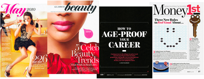
Use of Tangier’s Black weight in the recent redesign of Glamour magazine; Money magazine uses Benton Modern Display.
One of your first families based on classic types was the delightful Meno, inspired by the work of Robert Granjon and Dirk Voskens. It must have been quite an intense encounter with those master punchcutters from the 16th and 17th centuries...
I wouldn’t consider it an intense encounter, it sounds too scary and serious, let’s say exciting is more accurate. When I began to explore classic historical forms I realized first how little I knew about the actual construction of historical types, and next, how much inspiring material there is to profit from. Those old guys did all the important work for us. We get to merely reinterpret what is basically perfect material, supremely crafted with the added plus of its stunning originality and appropriate use. I tried to make something old, new again, and that is all we can truly hope to accomplish. Meno is actually headed for an expansion of weights and character set, long in coming.
For Adobe you developed the spectacular Bickham Script, in which you pioneered the use of OpenType technology to emulate formal calligraphy. It probably was one of the first script fonts with that many alternates and ligatures – over 1700 glyphs per font. Could you tell us something about the thinking and the process that led to that result?
First let me say, speaking as a calligrapher, that no typeface can truly emulate the unparalleled lettering of these 18th century writing masters. I merely attempted to capture the energy of these extravagant scripts and the technology of OpenType allowed me to move somewhat closer to that goal.
Given the wealth of material in The Universal Penman, on which Bickham was based, I focused on several pages of a certain style. Where there were no examples of a particular letter, and there were many, I had to invent them. Where there were too many variations of a particular form, I chose the ones that seemed appropriate to the whole. In the end, all the alternates, ligatures, swash glyphs and flourishes are provided to allow the user the various glyph choices that a calligrapher would spontaneously employ.
The OpenType technology will, in a sense, behave like a calligrapher as it is programmed to choose specific glyphs, given their context in a word or sentence, that will be visually appropriate. It is a long and arduous process to first choose and then draw all of the characters that will be necessary to accommodate the potential of this technology and to write the complex rules that govern their use. I could not possibly have done it alone and I had Adobe’s technical support team and type designers at hand to help me through the long process. They did all the OpenType pioneering, not me. And remember, many glyphs are merely accented characters. I did not draw 1700 glyphs, oh my.
meno
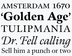
Of the many contemporary oldstyles based on sixteenth- and seventeenth-century sources, Meno is one of the most spirited and charming. Meno’s romans gain their energy from French baroque forms cut by Robert Granjon, the italics from Dirk Voskens’ work in Amsterdam. The family offers legible text with rich choices for forceful display, with titling, small caps, and swash styles.
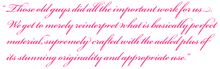
bickham script
Bickham Script was one the first script fonts to take full advantage of OpenType technology. With automatic or manual glyph substitution, hundreds of alternate characters interact to form a dense and ornate text image. The result is not necessarily extravagant: when showing some restraint, the writing may be poised or pensive.
You are now a designer at the Font Bureau. Lately you’ve been working on several collaborative projects with designers such as David Berlow, Matthew Carter and Dyana Weissman. As typeface design is such an individualist activity, it’s a bit hard to picture a designer as a team player. How does it work?
As individualist an activity as type design can be, much of the work that comes through Font Bureau may need several hands to complete. A large percentage of the work that we do is family expansion. These various type projects are assessed from their different stages of development — what already exists and what kind of shape it’s in. Some type families will be very large with multiple weights and widths, and some may already have had customized versions created for a particular client that need to be sorted out before they can be modified for other purposes like inclusion in our retail library.
A team approach is sometimes the only way that these projects can be completed in a timely manner. There are always deadlines to consider and Font Bureau works well as a team and whenever there is a need there is always someone who can jump in and assist another designer. In particular, type families are sometimes passed among designers for completion where they may finish up the character set, add kerning, help with proofing, create the OpenType features that some fonts will employ and of course there is the generating, testing and support for all of the fonts. Certain designers are good at doing specific jobs though there isn’t anyone who can’t complete a reasonably sized project on their own as long as the deadline isn’t too severe. There is a deep pool of talent here, and I tend to enjoy all of the collaborative efforts.
Your new Tangier is wonderful. Was it based on any specific model? Does its name refer to the colorful city in Morocco — or is there a different source?
It was based on the masthead lettering of a now defunct catalog. It presented yet another challenging puzzle for me, to turn nine interesting letters into a bold script font which I then expanded into a four weight family with alternates and ligatures. The black weight is my favorite. I originally wanted to name it Tango, but the name was already being used. You know, the hardest aspect of type design is naming your baby. I didn’t want to stray too far from Tango, so Tangier has four of the letters in the same order and that’s the way it happened, nothing to do with Morocco really.
Contrary to many other designers, you seem to shun publicity: you don’t blog, you are seldom interviewed. Is that how you like it best?
Yes. I like to keep a low profile. I am best represented by my work.
We are all the more honored that you’ve been willing to share your ideas and insights with us. Thank you!
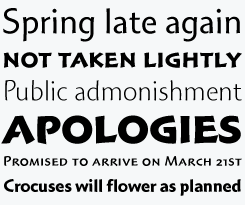
benton modern display
Benton Modern Display is an expansion of the Benton Modern series, whose text version was produced by Font Bureau for the Boston Globe and the Detroit Free Press. Design and proportions were based on Morris Fuller Benton’s Century Expanded and Century Schoolbook. These new display cuttings were prepared by Lipton and Dyana Weissman.
tangier
With the new Tangier, Richard Lipton continues to explore the possibilities of the elegant Spencerian form in its infinite variety. Inspired by lettering on a catalog cover, Lipton developed this lively series, exuberant yet disciplined, with a black weight that pushes the boundaries for contrast in a script. Captivated by Tangier’s flair and sprightly joie de vivre, Glamour magazine incorporated two weights into their 2008 redesign.

Who would you interview?
Creative Characters is the MyFonts newsletter dedicated to people behind the fonts. Each month, we interview a notable personality from the type world. And we would like you, the reader, to have your say.
Which creative character would you interview if you had the chance? And what would you ask them? Let us know, and your choice may end up in a future edition of this newsletter! Just send an email with your ideas to [email protected].
In the past, we’ve interviewed the likes of David Berlow, Ronna Penner, Rian Hughes, Alejandro Paul, Tomi Haaparanta, Veronika Burian and Jos Buivenga. If you’re curious to know which other type designers we’ve already interviewed as part of past Creative Characters newsletters, have a look at the archive.
Colophon
This interview was conducted & edited by Jan Middendorp, and designed using a template by Nick Sherman.
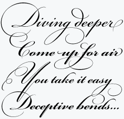
The Creative Characters nameplate is set in Amplitude and Farnham; the intro image features Avalon and Benton Modern Display Ultra; the pull-quotes are set in Bickham Script; and the large question mark is in Farnham.
Comments?
We’d love to hear from you! Please send any questions or comments about this newsletter to [email protected]
Subscription info
Want to get future issues of Creative Characters sent to your inbox? Subscribe at www.myfonts.com/MailingList
Newsletter archives
Know someone who would be interested in this? Want to see past issues? All MyFonts newsletters (including this one) are available to view online here.