
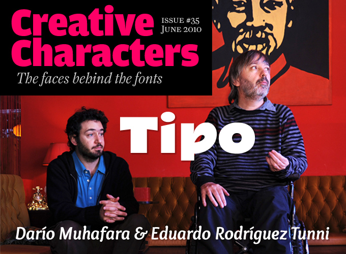
They are based in Buenos Aires, Argentina, one of the places from which a new wave of typographic invention and enthusiasm swept through Latin America over the past decade. The name of their foundry simply means “typeface” or “piece of type” in Spanish — though in slang it also means “guy”. Since its inception, Tipo has aimed to provide highly usable, well-wrought fonts for the discerning publications designer. Among the type designers they convinced to join them is Argentina’s pioneer of digital typography, Rubén Fontana, and their library is expanding. Meet Darío M. Muhafara and Eduardo Rodríguez Tunni, two men with a mission.
When we interviewed your fellow countryman Alejandro Paul last year, he told us that the creation of Sudtipos had a lot to do with Argentina’s economic crisis in the early 2000s, when many art directors and designers lost their jobs. Did a similar situation arise for you?
EDUARDO: As for me, I have always worked as a freelancer and wasn’t as affected by the crisis as people working in agencies — so no, the crisis did not account for the creation of Tipo. I would say that the foundry was born as a result of the sustained growth seen in typography in Argentina and in Latin America during that same period. Its starting point goes back to 2001 when an international conference was organized by Tipográfica, the magazine headed by Rubén Fontana. Following that event, a working group called t-convoca organized the biennial exhibitions known as Letras Latinas in 2004 and 2006, and then Tipos Latinos in 2008 and 2010.
These events began to generate a remarkable and very personal approach to type design. Many new typefaces were being produced which needed to be shown. In our opinion, these works would gain momentum if a type foundry were created that would gather them all under the same criteria.
DARÍO: Meanwhile, I had work published with several different international companies. Even today, I think that is a very good option. Publishing with an existing foundry allows a designer to concentrate on designing and producing type — and forget about all the other tasks involved in running a foundry. But at a certain point we realized we had a solid base of ideas, we had some typefaces of our own, and we had the support of well-known designers such as Rubén Fontana, who put their trust in us, so we decided to start our own foundry in 2007. What had begun with the international conference in 2001 had started to grow and become a new context for type design in Argentina that would mature over the next few years. That is, we began to know each other, trust each other and support each other in our daily work.
Another aspect of this changing context was the creation of a curriculum in type and typography at the University of Buenos Aires, which we both joined as teachers with its creation in 2009. This path comes to a conclusion as we extend our vision to students who are among Latin America’s potential new type designers.
How would you describe the Tipo foundry’s program?
EDUARDO: Right from the very beginning we were very clear about our proposal, namely: The creation of high-quality typefaces for editorial use, especially aimed at publications designed in Argentina.
We would also say that we work in a handcrafted manner, despite our use of technology, as our design processes are very much like they used to be historically, where hands and eyes used to do more work than machines. This way of working explains why our catalog is not yet as extensive as we would like it to be.
DARÍO: At this moment great typefaces are being developed in Latin America, even though in many cases we are working in a self-taught artisanal context and without too much technological support.
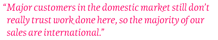
Our goal is to build a small but serious Argentina-based foundry that in addition to publishing our own work, will also include other Latin American designers who believe in producing and selling typefaces from Latin America to the international market. Major customers in the domestic market still don’t really trust work done here, so the majority of our sales are international. But we believe this will change over time. We know it will take time and effort to do this but we are not in a hurry.
The typeface families we publish have always had an editorial purpose. It goes without saying that our published typeface families must meet certain requirements to ensure a level of quality equal to that of other small foundries on the international scene. Our influences in terms of styles can be very varied. Eduardo and I both pursue our personal projects, with different perspectives and approaches, and we work separately or together on projects that require four hands. This method ensures that we are building an eclectic catalog with a broad spectrum in terms of functionality. Our catalog has more to do with concern for proper functionality and use, rather than to generate a unique style.
overlock
Don’t be fooled by its soft and charming look: Overlock is a very thorough and usable sans serif for text and display. As his starting point Darío Muhafara took a sewing technique called overlocking — stitching over the edge of the fabric to make a rounded edge — to create a humanist typeface with comfortable, slender curves. Suited for a wide range of uses, Overlock lends warmth through a gentle contrast and character through subtle alternates — look out for the longer-tailed ‘J’ & ‘j’ — available through the font’s OpenType features.
overlock cosida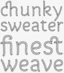
Overlock Cosida takes Overlock’s textile origins to their natural conclusion — perfect for those times when design needn’t be so seamless.
lineare
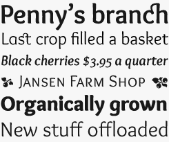
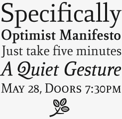
Intriguing serif detailing alone does not guarantee legibility, but in the case of Lineare, functional considerations led to an aesthetically pleasing result. Asymmetric serifs, both in height and width, moderately contrasted strokes and balanced upward and downward movements will provide readers with moments of pleasure and rest while their eyes stroll along each line. Add to that some nice tall ascenders – allow a little extra leading – and Lineare’s text face credentials are indisputable. Available in standard and oldstyle figure families, with an additional small caps font.
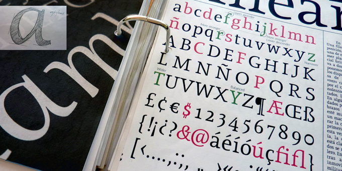
Sketches and proofs of Lineare.
When starting up the foundry, did you have any models or examples?
DARÍO: Not consciously, but I do see that there are several examples today of small foundries that have a model similar to ours. There are usually not more than three people, their work involves feedback between the designers involved, and they have eclectic releases in terms of style. What usually unites the entire catalog is the care and craftsmanship taken over the development of each project.
When you talk about working in a handcrafted manner, does this mean that each typeface begins with manual sketches? Could you describe your type designing process in some detail?
EDUARDO: With each project, I try to explore a specific aspect of typography — although that addition may not be evident in the final result. During the design process of Lineare Serif for instance, I developed in a parallel manner an accurate method of vector design which allowed me to understand the functioning of Bézier curves. In the case of Titulata, the initial challenge was to develop a family of alternative glyphs and for both of them to work within the same width. Loreto, a four-handed design created jointly with Pablo Cosgaya, captures the early print styles created by the Jesuits in Latin America. One of my latest projects, Median, is a text font designed on the basis of a long statistic performed on a spreadsheet.
Despite the differences in each of them, they are connected through the initial hand drawing stage which figured out the first glyphs in order to move on to digitization and final font production. During the lengthy production process of a typographic family, pencil and paper became major players more than once.
DARÍO: In my case much depends on the character of each individual project. Part of my overall strategy is to make fonts using different situations and triggers as starting points. I like the research aspect of it — it enriches the process and prevents the work from becoming tedious. Some fonts start from a silly idea such as Overlock and its intention of representing the way a sewing machine can draw letters. Others use the calligraphic experience as a starting point — for both the general style and as a guide to drawing a letter, even if you lose a lot of the “calligraphic spirit” on the way. There are always manual sketches but in some projects they are more relevant than in others.
Did you enjoy formal training in type design or lettering?
DARÍO: In my case the training I received was years of working on an almost daily basis alongside Félix Lentino, who taught me drawing letters by hand, which I followed up with some study in calligraphy. However, neither Eduardo or I received much formal education and although we have fed off the work and advice of many colleagues and have reached a solid knowledge base, the road has been and is much more difficult than it would be if I had studied in a formal context where the knowledge is better organized.
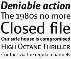
titulata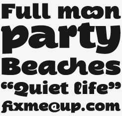
Titulata is Tipo’s attention-grabbing titling font, a fat and fluid typeface with a split personality. Each character has a second option that is softer and incorporates traits of manual writing. As both versions of the character occupy the same horizontal width without changing the overall line length, Titulata is great for creating variations with subtly different moods.
malena
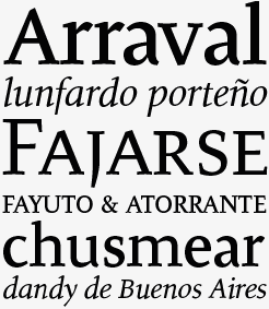
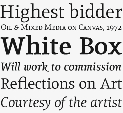
Created as a collaboration between Muhafara and Félix Lentino, Malena was designed as a high-specification text face for longer texts and fine grade printing. With its regular shapes and balanced contrasts Malena is a quiet and undemonstrative serif workhorse. A decent set of OpenType features and some pleasant surprises within the alternative glyphs provide some extra typographic pleasure to add the finishing touches.
From a North American or European perspective, many Latin American typefaces have special formal qualities — very individualist details, unusual solutions. One could say that this is the southern spirit, or Latin warmth, but maybe that is too simplistic. Where do you think the originality of many Latin faces comes from?
EDUARDO: I think that these details, styles and unusual solutions arise, on the one hand, from the short history of this profession in Latin America; on the other hand, we know and are aware of the good work carried out in other parts of the world where there is a long typographic tradition, and maybe we are attempting to take a path that lets us show our difference with respect to the rest of the world.
DARÍO: I do not think there is a southern spirit. I do not think that an Argentinian spirit exists either. In the case of Argentina for example, we are a very big country with dramatic differences from one place to the other. To see pictures from Salta, Buenos Aires and Patagonia one can tell that here live very different cultures and contexts under the same name. As Eduardo says, I do think that what brings us together is that in Latin America we do not have a strong tradition and the profession is still very young. As a result of this, we need to find our own working methods. Sometimes this context creates a certain freedom that allows us to work in a way that is more playful and not so strict. The good thing about it is that for a type designer with interests and experience in many cases the situation enriches his work, as you say, with unusual solutions. On the other hand, inexperienced designers with little knowledge of the discipline may sometimes lose perspective about the fact that we are working on a whole typeface rather than on individual letters.
botija
Botija began life as a Bodoni “reinterpretation”, which implies that several major modifications have been applied to get us to this rather formal and upright sans-serif, not least the absence of those genre-defining straight serifs. Botija’s origins in eighteenth-century Italy are most apparent in the vertical contrast (clearly evident in the lowercase ‘e’ and ‘o’) although the contrast is less pronounced, making for a gentler, easier read in medium sized texts. The font has a few interesting twists, such as the oldstyle zero with its contrast rotated through ninety degrees.
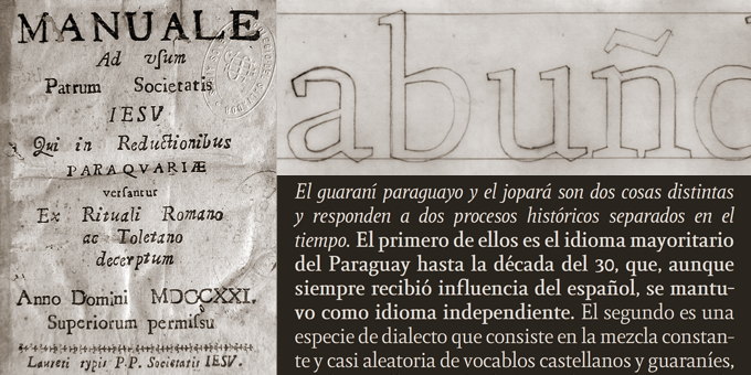
Images documenting Loreto’s production process: the title page of the 1721 Manuale, a working drawing and some test settings.
Darío, I know you’re interested in the challenges of “multi-purpose” typefaces for use at both text and display sizes. Do contemporary typefaces have more to offer in this respect than, for instance, digital revivals of classic text faces?
An important aspect of this is the issue of optical scaling: designing different masters for use in larger and smaller point sizes. New technologies have resulted in the use of one single master for a multitude of sizes. This sense of endless scalability along with the possibility of expanding on the screen makes the type seem flexible. Many of the fonts that have emerged within the last decade are based on the idea of multiple purpose use. But “multi purpose” inevitably means making compromises. As we cannot make a single master font work perfectly from caption to display and beyond, we need to find the best range for it. As a consequence, we need not only to define it as text or display, we need to find the best range of use at the moment of design.
Eduardo, could you tell us more about your daily work with your company, Fontime? Do you often get to develop your own lettering and fonts for branding or packaging projects?
I have worked independently as a graphic designer for private and corporate clients for over 25 years. My speciality is packaging and brand design, as well as communication projects. I have no internal coworkers, but rather we have formed a multi-disciplinary networked team, and together with them we provide a full design service without mounting a fixed structure that raises the costs of projects.
I do this work from Monday to Thursday, as a few years ago I decided to dedicate the Fridays exclusively to typography.
In many of the jobs, the customers have chosen a font from our foundry among the proposals; on other occasions we have produced custom designs or lettering.
What are your plans for the Tipo foundry? Will you be attracting more type designers?
Right now we have a new typeface from each designer. We will also soon be publishing new work in the catalog from Rubén Fontana. Lassi, the first in a series of typefaces Eduardo and I are developing, has been selected at Tipos Latinos 2010.
Our idea is to expand the catalog with our own work, and still remain open to new designers who are interested in being part of the foundry. For these cases we have decided that contracts are renewed on a two year cycle, with the foundry taking 15% of every sale. We think these are good conditions for anyone interested in becoming a member of Tipo.
Let’s hope that this interview will help you get in touch with more and more talented Latin American type designers. Thank you for your insights!
LORETO
Even if, as Tipo remarked, Latin America’s typographic heritage is poorer than its North American and European counterparts, they have managed to unearth some intriguing source material in the form of the Manuale ad Usum, a manual of sacraments published by early eighteenth-century Jesuit missionaries with collaborators from among the local Indian population. The typeface used inspired Loreto, a classical yet highly usable and well-featured contemporary text face. With this hybrid of influences across oceans and eras, Tipo have found something that truly typifies the unique character of the continent.
chaco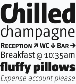
Chaco has its roots in wayfinding — it was developed in response to observed deficiencies in Argentina’s highway signage system. By adding thin and black weights, designer Rubén Fontana opened up its possibilities enormously, particularly in the media sector, where it has been used to great effect in headlines and larger text sizes. Chaco’s crisp and even character carries through all five weights, with even the lighter weights retaining legibility at smaller sizes or when reversed out.

Who would you interview?
Creative Characters is the MyFonts newsletter dedicated to people behind the fonts. Each month, we interview a notable personality from the type world. And we would like you, the reader, to have your say.
Which creative character would you interview if you had the chance? And what would you ask them? Let us know, and your choice may end up in a future edition of this newsletter! Just send an email with your ideas to [email protected].
In the past, we’ve interviewed the likes of David Berlow, Ronna Penner, Rian Hughes, Alejandro Paul, Tomi Haaparanta, Veronika Burian and Jos Buivenga. If you’re curious to know which other type designers we’ve already interviewed as part of past Creative Characters newsletters, have a look at the archive.
Colophon
This newsletter was edited and designed by Jan Middendorp and Anthony Noel using a template by Nick Sherman.
The Creative Characters nameplate is set in Amplitude and Farnham; the intro image features Titulata and Overlock; the pull-quote is set in Lineare Serif; and the large question mark is in Farnham.
Comments?
We’d love to hear from you! Please send any questions or comments about this newsletter to [email protected]
Subscription info
Want to get future issues of Creative Characters sent to your inbox? Subscribe at www.myfonts.com/MailingList
Newsletter archives
Know someone who would be interested in this? Want to see past issues? All MyFonts newsletters (including this one) are available to view online here.