
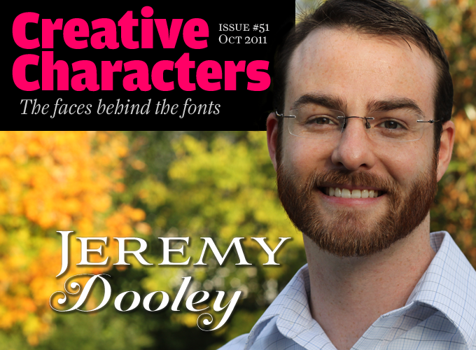
The name of his one-man foundry is modest: insigne, with a lowercase ‘i’. But his achievements, in the eight years since he launched his first font family on MyFonts, are remarkable. His label carries over ninety typefaces, from informal fun fonts to distressed scripts to ambitious suites, one of which — Aviano — made our Best of the Year list not once, but twice, and has graced Hollywood blockbusters. He has seen more of the world than most of us, and remains hungry for new experiences. Introducing Jeremy Dooley, his eyes firmly on the future.
Jeremy, in your short bio you describe yourself as a “world traveler.” Could you tell us something about those travels?
I grew up in a family that was often overseas. I spent most of my childhood in Germany, England and Italy as well as two years in Saudi Arabia. While living in these areas, we also traveled to places like Nepal, Thailand, Kenya, and Egypt. Just this year, my wife and I also traveled to India for two weeks and have just visited Reykjavík, Iceland, at the beginning of October for the ATypI conference.
Anywhere I go, I enjoy seeing new architecture, new cities, and love the unique feeling that comes from being in a totally new place. As a typeface designer, I am always on the lookout for new typographic inspiration. For example, I just spent a morning looking at Cherokee letterforms for a new project, a typeface that I hope to develop for the city of Chattanooga, Tennessee with Robbie de Villiers.
Where does your interest in type come from? How did you get to be a professional type designer?
That would take me back to my college days, where one of my first projects was to do a poster on a type designer. I chose Adrian Frutiger, and I was hooked. As I closely examined his typefaces, I was amazed by the simple beauty of his forms. Nothing comes close to the beauty of a well-drawn font — except my wife, that is. So after looking at Frutiger’s work, my passion was to learn how to make that kind of beauty.
Through my education, I came to enjoy branding a great deal, too. The two areas go hand in hand. Type is, in my opinion, the foundation of advanced visual communication. You cannot communicate advanced themes in commercial art with only space, size or color. You need type to convince, to persuade. In order to have truly distinctive and interesting branding you need custom type, or at least unique letterforms, to set the brand apart. Initially, I worked just with logotypes, but eventually custom typefaces really set my projects apart.
I love working on these fundamental blocks of written communication. It’s also great job security: we do something a computer can never do — be creative — and we will always need fonts. In 2050, when holographic displays that project themselves directly in front of our retinas will be commonplace, type will still be an important part of communication. We will have typefaces until the technology exists to beam information directly into our brains, and I’m happy to say that it seems like that will be in the distant future, so like I said, job security is looking good.
Sommet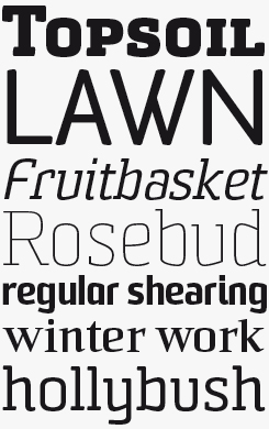
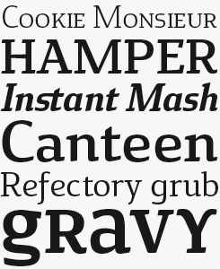
The Sommet series of five interrelated font families began life in 2008 as a simple yet sturdy, slightly condensed sans; its striking lettershapes, based on an underlying rectangular skeleton and with sloping horizontal strokes, set it apart from the crowd. Sommet Rounded followed later that year, adding the soft-edged aesthetic that goes so well with today’s sleek approach to digital design. Slab and Serif versions joined in early 2011, while Slab Rounded hits our shelves fresh off the press this week. Although the concept behind the series is to aim squarely at screen-based contexts, with such a breadth of style, range of weights and with lots of alternate glyphs, there are enough options here to suit the most demanding of editorial briefs — whether on paper or on screen; in an app interface or as magazine headlines, regardless of how they are delivered.
You seem to be a firm believer in progress. Do you like the way type design and typography have developed since you became involved in design? What are the most dramatic and/or inspiring innovations you’ve witnessed?
Typography is entering into an unprecedented age. We’ll only be able to call it a Golden Age in retrospect, but typography is witnessing the beginning of a new market that promises to dwarf what Gutenberg’s printing press began.
Web fonts are here, and they will be how we predominantly use fonts in the next decade, and webfont licenses will soon outnumber the number of print licenses sold. We are not seeing that yet, but is clear that will occur within the next two to three years. Tablet devices such as the iPad or smart phones are just the first few steps off the starting line, and down the line as we see higher resolution and lighter, cheaply produced displays we will have real-time information everywhere.
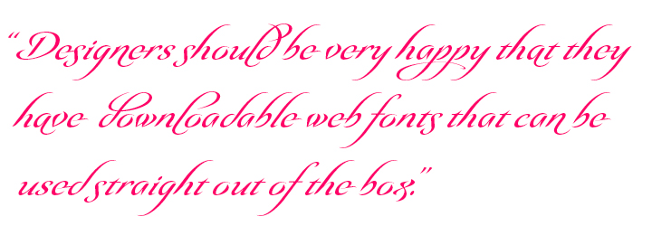
We have had the ability to use fonts on the web for a long time, but for multiple reasons, it never really clicked with designers. I remember working in a medical lab in my early days when I was still a hobbyist type designer. We used webfonts in an early stage (2005) to print barcodes. We had a lot of technical limitations and we used an Embedded OpenType web font to solve a barcode printing issue with an obsolete type of printer that had already been installed on number of remote sites. Using Microsoft WEFT to make the EOTs was somewhat difficult, so today designers should be very happy that they have web fonts that can be downloaded or served by a service and used straight out of the box.
Several of your best selling typefaces, such as Aviano and Sommet, are extended families with several variants. Did these families take shape according to some master plan — or have they grown organically as you discovered that a specific idea was successful and that there was room for more variety?
Yes, lots and lots of room! I am very interested in creating type systems that are useful in a broad range of applications. When I work, I am providing building blocks for a designer to make something beautiful. I see my work as a kind of LEGO™ with which designers can build. That is another reason that many of my fonts, even my scripts, have multiple weights. That versatility of use has to be there.
I was once asked if I had ever seen my work used in a design context I didn’t care for. I replied no, designers use it as they see fit. There are certainly some less attractive uses of my work, but to me the ultimate objective has been achieved — a designer used it. I want to see my tools used in new and exciting ways. Giving designers a type system, a comprehensive tool to work with, is part of that. I love seeing my typographic children go out into the world and be used in new and exciting ways.
Aviano did not begin with a “master plan”, but after its success, I saw that the concept could be carried into other type classifications. I have a long list of potential additions to the Aviano family, but some don’t make the cut. I did extensive sketches exploring a potential Aviano Royale, a typeface with script capitals and letter-spaced capital lowers, but realized that it really didn’t fit with the overall concept of Aviano.
Aviano, in particular, has been used in movies fairly frequently. I’ve seen various iterations of Aviano in Wall Street, Harry Potter, Thor, and of course, Aviano was used for the Robin Hood branding.
Sommet also did not begin with a master plan, but after its release, I knew that I wanted to create a rounded variant, and later I experimented with a slab serif variant after realizing that Sommet’s geometric forms lend themselves well to a slab serif. Just recently, I completed Sommet Slab Rounded, making it quite a bit softer than the original Sommet Slab, which is more cold and technical. Nowadays, I begin new font families planning to extend them further if they are well received by designers.
Aviano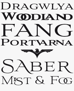
Aviano, the face that launched a thousand varieties (well, seven … ) remains a highlight in a series of extremely flexible, useable and intriguing caps-and-small-caps titling fonts. Its four weights each feature eye-catching alternate glyphs, sometimes dramatic ligatures and a choice of stroke terminals for some characters, making for very individualistic text settings. Its appearance in several instances of movie branding testifies to its status as a thoughtful designer’s Trajan, while its general weighty air will lend authority to many types of branding project.
Aviano Didone, Flare & Future
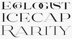
The Aviano suite now encompasses seven different categories, taking in the original’s chiseled romanesques as well as a sturdier variety called Aviano Serif, via a Didone and a Flare, among others, on its way to a very futuristic square sans. With the Aviano suite, Dooley now has almost the entire spectrum of the traditional typeface classification system covered. Respect.
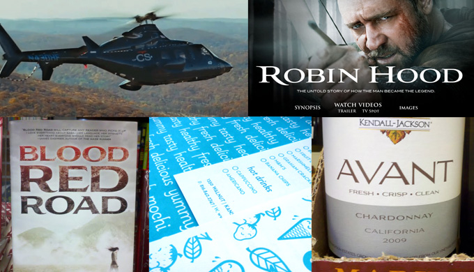
Fonts from the Aviano suite, as well as Pauline (bottom centre) used in various identity and movie projects.
Aviano does feel very cinematic — and it seems to be on its way to becoming an alternative to Trajan, the preferred face for blockbusters. How is your relationship with Hollywood, and what can be done to improve typography in the movie business?
Unfortunately, I don’t have a direct relationship with a Hollywood movie studio or anyone involved in designing collateral promotional materials for movies or designing props. I guess there are a fair number of folks that like what I do, but they haven’t reached out to me in any way, which is unfortunate. I’d actually love to do some custom work in that field. I like that a designer was willing to delve into slightly modifying Aviano for Robin Hood, adding a new initial capital.
Poster typography is perhaps the most visible form of movie typography. One thing I find interesting is that often movie titles in the movie don’t seem to match the branding material. I suppose that there are two separate teams with different time constraints involved. It seems unfortunate not to extend that branding into the movie as well. Perhaps that is an opportunity I can exploit in the future — who knows?
I would encourage designers working in the movie industry to try different typefaces and maybe getting into custom type. Perhaps there are marketing reasons for the limited number of selections, but as a typographer, that’s unfortunate, as we are seeing more and more great designs arrive. Does the world need more Bank Gothic, Trajan and Gotham on movie posters?
I think it is very interesting that the inscriptions of the Roman Empire are used and associated with movies. Perhaps it is because they project a certain sense of dignity and power. Trajan had a brief heyday of being on every single movie poster, but recently it seems that distinction has gone to Gotham. Now those Roman inscriptions, once the mighty face of an empire, have been relegated to horror movie posters. That’s the evolution of our trade.
When you create a typeface that is, or could be, labelled “futuristic”, what kind of future are you envisioning? What demands do you think future technologies will make on type designers?
When you say “futuristic”, you’re talking to a very exciting part of my psyche. I’ve been working on a book to that effect for many years. It’s a novel, and I hate to tell you this, but it’s a dystopian future. Thankfully, it’s only a work of fiction, and I’ve had a great time pulling the many ideas and storylines together…
But to answer you specifically, I’ll give you my predictions. For the immediate future, I believe we will someday see a new implementation of multiple master fonts. For a season we had a very interesting and fun format, but I can think of a couple reasons why it was discarded.
Another possibility is a font format that would allow the specification of different variables, such as lengths of serifs, x-height or rounding terminals. Many of these ideas are already possible with multiple masters, but there is a new extreme that they could be taken to with a parametrized typeface design format. As graphic designers’ typographic skills are growing, the profession will demand even more typographic control from type designers.
Type is very much like music. It is linear, and the notes or phrases have to fit the theme or song. You cannot go crazy with an ‘a’ and expect it to merge well with the ‘b’. You cannot create a musical phrase in orchestral music that doesn’t fit the rest of the piece. You have to design it so that it fits the system.
Parametrized typefaces, like a MIDI recording, run the risk of having no soul. A true pianist fuses emotion into the notes that a computer synthesizer that precisely hits notes as written can never convey. I think the same is true in type design. If we go to fully parametrized system, we will run the risk of losing some of the soul and humanity of type. Is that what we’re about? I don’t think so.
Looking further ahead, I think that augmented reality displays (layering text and information over objects in the real world) are inevitable. We just have to get past the fashion faux pas that these situations would create. We wear glasses, so I see that wall falling as displays become lighter and transparent. And, of course, these will need fonts. Will we someday have holographic displays? There is a fair amount of research occurring in that field. If so, we may need to have a 3-D font format as well with the new aspects of depth, beveling and surface texture.
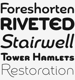
Cavole Slab
If 2012 is indeed to be the year of the slab serif, as Dooley predicts, then he is well positioned to take good advantage with Cavole Slab. On one level it is an uncomplicated, useable text face — discreet and unassuming. Stepping up a level, however, it is a small step to more unusual and free-spirited headlines or branding by simply turning on some OpenType features, or using the delightfully eccentric unicase caps. Like most of Dooley’s faces, Cavole features lots of weights, alternate characters and endless possibilities.
Chennai & Chennai Slab
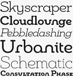
Chennai, named after the Tamil Nadu city on India’s southern peninsula, is a thoroughly contemporary and versatile typeface in both normal and slab style, with six weights plus italics, and loaded with OpenType features such as swashed and titling alternatives that make switching between text and display applications a breeze. It’ll find a natural home as part of branding projects for sociable web apps as well as on more physical products such as gadgets and candy packs.
You are one of those prolific young type designers who started publishing type at an early stage. I think your designs have become more sophisticated along the way. So to some extent you seem to have “grown up in public”. Do you see this as an advantage?
I don’t see that as an advantage or disadvantage — it’s just the way it happened. Hindsight is 20/20. In a professional sense, perhaps it would have been better to fully throw myself into type design from the start, but I had no way of knowing I could make a living doing that. When I introduce myself to someone as a type designer, that is the question I get all the time: you really make a living doing that? I began as a hobbyist, with no way of knowing that someday I would be designing type full time.
The United States does not currently have many professional type design programs and no masters programs that I am aware of. There are classes here and there, and SCAD started a certificate program just after I graduated with my masters in graphic design. In order to get access to a type design masters program, you have to go overseas. Criticism from peers and teachers is a very helpful thing in any design occupation, and that is the main advantage of these programs.
I feel a great deal of personal satisfaction in that I am self-taught. I am in a continual process of learning more about type to develop more sophisticated and beautiful typefaces. I do this by educating myself with design resources, participating in online forums and attending typography conferences where I can learn about the latest advances. Most of all, I can see some of the great work that is coming out of type design programs and from my peers on MyFonts.
Back to Adrian Frutiger, who turned 83 this year. Frutiger’s earliest projects were hand-drawn typefaces and alphabets cut in wood. Do you think that, as a designer who mainly works digitally, you’ve missed out on something?
Pioneering comes at various times and in various ways through history. Often, technical limitations and design constraints of any kind lead to unique and incredible design solutions. The craftsmanship of masters that “had to get their hands dirty” is amazing, but I don’t think I’ve missed anything vital. It is true for the most part that you have to know the rules so you can break them, and that takes time. But that is something that can be learned and is not limited to a specific medium. If I want to, I can definitely sketch, cut, engrave or, as Frutiger did, use paper and scissors to prototype designs. Thanks to the web, I can look at historical models. In a sense — and I say this with the deepest respect for my predecessors — older mediums slow down the design process. The computer allows both designs and designers themselves to evolve more rapidly. You can try different approaches more quickly, see what does not work and discard that approach for the future.
You kindly included some work-in-progress sketches for us; how important is a paper and pencil to your process?
I begin with sketches. At some point, a cat (her name is Ban) usually comes along and sits directly on what I am working on. I try to resolve design issues at this stage. After that, I begin working in the computer. In this case, I found that my idea of having tapered forms was not going to work at smaller point sizes. I wanted a large and unified family for what eventually became Eigerdals, so I had to redo many forms. Note the “happy” e. Eventually, this is what I ended up with. As you can see, the design evolved quite a bit..
Sildetas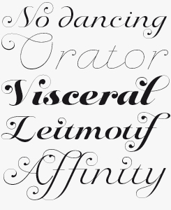
The Spencerian Revolution is gathering steam! Sildetas is Dooley’s contribution to this expanding category, and while it can’t boast the 5,000 glyphs of some of its contemporaries, for some users looking for a more manageable solution, that will be a welcome point of difference. Save the lighter weights for anything over 60pts (they’ll be perfect in 600pts for that 18×24″ poster), and use the more contrasty weights with care on screen; they’re really best suited for callouts and top level headlines.
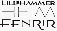
eigerdals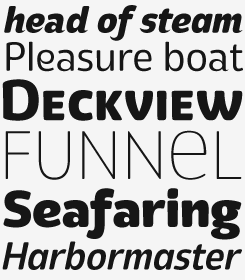
Where Aviano is solemn and portentous, and Sommet flexible and straightforward if a bit geeky, Eigerdals is the happy-go-lucky classmate. As with most of Dooley’s designs, Eigerdals has a more complex personality than first impressions let on — those hidden depths include tapered variants of some glyphs, a unicase stylistic set (activated through OpenType software) and a utility for text setting belied by its informal character.
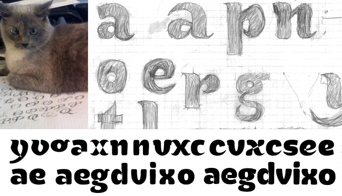
Precious moments from the design process for Dooley’s Eigerdals family — see his notes above.
What was the most amazing use of a font of yours in recent times?
When I first started in the profession, and didn’t have any fonts out in the wild, I recall seeing a distinctive and futuristic typeface used in a movie. I immediately thought how cool would be to see my fonts used in that particular way. I am very fortunate that I’ve been able to see many of my typefaces used in this way.
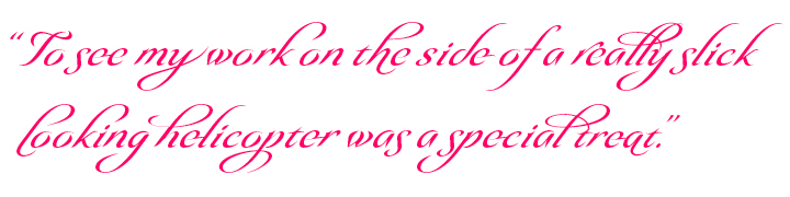
One of my favorite uses was for a logotype for a fictional company in the movie Wall Street: Money Never Sleeps by the name of ChurchillSchwartz. There was a scene with the company helicopter, and emblazoned on its side were the initials of the company, “CS”, in Aviano. They even used the Aviano eagle on the side of the chopper. I’m a big fan of aviation, and I often can be found searching Wikipedia and learning about different types of aircraft, so to see my work on the side of a really slick-looking helicopter was a special treat. Perhaps that is my favorite use of my fonts I have seen.
I especially like seeing my typefaces in movies, on luxury packaging, and for technology companies. These are interests of mine, and I often design fonts with those specific applications in mind. It’s very interesting to me that I frequently see fonts used in exactly the way I originally envisioned. I don’t think that I communicate the envisioned use, but often times it is just the way it works out.
As an independent type designer, how do you decide what to work on next?
I have a very long list of ideas that has stayed with me since I started in the field. These are pretty simple, mostly less than two words that can encapsulate the concept. I never delete any idea or concept from this list until it is complete.
Sometimes I will complete a line item, and then realize that there are three or four more different aspects to the idea that need to be explored. I generally find this out in the exploration phase at the beginning when I’m doing sketches.
I like to hear from all walks of life, and I intend to act upon that. One idea that I hope to implement soon is to do sketches for five concepts or so, then post them online and ask my customers which idea I should develop further into a complete font. There will be a unique voting system where one idea would be dropped, and revised so that another two would take its place in the next round.
I am very interested in what the current trends are, as fonts are very much like fashion, and so those dictate what I choose to work on as well. I think that next year the tide will turn for sans serifs on MyFonts’ Rising Stars and 2012 will be the year of the slab serif. As a cultural harbinger, it is interesting to see that Obama’s campaign has asked H&FJ to create a Gotham slab serif. Obama’s use of Gotham changed the landscape and visibility for type designers. We’re reaching into more and more sectors in society that need our help to make beautiful things.
Jeremy, thanks for your insights and fascinating speculations. We’re counting on you to finish that novel someday soon.
Sancoale & Sancoale Narrow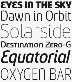
With Sancoale and its condensed version Sancoale Narrow, Dooley offers an attractive contemporary design that combines a lucid, open silhouette with unusual detailing. This makes for a readable typeface family that is useful despite its peculiarities, and a perfect candidate when a more distinctive face is called for. Sancoale’s design is simplified: no stems or spurs in the default character set; although the OpenType alternates do include some stemmed variants. There are six weights with italics. Have a look at the informative PDF brochure to see these features in action.
Olidia 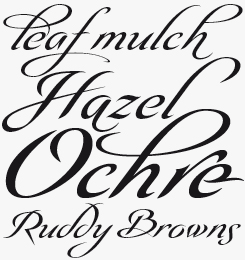
Olidia is one of Dooley’s more exuberant faces: a distinctive script with tall sweeping ascenders packed with alternates and ligatures. Olidia Pro includes over 40 alternate characters and 20 ligatures. This allows designers to mix and match characters to create luxurious and graceful custom logotypes and headlines in OpenType-savvy programs. For those who want access to these goodies, the alternates come in separate fonts: the ornamental Olidia Alternate, the more restrained Alternate Two, and Alternate Three, which has elements of the other two sets.
MyFonts is on Twitter and Facebook!
Join the MyFonts community on Twitter and Facebook. Tips, news, interesting links, personal favorites and more from MyFonts’ staff.

Who would you interview?
Creative Characters is the MyFonts newsletter dedicated to people behind the fonts. Each month, we interview a notable personality from the type world. And we would like you, the reader, to have your say.
Which creative character would you interview if you had the chance? And what would you ask them? Let us know, and your choice may end up in a future edition of this newsletter! Just send an email with your ideas to [email protected].
In the past, we’ve interviewed the likes of Michael Doret, Laura Worthington, Jonathan Barnbrook, Rob Leuschke, David Berlow, Ronna Penner and Jos Buivenga. If you’re curious to know which other type designers we’ve already interviewed as part of past Creative Characters newsletters, have a look at the archive.
Colophon
This newsletter was edited and designed by Jan Middendorp and Anthony Noel. The design is based on Nick Sherman’s original template.
The Creative Characters nameplate is set in Amplitude and Farnham; the intro image features Aviano and Sildertas; the pull-quotes are set in Olidia; and the large question mark is in Farnham.
Comments?
We’d love to hear from you! Please send any questions or comments about this newsletter to [email protected]
Subscription info
Want to get future issues of Creative Characters sent to your inbox? Subscribe at www.myfonts.com/MailingList
Newsletter archives
Know someone who would be interested in this? Want to see past issues? All MyFonts newsletters (including this one) are available to view online here.