
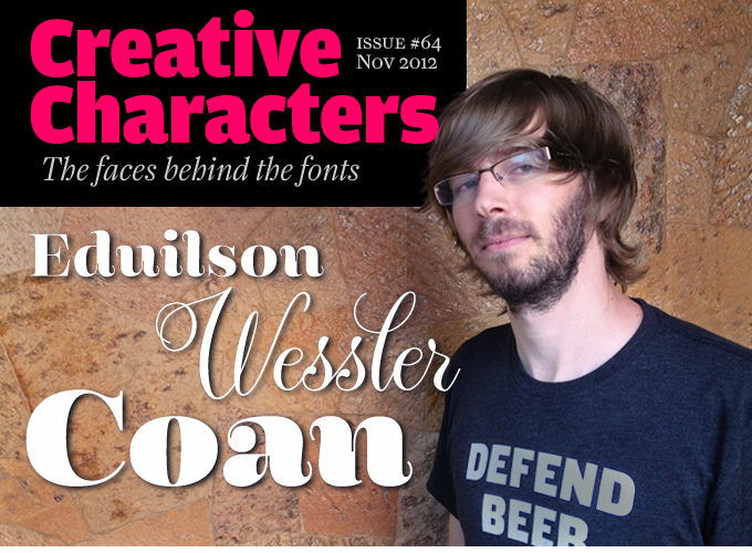
Type design is a craft that requires training and practice. Some newcomers choose to grow up in public, sharing their half-baked first attempts with the entire internet. Others do it differently: they develop their skills away from the public forums, then impress with a series of mature, quality fonts — which in the long run may be more rewarding. Our interviewee this month has followed such a path. His first typeface, released in 2008, was accomplished and singular — Ninfa made clear that, although still in his mid-twenties, Eduilson Wessler Coan knew what he wanted. Four years on, Coan’s dooType foundry has grown into a remarkable little collection of diverse typefaces with strong personalities. Meet our man in Curitiba, Brazil.
Eduilson, you live and work in Curitiba, the largest city in Southern Brazil. What is it like?
Curitiba, where I was born and grew up, is quite an interesting city. It’s known as the ecological capital of the country because of its many green areas and parks, and its efforts to create a sustainable economy. Curitiba also has a bustling cultural life. We don’t have beaches, so we meet in bars and on the squares, and visit art galleries, exhibitions, museums or theater shows. One famous art museum is the Oscar Niemeyer Museum, named after the architect who designed it.
The design scene has grown enormously in the past few years, and quite a few internationally renowned design professionals live and work here now. There are many design events, such as workshops and exhibitions. Type design also has potential: more and more young people are getting involved in type and lettering, and there are many opportunities to take type design courses.
How about street art?
Personally I haven’t been actively involved, but there is a lively street art scene in Curitiba today that several of my friends are part of. It’s a growing movement of people who work collectively — artists, designers, illustrators and photographers who create contemporary work mixing different approaches like graffiti, lambe-lambe, stencils and stickers.
What got you into typography and type design?
Typography was one of my earliest passions — I have been interested in fonts since I was a schoolkid. In 2001, the year I began my graphic design studies, I created a blog on design and the arts with some friends. We had total creative freedom, so the blog allowed us to do a lot of experimentation. Creating a whole range of different logos and branding proposals, I became aware of the endless possibilities that designing my own letterforms allowed me. As I was curious about how to create complete alphabets and fonts I learned about type design software, and I studied type and typography by reading the few books that were available in Portuguese at the time.
In subsequent years I worked in a design studio, where I did a lot of editorial projects such as newspapers, magazines and books, but my interest in type design kept growing. Having left the design company, my main goal was to produce my first commercial type family, which became Ninfa, published in 2008 on my own dooType label. I continued combining type design with editorial design projects for another three years. Then in 2012 I decided to fully focus on type design. I believe I have made the right choice, because it is a growing market, and I’m working on stuff I really love doing.
In the past few years, a whole new generation of type designers has emerged in Brazil, and several of them operate outside the big cultural hubs of São Paulo and Rio de Janeiro. Where does this new spirit come from? What are the main influences?
I believe the main reason for this is the intensive teachings of type and typography in design colleges around Brazil. Besides, it’s a growing economy that allows foreign capital to be invested in local talent; and of course the internet is also an influence, enabling global connections and exchanges of business and information.
In several places around Brazil friends and classmates have started up “affinity groups” that get together to exchange information and learn more about typography. There are also some traveling projects, like Henrique Nardi’s Tipocracia for instance, which takes workshops to cities across Brazil. Fortunately more and more literature on type design is being translated into Portuguese, allowing more students to have access to the subject. I should also mention Tupigrafia, an excellent magazine edited by Claudio Rocha and Tony de Marco that shows the best of what is happening in the field of typography in Brazil and in the world. Another major influence is the biennial Tipos Latinos event which is now in its fifth edition, showing the qualitative and quantitative development of typography and type design in Latin America.
For me personally, one of the major influences since my college days is the work of the great graphic artist Oswaldo Miranda (Miran). Having started out in the 1970s, he is an internationally awarded graphic designer and illustrator, who created much of his work using and abusing typography and calligraphy. Since 1983 Miran has been the editor and art director of the well-known magazine Gráfica—Art International, which selects the very best in visual culture, including photography, illustration, fine arts, calligraphy and much more.
Delicatta
It’s getting crowded in the realm of connected, swirly scripts, and it isn’t always easy for type designers to find their own voice. With the recent Delicatta, Coan does just that: the typeface strikes a nice balance between the ornately decorated shapes of a traditional copperplate or Spencerian script, and the more informal, lively solutions of 1950s-style commercial hand-lettering. Thanks to its ever-changing angles and a subtly undulating baseline, Delicatta makes for cheerful, expressive headlines and product names— a great choice for packaging, invitations, magazines and posters.
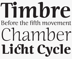
Ninfa & Ninfa Serif
Ninfa, Coan’s first typeface, is a spirited little family that artfully manoevres between well-known categories without fully subscribing to any of them. It is semi-serif: neither a sans, nor a fully serifed oldstyle; it’s an upright with the feel of an italic; it is an elegant display face that will also work well in smaller sizes and longer texts.
Ninfa Serif, released in early 2012, is much more than a serifed variant of that early effort. With five weights plus italics, Ninfa Serif has everything needed for ambitious editorial design. It’s equipped with small caps, oldstyle and tabular figures, fractions, and more — a fine instrument for typesetting books, magazines, annual reports and prestigious brochures.
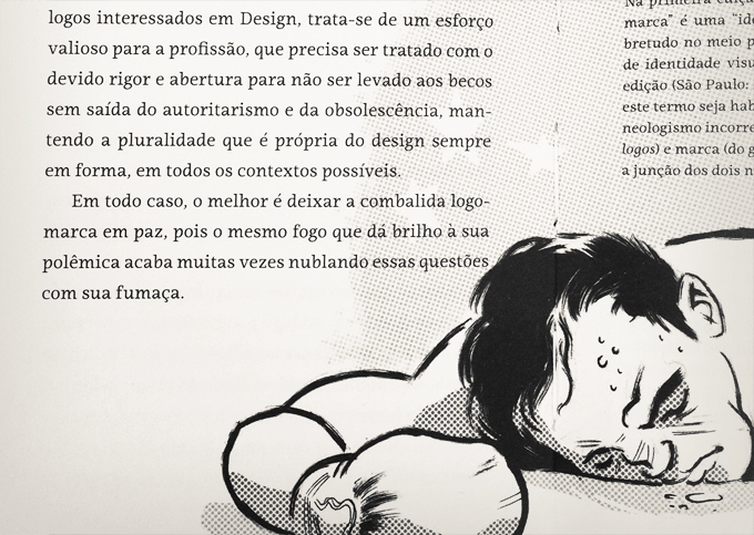
Detail from the book Logotipo versus Logomarca, set in Ninfa. Design by Bruno Porto, illustration by Renato Faccini
Many young type designers start out publishing experimental, simplistic or grungy fonts; but your first font, Ninfa, already had very sophisticated shapes and clean, elegant curves. Did you simply discard your earlier experiments? Did you have any examples or teachers that showed you how to do it right?
Since the beginning of my interest in typography I always preferred clean type projects in which the quality of the design was essential, so I never had much interest in creating grungy or experimental projects.
In 2005, during my last year at University, I designed a sans-serif font for magazine headlines; but because my experience in type design was so limited, the project seemed inconsistent and had badly drawn curves. So before I started on Ninfa, I worked on several projects with the goal of learning more about the creation of vector shapes, proportions of glyphs, etc. Most of these projects were discarded even before I had made en entire character set; some may be finalized and published next year.
You just said you became a full-time type designer this year. Do you think it is crucial to have a background in graphic design when making fonts? Do you still enjoy making posters, brochures and websites with your own fonts, or do you prefer to leave that to others?
I don’t know if formal training in graphic design is fundamental but I think most type designers have this kind of background. In my case it contributes a lot to the process of conceiving a new font. Sometimes, when wondering what would be the best solution to a specific type design problem, I remember issues I came across when working as a graphic designer; it has often happened that I took a different decision thinking about the final use of the font.
In recent months I have not had time for any graphic design work, as I did seven new type projects that were launched in the past ten months. Some typefaces, such as Encorpada Pro and Ninfa Serif, were rather complex and kept me very busy for months. But I was happy to receive some printed books as well as a few images from customers with very nice graphic design using my fonts.
How do you go about planning and designing a typeface? For instance, could you say something about the thinking behind Encorpada? What kind of process did you go through to design and produce Encorpada Pro?
Many of my fonts come from simple sketches created on paper. After this I draw the letters on my computer and so the shapes gain more definitive form.
Encorpada came out of my fondness for typefaces with a high contrast between thick and thin parts — I like the visual power of this style. I also wanted to give the letters a certain calligraphic rhythm, as well as ink traps, which I love and have used on several occasions as a stylistic element for creating more attractive shapes.
With the Encorpada Pro project, my purpose was to increase the possibilities for using Encorpada in large design projects. The Pro version has seven weights with italics, swashes and many others OpenType features that make the typeface much more versatile, with infinite possibilities for larger design projects.
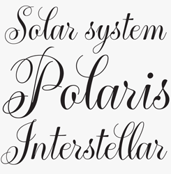
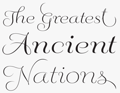
Maestra
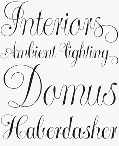
Inspired by classic copperplate scripts, Coan’s Maestra is more whimsical and less solemn than most typefaces in this style. With its animated curves and swashes, it is rather informal — and very appealing. While equipped with some nice OpenType Alternates for beginnings and endings of words, the font connects smoothly without extra technical wizardry.
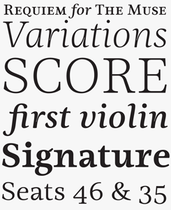
Encorpada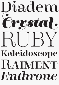
Encorpada began as a single font in an ultrabold (Black) weight, but Coan saw room for more variety — for an extensive family, in fact, with seven weights plus italics. Encorpada Pro is one of the most expressive Didone-style display faces published in recent years; also, it is equipped with small caps and multiple figure style for enhanced typographic sophistication.
Among your fonts, which are mostly exuberant and colorful, the stern and simple Niks Normal stands out. Why did you decide to make a minimalist sans? Were you aware that “niks” is the informal Dutch word for “nothing”?
The Niks project arose precisely out of a wish to make something that would be different from the other typefaces in my collection, with their strong personalities. So I wanted Niks to be simple, look neutral and look great in small sizes both on paper and on the screen.
Honestly, when I created the name I had no idea that Niks has this meaning in Dutch! It’s simply a combination of letters created when I was testing the font that looked good graphically and represented a pleasant sound.
Many type designers today are inclined to release fonts that have a lot of characteristics in common with existing fonts — like the ever-increasing number of variants on the Swiss grotesque model. Are you inclined to follow such trends?
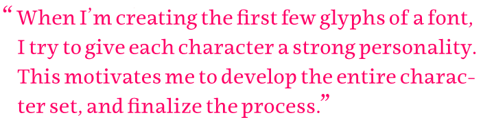
I don’t think so, at least not in the releases I am currently planning. When starting a new typeface, I always look hard to find special features. While I’m creating the first few glyphs of a font, I try to give each character a strong personality, which motivates me to develop the entire character set and finalize the process.
But as I want to develop a large library to provide a complete range of solutions for customers who work on very different kinds of design projects, I won’t exclude creating projects with those kinds of characteristics. But of course I will always be looking to lend each typeface a special touch.
Niks
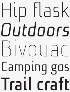
Coan’s first sans serif typeface, Niks is more radically geometrical than most new sans-serifs. While this makes it a less obvious choice as an all-purpose text face, its objective, mechanical shapes lend a strong personality to contemporary graphic design work. With four weights and matching italics, and with support for thirty languages, Niks can handle complex tasks, too — its range of possible uses covering anything from club flyers to art catalogues and websites.
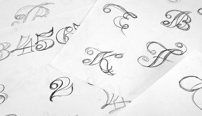
Sketches for Encorpada
What do you think of the new possibilities and challenges that the use of type on mobile media — from smartphones to tablets — poses to type designers?
I believe it is a new market with a lot of potential for further growth in the coming years, so type designers should explore and consider it. These fonts are different from fonts produced for print design; because of the many different devices on the market today, typography for mobile media has many particular requirements.
I’ve begun researching these media this past year with the Niks project. I tried using simple shapes for the construction of the characters, creating a family that is suitable for use in presentations, web and mobile media.
What is your favorite instrument to make letters with?
I am not an illustrator, so when beginning a new project most of my sketches are done very simply with pen or pencil, just to find the right shapes and some details. It often happens that when I am drawing lettershapes working on the computer, I take a pencil and make some roughs on paper, only to relax. When I see a potential new form I take a photo and archive the picture, to serve as a basis for the construction of a new typeface in the near future.
Also I began working with “automatic calligraphy tools” such as Parallel Pen and Pentel Brush in order to learn more about the structure, contrast, angles and weights of letterforms. Simple exercises with these tools help me produce vector shapes more quickly.
What are the characters in a font that you find most difficult to make? Which ones give you most pleasure?
I have different styles of fonts in my library — sans serif, serif, calligraphic — and each style has its own special features. The letter ‘s’ is the most difficult for me, especially in the black and black italic styles. Also my fonts have many curves and I sometimes have trouble with straight letters such as ‘k’, ‘v’, ‘x’, ‘w’, ‘y’ and ‘z’.
On the other hand the most pleasurable are certainly the characters ‘a’, ‘g’ and ‘k’, which are among the ones in which the font’s personality shows most strongly. I should also mention swash characters, for example those included in the Encorpada Pro family.
Have you ever considered enrolling in one of the type design postgraduate courses, in Reading, The Hague, or Buenos Aires?
I have actually been thinking about this in recent years, and some friends have asked when I will join one of these postgraduates. I have several friends who have completed one of these courses, and I still need to talk more with them to find out which curriculum fits my profile best. However, it is a plan for the future for I am sure it won’t happen in the next five years or so. My current plan is to keep studying on my own and learn more with each new release.
What is the biggest thing you hope to achieve as a type designer in the next ten years or so?
I hope to be able to keep focusing exclusively on type design, which is a big challenge and it is not practiced by many type designers in Brazil; I also intend to expand the dooType font library with new projects creating a collection with more quality. I am also planning for the next two years prepare a structure to enter the market of custom types, a market that can grow considerably in Brazil in the coming years.
Thanks, Eduilson! Keep ’em coming.
Fluence
Fluence is a spacious non-connecting script, well pitched between comfortable intimacy and a discreet grace. A decent selection of ligatures and swashes ensures that stylistic variation is just a flick of the OpenType switch away. However, there is still plenty of natural style available within the basic feature set to make Fluence an attractive choice for web as well as print designers. The best news: until the 10th of December it’s 50% off!
Tres Tres Chic
Some typefaces more than others owe their origin to a graphic designer’s mindset; designed in collaboration with the design and illustration studio Firmorama, Tres Tres Chic is a perfect example. Based on geometric proportions, the intention from the outset was to create something that spoke of refinement and delicacy — as the designers put it, “appropriate to the feminine universe.” This typeface will appreciate both a large canvas and an intimate relationship with the reader: editorial spreads, glamour advertising and clean, high key photography will all be well served by its drama and dynamism.
MyFonts is on Twitter and Facebook!
Join the MyFonts community on Twitter and Facebook. Tips, news, interesting links, personal favorites and more from MyFonts’ staff.


Who would you interview?
Creative Characters is the MyFonts newsletter dedicated to people behind the fonts. Each month, we interview a notable personality from the type world. And we would like you, the reader, to have your say.
Which creative character would you interview if you had the chance? And what would you ask them? Let us know, and your choice may end up in a future edition of this newsletter! Just send an email with your ideas to [email protected].
In the past, we’ve interviewed the likes of Gerard Unger, Emily Conners, Jonathan Barnbrook, Nick Cooke, Chank Diesel, PintassilgoPrints and Jos Buivenga. If you’re curious to know which other type designers we’ve already interviewed as part of past Creative Characters newsletters, have a look at the archive.
Colophon
This newsletter was edited by Jan Middendorp and designed using Nick Sherman’s original template, with specimens and type descriptions by Anthony Noel.
The Creative Characters nameplate is set in Amplitude and Farnham; the intro image features Encorpada Pro and Delicatta; the pull-quote is set in Ninfa Serif; and the large question mark is in Farnham.
Comments?
We’d love to hear from you! Please send any questions or comments about this newsletter to [email protected]
Subscription info
Want to get future MyFonts newsletters sent to your inbox? Subscribe at myfonts.com/MailingList
Newsletter archives
Know someone who would be interested in this? Want to see past issues? All MyFonts newsletters (including this one) are available to view online here.