
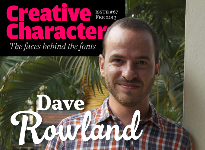
His typefaces are as varied as the places he’s lived in. Is that the reason why his foundry is called Schizotype? No, he says, the name was pure serendipity — as was the way in which his love affair with lettering and type began. He came to MyFonts as a hobbyist type designer offering a bunch of carefree and less-than-perfect fun fonts, but quickly honed his skills. He began putting out ever more sophisticated and increasingly successful typefaces, from luscious scripts to idiosyncratic yet usable text types. Meet Dave Rowland, calling from Koh Samui, Thailand.
Dave, you’re from Sheffield, home of some of the greatest British bands of the past 30 years — from Cabaret Voltaire and Heaven 17 to Pulp, Moloko and Arctic Monkeys. Has this influenced you as a designer?
Yes, I’m from Sheffield, but I’ve moved about a fair amount over the past few years. I’ve lived in Japan, the Philippines, Liverpool, and I’m currently based in Koh Samui, Thailand. It’s true that Sheffield has a rich musical heritage, but I wouldn’t say that has influenced me as a designer particularly.
Music in general is a fairly big influence, but I don’t really feel all that much affinity with Sheffield bands in particular, although it is nice to hear songs that talk about places I know well. There is a great music scene in Sheffield, and growing up there, I used to play in some bands, and saw some amazing gigs. Yo La Tengo at the Leadmill was the best gig I’ve ever been to, but they’re not a Sheffield band and it was ten or fifteen years ago. I feel a little out of touch in my old age.
So, being the mature cosmopolitan that you are, how did you end up on an island in the Gulf of Thailand? You must be the only designer there.
It’s a long story! Until about four or five years ago I’d not left England for about a decade. When I met my now fiancée, Lauren, in 2009, that all changed. I caught the traveling bug off her and now I love seeing (and living in) different parts of the world. We moved to Japan together in 2010. She was studying Japanese at university and a year of her course was to be spent there. We lived in Kanazawa on the east coast. It’s a beautiful city, with stunning gardens and old temples. It’s warm in summer and thick with snow in winter. We went on holiday from there to Thailand in March, 2011. Ironically, we were at the Tsunami Museum when the big tsunami hit Japan and the ensuing Fukushima Daiichi nuclear disaster occurred.
We went back to Kanazawa, afterwards, but Lauren’s university and the British Government were advising foreigners to leave Japan. At that time, we weren’t ready to move back to England; we looked for the cheapest flights to anywhere that looked interesting, and ended up living on the paradise island of Boracay in the Philippines for a couple of months. Lauren volunteered at a school there, loved it, and decided teaching was the career for her. That brings us to now. After moving back to England for a while, in October last year we came to Thailand, where Lauren is working in a school and I’m making fonts. It’s a great life — friendly people, nice food, relaxing. We can’t complain!
I don’t think I’m the only designer here. There are plenty of print shops, which I’ve yet to investigate, but I dare say I’m the only type designer on the island. I think most of the designers in Thailand are based in Bangkok. I hope to go over there again in July for a non-Latin type conference, where hopefully I can meet a few people that I’ve only ever talked to through Typophile and Twitter.
What got you into type?
I was never a “proper” graphic designer. In Sheffield, I wasn’t really part of the graphic design scene. I kind of fell into type design by accident. I studied Fine Art at university, and lived in Birmingham for a few years after graduating, half attempting to make it as an artist. Video art was my specialty, but I don’t think my heart was ever really in it. I ended up being a pizza delivery driver for a few years, gradually becoming less and less active in the art scene.
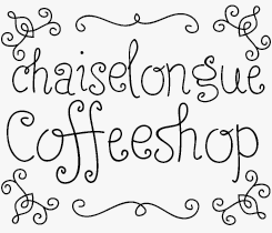
When I tired of my life not really going anywhere, I moved back to Sheffield and, having taught myself Adobe Illustrator, got a job as a graphic designer for a small company that made tableware for coffee shops and restaurants. My job there was to create visualizations of how their logos would look on crockery, then “fit” the logos so that when applied to the curved surfaces, they still looked straight. It wasn’t the most inspiring work, to be honest, but I liked the people I worked with and had a good time. The closest I got to real design was the occasional advert or price list, and very rarely, I got to design logos for customers who didn’t have one. Most of my day was spent vectorizing logos — the number of companies who only had low-res bitmaps of their logos was staggering.
Anyway, this day-to-day tracing is what honed my Bézier drawing skills and taught me to be pretty good at identifying typefaces. I fell in love with type. It was this job that introduced me to MyFonts, through your WhatTheFont service. Up until then, I’d naively had no idea that people bought fonts, and certainly had never considered type design as a possible occupation. But tracing letterforms on a daily basis, it wasn’t long before I thought about making my own fonts. I bought FontLab, signed up with MyFonts, and that’s where it all started. I quit the day job over a year ago now, and I’ve never looked back!
So you never tried submitting fonts to an existing type library?
No, MyFonts was the first font distributor I even knew about. If it wasn’t for you, I doubt I’d have ever got into type design at all.
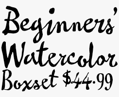
Ollie
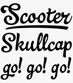
Ollie is Rowland’s latest release, a signage script whose laid-back attitude belies some muscular OpenType power. With something in the region of 900 glyphs, there’s lots of scope here for creating a convincingly hand-made flow, thanks to the OpenType Contextual Alternates feature. Swash characters and ligatures offer even more variety, making this a great font for packaging, branding and logos.
Gelato Script
Gelato Script is a smooth-flowing font influenced by both formal scripts and mid-twentieth century hand-lettering that will grace packaging, café menus, vintage automobile magazines and arty shop interiors alike. Used in conjunction with OpenType capable software, features such as Contextual Alternates and Stylistic Sets offer clever ways to effortlessly create a smooth flow, change the mood of the text or apply an underline (read the font page for details).
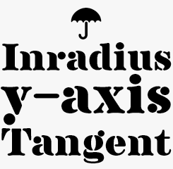
Range Serif
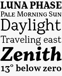
Range Serif is a robust and sturdy set of typographic tools for the demanding designer. Angular and somewhat glyphic in its stylistic origins, this would be a good choice for both body text and book cover typography. A family of five weights with corresponding italics, each font has an abundance of OpenType features for serious typesetting including fractions, numerals and small caps, as well as comprehensive language support.
Development work for the as yet unfinished Range Sans family.
Why did you call your foundry “Schizotype”?
Sadly, there’s no really cool explanation for this. I searched for a word ending in -type that hadn’t already been taken by another foundry. Schizotype sounded good, so I went with it. The “foundry with a multiple personality disorder” tagline is post facto rationalization for the name, but I think it fits quite nicely. I don’t think my fonts are immediately recognizable as being by the same designer, and I do cover a wide range of genres. It keeps it more interesting for me that way. I think if I only made scripts, for example, I’d start to get bored.
When you signed up four years ago, your first fonts were a pretty eclectic bunch: a couple of geometric techno fonts, a rather crazy script called Astroboy, a wobbly hand-drawn slab-serif, an Art Deco font… Did you have a plan for the foundry, any role-models for where you wanted to go as a type designer?
I think I started out as a hobbyist. I was making fonts in my spare time, and in those early days, I thought if I could make enough money from sales to pay for the software I’d bought to make them, that was a success! As far as a plan for the foundry goes, I was just enjoying making fonts, and seeing what happened. At the time, I was very much a beginner. I know those first fonts aren’t brilliant to say the least, but it was all a learning process, and those first few sales made me think, if I can get better at this, it could be an actual career rather than just a hobby.
From those somewhat low-key beginnings, how did you get to the much more sophisticated typefaces you’ve produced lately? Was it all trial-and-error and self-study, or did you enlist the help of any “masters”?
It was a bit of all three. Drawing fonts every day, I gradually improved. At first, my fonts were all either too modular or just too sloppy. I didn’t know about important design considerations like overshoot, uniform color, good spacing; I’ve even got the upper case A with the thick and thin the wrong way around in one of those first fonts. It wasn’t a matter of deliberately going for a naive charm — I just didn’t know any better! That said, I think even in the most amateurish of those fonts, I was learning, and over time I developed a much better eye for what looked right. I’ve considered removing some of those early fonts from my library, but in the end I decided to keep them there. I know they’re not great, but there is something in all of them that could be useful, and a good designer working with a bad font is going to make better work than a bad designer working with a good one.
A major factor in my improvement has been Typophile. I was reading the critique section regularly, and learning a lot from the professionals there. Brag was the first font I submitted to the critique forum there, and the help I got was invaluable. I can’t recommend Typophile enough to designers just starting out. I still visit regularly, and I’m always learning new things. Sometimes I spend a bit too much time learning and not enough actually working!
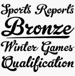
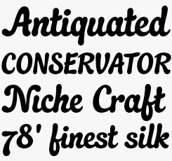
Brag and Brag Pro
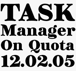
Brag is a chunky, confident display font that marries Cooper Black’s warmth with a Didone-like vertical contrast. It will be good for those occasions that require something a little more upright and straight-laced than Cooper’s cozy retro-ness — extensive OpenType features bring added sophistication to the party. Brag Pro offers wider language support, plus a decent saving if purchased together with the Pro version of Brag Stencil.
Brag Stencil
Rowland completely redrew Brag (see above) to create Brag Stencil, taking great care with optical compensation to give the new font as even a color as possible. A handful of stylistic alternates and a collection of esoteric ornaments make this a great choice for posters, T-shirts, headlines and all kinds of branding (especially the sort that involves a hot iron).
Most of the typefaces you’ve done in the past two years kind of fit into a existing genre — brush script, transitional, display Didone — while adding a very personal and unconventional touch. Is that a principle of yours — to be original, and not to walk well-trodden paths?
Yes, it’s very important to me to try and be as original as possible. When making a font, ultimately, I want it to sell, and having a little something different from other fonts hopefully makes them stand out from the crowd. It’s impossible to be 100% original, because at the end of the day, they still have to be readable. An ‘a’ has to look like an ‘a’, but there’s almost infinite scope within that.
When I tell people I’m a type designer, the response I get most often is “haven’t they all been made already?”. I can kind of see where they’re coming from. To the layman, most fonts look similar. Even to me, certain fonts (text fonts especially) look alike. What I try to do is make fonts that don’t look like others. The differences can be subtle, but I think they’re important. On an almost subliminal level, these differences come across. Vulpa for example, looks a lot like Plantin at first glance. I’m a fan of Plantin and I wanted to make a text font in a similar style, but making straight revivals doesn’t interest me. I’m not saying there’s no place for revivals; there definitely is. It’s just not my thing! Taking elements of existing fonts is a great way of coming up with new ideas. I like American Typewriter and Cooper Black, so I think, what would a mixture of the two look like? and Margot is the result. Put a bit of fraktur-ness into a slab serif, and Range Serif is the result. Trying to be different, and sometimes just a little experimental, keeps things interesting to me. There’s a phrase in Thailand that I hear on an almost daily basis: Same same, but different. I think it’s a good motto to work by.
Several of your most successful typefaces are script fonts; they’ve gradually become a kind of specialty of yours. Connected scripts in particular need to follow certain rules to look natural — to faithfully imitate the artist’s pen or brush stroke. How did you learn about the behavior of script letterforms? Do you paint, write or sketch while designing them?
In part, I think it was the success of Gelato Script that made me make more script fonts. I like making all kinds of fonts, but when a particular style seems to sell better than others, it’s hard to ignore that. While I try not to be too ‘on trend’ when designing (I made a serif family when there were only three in the best sellers list!) I’d be silly not to bow to market forces a little, especially if I’ve got ideas for fonts that I think would be popular right now — I’m making a sans family at the moment. Not too generic, but hopefully useful.
Whether I’m making a script font, or a sans, or a display latin serif with spirals (also in the pipeline), my work process is pretty much the same. Although I can paint, or at least used to be able to, I don’t use this in the making process. I doodle a fair amount, and develop ideas from there, but I never use a brush or broad-nibbed pen for example. For some designers, especially of scripts, the analog part of the process is important, but for me, the quicker I get an idea into the computer, the better. I don’t feel I have to actually do something by hand to know how something done by hand looks. I study other typefaces, so I know where to put the contrast, how to connect the letters, and so on, but I think imagining how a painted letter should look, rather than actually painting it, is a good thing. It forces me to think more, and I might come up with a less obvious solution to a problem than I would otherwise. I think some of my scripts, while they look kind of handmade, would be difficult to recreate with a brush or pen. I like this about them.
One big factor in getting my scripts to work is the OpenType programming I put into them. In Gelato Script, for example, there are different forms of most letters, which are substituted depending on how the previous letter connects to them; a ‘t’ following an ‘o’ is different from a ‘t’ following an ‘e’. Then there’s different forms for letters at the beginning or end of a word, and sometimes different forms of letters purely to make the text look more handmade. Ollie, my latest release, has this function. The contextual alternates feature looks back up to eight characters to see if the same letter has already been typed. If it has, it changes the letter to an alternate form. Ideally, a font should work well without any OpenType features engaged, and I sometimes have a problem with this. I don’t like the look of Gelato Script when the end forms aren’t used. The connecting outstrokes look a bit clumsy. Hopefully, as support for OpenType grows, it will be less of a problem.
Vulpa
Font families comprised of just two weights and a single italic don’t usually make it into our Rising Stars text font slots, but Vulpa was a special case. Loosely based on the proportions of Plantin, (a personal favorite of Rowland’s) Vulpa is seductive and expressive, with whimsical details built on a basic structure that makes for perfect readability at text sizes. Separate fonts for drop capitals and ornaments are also available, making for a compact yet very attractive package.
Margot
Margot could be the result of too much sticky, gooey ink in your (American) typewriter. Great for adding a contemporary feel to confectionery packaging or a touch of personality to app interfaces.
Quayside
Quayside is a versatile script typeface that can be either modern or retro, fun or just a little bit serious. Its generously bulbous outline will suit food and drink brands in particular, while a comprehensive suite of OpenType features means that logo projects have plenty of capacity for individuality.
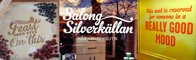
Rowland’s typefaces in use: Gelato Script, left and center; Quayside, right.
Many type designers have a few favorites in the glyph set. What are yours, and why?
In anything other than script fonts, my favorite glyph to draw is the asterisk. I like how simple it is, but behind that simplicity, there’s a challenge. Getting it to fit but at the same time, stand out. You can get a lot of character into it. I prefer five points, but sometimes six is better... For such an “easy” glyph, I can often end up spending a lot of time on it! In script fonts I’d happily ditch ‘s’, ‘x’ and ‘z’ from the alphabet. They’re such a pain to get right. I like upper case ‘G’ when I go to town on the swashes; the same with ‘Q’. In a serif, italic ‘y’ and ‘z’ are favorites. In a sans, I like ‘5’. I have a love/hate relationship with ampersands. For me, it’s a constant battle with the curves, but when I get them finished they’re probably the most rewarding.
Your fonts have become quite popular, so you must be encountering them in use more and more often. What is it like to see them “in the wild”?
Honestly, it’s a brilliant experience. I’d seen my fonts occasionally, but only by tracking them down through the Internet. The first time I saw one completely “in the wild” was Gelato Script on a cookbook in a Liverpool supermarket. I bought it straight away, and I’ve continued to buy a few things as mementos. It makes me very proud to think that there are people who like something that I’ve created enough to actually part with cash for it.
I think when every type designer starts out, the first dream is to come across their fonts being used, and now that dream’s come true for me, it doesn’t really get less exciting. Sometimes I don’t think my fonts are used to their full potential; the user may have messed with the spacing or not used contextual alternates, and that can be frustrating, but for the most part, I’m just happy to see them being used at all.
Finally, back to the beginning: learning about type. You’re about as self-taught as it gets; in your four years on MyFonts you have more or less grown up in public. With hindsight, would you do it differently? What would your advice be to young type designers who are still struggling to get it right?
Good question! It’s difficult to answer. There are definitely some things I’d change, some fonts I wouldn’t have bothered making! I don’t think it was a mistake to release my first efforts, though. I know there are other designers who grow up very much behind closed doors, learning the trade and only releasing when the end product is completely up to scratch. I think if I did it this way, I’d still not have released anything! I needed those first few sales to give me the impetus to carry on; the opportunity to quit the day job and work full time on fonts would never have arisen had I not been earning from my first fonts. So I guess my advice to young designers starting out is: try and get your first fonts as good as possible, and release them. I think it’s a very rare occurrence when a designer’s first font is really good, so you shouldn’t be too embarrassed, and just learn from your mistakes.
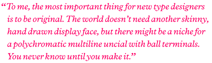
For me, the most important thing for new type designers is to be original. The world doesn’t need another skinny, hand drawn display face, but there might be a niche for a polychromatic multiline uncial with ball terminals. You never know until you make it.
That sounds like the perfect conclusion to this insightful interview. Many thanks!
Pastiche Brush
Inspired by the work of notable film-titling artist Wayne Fitzgerald, Pastiche Brush is an organic brush script font. Its handmade aesthetic is enhanced with substantial OpenType programming that ensures no two letters look the same in one word. Fashion branding and publishing, whole foods and craft products will all benefit from its personal flavor.
Chestnut
Chestnut is Rowland’s contribution to the genre of light-hearted, skinny hand-drawn lettering fonts, enhanced with his trademark leveraging of heavyweight OpenType programming. Try out the basic free version, which only has regular ligatures and kerning.
MyFonts is on Twitter and Facebook!
Join the MyFonts community on Twitter and Facebook. Tips, news, interesting links, personal favorites and more from MyFonts’ staff.


Who would you interview?
Creative Characters is the MyFonts newsletter dedicated to people behind the fonts. Each month, we interview a notable personality from the type world. And we would like you, the reader, to have your say.
Which creative character would you interview if you had the chance? And what would you ask them? Let us know, and your choice may end up in a future edition of this newsletter! Just send an email with your ideas to [email protected].
In the past, we’ve interviewed the likes of Gerard Unger, Bruno Maag, Jonathan Barnbrook, Melle Diete, Chank Diesel, PintassilgoPrints and Jos Buivenga. If you’re curious to know which other type designers we’ve already interviewed as part of past Creative Characters newsletters, have a look at the archive.
Colophon
This newsletter was edited by Jan Middendorp and designed using Nick Sherman’s original template, with specimens by Anthony Noel.
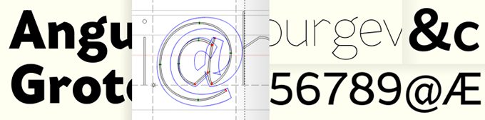
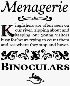
The Creative Characters nameplate is set in Amplitude and Farnham; the intro image features Ollie and Range Serif Black; the pull-quote is set in Vulpa Italic; and the large question mark is in Farnham.
Comments?
We’d love to hear from you! Please send any questions or comments about this newsletter to [email protected]
Subscription info
Want to get future issues of Creative Characters sent to your inbox? Subscribe at www.myfonts.com/MailingList
Newsletter archives
Know someone who would be interested in this? Want to see past issues? All MyFonts newsletters (including this one) are available to view online here.