
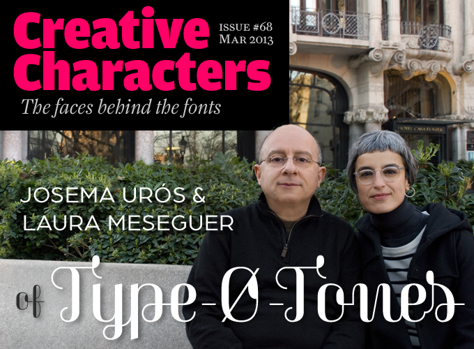
Photo by Marta Sánchez
They are four designers from Barcelona: Laura Meseguer, José Manuel (aka Josema) Urós, Joan Barjau and Enric Jardí. They’re a loosely-knit collective of independent individuals, each with their own activities as graphic designers, writers and teachers. They have been making and publishing fonts since the early days of desktop type design, and pioneered digital techniques that are now commonplace. Their fonts represent an approach that is, perhaps, typically Catalan: simultaneously adventurous and serious, witty and well-conceived. They recently released a string of new typefaces by Laura and Josema alongside some by other brilliant Barcelona designers. Meet the delegates of Type-Ø-Tones, a foundry that deserves respect.
Type-Ø-Tones has been around since the early nineties. That makes you one of the oldest independent foundries in Europe. How did it start?
Josema: Our relationships date back to the late eighties. Our initial meeting was directly related to our graphic design activities and to our early adventures in using the computer as a tool for our work. Only two of us, Joan and I, had worked together before becoming Type-Ø-Tones. We met Enric in 1989 and the three of us founded the group in 1990. Laura joined early in 1992. It was a case of cosmic causality!
These were the years when computer graphics still held the fascination of the unexplored. We came together as a working unit at a moment when the possibility of creating digital typefaces had barely evolved from Utopian fantasy to fully functional reality.
Joan Barjau had been an illustrator at a satirical comics magazine of the time, El Papus. I was a frequent visitor to his studio where I learned silkscreen printing and tricks for being a good graphic designer, and we soon became friends. I worked as a programmer, and Joan was interested in acquiring a graphics computer. I had bought mine shortly before, so we joined forces to learn to use them. Joan’s way of working was very intuitive and he quickly got amazing results from the machine.
Our initial relationship with Enric Jardí, who then had a studio called Propaganda, was one of vendor-and-client. He came to the computer products store where I worked to test a laser printer that was on promotion and gave me a diskette with FreeHand documents. On it, I found his custom typefaces. The PostScript printer’s price was a quarter of the price of an Apple LaserWriter, and it worked! That was the beginning of our collaboration.
In 1991 Laura, who was working in an advertising agency, attended my classes on using the Mac and was very eager to learn. When she first discovered a typeface seen as outlines in an Adobe software package, her perspective evolved from interested to passionate. As I was specializing in the new tools offered by this technology and was working for numerous clients starting in this field, I began connecting the dots and found people with the same interests. In this case, the design of alphabets. Quite a unique situation.
What made you think that the four of you could work as a collective?
Well, we think we can put an exact date on that: October 10, 1992. Until then, each of us was working on their own first fonts in Fontographer, but with the advice of the others. That day, we became a team working on a Cyrillic alphabet commissioned by a client. It was the end of the Cold War, and companies wanted to expand into Russia. So there was a need for printed materials in the appropriate alphabet. And in 1992, there were not so many digital types available in Cyrillic.
We drew a Russian Grotesque in two styles, three of us working for 12 hours a day over one weekend. A huge effort, but very exciting. I guess that’s when we all became aware of the old adage that says: “A team is greater than the sum of its parts”.
Karol
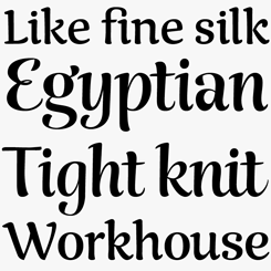
Designed for the specific purpose of setting books, Karol is a typeface that is nevertheless full of character and personality, with a glyphic style that recalls the skilled movements of a draftsman’s hand holding a broad-nibbed pen. Karol successfully evokes both a historical atmosphere and an elegant, post-modern corporate sophistication. Available in eight weights from Regular to Black, with matching italics, small caps and full figure sets, Karol was created by Brazilian designer Daniel Sabino while on the MA Advanced Typography course offered by EINA/UAB.
Magasin
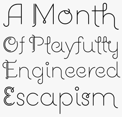
Magasin is an intriguing combination of kinky calligraphy and finely balanced geometry. Like the name suggests, this typeface makes a wonderfully idiosyncratic addition to a style mag’s typographic palette — and with lots of OpenType features under the hood, there’s plenty here to keep demanding art directors busy.
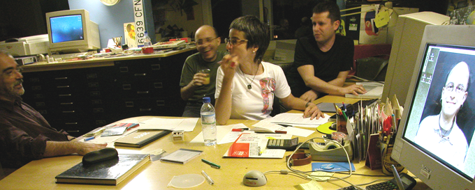
Type-Ø-Tones, some years ago. Left to right: Joan Barjau, Josema Urós, Laura Meseguer and Enric Jardí.
Did any of you have classes in type or lettering at school?
Laura: “Enric and Josema never received formal training in lettering or calligraphy. Joan did, at a very early age: at about six or seven he learned the basics at school — the regular or round (as digitized in our Memimas typeface) for learning to write; the English or copperplate; the redondilla and the gothic. Just with ink and pens.
As for me, I remember art school exercises such as drawing Futura with a pencil, some India ink, a compass and tracing paper, and especially one about creating an alphabet from a logo on a can of sardines. At that time we had no computers, so all projects were done by hand. Typesetting was done by photocopies, galley proofs or Letraset. I learned a lot about typography and lettering from the art director who was my first boss. He would lay out all the headlines or slogans by hand, in any typeface. My job as an intern was to find the best matching typeface in Letraset, composing it using the Repromaster copy camera if needed, and go! I got my first professional job at an agency because of my knowledge of typography and my ability to recognize typefaces. That was a hobby for me. :)
Finally — and this has been very important— my father is a retired letterpress printer, and so was my grandfather. I remember my early fascination with the specimen books, and wood and metal types.
Could you say something about your current activities in the design field?
Enric, Joan and Laura are all graphic designers, and Josema, who used to be more involved in studio management and graphics technology, is now also an independent graphic designer, besides being a musician. Josema and Laura are teachers of typography and type design; Laura and Enric have published books related to the field of typography.
You all live and work in Barcelona, a city that has long been seen as one of Europe’s design capitals. Not just graphic design; among other things, it is home to the design departments of some of the world’s biggest automotive brands. How has Barcelona’s hipness influenced your work?
We were all born in Barcelona, so it’s likely that the city’s threads are in our DNA, for better or for worse. Without any doubt the light, the climate and the streets have influenced our work and perspective on life, probably in ways that we aren’t even aware of.
The conversion of our city into a major tourist destination, and also a design business town, happened after we started out and probably caught us a bit unawares. As we work in a pretty much intuitive way, we are not so sure that those facts reflect directly on our type design work. We are teachers, however, partly because of the demand that comes with the city’s new creative status, and that no doubt has a positive influence on our work.
Having started out as a four-person collective, was there ever such a thing as a manifesto, or a common philosophy? Has that changed over the years?
No, we always avoided the concept of a manifesto. It tends to be that the more radical they are, the more you come to regret them as time passes, so we steered clear of them from the very beginning. On the other hand, we have always shared our love for vernacular typefaces that remind us of our childhood years — whether lettering from comics, advertising or shop signage. All through the ’90s our work was based on personal tastes and we never thought about releasing text typefaces — either something new or based on the classics.
Somehow our line of work was “let’s do interesting typefaces that no-one has done before; even better if they have a cultural and emotional background that we all share”.
In several ways (starting with the name) there was always something very playful, almost unserious, about Type-Ø-Tones. To misquote Frank Zappa: does humor belong in type design?
Considering that we are a group of people who, when meeting, seem to have the motto “humor belongs in life”, the answer must be “Yes.” The designs, the name of several of our typefaces, the sample texts in the specimens, the unpublished projects (some of them are mere jokes), and even our personal relationships, suggest a sense of life that is pretty far from serious drama and much closer to a comedy of manners. Our name is the first example, and our logo the second. Yes, it’s a pretty good idea to work seriously but always with a smile.
Several of your typefaces from the nineties were technically complex, pioneering techniques that are now common, such as multi-colored layering and automatically connecting scripts. What got you interested in that kind of experimentation?
At the time, there wasn’t the overload of typefaces we see now. The design schools were not teaching type design and the production of digital versions of classics was in the hands of big players such as Adobe, Linotype and Monotype… It was not our field, as it wasn’t for many other independent foundries of that time, like Emigre or Font Bureau in their early days. Our focus was on experimentation, new concepts, unexplored aspects or under-developed ideas. Joan and Josema still remember the day they discovered the Bifur specimen by Deberny et Peignot, and how without having mentioned that to Enric, he came back a few days later with the first sketches for Wilma and Peter Sellers, revealing some significant ideas on layered types.
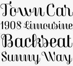
Rumba
Rumba was Laura Meseguer’s graduation project from her time on KABK’s Type and Media program. Rather than different weights, each of the three fonts in this family has been designed for setting in a particular size or context. Rumba Small’s subtle contrast makes it suitable for medium and long texts; drawn more loosely, the letterforms in Rumba Large are intended for headlines and short call outs; while Rumba Extra is meant for single word settings. Lots of OpenType features mean that the family is packed with alternate characters for creating highly individualized designs.
Wilma
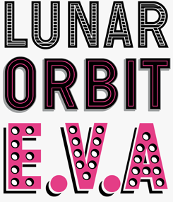
Wilma is an early example of a chromatic font — a breed of typeface designed for creating multi-colored layered effects. The family contains a total of 19 fonts, with a variety of shadows, fills, dots and outlines available. While specialist software isn’t strictly necessary to make chromatic fonts like Wilma work, it helps if the software can create text within frames that can then be precisely layered over one another; this will be tricky in some word processing programs.
Poster
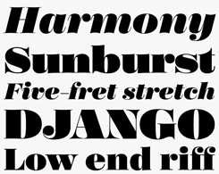
Poster by Íñigo Jerez is a high contrast Didone display typeface in a family package of eight fonts designed for either large, huge or enormous settings. At the family’s extreme end of the scale, Poster Display Monster Italic is a fantastically fat and engaging presence; even here it’s noticeable how effectively the white of the counters and the joins of the strokes have been utilized to create the letter shapes. Note how the “Display” versions have enhanced contrast between the thick and thin strokes for extra impact in large sizes.
Some of your experimental fonts were made long before OpenType technology became commonplace. Would the design process have been very different today? More generally, what has the advent of OpenType changed for you?
First of all, we think the OpenType format was necessary and clearly superior to previous technologies. It’s a small miracle that it has established itself as a universal format — considering that other promising technologies like MultipleMaster, TrueType GX, etc., never managed to consolidate themselves — and that all those great expectations that the beginnings of OpenType generated have been met. Unicode, Features, multiple platforms… all breakthroughs for users and producers.
It has also been particularly important for small foundries like ours. On the one hand, it’s an extra, although necessary, maintenance task because we have to continually upgrade all the fonts in the collection. But among the positive aspects, we now have the production of more efficient and compact resources (Memimas will decrease from 15 styles in PostScript / TrueType to only five improved and expanded character sets in OpenType), and critically, the maintenance of only one unique master for each style.
Laura, after ten years of designing typefaces, you decided to become a student again and do the Type and Media course at the Royal Academy in The Hague. What did that change?
I always loved typography but enrolling at Type and Media was a dream come true and it changed everything. Before that my approach to type design had been very naive and without any of the basic foundations, not even calligraphy. For instance, I designed Cortada while learning to use Fontographer, and Frankie with a photocopier and scanner and a low resolution copy of Franklin Gothic. Some other fonts were collaborations with illustrators, with me doing digitizations from their hand-drawn typefaces.
So, I went to The Hague, I learned it all and I practiced, from stone carving and calligraphy to programming, and I successfully designed my typeface Rumba. I came back to Barcelona and immediately became a teacher and a professional type designer, and since then I’ve specialized in custom lettering and type design for design projects — I work mostly on that in a professional and in a personal way — but also in editorial design.
Josema, you worked at the famous studio of Javier Mariscal for a long time. What were the main things you learned there — did it help or influence your type design?
I worked at Mariscal’s studio for twenty years. I joined the studio in 1991 to teach designers how to work with graphic software, and how to integrate their manual processes into the digital workflow. During my time there, I was responsible for hardware and software, but I also participated in several design and editorial projects. Of course I was handling the production of all the in-house fonts by the “auteur”. But my learning there had more to do with organization and team working, rather than on the typographic side, where the majority of the projects were Mariscal’s scripts.
Guapa
Taking elements of Deco frivolity and combining them with a geometric outline à la Futura, Guapa (“pretty” in Spanish) is a successful experiment in postmodernist type design with an added air of frisky irreverence. Swash capitals, stylistic alternates and a handful of useful ligatures are all available via OpenType features.
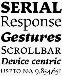
Arboria
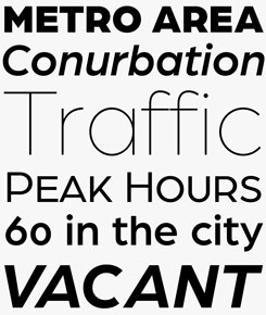
Arboria is Josema Urós’ semi-geometric grotesque — and it has been many years in the making. Originally conceived as a custom architectural font, it changed over the years to its current form. It is named after the capital of planet Mongo, a futuristic city with Art Deco influences in its buildings. Arboria has a similar tension but with many elements mixed in. The result is a hybrid Grotesque with nods to the 22nd century. With six weights and matching italics, Arboria is a great typeface for body text as well as display.
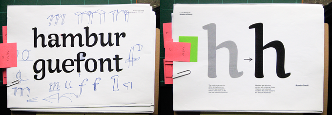
Documentation from the design process of Laura Meseguer’s Rumba.
From the start, Type-Ø-Tones has welcomed typefaces by people outside the four-person nucleus. Recently, you released great new families by Daniel Sabino and Íñigo Jerez? What do you look for in fonts by others? What are the criteria for acceptance?
The answer is very simple: they have to fit in our catalogue. Of course, our point of view has evolved, and what we appreciate now is different to what we have done in the past, not only with those external contributions but also when looking at our own projects. In the beginning, we were only working on display and script typefaces; we still keep an eye on that area, but text typefaces have become a part of our collection.
These days, any interesting typeface may deserve our attention, and if the author has an affinity with our collection or would simply like to publish with us, we initiate a collaboration. We all have to agree to publish that font or typeface family and it has to be finished, although we can also help a bit when necessary.
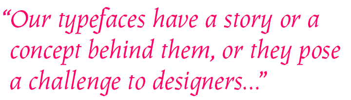
Many people seem to have the impression that we did a kind of “relaunch”. In fact, we never stopped; but the feeling may have more to do with the quality and diversity of the latest typefaces we have released. We have worked in typographic styles that were kind of new to our collection, but are very representative of the kind of work we like to do now: typefaces that have a story or a concept behind them, that pose a challenge, and are attractive to both aficionados and professionals.
Laura, the book TypoMag, which you wrote and designed, describes current approaches in magazine typography. You are also the co-author of a book about making fonts. For you, how do these activities — editorial design, type design, writing — interact?
I’m very much interested in all aspects of graphic design that involve typography, not only type design itself. I’m also an editorial designer and I teach typography for graphic design students, so consequently I’m always surrounded by publications and magazines that make excellent use of typography and lettering as a primary component: custom fonts, display typefaces, classic layouts, experimental formats… I consider magazine design as one of the most creative and experimental fields for designers, and I enjoy that a lot.
The idea for TypoMag came after watching this developing trend and I proposed it to the publisher, IndexBook. My other book Cómo crear tipografías. Del boceto a la pantalla (How to create typefaces. From sketch to screen) is a joint venture between Tipo e, a small Madrid-based publisher and three different educators: Cristóbal Henestrosa, José Scaglione and myself; the goal was to create a guide to typeface design for students and beginners. As you can see, everything is connected.
Finally, a question about the broader context of your work. Spain has been going through a deep slump these past few years. How bad has it been for designers? Is there light at the end of the tunnel?
This economic situation has been provoked by avarice, ineptitude and the mafia which has become the political class, serving the banks at our expense, supported by a majority of people who voted them. Today, a design student or a young professional has not as many job opportunities as we had in the past, and the economic conditions have imposed change for everybody: the local clients invest less in design, and those related to culture even less because of the cuts. Fortunately, and thanks again to developments in technology, we have been able to extend our boundaries and reach any place in the world where some person might be interested in our skills as a type or graphic designer, and this is great.
Thanks for that optimistic final note, and thanks for the interesting conversation!
For more images from Type-Ø-Tones, see our dedicated Flickr page!
Memimas
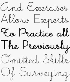
The Memimas family was the outcome of a 1991 assignment from the publisher Barcanova to digitize their alphabet for teaching schoolchildren how to write, based on the Montessori system. Urós’ and Barjau’s familiarity with the style (they too had learned to write this way) allowed them to introduce numerous new details in the structure of the font, needed for the digitization process. Special characters were made for creating the connections, accommodated in a separate “Ligatures” font, as are the Alternate versions. The current version still has this structure — three fonts per weight — which, in a way, is an advantage for those using it in applications that aren’t fully OpenType compatible. However, OpenType versions, with one large font file per weight, will soon be available.
Frankie

Created in the early 1990s, Frankie is one of the original grunge fonts. It was, as has often been the case with these pioneering typefaces, a digital work created by analog means. Photocopies of printed Franklin Gothic specimens were scanned, reprinted and photocopied again until the characters achieved the desired degree of erosion and, well, grunginess. Having been a bestseller and a mainstay in international advertising campaigns for twenty years, it is now available in an updated version with additional language support. A witty cartoon by Enric Jardí from the early days shows Laura Meseguer and her partner in crime Juan Dávila working on their clandestine mission of typographic subversion.
MyFonts is on Twitter and Facebook!
Join the MyFonts community on Twitter and Facebook. Tips, news, interesting links, personal favorites and more from MyFonts’ staff.

![]()


Who would you interview?
Creative Characters is the MyFonts newsletter dedicated to people behind the fonts. Each month, we interview a notable personality from the type world. And we would like you, the reader, to have your say.
Which creative character would you interview if you had the chance? And what would you ask them? Let us know, and your choice may end up in a future edition of this newsletter! Just send an email with your ideas to [email protected].
In the past, we’ve interviewed the likes of Emily Conners, Laura Worthington, Jonathan Barnbrook, Dave Rowland, Gerard Unger, Pintassilgo Prints and Jos Buivenga. If you’re curious to know which other type designers we’ve already interviewed as part of past Creative Characters newsletters, have a look at the archive.
Colophon
This newsletter was edited by Jan Middendorp and designed using Nick Sherman’s original template, with specimens and type descriptions by Anthony Noel.
The Creative Characters nameplate is set in Amplitude and Farnham; the intro image features Arboria and Magasin, the pull-quote is set in Karol and the large question mark is in Farnham.
Comments?
We’d love to hear from you! Please send any questions or comments about this newsletter to [email protected]
Subscription info
Want to get future issues of Creative Characters sent to your inbox? Subscribe at www.myfonts.com/MailingList
Newsletter archives
Know someone who would be interested in this? Want to see past issues? All MyFonts newsletters (including this one) are available to view online here.