
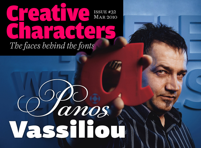
Photo by Vagias Katsos / Square
The Parachute foundry from Athens, Greece, had been on our wish list for a while when, about a year ago, they replied to our gentle poking with a whole-hearted “yes”.
As soon as Parachute’s sophisticated type families began appearing on MyFonts, they caught the attention of our quality-conscious users. For months, they dominated our Hot New Fonts charts. Their spectacular Champion Script became the most popular formal script of 2009, and has remained one of our best selling fonts to date. So yes, Parachute’s founder and spokesman Panos Vassiliou is a happy man. And totally in love... with typography.
Greece has an extraordinary position, typographically speaking: it’s one of the few countries in the western world with a principal language that has its own script. That must have enormous implications for typography and design...
I wouldn’t call it implications but rather opportunities in typography as well as graphic design.
Greek typography remained stale for hundreds of years. While the rest of Europe was busy evolving during the Renaissance, Greece was badly fighting to survive the Ottoman occupation. This greatly affected typography, which did not progress for more than 400 years. Even until about the end of the 1980s most Greek typefaces came from abroad or were a result of “Hellenization” of existing Latin typefaces. Hellenization (from Hellas, the historic name of Greece) in this case refers to the conversion of Latin into Greek. In the beginning of the ’90s we experienced a boom in print media, advertising and communications in general. This created demand for new typefaces and the void was first filled with Greek versions of existing Latin typefaces and later with several original designs.
The major concern since then has been to match the visual appearance of both Latin and Greek alphabets without losing their own distinct characteristics. In total, Greek lowercase characters have more round parts than Latin ones, as well as there being a much higher frequency of round characters within a sentence. In this respect the greatest challenge is to design the Greek characters in a way that the difference in appearance is not disturbing. It’s a trade-off between the round and square parts of the characters.
Some traditionalists may argue against this “harmonization” as they support a more dramatically distinct appearance of the Greek alphabet even within the same typeface. The argument is also supported by a few academics, but the market feels otherwise.
I’ve been watching for years the attempts of several foreign designers trying to get the hang of the Greek alphabet but in most cases their nice contemporary typefaces turned old-fashioned in Greek. There is nothing wrong with the designers, what is wrong is the insistence on using old manuscripts as a reference for certain letterforms, which seem out of place when set next to other characters.
You studied at the University of Toronto and lived in Canada for many years. What made you decide to re-establish yourself in Athens?
It was never a matter of choice between the two worlds, I belong to both of them. I’m Canadian as well, so I have strong ties with Canada. At that particular point in time I needed more sunshine, some time to re-evaluate my options and pursue new business opportunities. Typography was never my first option. I just happened to be in Athens when I decided to start Parachute. I can only think of one major drawback here, which is the lack of immediate access to type resources as well as the small amount of reference material that is available compared to other European countries or the United States. For instance, you cannot walk into a library and expect to find a reasonable number of typographic reference books. Those that do exist, like old manuscripts, are not properly filed in a form that would make them easily accessible to the general public. Furthermore, there are no schools with a major in typography which in turn makes it quite difficult to find designers with typographic skills.
pf Champion script pro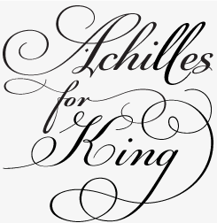
Based on the manuscripts of the 18th-century calligrapher Joseph Champion, Champion Script Pro is one of the most sophisticated script fonts available. With two weights, each loaded with a stunning 4,280 glyphs, the font is likely to contain the largest number of alternate glyphs of all script fonts on offer. Read Parachute’s Champion Script Pro article to learn all about the typeface’s design principles and OpenType features.
pf monumenta pro 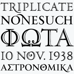
Monumenta Pro pays tribute to the inscriptional capitals of ancient Rome — the same style that inspired such successful all-caps fonts as Trajan (a staple of movie titles) and Jupiter. So how is Monumenta Pro different? As it was designed in the land of Alpha and Omega, it naturally comes with a perfectly drawn Greek character set; it also supports Cyrillic. What makes the Monumenta family especially attractive and versatile are its open varieties: Shaded, a regular cut with a finely carved inline, and Metallic, simulating three-dimensional metallic lettering. Elegant!
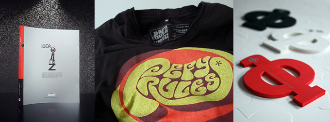
Parachute merchandise: The 2003 award-winning catalog, an original “Defy Rules” t-shirt, and the “Resist the Ordinary” collection of coasters.
Apparently, you were not trained as a type designer. When and how did you decide to make your passion for typography into a profession?
I’m largely self-taught in type design. I studied Applied Science and Engineering at the University of Toronto. After working in the industry for a couple of years I felt the environment was too conservative for me so I decided to change direction and find another way to fuel my creative energy. Ever since my university years I had developed a knack for graphic design and typography, either by designing flyers for the underground music scene of the ’80s, setting type at a local printshop to finance my studies, or by taking part-time courses in magazine publishing and graphic communications at Ryerson University. It wasn’t long before I got involved with acting as part of a theatre company, founded a design studio with my girlfriend, while teaching at the same time at George Brown College. After I moved to Athens I published a monthly magazine and two years later I started Parachute.
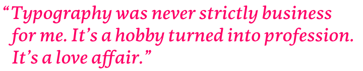
Typography was never strictly business for me. It’s a hobby turned into profession. It’s a love affair. Ever since I put my hands on letterforms back in 1993, typography has become a daily obsession. I started learning type design by redrawing typefaces from the ATF library, but my very first attempt was a recut of Corvinus which was originally designed by Imre Reiner for Bauer around 1930. Not a result I would be proud of by today‘s standards.
You started Parachute on your own in 1999; since then, you’ve been joined by twelve other designers. Does this mean that Parachute has become a kind of collective, or society? In other words, how does Parachute work?
It started as an one-man show with minor resources back in 1999. The first 2 years were barely professional but the demand was such that I seriously started thinking about turning this into a real job. In the beginning I had a hard time finding designers with typographic skills so I had to go around and look for them. I had to discover talented designers from diverse fields and convince them to work on particular projects which I always oversaw and managed. These were stressful times as I was the only one running the show.
Parachute is now well organized and we accept submissions from around the world. For instance, very recently we released Adamant Pro, a text typeface by a promising young designer from Serbia. Soon we will release the work of another designer from the United States. We are mostly interested in text typefaces and extraordinary display and script types. Designers who share our vision are more than welcome. Parachute is also wide open to interesting collaborations with other independent foundries.
What does the name Parachute refer to?
Of course, there is an obvious connotation of audacity, as well as the famous quote attributed to Frank Zappa: ”The mind is like a parachute, it doesn’t work if it isn’t open.” But there is also a more emotional attachment to the name. You see, Parachute dropped en masse out of nowhere. This alone would be enough to generate mixed emotions. The name was picked to entertain any possible reservations towards the unknown and works as a contradiction between what it seems to be and what it really is.
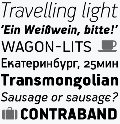
pf beau sans pro
Beau Sans Pro was inspired by Bernhard Gothic, designed by Lucian Bernhard in the 1920s. Its first incarnation, named Traffic, was a minimalist text typeface with details drawn from Bauhaus typography. A drastic makeover resulted in Beau Sans Pro. Although the modernist influences are evident, there is hardly a trace of Bernhard’s original any more in Beau Sans — a contemporary sans-serif with a distinct personal style. The family comes in a generous range of eight weights with true italics and several styles of numerals.
pf baseline pro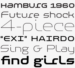
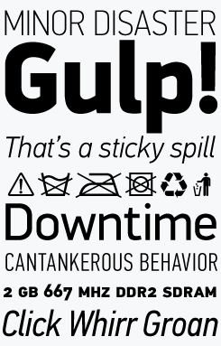
Baseline Pro is one of the earlier Vassiliou designs: a techno-syle geometric typeface that lends a futurist look to screen pages and printed documents. The wide and simple forms, combined with the selective application of a few distinct characteristics, has resulted a striking typeface that performs well in a broad array of applications, such as music packaging, technology magazines, club flyers and corporate identities. Baseline Pro supports more languages than most fonts in this genre and has an interesting set of alternates.
Parachute has a strong position as a typographic partner to publishers and advertising agencies — both in Greece and international. How did you get there?
For several years we concentrated on the local market selling directly to our customers without using any distributors. This way we were able to safeguard quality, monitor the use of our fonts and most importantly offer proper and immediate support to our customers.
In 2003 we released our first major catalog, which included several classic revivals of historical importance as well as many original designs. Our type library was updated, as several of the older designs were either discarded or redesigned to reflect current aesthetics with an emphasis placed on text typefaces. Parachute was further established in the local market but still I did not feel we were ready to make a strong international appearance, so immediately after the release of the catalog we started working on the next big project — expanding our library to include all European languages. This took about four years to realize and in between I was able to design a few more typefaces, like Centro Pro and Champion Script Pro.
Meanwhile our website was finally up and running in 2007, followed by Upscale Typography, Parachute’s popular independent blog on what we are obsessed with: typography. The reception was overwhelming and I was seriously thinking about running an exclusive distribution, but soon it became apparent that alone you can only do so much and eventually I had to become more open. So when we were invited to join MyFonts my initial reservations were immediately waived. Eventually this proved to be a wise decision as our exposure has dramatically increased since then.
pf handbook pro
Handbook Pro is an original sans-serif with smooth rounded corners. It incorporates unusual design elements in some characters, such as the lowercase a, g, k and m, without compromising legibility. Handbook Pro is a balanced typeface that works surprisingly well in longer texts and at small point sizes. It comes with a set of interesting stylistic alternates that can be used to add a refreshing flair to your designs. Like in most other Parachute families, each font comes with a series of 270 universally usable symbols.
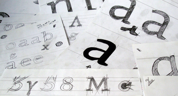
Some rough sketches for Centro Serif Pro
As a type design studio with connections to the world of advertising and media, you could have travelled the easy road and concentrated mostly on fashionable display fonts. Instead, you chose to specialize in large families and complex script faces like Champion. How come — and how is that gratifying?
I must admit it wasn’t like that from the beginning. I have tried everything from geometric types such as Baseline Pro to organic ones such as Fuel Pro. Meanwhile, I was always interested in timeless pieces of work. Fashion is ephemeral but style lasts forever. I kind of like to associate myself with high-end, sophisticated and stylish products. So I started working more on text typefaces like Square Sans Pro, Handbook Pro or Beau Sans Pro for demanding customers and paying more attention to the finer details. Then I realized the limitations of my world and I started thinking globally. But if you want to reach a diverse group of people you have to speak their language.
Developing complex families was fun and painful at the same time. Back in 2003 you could only find a fraction of well-crafted contemporary typefaces that supported all European languages and most of them — if not all — were classic text typefaces. I was determined to create a new type library that included a variety of contemporary text as well as display typefaces which covered a wide spectrum of languages and this seemed very appealing to me. I had no previous knowledge of Cyrillic so I started by running my own extensive research on the subject while also consulting with local experts such as Russian-speaking teachers. I even went down to the very first level, reading children’s books and learning the elementary steps of handwriting Cyrillic. It took me about 2 years to perfect my skills or at least reach a satisfactory level. Cyrillic is a script which evolved as a mix of Greek and Latin, so these characters are always designed after I finish Greek and Latin.
Champion Script Pro is the first and most advanced family I ever created. It was based on the manuscripts of the 18th-century calligrapher Joseph Champion but was infused with fresh contemporary forms to make it more appealing. This was a humongous project that required precision, organization, craftsmanship and the invaluable help of our junior designer. It was the most difficult script I ever laid my hands on. The knowledge I gained out of this though was incredible and became an ongoing reference for my other projects. Creating complex scripts is exciting as well as challenging but it takes determination and a lot of effort.
Among your more complex type projects, which is your favorite, and why?
My favorite so far has to be our award winner, Centro Pro. This is a series of 3 superfamilies — Serif, Sans and Slab — for a broad spectrum of editorial and corporate design projects. The idea behind Centro Pro was to create a versatile series which combined modern square forms with traditional shapes without hurting legibility. The serifs reflect the simplicity of a contemporary building, while pronounced triangular cuts were introduced and properly balanced with round forms to avoid creating unorthodox letterforms. This project covered the full package of the design process right from the start — conceiving the idea, doing thorough research, sketching and implementing. This gave me the opportunity to discover ideas of the past, incorporate several of them and most importantly realize that unless you understand and know the history of type you’ll have a hard time becoming a successful designer.
PF fuel pro
The grunge-style Fuel Pro evokes the rough reality of the urban cityscape. It has been part of numerous product campaigns — music, mobile telephony, food, beverages, politics, you name it. The ‘Pro’ version includes Greek, Cyrillic and a useful set of matching frames.
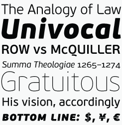
pf centro Pro
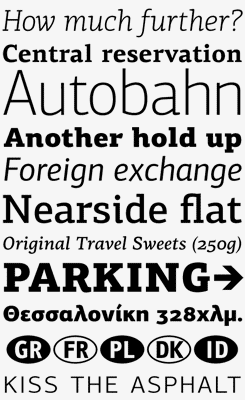
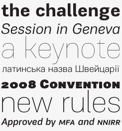
Centro Pro is a type system composed of three compatible families — Serif, Sans and Slab — each supporting Latin, Greek and Cyrillic. It meets an ever-growing demand for such versatile type systems among pan-European companies and institutions. Centro Pro’s design has character without being conspicuous, it is modest without being bland. With extreme weights such as ExtraThin and UltraBlack, Centro Sans Pro and Centro Slab Pro are ideal for magazine headlines. Each font in the series comes with a practical set of 270 symbols for packaging, signage, environment, transportation, IT, fabric care and urban life.
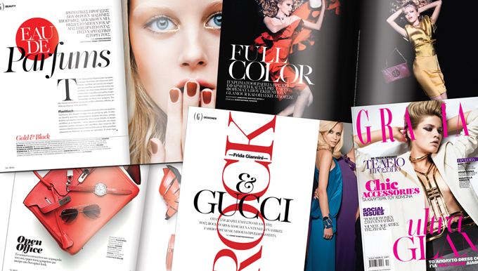
Grazia magazine using the custom typeface Regal Pro
Besides the typefaces we know as Parachute’s retail fonts, have you produced many fonts as custom fonts only? What kind of clients are most interesting to work for?
Over the years I’ve had the opportunity to work on several custom projects for quite a few high profile customers. For instance, a while ago I finished a new type system for the redesign of Grazia magazine. Regal Pro is diverse in its construction as it consists of three related serif superfamilies: Text, Display and the elegant Finesse. There is a variety of weights which range from regular to ultra black. In that respect it is very flexible as it can be used in all design aspects of a publication, anything from the front cover to body text. For this project I worked closely with creative art director Kostas Aggeletakis whose critical typographic suggestions were instrumental in the development of such a complex series.
Other clients that have commissioned custom typefaces from Parachute are as varied as the National Bank of Greece and Kraft Foods. One of the typefaces, called Fidelity, was designed and used as the corporate typeface for Cosmoline, an innovative communications company. Several years later in 2009, Fidelity was used as the model for Encore Sans Pro. Finally, I’m currently working on a new typeface for one of the leading national newspapers.
If you ask me what clients I prefer I can say that I’ve always enjoyed working with advertising and branding agencies. But if we are talking about text typefaces I believe it is magazines and newspapers where you get the best and most critical feedback for your work. It is a demanding environment and there are a lot of details to account for. I wish I had more projects like that. It is like having the critical eye of a partner who corrects your work. This is why it is so important to have designers around you with a typographic vision as well as a vibrant publishing community which appreciates the value of customization and demands innovative work.
Every foundry that carries original material has problems with font piracy. How bad is it for you, and how do you deal with it?
The level of font piracy in Greece is close to average. A number of designers still prefer not to buy fonts. However, in the last few years this trend is being reversed. There are three reasons for this. First of all, younger designers are becoming better aware of copyright laws. Secondly, the state runs regular inspections of larger companies for pirated software through its tax department. Third, we monitor the market, keeping track of new commercials, print campaigns, TV shows, books, magazines and corporate identities.
The good thing about fonts is that they are visible, so sooner or later pirate copies will surface. This may sound effective for the local market, but becomes harder on an international level. We’ve had numerous cases of piracy since we went online. I used to worry about it but then I realized that this is something you can only control but not stop. When it comes to controlling it, we do not take a direct aggressive or bullying stance against them. On the contrary, first we try to exhaust all possible ways of communication and it so happens that in all cases we have been successful. We do not punish them or go public, we work out a way to legalize their fonts and help them become customers for life.
Most designers are decent people, and all they want in situations like that is a decent way out. Legal action is the last thing we consider when everything else fails. Fortunately, in all different cases we’ve handled over the years we have never had to resort to further actions.
Communication makes things easier.
With such an impressive body of work already in place, what would you wish for yourself and Parachute to happen in the near future?
Our collection and for that matter our work is still far from what I would like it to be. As long as that hasn’t happened we will be restless. But definitely we want to be there when it happens and above all make it happen.
And on that note, Panos, we’d like to thank you for your insights. It was a pleasure talking to you.
PF din pro
Based on the alphabets for hand-lettering issued in the 1920s by the German Institute for Standardization, DIN typefaces used to be known for their mechanical, “undesigned” look. In order to use DIN as a text face, drastic optical adaptations needed to be made. While FontShop’s FF DIN did address these issues, its early versions lacked Greek, italics and display weights — so in 2001 Panos set out to design his own DIN from scratch to produce the typeface his customers wanted. Based on the original DIN standards, PF DIN Pro is a superfamily including Condensed, Compressed and Display versions, with true italics for all. Recently a new set of hairlines was released.
pf encore sans pro
To some, they are universal typographic toolkits; to others, overused and overrated. But whatever your opinion of the 1900s gothics and 1950s grotesques, many of them lack at least a couple of features you might need for a complex typographic project today. They may lack small caps, various numeral styles, or real italics. Encore Sans Pro offers all this and more, while borrowing stylistic elements from those modern classics. With its wide range of weights, huge character sets, ample language support and stylistic refinement, Encore might be the sans you’ve always dreamt of.

Who would you interview?
Creative Characters is the MyFonts newsletter dedicated to people behind the fonts. Each month, we interview a notable personality from the type world. And we would like you, the reader, to have your say.
Which creative character would you interview if you had the chance? And what would you ask them? Let us know, and your choice may end up in a future edition of this newsletter! Just send an email with your ideas to [email protected].
In the past, we’ve interviewed the likes of David Berlow, Ronna Penner, Rian Hughes, Alejandro Paul, Underware, Alexandra Korolkova, Veronika Burian and Jos Buivenga. If you’re curious to know which other type designers we’ve already interviewed as part of past Creative Characters newsletters, have a look at the archive.
Colophon
This interview was conducted & edited by Jan Middendorp, and designed using a template by Nick Sherman.
The Creative Characters nameplate is set in Amplitude and Farnham; the intro image features PF Champion Script Pro and PF Centro Sans Pro; the pull-quotes are set in PF Centro Serif Pro Italic; and the large question mark is in Farnham.
Comments?
We’d love to hear from you! Please send any questions or comments about this newsletter to [email protected]
Subscription info
Want to get future issues of Creative Characters sent to your inbox? Subscribe at www.myfonts.com/MailingList
Newsletter archives
Know someone who would be interested in this? Want to see past issues? All MyFonts newsletters (including this one) are available to view online here.