Alphabet Tree - The Letter P
New words are being invented all the time, to keep up with changes in technology and daily life. This may have been one of the reasons the Phoenicians came up with the innovative notion of a phonetic alphabet: one in which the letters represented sounds. It was an elegant and practical idea, and it’s obviously had a huge impact on the nature of writing to this day.
A pictorial written language worked fine for the earlier Egyptian culture. For example, to the Ancient Egyptians, a picture of a man with a weapon clearly meant warrior. But in the more complicated society of the Phoenicians, the distinction between merchant and money-lender was not so easy to represent with an illustration. To address this problem, the Phoenicians worked out a modified picture-based alphabet. Now each picture did not represent the object itself, but rather, one of the sounds in the name of the object depicted.
The letter P is a perfect example. In Egyptian hieroglyphics, a drawing of a mouth would have meant just that: a mouth, or perhaps someone talking. In the Phoenician alphabet, the symbol of a mouth represented the sound of its Phoenician name, “pe.”
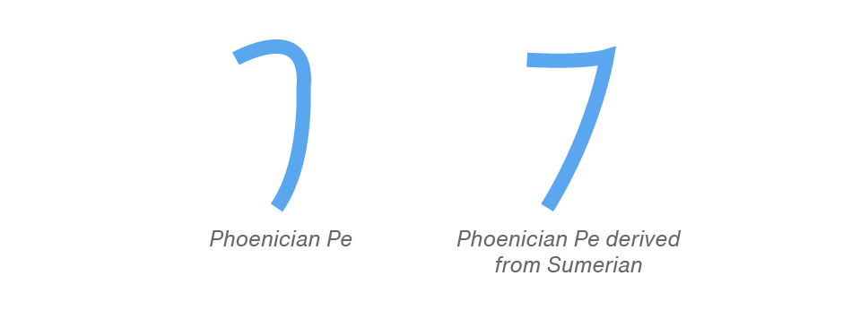
The Phoenician P actually had two forms. One had a rounded shape that looked a little like an upside-down J, and the other was a more angular form, derived from a Sumerian symbol.
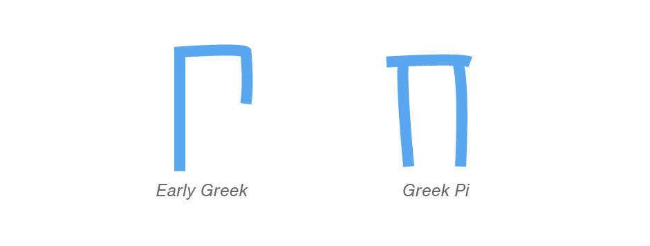
The Greeks borrowed the sign from the Phoenicians; but here things get a little confusing. What looks like our P in the Greek language was actually their symbol for the ‘r’ sound, while their ‘p’ sound was represented by a more geometric, asymmetrical shape. This character was then further modified and, as the Greeks were compelled to do, made symmetrical. The final outcome was the sign they called “Pi.”
The Romans inherited their P, which looked somewhat like the earlier Phoenician sign, through the Etruscans.

In time, the Romans turned the letter around and, in the process, developed the monumental P that is the prototype of all forms of our letter.


Palatino® Nova is Hermann Zapf’s redesign of his own masterpiece, Palatino. The original Palatino was cut in metal, as hand-set type, by August Rosenberger at D. Stempel AG type foundry in Frankfurt, and released in 1950. Palatino was later adapted for mechanical composition on the Linotype machine, and became one of the most-used typefaces of the 20th Century. The typeface was named after Giambattista Palatino, a master of calligraphy from the time of Leonardo da Vinci.
Zapf and Akira Kobayashi redeveloped Palatino for the 21st Century, creating Palatino Nova. Released by Linotype in 2005, includes several weights (Light, Regular, Medium, and Bold), each with companion italics. The Palatino Nova family also includes revised versions of Aldus (now called Aldus Nova), as well as two titling weights.
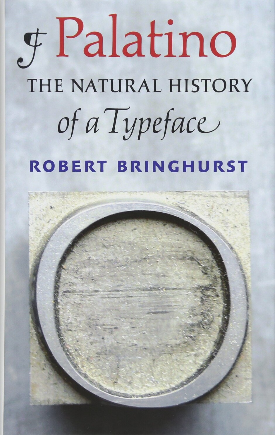
Want to know more about the Palatino typeface family? Robert Bringhurst has written a whole book about it. You can buy it used here. It’s also available new, from Amazon.
