Alphabet Tree - The Letter L
When the Rosetta Stone was discovered in 1799, it sparked considerable interest among scholars and the general public. It was believed that this slab of black basalt, with its identical messages carved in Egyptian hieroglyphics, Egyptian demotic writing, and Greek script, could help unlock the mysteries of ancient Egypt.
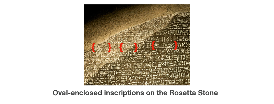
The key resided in the oval-enclosed inscriptions on the stone, all referring to Egyptian rulers. The oval symbolized royalty, and the inscription within identified a particular ruler. The most frequently named ruler was Ptolemy; second in frequency was Kleopatra. The five letters that appear in both rulers’ names – P T O L E – were instrumental in deciphering the hieroglyphics.
So where did this useful L originate? The Egyptian equivalent of our L was first represented by the image of a lion.

Over centuries, this image evolved into a much simpler hieratic character that became the basis of the letter we know today. When the Phoenicians developed their alphabet around 1000 B.C., the ‘el’ sound was depicted by several more-simplified versions of the hieratic symbol. Some were rounded and some were angular.
From this point in its history on, the L becomes a rather complicated character. It took on a variety of forms, sometimes simultaneously, in just about every alphabet in which it appeared. The Greeks alone had four versions. The Phoenicians called the letter lamedh, which meant “goad,” or a “lash.” Though a stretch of the imagination, a whip or lash can be seen in the basic shape of the Phoenician letter.

As they did with so many other letters, the Greeks borrowed the basic shape of the Phoenician letter, but made modifications to its design and name. They established the angular quality of the L.

The Romans adopted one of the Greek versions of the L, but even then the letter continued to evolve. The first Roman L looked more like an arrow pointing southwest, rather than the right angle of the current form.

Over time, the letter evolved into the horizontal and vertical stroked character used on the monumental Trajan column – the same one we write today.


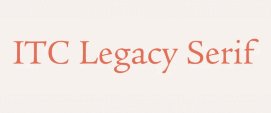
Based on one of the first roman typefaces, ITC Legacy Serif is the result of two design attempts and a 10-year gestation. The end result is one of ITC’s most beautiful and versatile typeface families.
The genesis for ITC Legacy actually began many years ago when its designer, Ronald Arnholm, was in a graduate design program at Yale University. In a history of typography class, he was able to study, first hand, a copy of the 1470 Eusebius, set in the roman type of Nicolas Jenson. It was (typographic) love at first sight. With this inspiration Arnholm decided that a revival design of Jenson’s work would be an exciting and worthwhile challenge – and the perfect subject for his master’s thesis.
Years later, however, Arnholm decided that his first Jenson design had not captured all the qualities of the original, and that it yearned for companion italic to complete the family. For his model he went back to the 1470 Eusebius. This time Emory University in Atlanta, Georgia provided the source. Arnholm was able to do extensive study of the Jenson type, photograph the book at very close range, and make hundreds of trial drawings just to get a proper “feel” for the type. Next came more drawings, and test fonts; then edit, rework, and more test fonts. The final result, after countless hours of labor, is ITC Legacy Serif.
