Alphabet Tree - The Letters U, V, W, and Y

The story of U is also the story of our V, W and Y. In fact, the origins of U even have something in common with the F, the sixth letter of our alphabet.
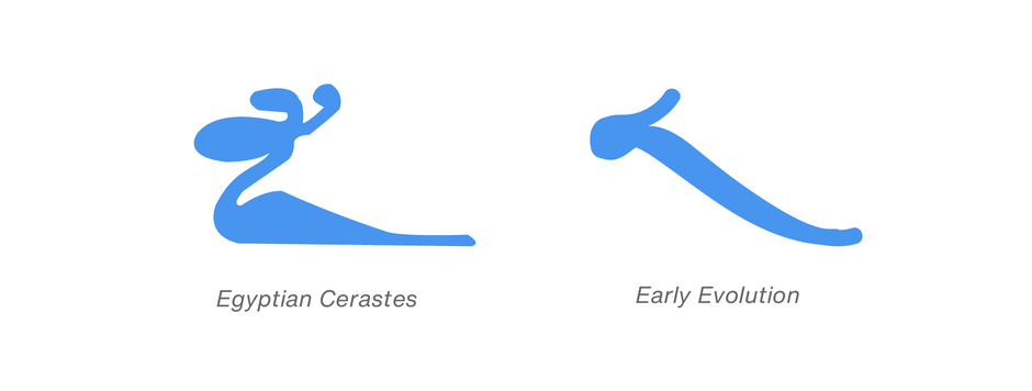
It all starts with an Egyptian hieroglyph that depicted a creature the Egyptians called Cerastes (the creature resembled a giant snake or dragon). This mark represented a consonant sound roughly equivalent to that of our F.

It was the forerunner of the Phoenician “waw.” Certainly the most prolific of the Phoenician letters, the waw ultimately gave birth to our F, U, V, W, and Y.

Sometime between 900 B.C. and 800 B.C. the Greeks adopted the Phoenician waw. They used it as the basis for not one, but two letters in their alphabet: “upsilon,” signifying the vowel u sound, and “digamma,” for the f sound. Upsilon was also used by the Etruscans and then the Romans, both for the semi-consonantal w sound and the vowel u, but the form of the letter looked more like a Y than either a U or a V.

In ancient Rome, the sounds of U, V, and W, as we currently know them, were not systematically distinguished. Context usually determined the correct pronunciation. As a result, the Roman sharp-angled monumental capital V was pronounced both as a w in words like VENI (pronounced “way-nee”) and as the vowel ‘u’ in words like IVLIUS (pronounced as “Julius”).

And what happened to the Y? After the Roman conquest of Greece in the first century B.C., the Romans began to use some Greek words. They added the Greek Y to the Latin alphabet to accommodate these new additions to their vocabulary. But the sound value given to Y, by the Greeks, was unknown in the Latin language; when the Romans used it, in adopted Greek words, it took on the same sound as the letter I.
In the Medieval period, two forms of the U (one with a rounded bottom and one that looked like our V) represented the v sound. It wasn’t until relatively modern times that the angular V was exclusively retained to represent our v sound, and the version with the rounded bottom was left with the single job of representing the vowel U.

As for the graphic form of W, it was created by the Anglo-Saxons, more or less during the 13th century. Sensibly, they tried to distinguish among the various sounds represented by the inherited letter when they wrote it down. So, though they used a V for both the u and v sounds, they wrote the V twice for the w sound. Eventually the two Vs were joined to form a single character, called “wen.” This early ligature stuck and became part of the common alphabet rather than an accessory.
16th century, Italian printers started distinguishing between the vowel U and the consonant V. However, the V continued to be used for the U sound at the beginning of words. In 1629, the capital U became an accepted letter when Lazare Zetzner, a printer, started using it in his print shop.

Univers is a modern translation of the classic sans serif typestyle. Designed by Adrian Frutiger, in 1957, the initial rendition of Univers was the first typeface to be developed as a cohesive type family (with consistent weight and proportion changes) from its onset. Its ample lowercase x-height and open counters enable character fidelity across a wide range of sizes and resolutions. In addition many characters, such as the two-storied a, distinctive k and round-bottomed t, ensure high levels of legibility. A slight modulation of character stroke weights also aids readability.
Univers Next is a refined and updated version of the original Univers typeface family. Frutiger and the design staff at Linotype completed this large joint-project in 1997. All the existing weights of Univers were redrawn, with careful attention paid to making the proportions more consistent with each other and improving fine details such as curves and thick-to-thin stroke ratios. The family was also expanded from 27 to 76 weights, providing a much larger palette of typefaces to graphic communicators.

Download a pdf version of the Alphabet Tree - The Letters U, V, W, and Y and view the Univers® Next by Linotype.