Best Fonts for PowerPoints
You never get a second chance to make a first impression. You can take this simple truism to far-reaching business parameters.
Business presentations are often the first things that make people aware of problems, conditions, or needs. Unfortunately, too often, authors slave over the content of a presentation, assuming that it can just be “poured” into the slides via a software application.
Presentations, however, are much more than a bunch of words squeezed into a rectangular format. Like a display headline, slides must be able to read quickly and easily. Some slides must act like a brochure and show product, or concept, features and benefits. At times, they must also provide information, much the same as a directory or parts list.
Four Things you Should Know About Fonts for PowerPoints
What is the best kind of font to use in PowerPoint or Keynote?
Most of what slides are about is typography. Illustrations and information graphics are clearly important but presentation graphics are, for the most part, made up of words set in type. And some fonts are better than others for the creation of slides. The best typeface for presentation graphics is a sans serif (because it is more legible than a serif design), bold weight (to enable high levels of visibility), of condensed proportions (when you need to get the maximum number of words in a small space).
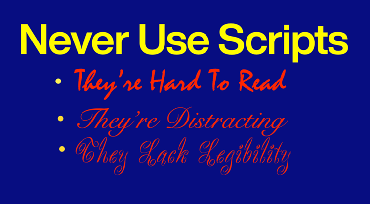
These fonts are a safe bet, and we’ve identified some of the best of these fonts from the over 270,000 available from MyFonts If you want to take a walk on the typographic wild side, serif faces provide a much wider variety of typographic choices. Pick faces that are not too decorative, have sturdy serifs, and not too much contrast in stroke thickness. We’ve also identified several of these that will produce commanding presentations. Never, ever, set slides in a script typeface. Period.
How much text should be on a PowerPoint or Keynote slide?
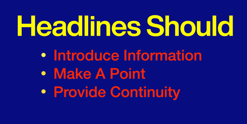
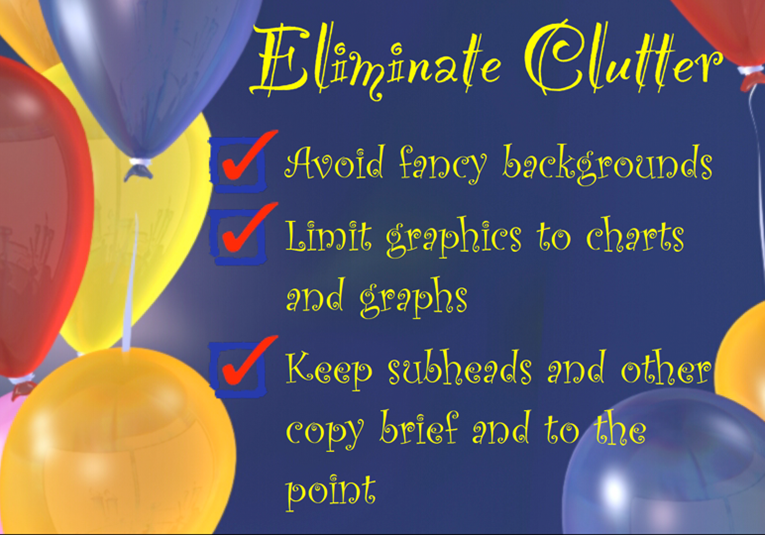
Limit headlines to three or four words. Much more and the reader will begin to lose interest. Headlines in presentation graphics should do one of three things:
- Introduce the information that follows
- Make a point
- Provide continuity for a series of related slides
Bullet-point copy should be 5 to 7 words in length. The words in slides should punctuate what the presenter says, not echo it. Copy should be crisp, accurate – and never cute. Cute rarely works in a business environment.
How much information should be put on a PowerPoint or Keynote slide?
Restrict the amount of information you include on one slide. Confine typography to four or five lines. Too much information will confuse to the reader and mean that the slide will be on the screen for a long time. (Audiences tend to become bored easily.) If you have a lot of information that must be remembered, consider a hardcopy handout to accompany the presentation.
Use Rules and Bullets
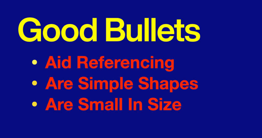
Use rules and bullets only when they add to the understanding. Rules can help to separate headlines from sub-points, and bullets are an aid to referencing information in series; but these are also strong graphic elements that can detract from the process of information transfer. If they begin to look too dominant, tone down bullets in size or color. Use single hairline rules instead of the bold or double variety.
Bold type, size and font changes work fine for typographic emphasizers. Italics with underlines, bold type with drop shadows, and outline fonts with internal textures make presentation graphics look more like circus posters than business communication.
How to Create Hierarchy in a PowerPoint or Keynote Slide
Type style and weight changes should be obvious. Subtleties tend to get lost in presentations. With some type families, you will have to pick font weights that are more than one level away from one another (book and bold, rather than book and medium) to achieve a strong typographic contrast. Font style changes should also be obvious. The rule of not combining two different sans serif designs clearly holds true in presentations. And, as far as serif typefaces are concerned, the subtleties of mixing two different styles are usually lost in presentations. Unless it runs counter to corporate style, stick with the basics: mix sans serif typefaces with serif designs.
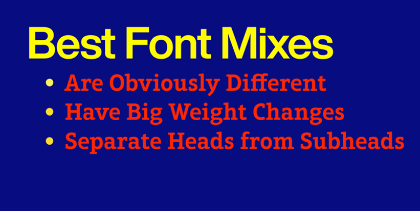
Use colors that are obviously different from one another. Use dark colors for the background and warm, bright colors for the type. Avoid cool colors, like light blue and green, which reduce the vitality of your presentation.
Sans Serif Fonts
Sans Serif fonts are the safest choice for presentations. Each of the following families also contain condensed designs, for when economy of space is an issue.
ITC Avant Garde Gothic is a minimalist geometric design that is highly legible and ideal for presentations that instill a sense of clarity and forward thinking. Its seminal geometric sans serif characters are available in five weights of roman, italic and condensed typefaces – a palette of designs rich enough to take on virtually any presentation demands.
The letters in Avenir are based on simple geometric shapes, softened with subtle calligraphic overtones. It’s business-like without being harsh, and easy to read from a distance. It has the straight-forward directness and simplicity of other sans serif designs, but also enjoys a little humanistic softening.
Helvetica Now is the newest Helvetica design. A vast improvement over previous designs, it is a classic, recreated for the 21st Century – and only available from MyFonts, and its family of font providers. A solid communicator, easy on the eyes and remarkably legible, Helvetica Now is guaranteed to make PowerPoint presentations that are commanding – and memorable.
Gotham is known for its clean, modern aesthetic and a wide range of weights and styles, making it ideal for powerful presentations. With 66 fonts in the family, there’s little beyond the range of Gotham’s capabilities.
Knockout® (Set in No. 32 Cruiserweight)
Knockout features a unique blend of vintage and contemporary design elements – in addition to a wide range of styles and widths – making it ideal for creating impactful presentations with a bold, distinctive and inviting demeanor.
Neue Frutiger is newest version of the Frutiger typeface family, and has been revised and improved over its predecessor. The design combines the clear structure of a sans serif, enhanced with calligraphic overtones. This makes Neue Frutiger highly legible and welcoming – a perfect combination for presentations.
Serif Fonts
Serif fonts evoke feelings of steadiness, longevity, trustworthiness and a sense of authority.Archer® (Set in Bold weight)
Archer combines elegance and readability. It was designed to hit just the right notes of forthrightness, credibility, and charm. Archer’s distinctive and refined shapes make it ideal for presentations. It’s eleven weights, each with a complementary cursive italic, give the family exceptional depth.
Aptifer™ Slab (Set in Medium weight)
Aptifer Slab’s generous x-height, large counters, sturdy serifs and open apertures make it an excellent which make it a clear, legible, and a powerful communicator in slide presentations. When combined with Aptifer Sans, it can take on the most complex of projects.
ITC Century® (Set in Book weight)
ITC Century is a classic, elegant design that features a balanced mix of traditional and modern letterforms. With its timeless appeal and legibility, ITC Century is an excellent choice for PowerPoint and Keynote presentations. It’s conservative, without being stuffy, and commanding without being inelegant.
PMN Caecilia® (Set in 55 Roman)
PMN Caecilia has sturdy slab serifs that give the design an honest straight-forward vibe. Their softened corners also create a sense of affability. In addition, PMN Caecilia’s proportionally large lowercase letters, also make it easy to read. The result is a solid and stylish typeface for slide presentations.
Neue Swift® (Set in Medium weight)
Neue Swift can be used just about anywhere maximum legibility is a requirement. It’s also a striking design, making it both distinctive and easy on the eyes. Swift’s round forms are relatively flat on the and bottom. This combined with long strong serifs produces a strong horizontal stress that guides the eye along a line of copy.
Sabon® Next (Set in Regular weight)
Sabon Next is patterned after classic Renaissance typefaces. The design is viewer friendly, while maintaining all the grace and elegance of some of the earliest printing typefaces. It makes a statement, without calling attention to itself. Sabon benefits from the relatively large and soft serifs which aid the reading process and give the design a friendly demeanor.