Creative Characters: Up and coming — Richard Lipton

— Richard Lipton
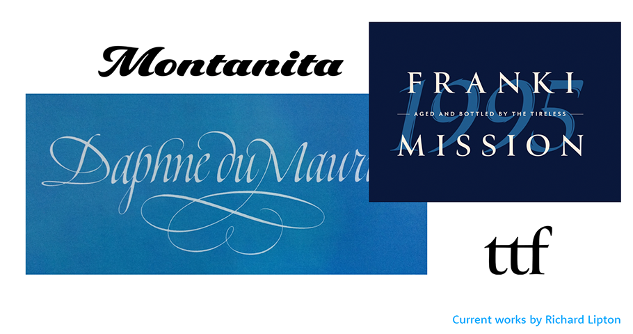
Richard Lipton has been drawing and designing letterforms for an impressive five decades, blending experience in sign painting, calligraphy and type design in a career that’s included time at Bitstream, Adobe, Font Bureau and as a founding partner at Type Network. Lipton Letter Design is now part of The Type Founders, home to renowned type foundries from around the world. We chatted with him about why he still loves the creative ‘boundaries’ of type design. The following interview is edited for clarity.
MyFonts(MF): What was it that got you hooked on calligraphy?
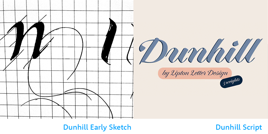
Richard Lipton(RL): In college, I was doing silk-screening, analogue photography and some painting – a lot of expensive, messy media – so one day my professor showed me this lovely piece of lettering on handmade paper. The calligraphy pen, black ink and handmade paper was very basic and elemental, and it really struck a chord with me, seeing letters rendered in a direct and dramatic way. There was no course in calligraphy, but I found some decent books as a guide and started to practice in my spare time. There was something inherently engaging about the structure of letterforms and the calligraphic tools, and here I am still working at it.
MF: After college, were you able to turn this burgeoning calligraphy practice into a career?
RL: I tried to stick with it in any way I could, but when I graduated I wasn’t able to make much money out of it. But it was the world of letters, not just formal calligraphy, that I became interested in. I started to hang around a sign painting shop, because I liked the idea of being able to manipulate a brush in a really elemental and elegant way. They were very generous and let me watch and eventually help out, and I did that for about a year. I eventually did get my own sign painting work but my love was for pen calligraphy.
MF: What is it you loved so much about understanding and drawing letters?
RL: I think somehow I connected with them in a very visceral way. There was something that I can’t quite wrap my head around; I think it might be the strict parameters in which you can draw letters. There’s an underlying sense of boundaries and rules around letterforms because it’s the alphabet, and you can’t mess with it that much – it’s got to be somewhat legible to be useful. Even if you abstract letters to the point where it’s difficult to read them, enough rules remain and I liked the rules; it helped me to be creative within them, as opposed to having no artistic boundaries. I’m a type designer as well as a calligrapher and that more disciplined process allows me to make practical, functional letters for people to use daily. That appeals to me.
MF: What was it like going from pen and paper to designing type digitally?
RL: It was mesmerizing. My introduction to type was digital as I had an opportunity to work for Bitstream in ‘83. I was interested in formalizing my hand lettering experiences into making type for several reasons. There was something appealing about creating letterforms that could have a wider audience, unlike my calligraphy’s limited access. The process of making (digital) type meant I could learn a lot about the typographic structures of letterforms, and it appealed to me to do that work in combination with my hand lettering and calligraphy. One informed the other, and it helped my early original type work to come from a calligraphic background, and have this natural approach to understanding letterforms.
MF: What was the philosophy behind Lipton Letter Design?
RL: I can’t think of an inherent philosophy behind LLD and I’ve never really consciously attempted to achieve a particular style - though colleagues may disagree. My tastes are pretty eclectic. I think everybody naturally strives to find their personal unique voice that sets their work apart. I don’t really think you can ‘try’ to be unique - you just are - and doing authentic work will reflect that. I’m currently affiliated with a new venture - The Type Founders - which is ultimately respectful of what its member foundries have built and allows me the opportunity to become the most creative designer I can be. There’s nothing holding me back now from doing what I love to do, which is a sweet place to be at this point in my career.
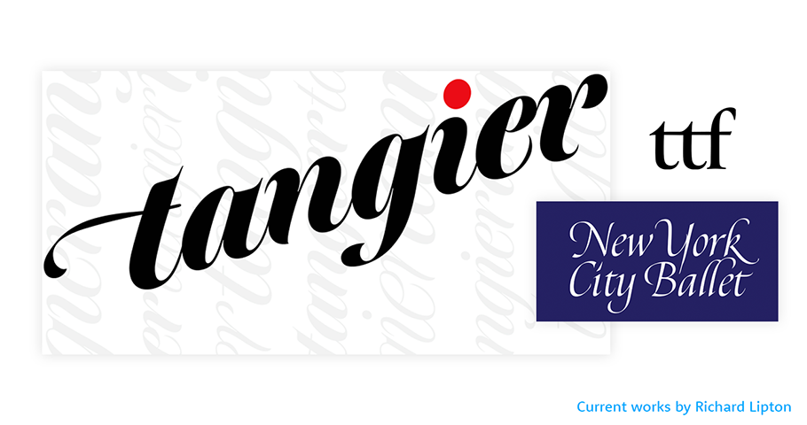
Give Richard Lipton a shout-out on social media using #CreativeCharacters @richardlipton @MyFonts.
We hope you enjoyed this interview. Check out previous interviews of up and coming creative characters.


