Classic Grotesque™ Font Field Guide

FOUNDRY: Monotype
DESIGNER: Rod McDonald
CLASSIFICATION: Sans Serif Grotesque
BEST PRACTICES
When asked about the intended uses for Classic Grotesque, McDonald’s answer was, “Graphic and interactive designers will probably use Classic Grotesque in ways that I would never imagine. I’ve used pre-release versions of the family in ads and in books, and they worked remarkably well in both. I can’t think of many places where Classic Grotesque won’t perform well.”

FAMILY
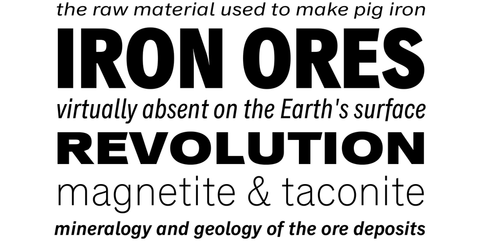
The Classic Grotesque family is comprised of seven weights each of normal, condensed, compressed, and extended designs, from light to extra bold, each with a cursive italic complement – for a total of 56 styles.
FONT FACTS
- The Classic Grotesque family is the culmination of 8 years of design research, sketching, drawing, testing, editing, and refining.
- Alternatives characters, like the closed a, bowl and loop g and old style e, available through the OpenType® format.
ROOTS
A melding and reimaging of seminal typefaces from the first part of the 20th century, the Classic Grotesque family pays homage to classic styles such as Akzidenz Grotesk®, Ideal Grotesk, and Venus, providing a 21st century alternative designed to perform equally well in print and on screen.
The first Classic Grotesque typefaces were introduced in 2012, then expanded, in 2016.

LEGIBILITY
Modest stroke width variations, letters with a distinct personality and simple character shapes make for a highly legible design in a wide range of sizes in both hardcopy and digital imaging.

Alternate Choices
Perfect Pairing
Download a PDF version of the Classic Grotesque Font Field Guide and view the Classic Grotesque font family.
More Font Field Guides

Diotima Classic® Font Field Guide
Diotima Classic Regular and Bold are distinctive – and still highly legible at text sizes. Diotima Classic Light can also be an excellent choice for short blocks of text copy. It, and the Bold and Heavy weights, create striking headlines.

While “Text” weights have been designed, Neue Plak is essentially a display design. Neue Plak’s somewhat quirky design traits, make it an excellent alternative to more structured geometric sans serif typefaces.


