Perpetua Font Field Guide

Foundry: Monotype Designers: Eric Gill Classification: Transitional Serif
Best Practices
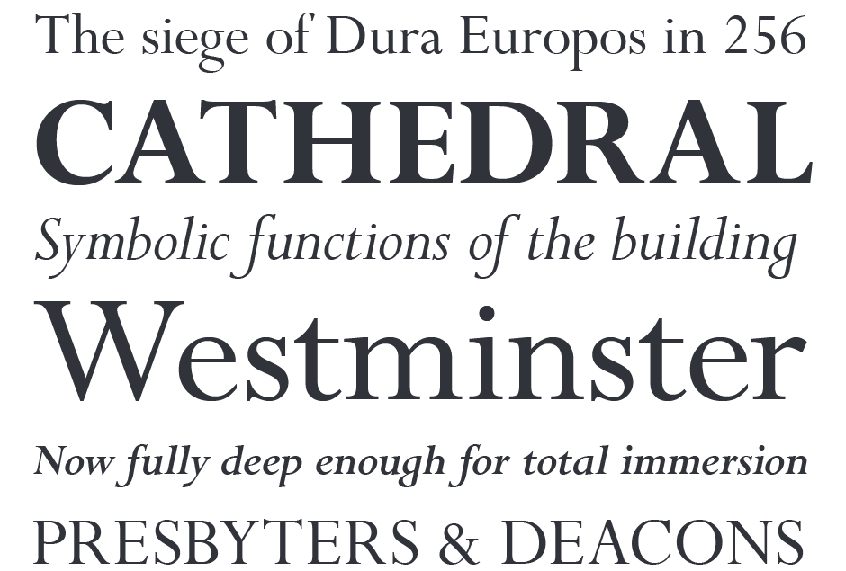
Because of its fine hairlines and delicate serifs, Perpetua should be set a little larger in on-screen applications than in print. The bold design is sufficiently heavier than the roman weight, ensuring differentiation on screen. It is not a large family, however, and would not be a good typeface, on its own, for complicated branding projects.

Family
Two weights, each with a supporting italic design and three weights of titling.
Font Facts
- First use was in the English translation of The Passion of Perpetua and Felicity.
- The roman was named “Perpetua.” The first italic, named “Felicity,” was a sloped roman. Later, a traditional, cursive, italic was designed.
- Although design began before Gill Sans, Perpetua – seven years in the making – was released after Gill’s famous sans.
Roots
Perpetua was to be the first original typeface in Stanley Morison’s plan for building the Monotype type library. He wanted the design patterned after epigraphic rather than calligraphic letters, and asked Eric Gill to create the design. Morison circumvented potential Monotype reluctance to the project by commissioning Charles Malin, to cut a set of punches. These were presented to Monotype as proof of the quality of the new design.

Legibility
Characters are distinctive, generally making them legible. Tight apertures, however, detract from legibility – especially at smaller sizes.
How to spot Perpetua


