Trade Gothic® Next Font Field Guide

FOUNDRY: Linotype, DESIGNERS: Akira Kobayashi and Jackson Burke & CLASSIFICATION: Sans Serif and Grotesque Sans
Best Practices
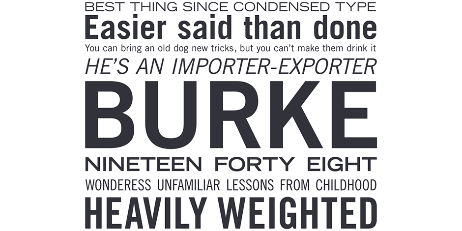
The Trade Gothic® Next family maintains the distinctive Mid-20th century design traits of the original Trade Gothic design, but benefits from a large systematic suite of weights.

FAMILY
The Trade Gothic Next family has four weights from light to heavy in regular and condensed proportions. Each roman design has an italic counterpart. In addition, the family has three compressed designs in regular, bold and heavy weights; In total 17 designs.
Font Facts
- The News Gothic™ family is very similar to Trade Gothic.
- The first designs were developed as alternatives to European sans serif typefaces of the 1920s and 1930s.
Roots
The first of the typefaces that were to eventually make up the Trade Gothic family were released in the late 1940s. They went by the simple names of “Gothic” with a numeric suffix (Gothic No. 17 through No. 20). These were condensed sans serif designs that proved to be very popular for what was then called “jobbing” or “trade” work. It wasn’t until several years later that designs of regular proportions were drawn and the group of faces was given the name of “Trade Gothic.”
Akira Kobayashi, one of Monotype’s type directors, took the design of Trade Gothic and updated to modern digital standards. Without losing the original’s natural personality, the new design is a more elegant – and much more versatile – typographic tool.

Legibility
Open counters, a large x-height and condensed proportions make Trade Gothic a highly legible and space economical design.
How To Spot Trade Gothic Next

Alternate Choices
Perfect Pairing
Download a pdf version of the Trade Gothic Next Font Field Guide and view Trade Gothic Next.
More Font Field Guides

Egyptian Slate™ Font Field Guide
The Egyptian Slate family is a large suite of designs that is ideally suited to branding, headlines and short form text copy in print and on screen. Its simple shapes, large x-height, open apertures and robust serifs also make it a good choice for small screen environments. Learn more

Dante® Font Field Guide
Mardersteig designed his typefaces for letterpress printing. The ultimate triumph of the Dante design is that it now serves the diverse needs of digital text typography. Designed as a “book face,” Dante can be ideal for long blocks of text copy. Learn more


