Font Pairing Myths
To help our customers better understand pairings, we spoke to the Monotype studio and wanted to share what we learned from them on their idea of Busting Myths About Font Pairings.
Typefaces play an important role in the graphic design and typography world. They are the basic elements that bring meaning to content and choosing different fonts for a project that pair well has always been one of the greatest challenges in graphic design.
Recommendations are rightly often based around the idea of contrasting different fonts rather than conflicting them – but what exactly defines a working contrast of two typefaces? There aren’t (and shouldn’t be) strong rules or dogmas in design and there is always the potential to bring your own visual preferences to play.
The number of different fonts we have at our disposal and the possibilities of matching them is countless, and the initial confusion over which fonts to select is only heightened by this fact. It is more important to look carefully at the type designs you are selecting, study their details in depth and make your own judgment towards good combinations of fonts for your own purposes, rather than following any recipes.
The truth is, rules are only there to be broken, so we have collected a few of the most common myths in typographic matchmaking and explained why they should be ignored-, - or at least taken with a pinch of salt.
Myth 1: ‘You shouldn’t use various font designs in the same layout’
Often designers say that mixing different typefaces in the same design is a terrible mistake. This may be true in some cases but actually it depends. Typographical diversity is not always undesirable. It can be seen by more conservative designers as something which doesn’t work in principle. But by studying details and strengths of different typefaces, it is possible to create working systems which rely effectively on type designs with different tones of voice.

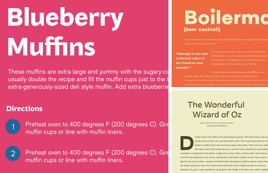
In the example above we have 4 different typefaces working well together in a coherent hierarchy. FS Aldrin in the main heading, FS Pimlico for the large numbers, FS Dillon for the sections, and FS Silas Slab for the body text. They work well together because each one is used for a different section of the piece
Myth 2: ‘Try to use the same type family throughout your design’
Using the same family throughout your whole design is of course possible and often works well, but can rule out potential pairs. Type families with sans, serif, and other variants are often handy for ease, but it is also possible to achieve good or even better results by planning your hierarchy using different families.

FS Silas Sans and FS Silas Slab are used throughout the layout above making use of its different weights and variants, creating a concise hierarchy consisting of running text set in the slab version, and sub-heads and titles in the sans version. The second layout is set using FS Brabo for the main text and FS Lucas for headlines and titles. Even though the layout makes use of two very different families, the hierarchy remains concise and clear.
Myth 3: ‘Don’t use two very similar font designs together’
Another common belief and an apparently obvious rule of thumb, is that mixing two very similar type designs in the same layout is a primary error, as the reader might notice the slight differences and think it is a mistake. There are cases though, in which this recommendation doesn’t make sense – sometimes it might be better to use one sans design for headline in a specific weight, and a very similar design for the running text in a thinner weight – creating a coherent visual system. The typefaces aren’t exactly the same but their slight differences aren’t important at all.

The layout above shows FS Albert Narrow for titles and FS Me for the main text. FS Me was selected for its accessible characteristics, but as it doesn’t have a narrow version, FS Albert Narrow was brought in for the titles. Both families follow a similar structure and skeleton, but they do not conflict when used together.
Myth 4: ‘Sans for heading, serif for body text’.
It is true and a well-known fact that serifs help to make words more recognizable and legible for continuous reading, and we rarely see a printed novel or newspaper text set in a sans serif. However, as technology changes, we are gradually becoming more familiar with quickly reading messages, emails and news on screens and small devices which emit light, so the situation is changing a bit. A sans, for its simpler structure of shapes, will render better and be more legible, direct and welcoming to read on screens. You may argue that screen technology is evolving and soon screens or e-readers will be very close to print, but at least for the time being, they aren’t, so this recommendation shouldn’t be taken as a general rule. Serif fonts may work or be designed for smaller screen use, but in some situations a sans design will do the job in a similar or perhaps even more effective manner.

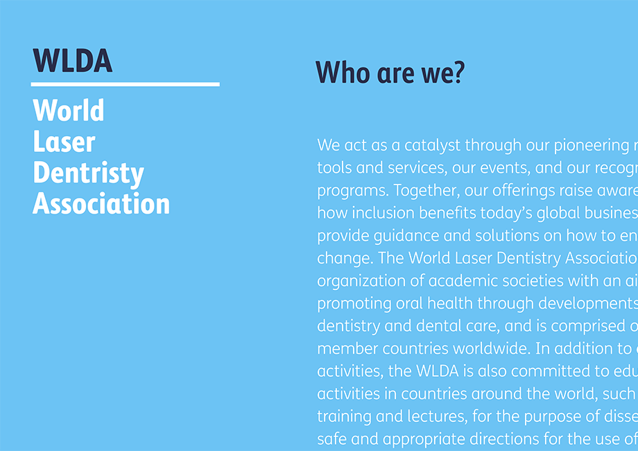
The example above shows sans serif FS Millbank for the headline and captions and serif FS Sally for the body copy. Both typefaces work well because they have similar skeletal proportions and letterform characteristics.
The second example uses a sans serif typeface in the body text which is better for reading online. Using a serif for headings and subheadings creates differentiation alongside different weights and italics.
Check out Busting Myths About Font Pairings – Conclusion and Tips from the Monotype Studio.
Here are the Studio’s recommendations of what to do whenever you are feeling lost with which fonts to pair in a project:
- Match the brief but forget all the rules
Firstly, analyze your brief and the content you need to communicate. Start thinking about the structure of your design and its hierarchies. Avoid looking for help from articles or indications of working pairs – the design decisions should be yours!
- Be brave – don’t stick to the same tried and tested combinations
analyze as many font designs as you can. Study their characteristics, features, strengths and weaknesses. Ask yourself if you really need to combine two, three or more different fonts, and why.
- Type setting is important
Last but not least, make sure you set your selected typefaces correctly in terms of text adjustment. Setting typefaces properly in terms of size, leading and other typographic features plays an important role in creating an effective match, and communicating your message effectively.
Interested in learning even more about how to pair fonts? Check out these resources: