Hidden Gem Bodoni™

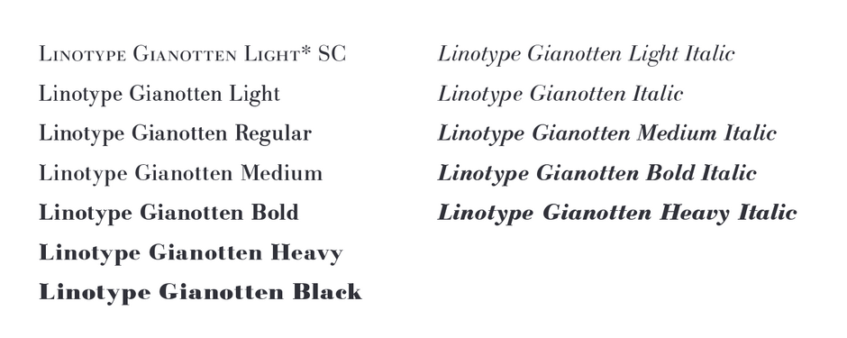
FOUNDRY: Bitstream, Linotype, International Typeface Corporation, Monotype, and several others
DESIGNER: Giambattista Bodoni, and many others
CLASSIFICATION: Neoclassical Serif
WHY BODONI
- Bodoni’s high contrast of thick and thin strokes, refined curves and sharp serifs create striking visual impact.
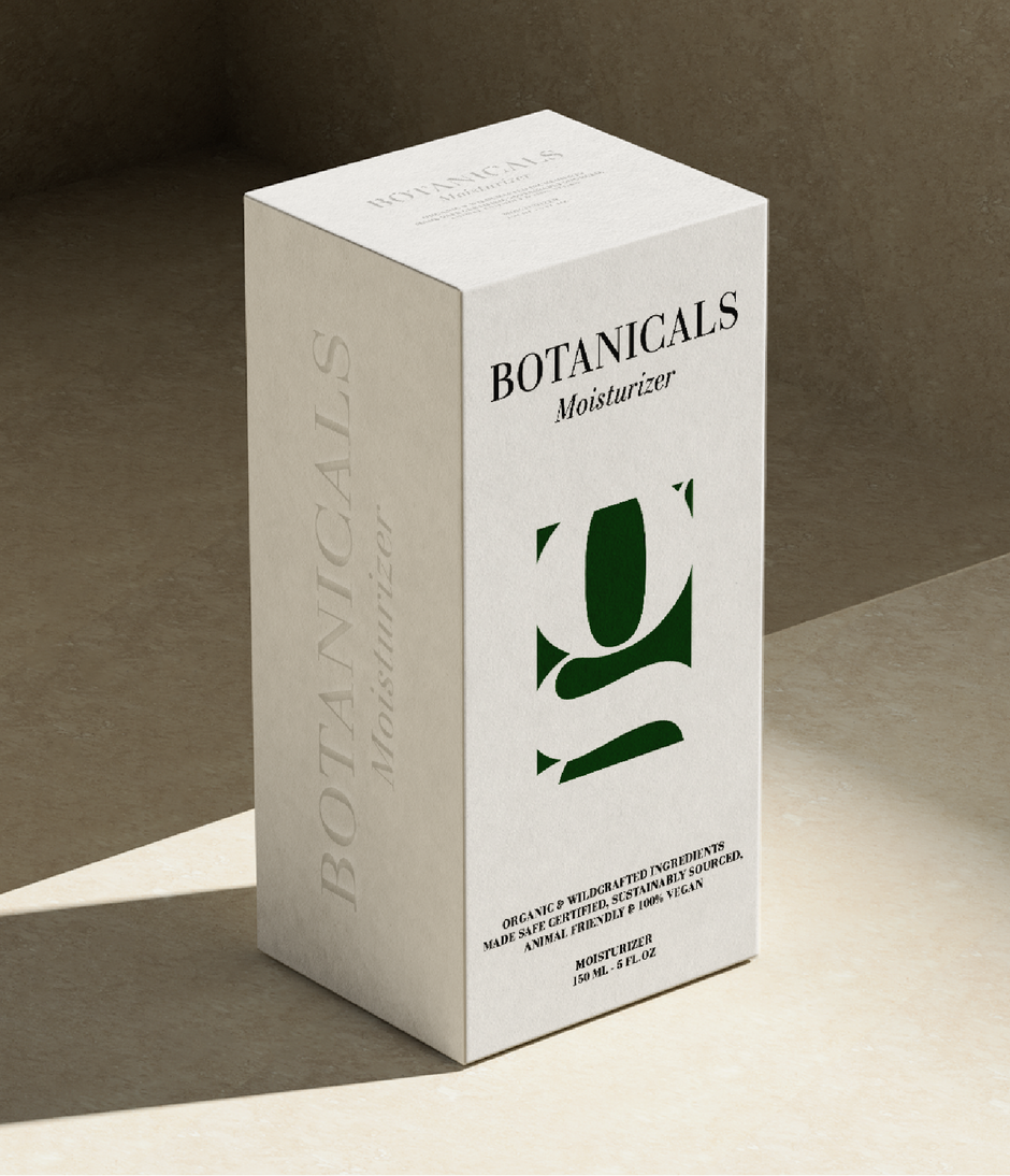
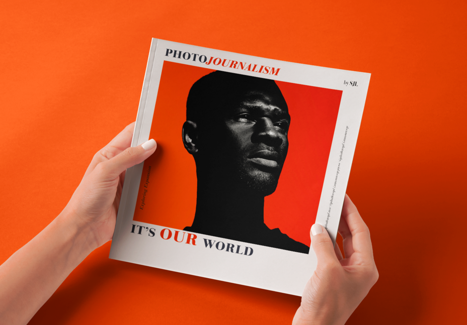
- The Bodoni typestyle is a staple of elegant graphic communication. It shines in editorial design, branding, and advertising, evoking a sense of luxury and tradition. The meticulous craftsmanship evident in Bodoni’s original letterforms ensure its place as a classic of typographic design.

ANCESTRY
- Designed by Giambattista Bodoni in the late 18th century, his designs have been widely replicated and interpreted many times. The original Bodoni designs, however, remain, challenging to replicate. This is because Bodoni created over 140 Roman fonts with italic counterparts, each featuring signature design traits adjusted for various sizes and applications.
- The first modern revival was by Morris Fuller Benton for the American Type Founders Company (ATF) in 1910. Drawing on the best qualities from Bodoni’s printed works. This revival was not a direct copy but an interpretation of Bodoni’s distinctive style.
- Fonts produced in the early 20th century often featured harsh serifs that diverged from Bodoni’s softer, friendlier designs – and rarely captured the essence of his original italics. Later phototype versions either copied metal fonts or attempted – without much success – to interpret Bodoni’s original designs.
- Recently, new interpretations of Bodoni’s original work have emerged from International Typeface Corporation, Linotype, and Monotype, marking significant advancements in the revivals of his work.


PAIRING BODONI
- Humanistic sans serif designs like Frutiger® Next or ITC Legacy® Sans provide an excellent visual counterpoint to Bodoni.
- Geometric sans, such as Futura® Next and ITC Avant Garde Gothic, also make for dynamic contrasting pairings with any Bodoni font.
- Serif designs can also be powerful pairing partners. Look to designs like ITC Charter® and Neue Swift®.
CLASSIC FACTS
- Bodoni once confided to a friend that he agonized more than six months and produced thousands of trial proofs in the process of choosing just the right type for the title page on one of his books!
- Giambattista Bodoni was clearly a perfectionist – but he was also pragmatic. Research into his original metal punches reveal that he used the punch for the number 6, upside-down, to produce type for the number 9. Current type designers realize that these are two different characters with subtle stroke-weight differences.

