Hidden Gem Optima Nova®

WHY OPTIMA NOVA
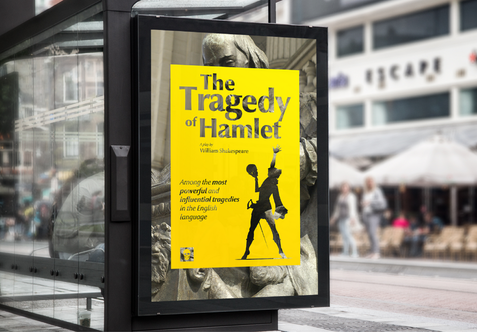
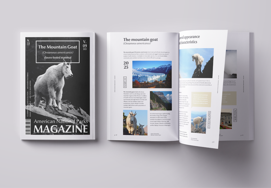
- Few typefaces meld so handsomely with both serif and sans serif designs. Optima Nova scales easily from small text to billboard-size type, making it ideal for use in everything from books, magazines, and annual reports, to branding and advertising.
- Optima Nova is a timeless blend of elegance and practicality – a harmonious balance between classic serif and modern sans-serif aesthetics. Optima Nova’s distinct shapes, open counters, and generous apertures make it an exceptional communicator in both print and digital media.

ANCESTRY
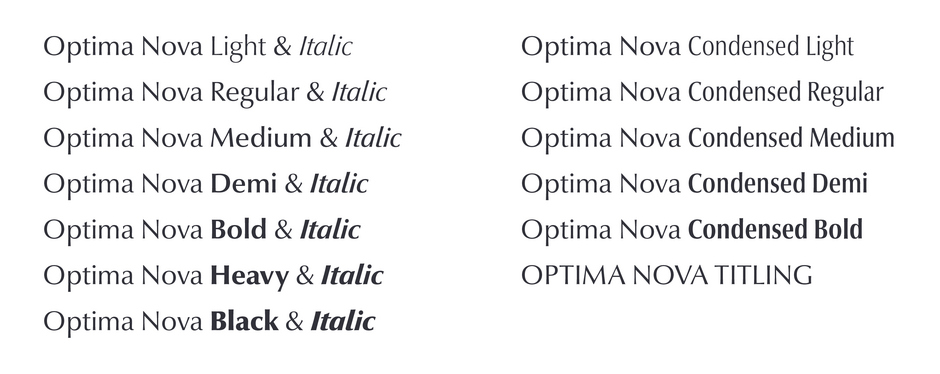
- Optima was released in 1958. There are 14 typefaces in the digital family – plus two Cyrillic designs.
- More than 50 years after the first release of Optima, Zapf was provided the unusual opportunity to redraw the design for digital typesetting. In doing so, he was able to collaborate with Akira Kobayashi, type director for the Linotype Library.
- Zapf and Kobayashi corrected the inherent spacing and proportion problems that had been the result of metal typesetting technology.
- The Optima Nova family has seven weights of roman condensed designs and each with an italic counterpart. The italics are also true cursive designs, while the original Optima italics were obliqued roman designs.
- The family also has five weights of italic designs and a titling font.


PAIRING OPTIMA NOVA
- Pair Optima Nova with humanistic serif designs like Monotype Century Old Style™ and Dante®.
- Slab serif typefaces like Egyptian Slate™ and Joanna® Nova provide an excellent visual counterpoint to Optima Nova.
- Sans serif fonts are not outside of Optima Nova’s typographic pairing partners. Look to grotesques like Helvetica® Now and square sans like Cachet™.
CLASSIC FACTS
- In 1950, Zapf was researching Italian typeface design at the Basilica di Santa Croce, in Florence, and happened upon an ancient Roman gravestone that would have been missed by casual observers.
- The letters cut into the gravestone were unusual in that they lacked the traditional serifs. These delighted Zapf and appealed to his classic sense of design. The problem was that he had run out of drawing paper just prior to finding the gravestones. As a result, the first sketches for Optima were made on a 1,000-lire bank note.
FAMILY

