Monotype Studio Pairings Guide
We asked Monotype Creative Type Directors Charles Nix and Sara Soskolne to choose pairings from a selection of MyFonts typefaces and families and share details about “why” each pairing works, as well as their thought process when combining type.
In the spirit of full disclosure, we should admit that we’re choosing pairings from a list of more than 100 faces/families. There’s a virtue in this in that the universe of possibilities has been limited for us. But, 100 faces/families is still a lot, and the bigger part of this pairing exercise is knowing what not to choose. Some combinations just won’t work. Sometimes finding a mate for a particular typeface is on the difficult-to-impossible side of the spectrum.
I love assignments like this. Of course, I love looking at type, but this is like the challenge of checking what’s in left in the fridge and pantry and coming up with a meal. In keeping with that metaphor, let’s start with an easy dessert.
Luthon Southard Script by Lemonthe & TT Arlen by TypeType

Vastly Different:
Pairing is about contrast. A fat sans like TT Arlen and a monoline script like Luthon Southard combine to provide maximum formal contrast.
- Charles Nix
Akkordeon Slab Six by Emtype Foundry & The Billion Regular by Lemonthe
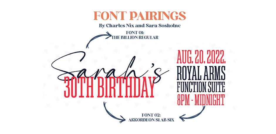
It doesn’t have to be a fat face sans and a monoline script; contrast is the key.
- Charles Nix
Manofa & Apoka by The Northern Block
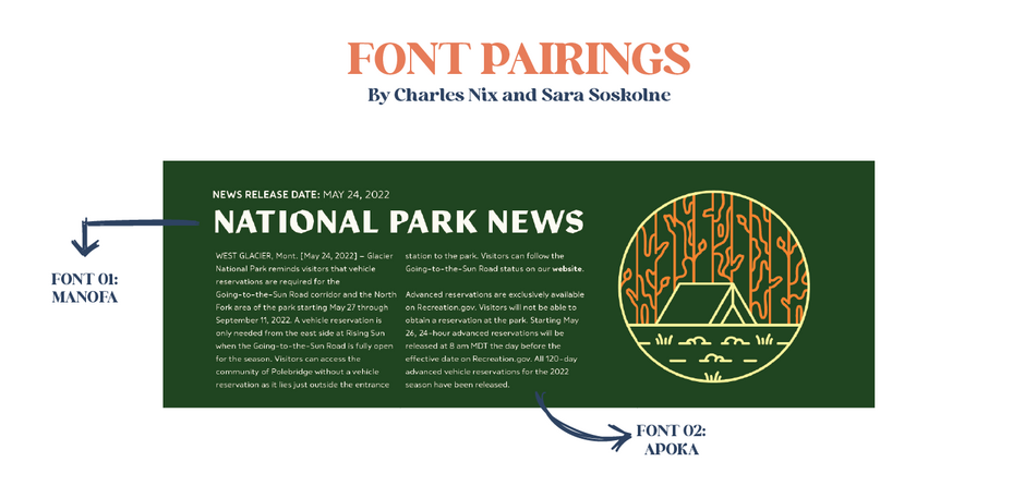
The same bones:
A pairing like this works because while the typefaces’ styling are completely different (which provides the all-important contrast Charles mentioned), their underlying skeletons are similar in shape — their x-heights, open apertures, simplicity of form — and proportion. The angularity of Manofa paired with the softness of Apoka yields inline contrast at its best.
- Sara Soskolne
Geogrotesque Slab & Akkordeon Sans by Emtype
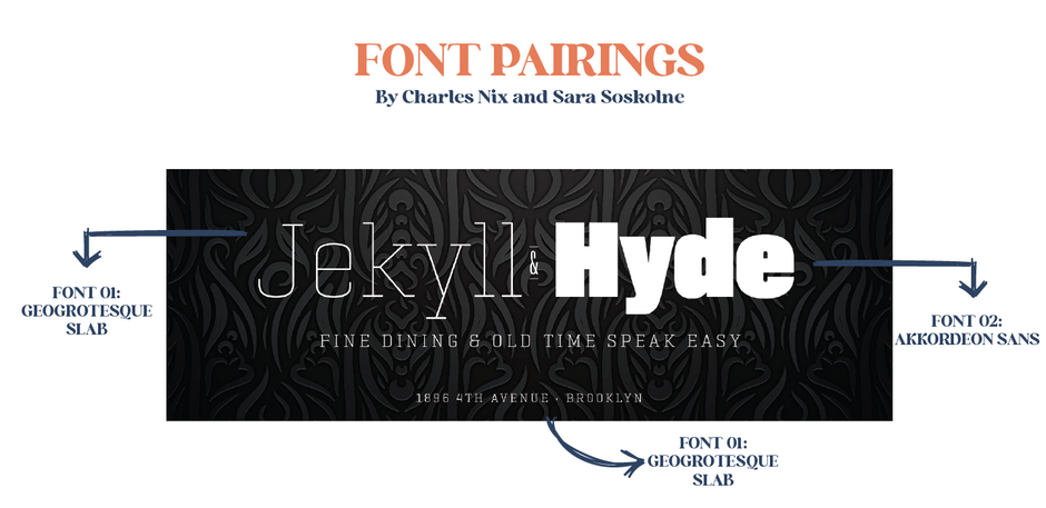
Seismic weight shifts:
With this pairing, most everything is different in the two choices (extreme variation in weight, serif versus sans) except that both are monolinear, and have somewhat super-elliptical curves, which gives them just enough of a familial resemblance to connect them — like cousins rather than siblings.
- Sara Soskolne
Quincy by Connary Fagen & Portland from Fenotype
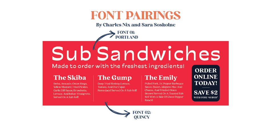
Strange bedfellows:
Going outside the same family or same foundry approach, I aimed for a strange-bedfellows approach here, with a contemporary and eclectic pairing.
- Sara Soskolne
We could even look beyond pairings into triplets, quadruplets, and quintuplets, and further into 19th-century-style circus-poster typographic soups (like the “Mix-Up” style that’s popping up everywhere and that we called out in our Trends report). But those require an almost horse-whisperer kinship with type.
- Charles Nix
Ramillas by TypeType & Visby Round by Connary Fagen
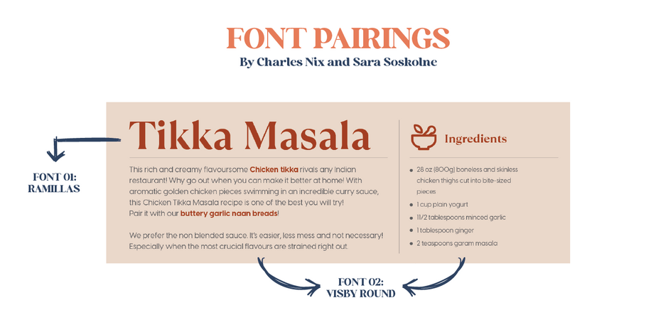
Same weight, different clothes:
Here, I focused on a simpler idea: pairing fonts of two completely different styles in the same weight. The subtle stroke contrast in Ramillas adds an important dimension of difference from the monoline strokes of Visby; but alternatively, Visby could also be paired with another monoline face in the same weight with a totally different structure — like a script or a blackletter. (Aside: That ff ligature in Ramillas is :chefs kiss:)
- Sara Soskolne
Trend by Latinotype
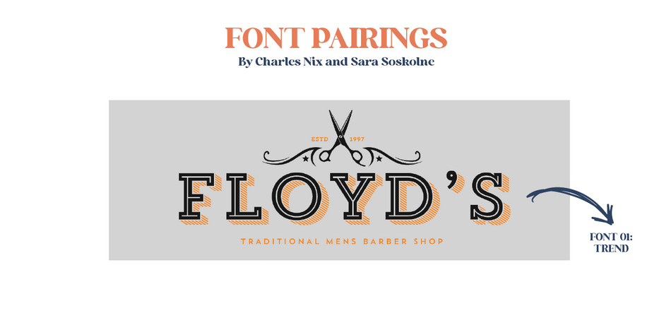
Meal kits:
Along similar lines, another strategy is to find a family that provides you with a wide-ranging kit of parts that you can combine in innumerable different ways. There are so many possible versions of this lockup just from this one family: every possible combination of inline, sans, slab, and shaded versions of the same essential set of forms. This is a reliable approach, especially for the pairing beginner.
- Sara Soskolne
Luckily, a few foundries, like The Northern Block for example, are creating the typographic equivalent of a food delivery service. Their Karlo family has five weights of Sans (plus lively italics); five weights of Serif (again, plus lively italics); and two Open style fonts (Open Regular and Open Italic) – perfect for pairing.
- Charles Nix
Blacker Pro by Zetafonts

Traditional systems:
Continuing with the “meal-in-a-box” family approach, there are more traditional systems in which the usage is implied. We’re talking optical sizes – specific typefaces for specific sizes: close-up ready Display fonts; workhorse Text fonts; and rugged Micro fonts. There are a couple of those in our list, like Blacker Pro from Zeta Fonts.
- Charles Nix
Klik by Fenotype
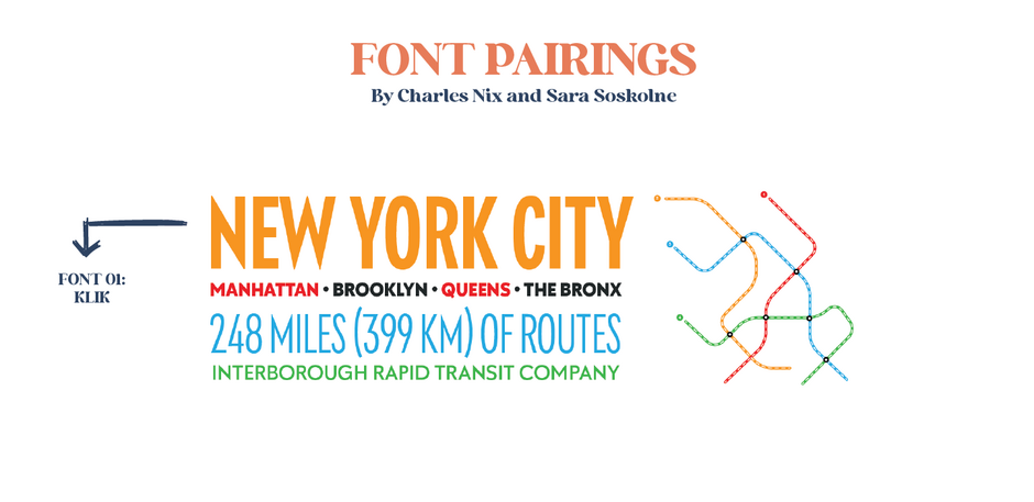
Push and pull:
We’ve not paid much attention to the width axis, so let’s make up for that in this digestif menu. It uses just a small portion of the vast Klik family from Fenotype, taking advantage of both weight and width contrast, resulting in a nice push-pull combination.
- Charles Nix & Sara Soskolne
- Sara Soskolne