Black White & Red Manual

Black, white and red are the three most powerful colors for typographic communication:
White, that’s your background
Black, always the best for type
Red, the proven winner for emphasis and drama
White is the brightest, and can be the perfect backdrop for any other color put on top of it. All other colors stand out from, and contrast with, white. It is the ideal foundation for graphic communication.

Because black holds the greatest contrast against white, it is the best, most logical choice for type set on a white background. Type can be set in other colors but every step away from black is a step away from the perfect contrast – and the best shot at readability and comprehension. Gutenberg, Garamond, Caslon, Bodoni, and Baskerville could all have chosen to set their text in a color other than black – but didn’t. Hundreds of years later, we still revere their work as some of the best typography ever produced.
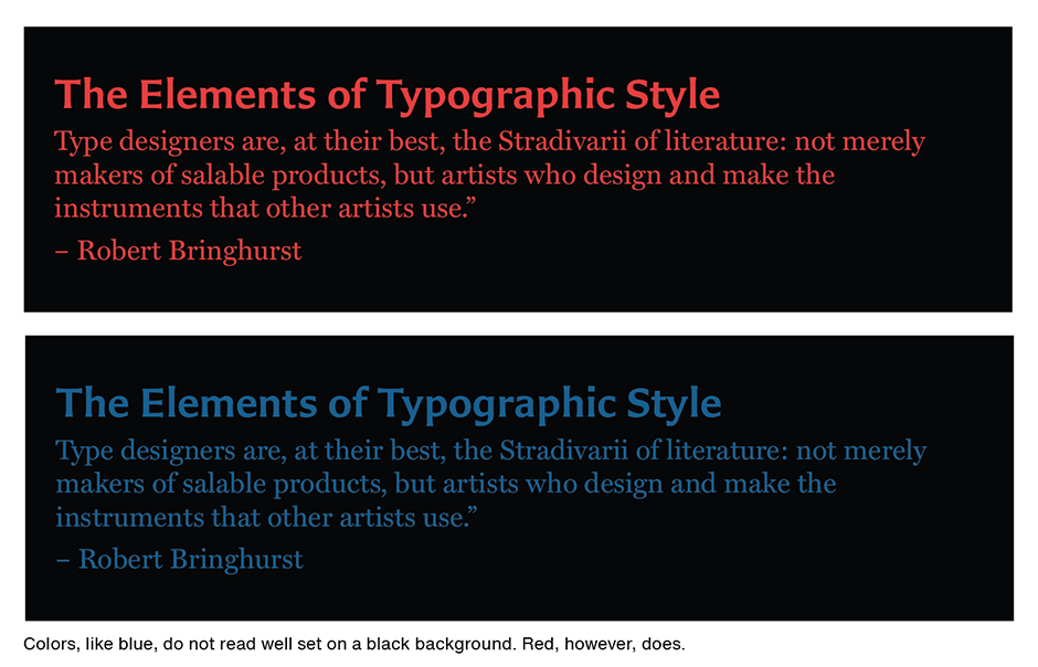
And then there is red. Yellow on white is difficult to read. Red on white isn’t. Blue type fades against a black background. Red won’t.

If you are considering third color for typographic communication, think of red first. It is the third most powerful color for type. Although it is powerful, it should not be used to replace black. Too much red type can easily become overpowering.

Download a pdf version of the Black White & Red Manual.


