Fine Points Of Design Manual
Most punctuation marks work fine right out of the box of your design application; typeface designers have taken care of that for you. There are a few instances, however, where you might want to adjust the punctuation for added finesse. Some of the most important and common of these adjustments follow.
The Right Quotes
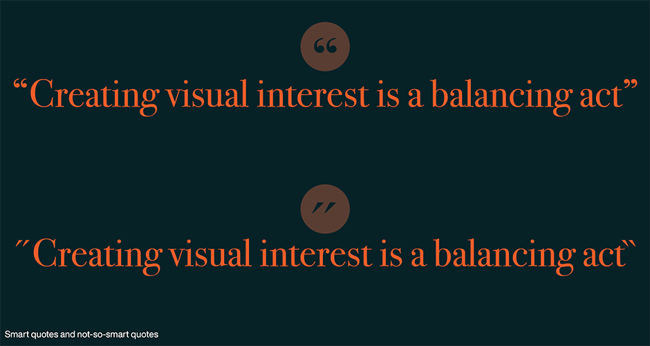
OK, it shouldn’t have to be said, but always use “smart” or “curly” quotes when setting type – never the foot or inch mark. A simple “preference setting” in virtually any software application will make smart quotes the default. Sometimes, however, files of copy containing the wrong quotes will arrive on your desktop from writers, co-workers and even bosses. Don’t assume that copy providers will do the right thing. Check all copy that you receive.
Correct Spacing
Also be on the lookout for the use of a double space after a period. When people used typewriters – and monospaced fonts – two spaces were needed after a period to distinguish the end of one sentence from the beginning of the next. Even though typewriters have not been used for word processing since fonts were something you could hold in your hand, the automatic addition of two spaces after a period remains a deeply engrained habit. One space after a period is the right number. As with dumb quotes, be sure that the copy you receive is purged of superfluous spaces.

Cap Alignment
Hyphens, en and em dashes, parentheses, braces and brackets look fine in lowercase settings because this is the context in which these characters are most often used, and type designers aligned them accordingly. The problem is that they can appear too low when set next to caps and lining figures. The larger the type, the more noticeable this will be. Use the baseline/shift feature of your layout program to raise the character slightly until it’s optically centered with the height the caps or lining figures.

Hung Punctuation
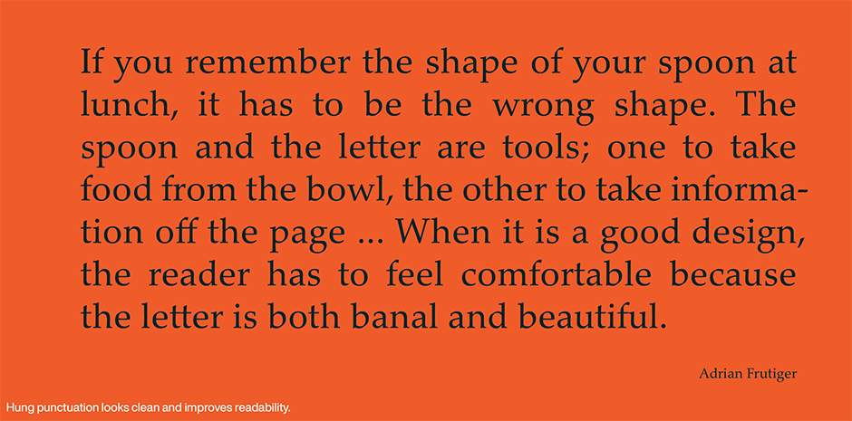
The practice of extending lines of text that begin or end with punctuation marks slightly into the margin to improve the optical alignment of the column is referred to as hung punctuation. In flush left or justified text, a line that begins with quotation marks or an apostrophe can appear to be indented. This is because these punctuation marks are smaller than most other characters, with large amounts of white space surrounding them.
The same problem can occur in the right margin of flush right or justified text. Lines ending with quotation marks, apostrophes, periods, commas, hyphens, or asterisks will appear to end short of the margin. If available, use the optical margin alignment feature in your design application to create margins that are visually smooth.
Downsizing Punctuation
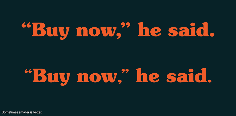
Punctuation almost always looks too big at display sizes. If you are setting headlines, subheads or other copy larger than 24 point, try downsizing the punctuation by a few points.
Eliminating Clutter
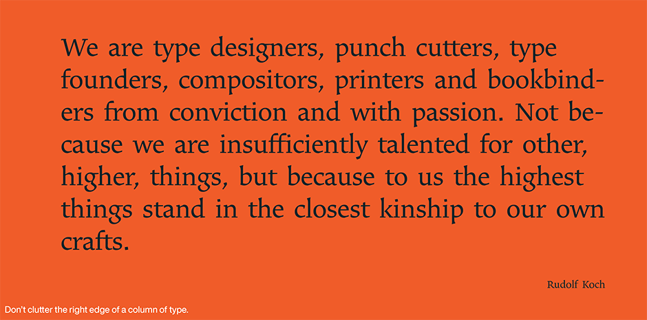
A bunch of hyphens stacked up in the right margin is distracting to the reader. Some say there shouldn’t be more than two hyphens in a row. An even better rule is that there shouldn’t be more than two punctuation marks of any kind stacked on top of each other
Typefaces used in this article
Download a pdf version of the Fine Points Of Design Manual.


