Fonts from Parachute.

Parachute® is a digital type foundry dedicated to crafting bespoke typefaces, multilingual corporate fonts, and custom lettering. Known for developing proprietary designs trusted by some of the world’s most iconic brands and institutions, we pride ourselves on pushing the boundaries of modern typography through innovative collaborations with visionary organizations. With a focus on excellence, we deliver type solutions that elevate brands and captivate audiences worldwide.
Popular Parachute fonts.
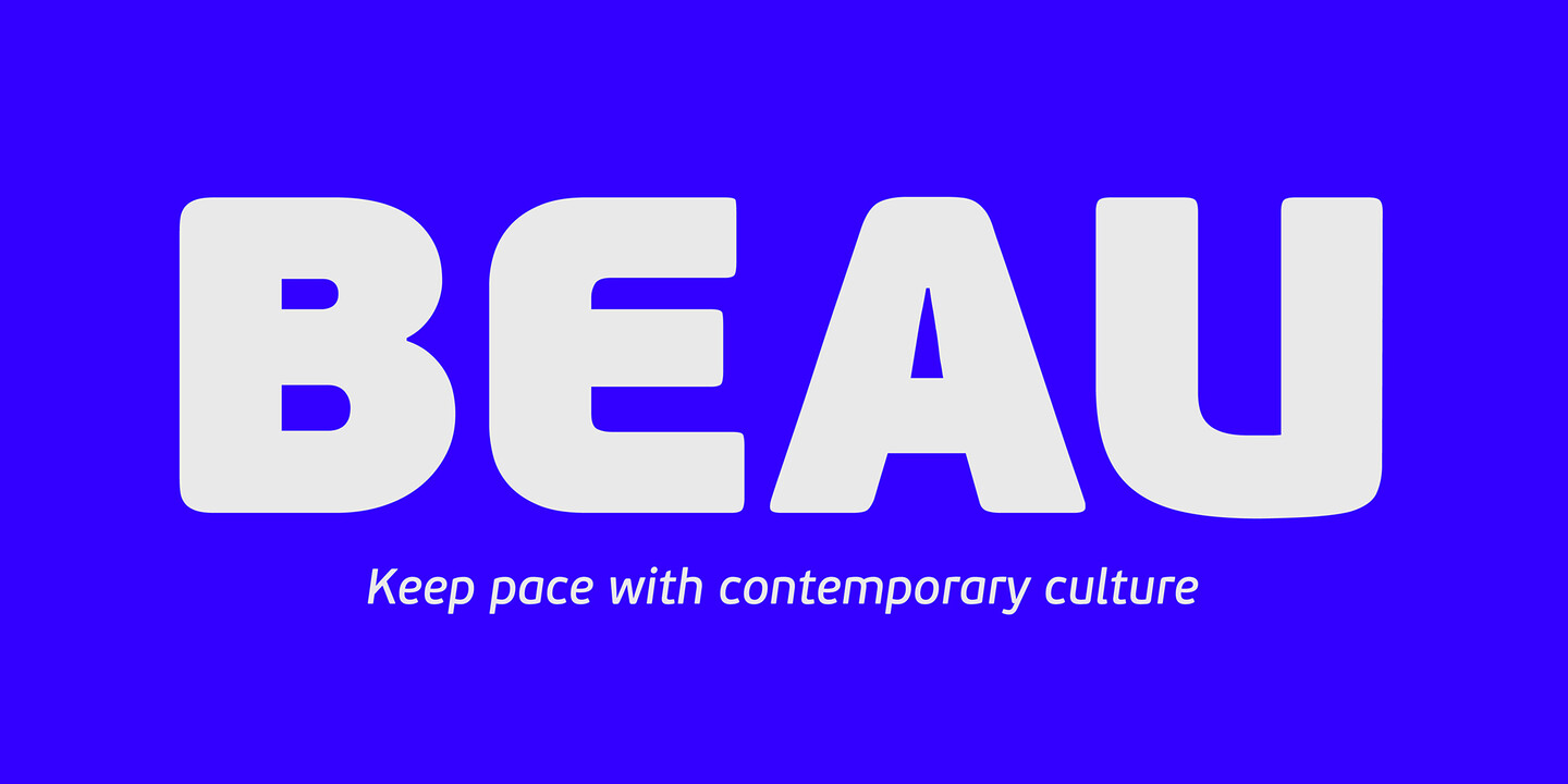
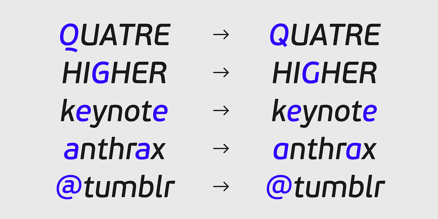
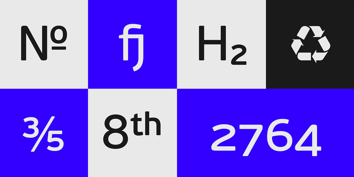
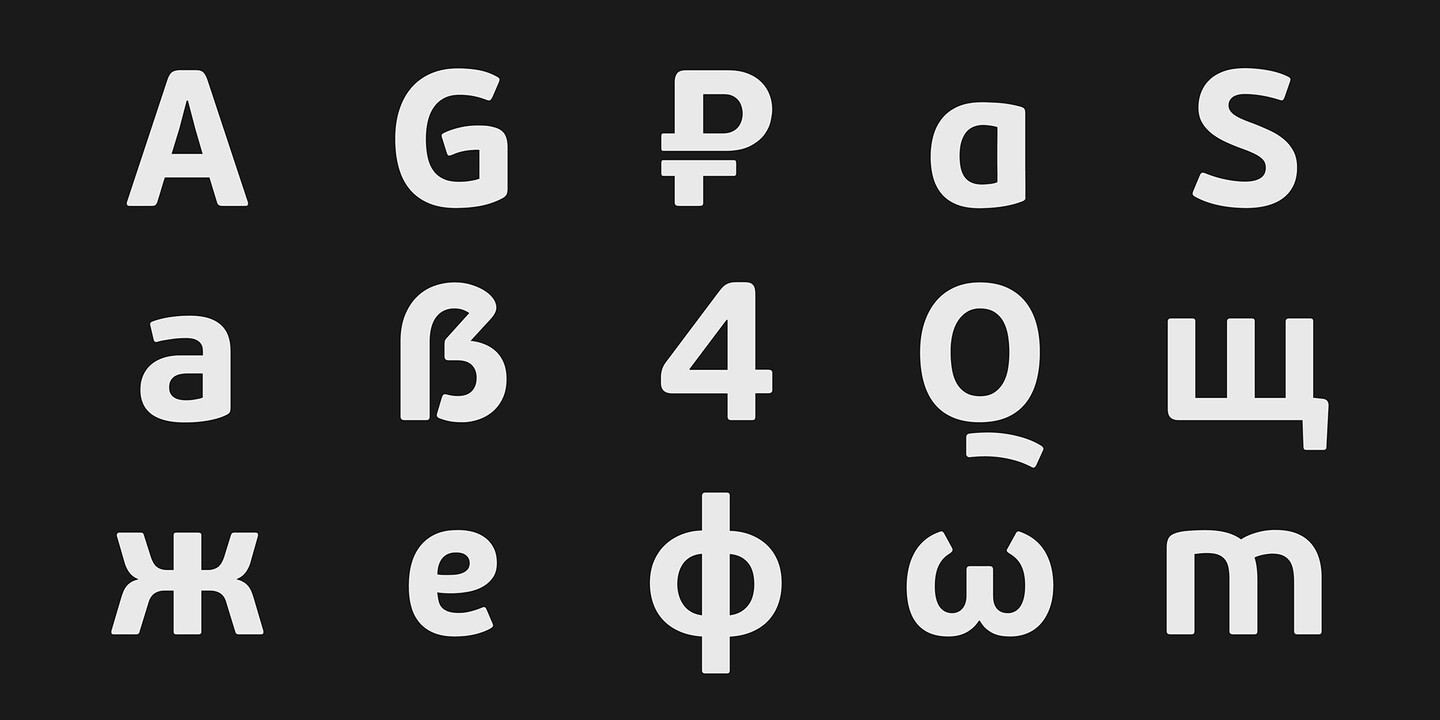
Beau Sans is a meticulously crafted sans serif family defined by soft, humanistic details and a clear, inviting texture on the page. Its generous x-height and simplified forms make it exceptionally readable in long passages of text, while its refined geometry gives it a calm, confident presence in display settings. Since its original release, Beau Sans has become a signature Parachute design—one widely adopted by major international brands across sectors ranging from corporate identity and advertising to packaging and large-scale communication systems.
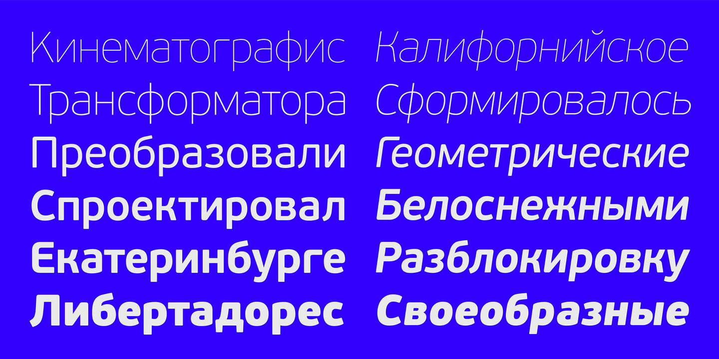
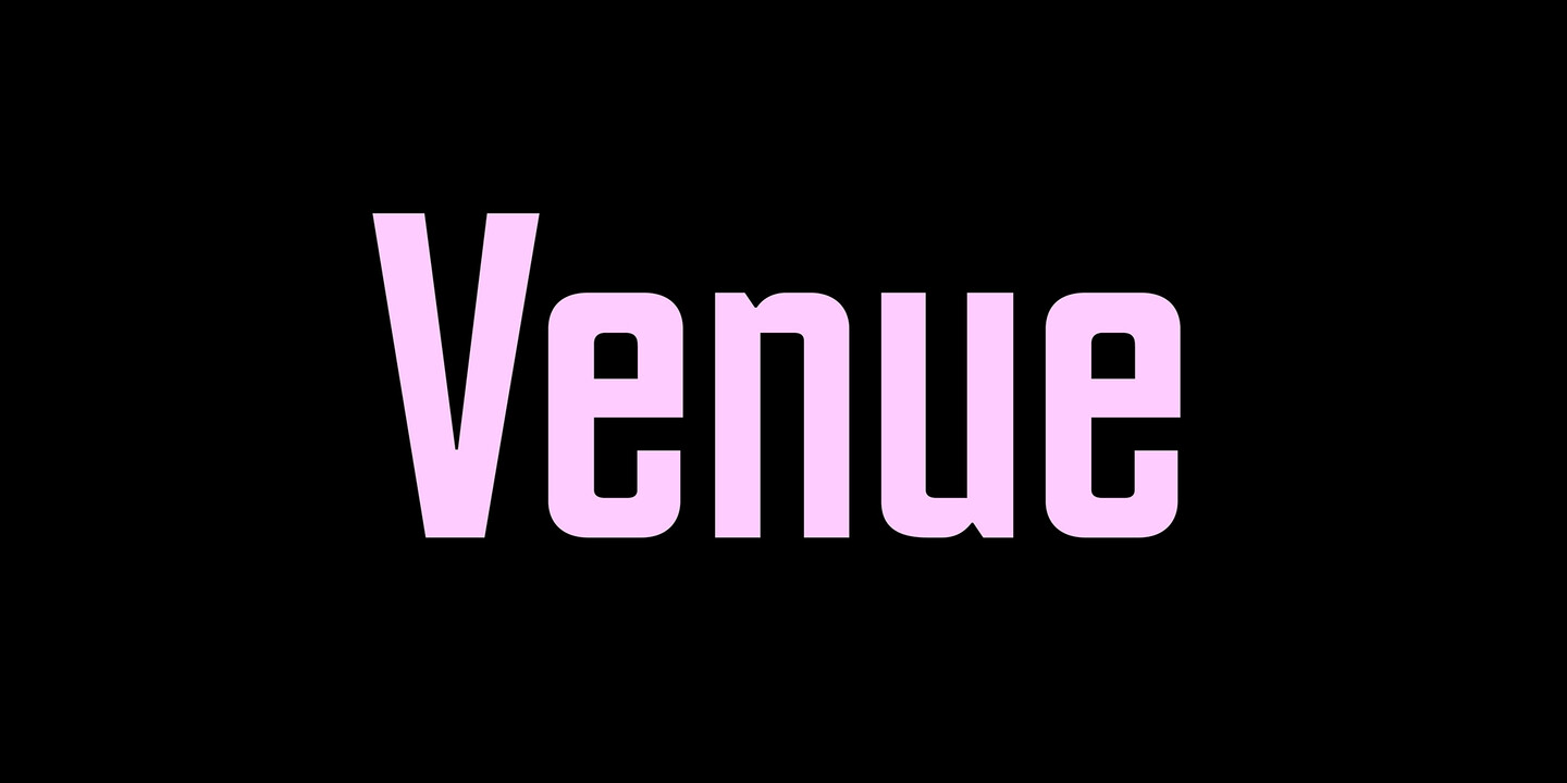
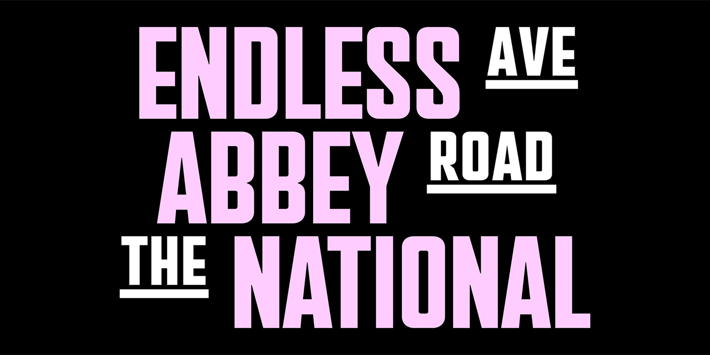
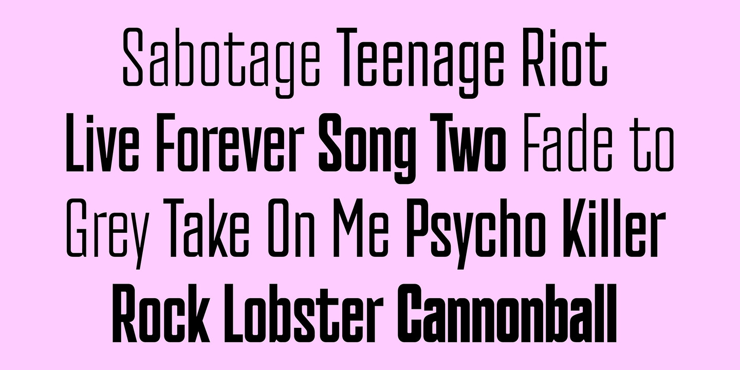
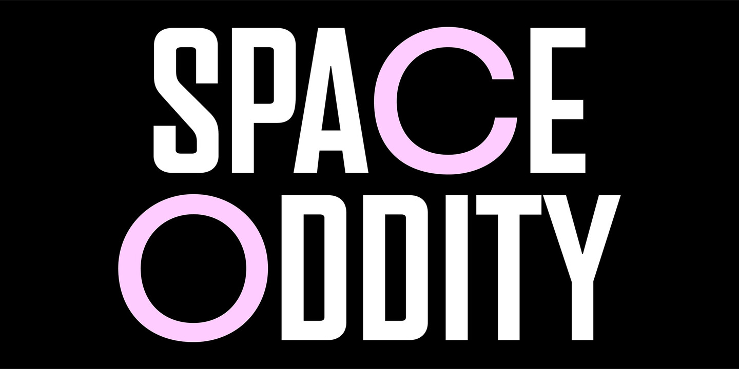
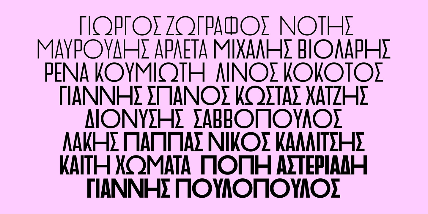
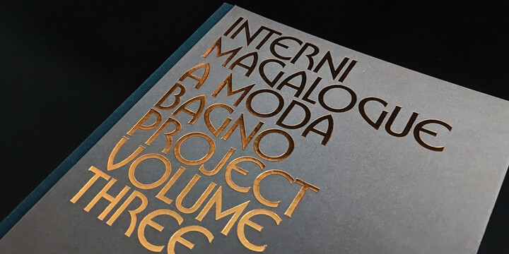
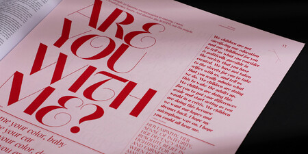
Venue is inspired by the sleek, geometric elegance of Art Deco, featuring bold monostroke forms and a generous x-height. Its two families, with alternate letterforms, create unique textures, while the interplay of narrow and wide shapes gives it a striking, eye-catching personality. Perfect for posters, ads, book covers, and avant-garde fashion editorials, Venue supports Latin, Greek, and Cyrillic scripts, offering endless creative possibilities across its full collection of families and alternates.
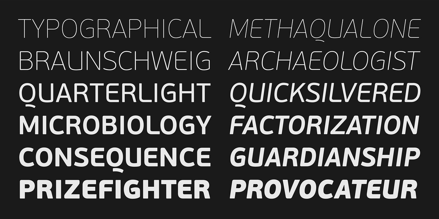
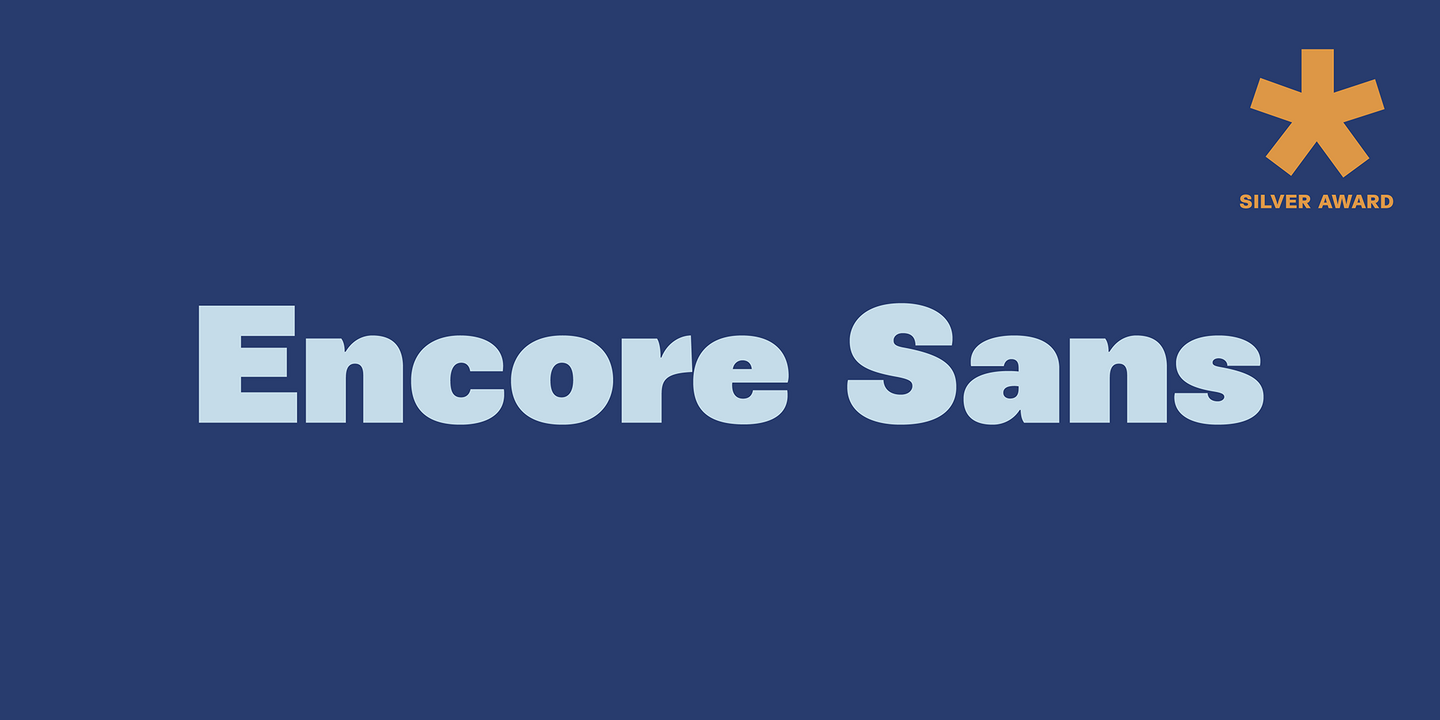
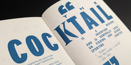
With subtle round details like gently curved-in edges, Encore Sans achieves a modern look while nodding to traditional typographic forms, creating a harmonious blend of classic and contemporary design. This thoughtful balance ensures versatility across a wide range of uses, from print to digital media. Extreme weights are crafted with precision: the elegant hairline maintains even colour and readability, while the boldest ultra-black retains clarity and impact despite its intensity. Its refined design earned a Silver Award from the European Design Awards.
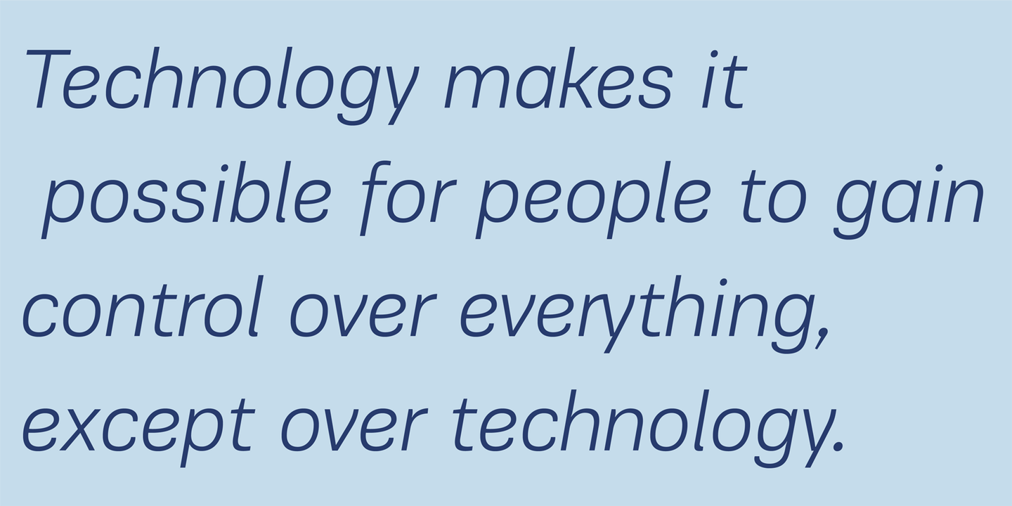
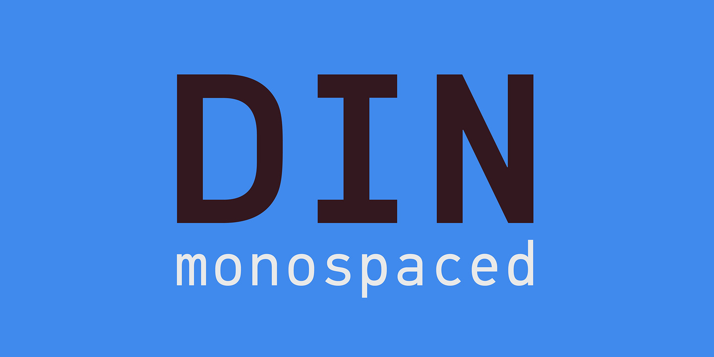
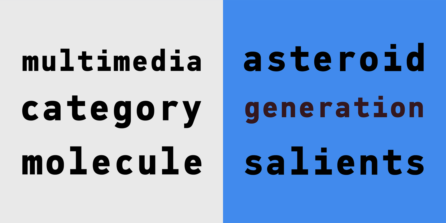
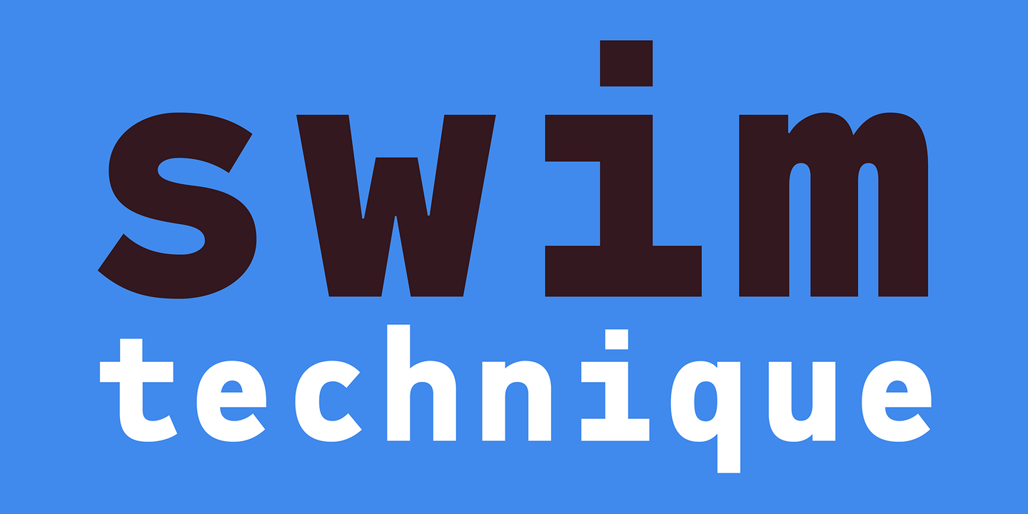
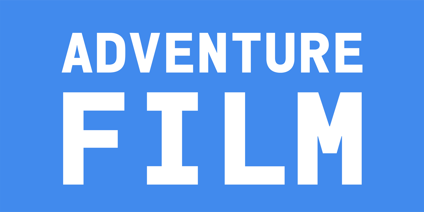
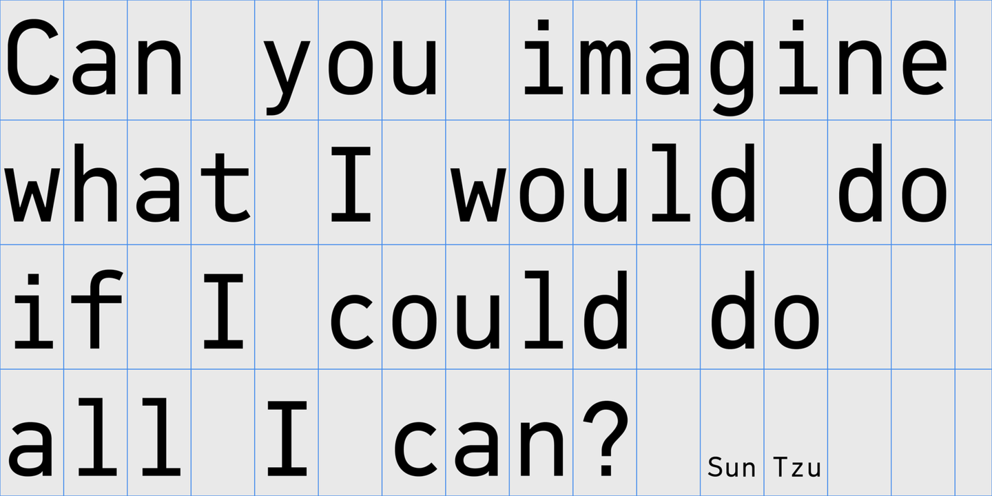
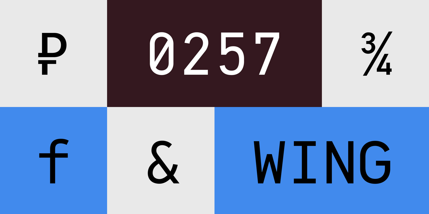
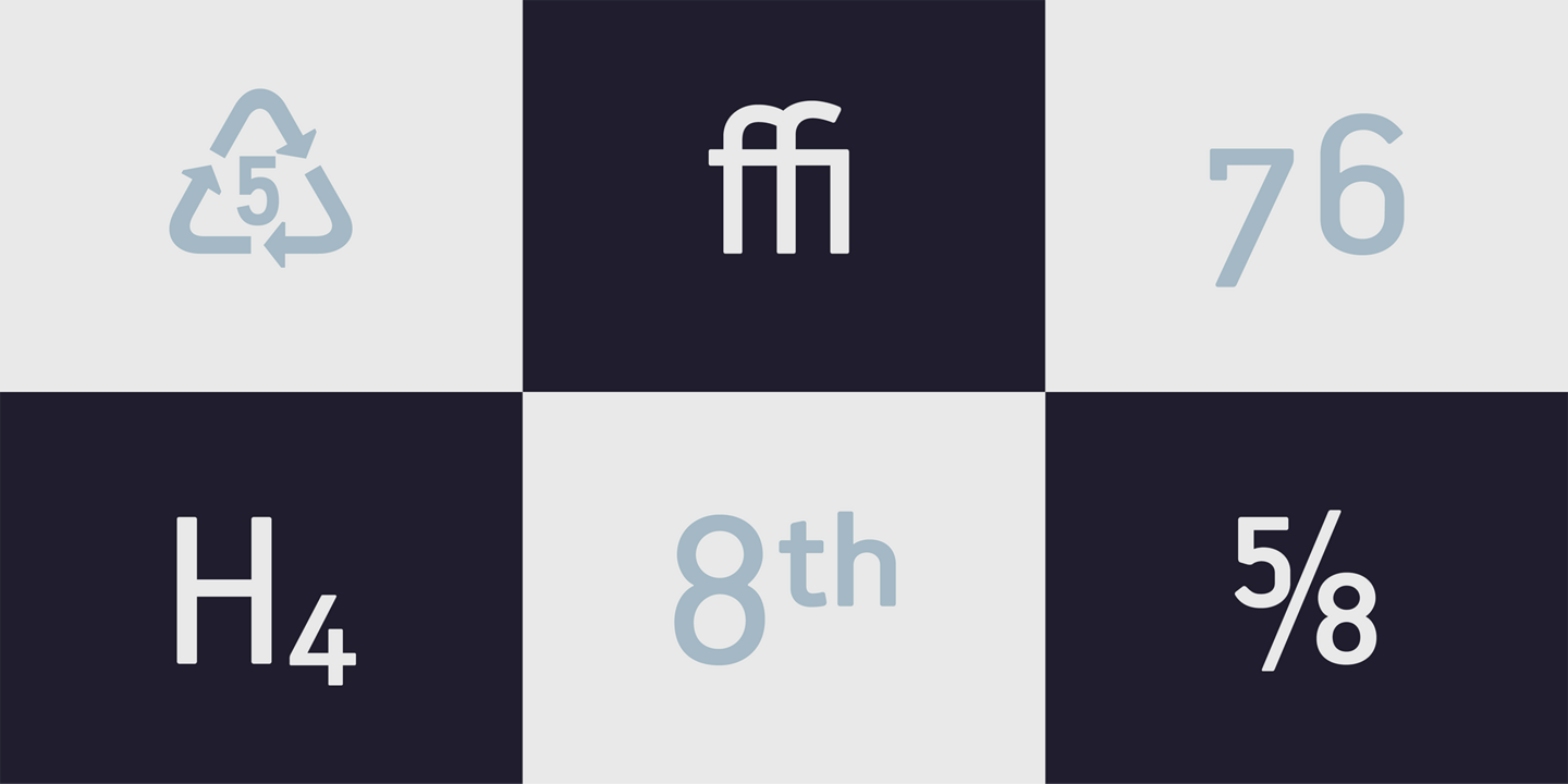
DIN Mono is one of the several additions to the DIN superfamilies by Parachute. It is a monospace typeface which is comprised of characters with fixed width. In the world of proportionality, DIN Mono stands out as a fresh new alternative to the popular standard, particularly for publishing and branding applications. Additional care was given to the aesthetic form and its pleasing characteristics. The spacing attributes of the glyphs were redefined and legibility was further improved by revising or changing the shape of the letterforms. The family consists of 12 weights including true-italics. A multilingual version is also available with Latin, Greek and Cyrillic.
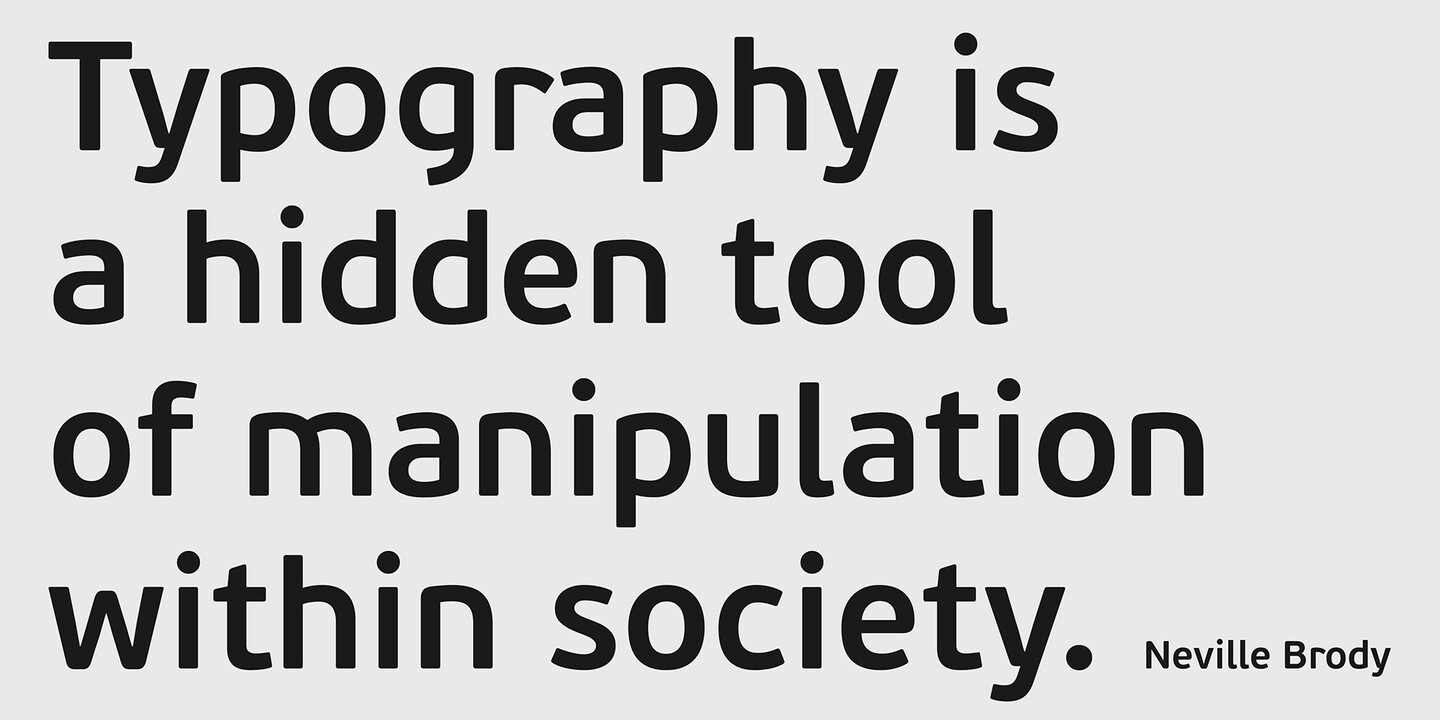
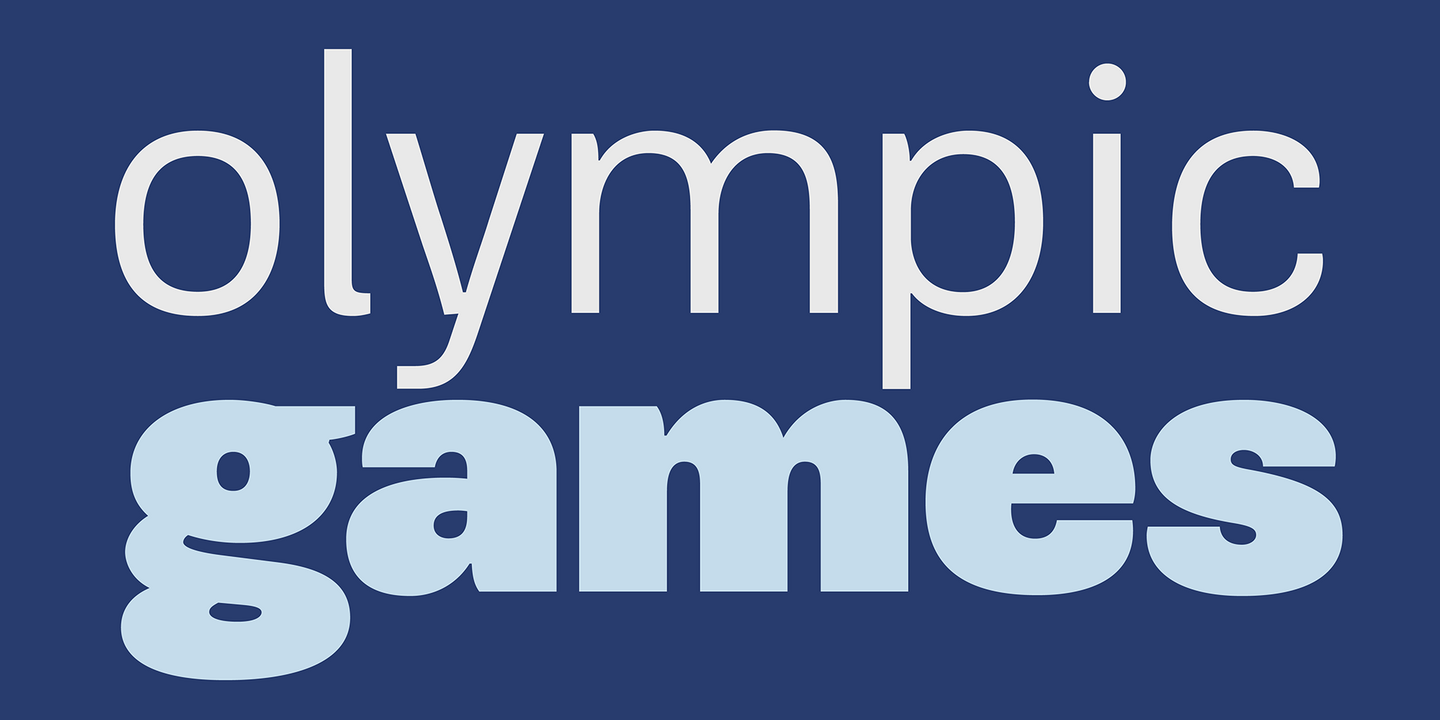
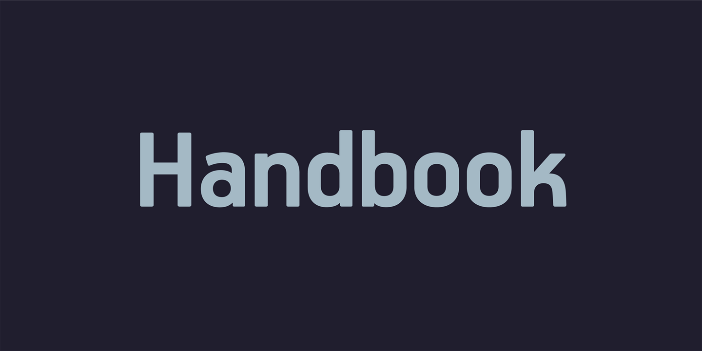
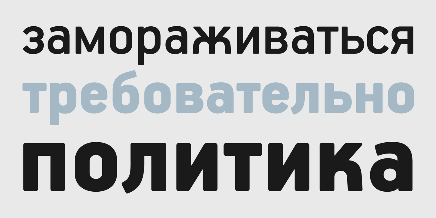
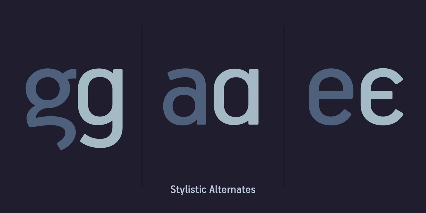
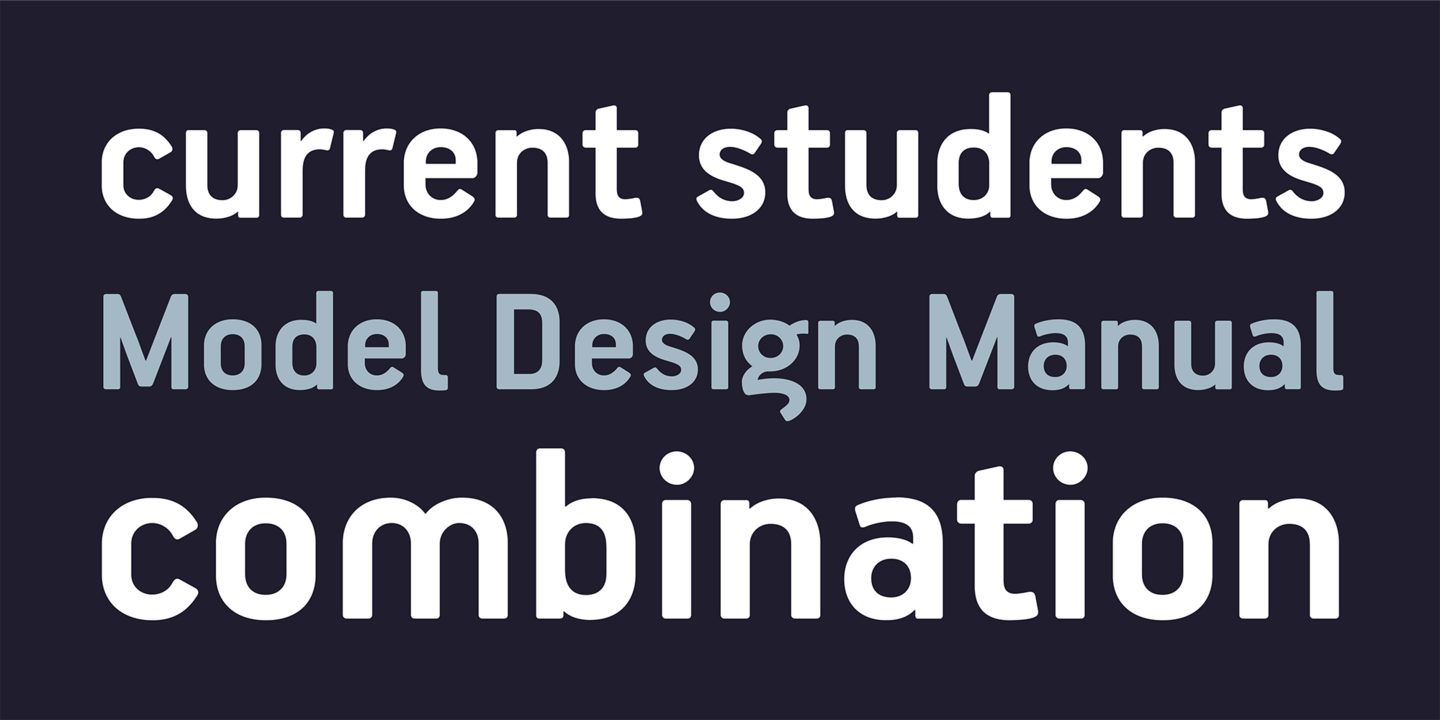
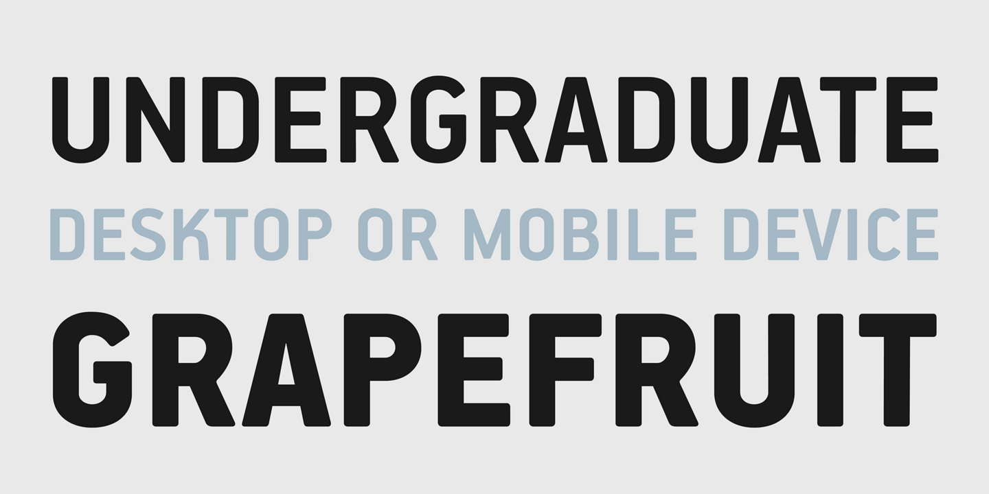
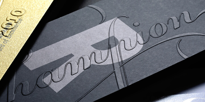
Handbook is designed to address the visual needs of an ever-demanding corporate environment in a straightforward manner. With slightly rounded outer corners and a robust, totally unpretentious yet notably recognisable character, this design aims to be a real workhorse and an honest business asset. Handbook is an exquisitely well balanced and versatile typeface that works extremely well in body text and headlines within a long range of point sizes. Powered with the bare essential visual assets, Handbook’s vigorous personality is carefully engineered to avoid time consuming and inefficient design workload.
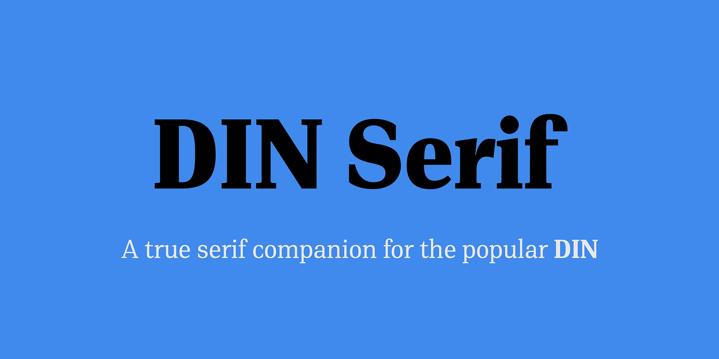
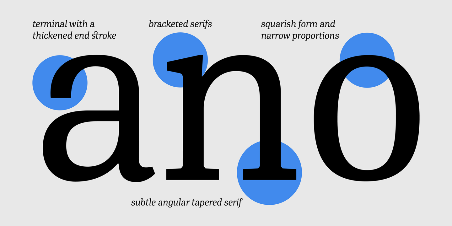
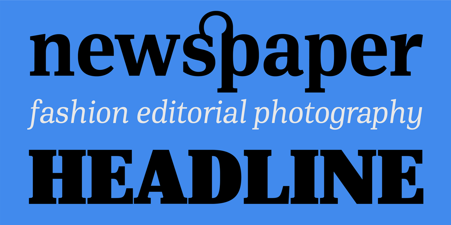
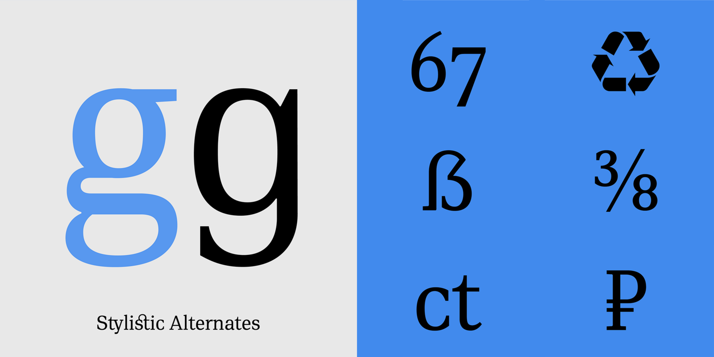
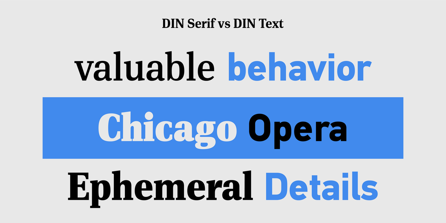
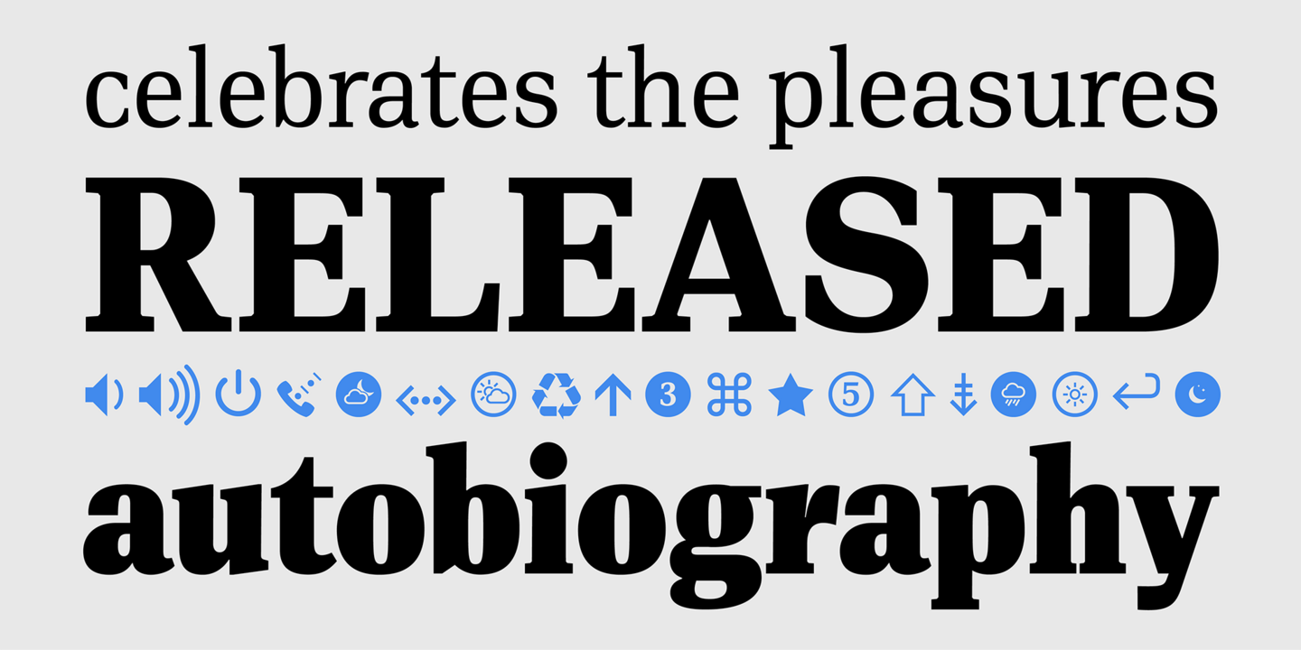
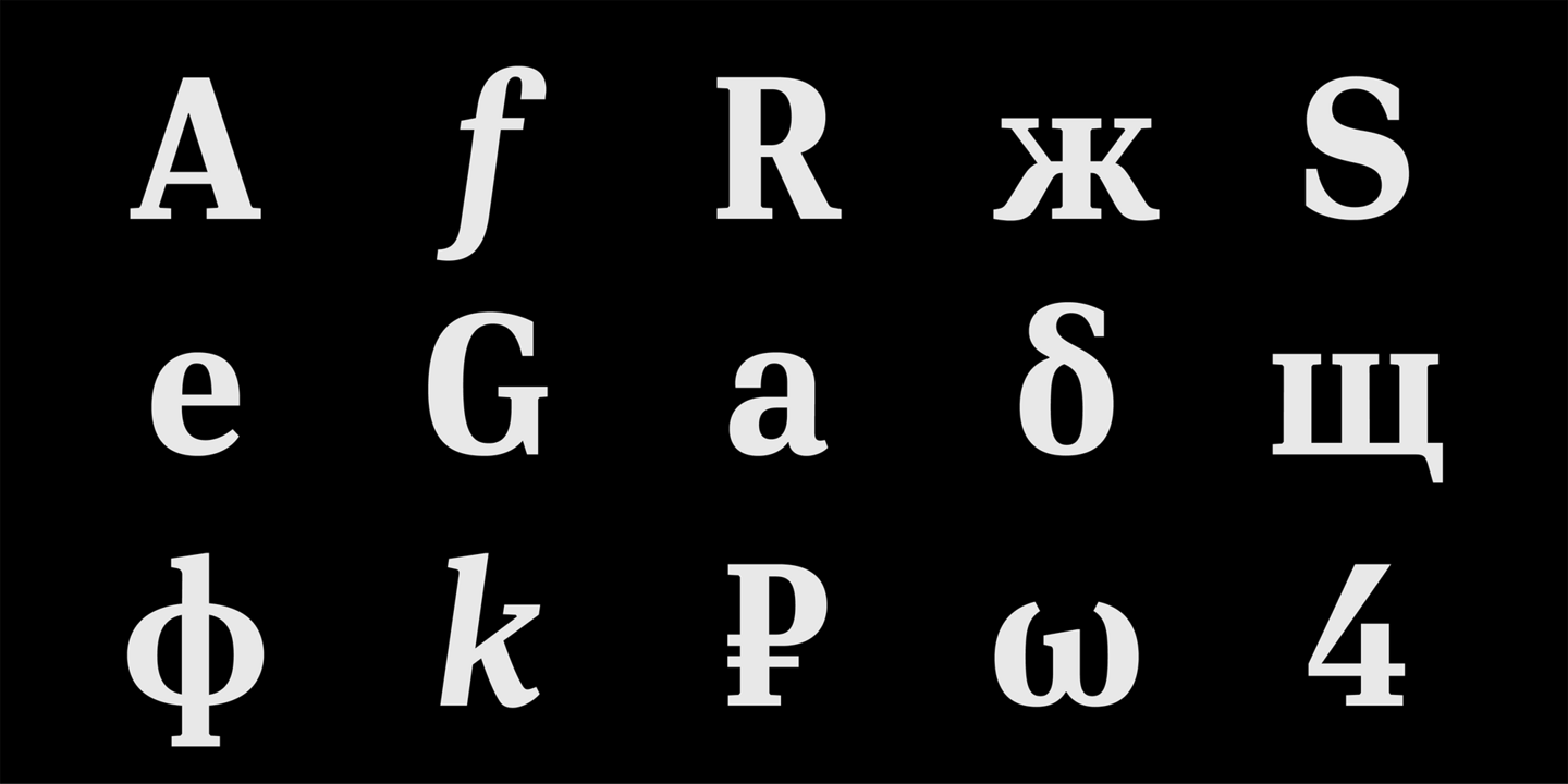
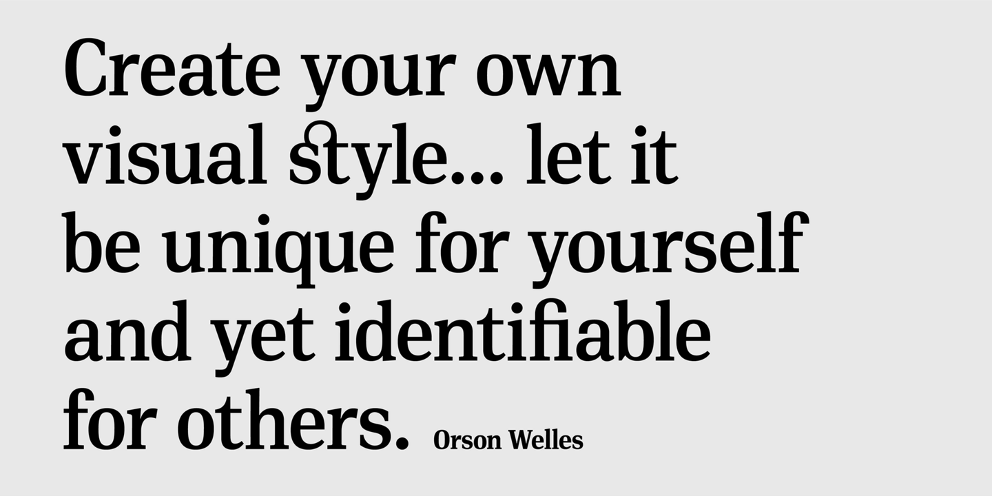
This is the first ever release of a true serif companion for the popular DIN typeface.It is simple and neutral enough when set at small sizes, but sturdy and powerful when set at heavier weights and bigger sizes. DIN Serif makes no attempt to impress with ephemeral nifty details on individual letters, but instead it concentrates on a few modern, functional and everlasting novelties which express an overall distinct quality on the page and set it apart from most classic romans.
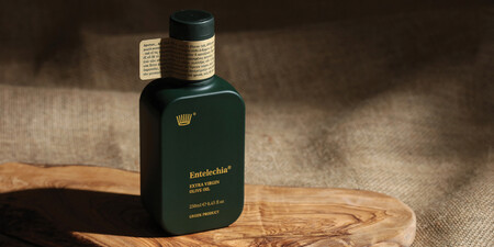
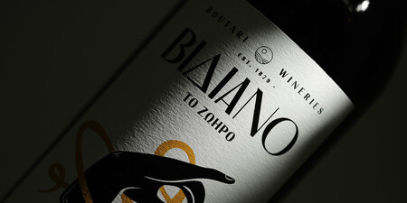
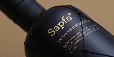
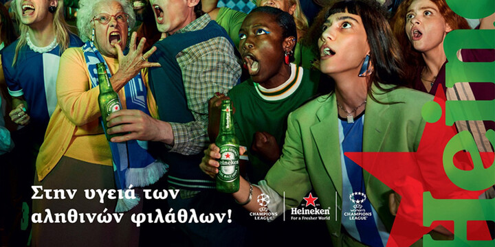
Fonts in use.

Parachute

Parachute® is a digital type foundry specialising in bespoke typefaces and multilingual corporate fonts. Its team of type designers, graphic designers, and font engineers collaborates with leading international organisations to integrate complex type into brand strategies. By combining creativity, precision, and innovation, Parachute crafts type that helps brands communicate with clarity and style, transforming local identities into global voices.

Founder, Type Director
Panos Vassiliou
Panos Vassiliou studied Applied Science and Engineering at the University of Toronto. Following his graduation, he became actively involved in the arts and literature, while maintaining a strong social and cultural presence in Canada. He founded Parachute® in 2001. His work has been internationally recognized from leading institutions such as Red Dot, European Design Awards, Type Directors Club, and German Design Awards. Panos has served on the boards of directors of cultural organizations, has lectured across Europe on branding, design, and typography, and has participated as a jury member in several international design competitions, notably serving as President of the D&AD Awards 2021 Type Design competition.

Art Director
Manos Daskalakis
Manos Daskalakis is Parachute’s art director and literally the man responsible for bringing the type foundry's many projects into the limelight via exhaustingly curated branding and design. He studied visual communication at the Vakalo Art & Design College. He has designed many high profile magazines and newspapers providing a detailed eye on eligible, straight forward design ethos. Daskalakis bears a deep knowledge of typography's many qualities and advantages in regards to efficient design.

Visual Designer, Type Designer
Charis Tsevis
Charis Tsevis holds a Diploma of Graphic Design from the Akademie für das Grafische Gewerbe, München and a Master in Visual Design from the Scuola Politecnica di Design, Milano. He manages a modest studio serving clients all over the world. His client list includes Fortune 500 companies worldwide. He is a visiting professor of Editorial Design and Typography at the AKTO College in Athens. He has also presented seminars and given lectures at numerous national and international Universities, Colleges, Conferences and Symposiums. Charis' work has been featured in many books, magazines, and websites around the world. His artwork has been presented in exhibitions in Athens, Barcelona, San Jose and other cities around the globe.

Type Designer
Vedran Erakovic
Vedran was born in Split, Croatia and lives in Belgrade, Serbia. His fields of work include type design, calligraphy, graphic design, and the design of newspapers and magazines. He works as an Assistant Professor of Calligraphy and Typeface Design at the Faculty of Applied Arts in Belgrade. Vedran has taken part in many exhibitions and projects involved with calligraphy, lettering and type design and has received a number of prizes for his typefaces in international contests, His type designs are presented in books and magazines published by some of the world’s eminent authors and publishers.

Type Designer
Alexandros Papalexis
Alexandros Papalexis graduated from the University of Graphic Arts and Design of Athens. The graphic designer, illustrator and type designer Papalexis made a name for himself via creating corporate packages for leading Greek companies and the most prominent music labels and local artists. A truly versatile designer whose playful and vibrant type designs enrich the Parachute Typefoundry’s extensive type system universe.

Type Designer, Illustrator
Vladimir Radibratovic
Half Serb, half Croatian Vladimir Radibratović studied Architecture before falling in love with the visual arts as a student of painting and illustration at the Academy of Applied arts in Belgrade. A refugee of war, the artist and designer moved to Athens, Greece dedicating himself to calligraphy, lettering and type design with script fonts being his field of expertise and knowledge. Radibratović, a scholar and graphic design artist alike, has received several design awards.

Monotype Fonts
Parachute fonts are included with Monotype Fonts

