

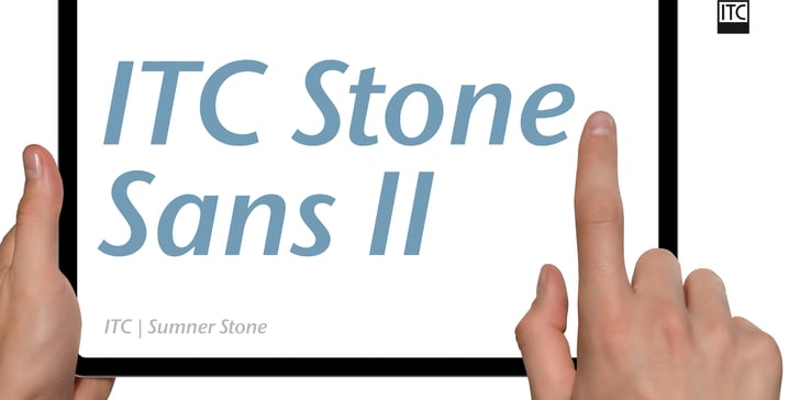

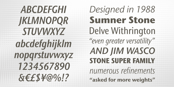

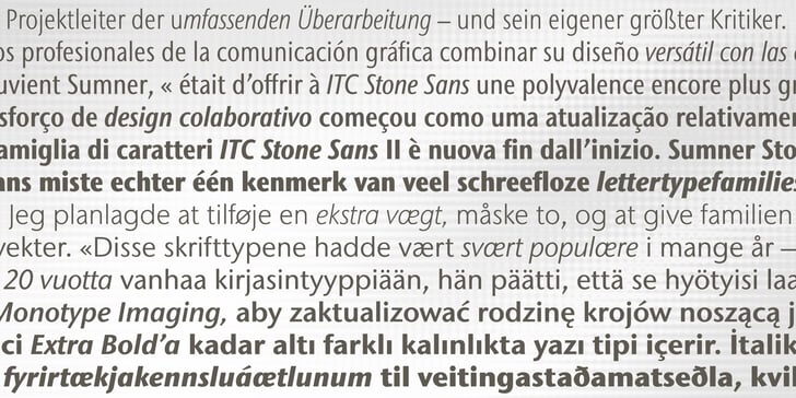


ITC Stone Sans II, designed by the renowned typographer Sumner Stone – then Director of Typography at Adobe—and released in 1987 by ITC alongside Bob Ishi (whose name literally means “stone” in Japanese), can bring exceptional clarity and cohesion to wayfinding systems. As a member of the Stone superfamily (which includes Sans II, Serif, Humanist, and Informal variants), it shares consistent x‑height, cap height, and stem weight across all designs, enabling seamless typographic integration in hardcopy and digital applications.
ITC Stone Sans II’ open counters, subtle letterforms, and structured sans-serif construction align with Americans with Disabilities Act guidelines, prioritizing legibility and reader comprehension.
Stone Sans II is increasingly adopted in wayfinding strategies – supporting streamlined navigation in corridors, signage, and digital directories. Its precision and neutrality have made ITC Stone Sans II a design staple – in environments where clarity can be life-enhancing, ensuring that wayfinding is not only functional but also visually calming and consistently clear.