Ambroise™ Std
by Typofonderie

- Aa Glyphs
-
Best ValueFamily Packages
- Individual Styles
- Tech Specs
- Licensing
About the family
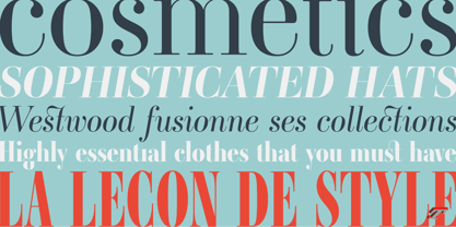
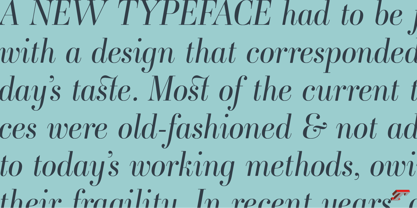
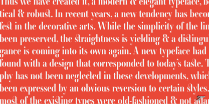
An exquisite Didot font in 18 series Ambroise is a contemporary interpretation of various typefaces belonging to Didot’s late style, conceived circa 1830, including the original forms of g, y, &; and to a lesser extent, k. These unique glyphs are found in Gras Vibert, cut by Michel Vibert. Vibert was the appointed punchcutter of the Didot family during this period. It is the Heavy, whom sources were surest that Jean François Porchez has been used as the basis for the design of the typeface family. In the second half of the 19th century, it was usual to find fat Didots in several widths in the catalogs of French type foundries. These same typefaces continued to be offered until the demise of the big French foundries in the 1960s.
Ambroise attempts to reproduce more of what we see printed on paper in the 19th century; a more accurate representation of Didot punches. So, the unbracketed serifs are not truly square straight-line forms but use tiny transitional curves instead. The result on the page appears softer and less straight, particularly in larger sizes.
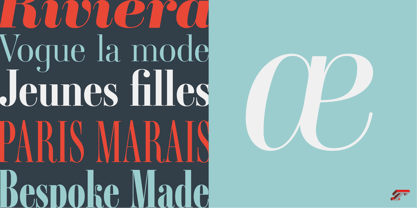
The illustrious Didot family of type founders and printers
Every variation of the typeface carries a name in homage to a member of the illustrious Didot family of type founders and printers. The condensed variant is called Ambroise Firmin. The extra-condensed is called Ambroise François.
Ambroise Pro brought back to life: fifteen years in the making!
Club des directeurs artistiques, 48e palmarès
Bukva:raz 2001

About Typofonderie
We are an independent French type foundry since 1994, we design, manufacture and distribute exclusive typefaces. Meticulously built years after years, our library includes type families suited for every aspect of typographic usage. We are passionate about our work. Each of our published typefaces is the result of years of teamwork at Typofonderie. Typofonderie is digital type foundry who has become over the years, a real institution in France and abroad. Our customers recognise the timelessness of our typefaces, which help them give meaning and strength to their projects, whether they are companies, brands, publications or institutions. Our typefaces can be found in the métro in Paris, as well as in Osaka, at the Opéra de Paris, La Tour d’Argent, Vuitton, Séphora, Galeries Lafayette, Yves Saint Laurent Beauty and are used by the French Olympic team. You will also encounter them in museums, in the Who’s Who, Wired, at Dell, at the Boston Consulting Group, on the jerseys of the French Olympic team and in the Alps thanks to SwissSki. Hillary Clinton and Emmanuel Macron used our typefaces during their presidential campaigns. The palais de l’Élysée uses three of our typefaces families for the identity and communication of the French president.
Read more
Read less
- Choosing a selection results in a full page refresh.