Skip to content
Skip to main content

Axar

by Aliabbas
Individual Styles from $19.00 USD $13.30 USD
30% Off
Complete family of 7 fonts: $79.00 USD $55.30 USD
The Axar Font Family was designed by Ali Abbas and published by Aliabbas. Axar contains 7 styles and family package options. More about this family

About the family


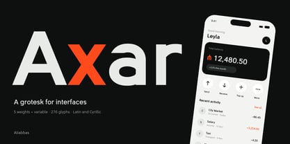
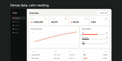
Axar is a grotesk made for interfaces. The name means "flowing" in Azerbaijani, and the design follows from it: round bowls, open apertures and flat terminals that keep words moving at small sizes.

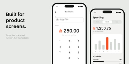
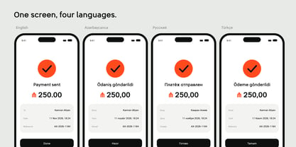
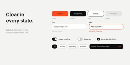
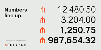
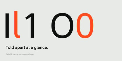
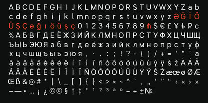
It was drawn for product screens first. The x-height is tall, the lowercase l has a tail, the zero is narrow, and I, l and 1 are easy to tell apart in a table or a form field. Figures are tabular in every weight, so amounts line up in columns without extra setup. The currency set covers the manat, lira and ruble signs next to the dollar, euro, pound and yen.

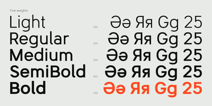
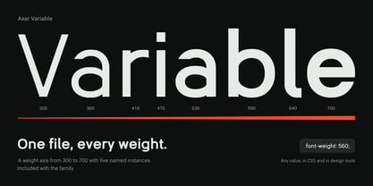
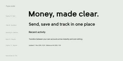
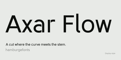
The family has five upright weights, from Light to Bold, and a variable version with a weight axis from 300 to 700 for when you need a value in between. Axar Flow is a display cut of the Regular with a small break where each curve meets its stem. It is meant for headlines and logos, not for body text.

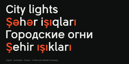
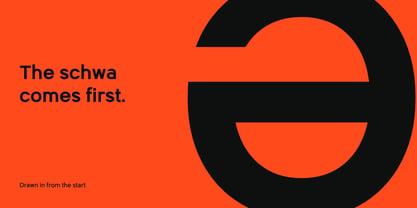
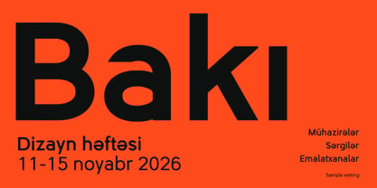
Axar supports Azerbaijani, Turkish, Russian and the main Western European languages. The schwa was part of the design from the first sketch.

Use it for apps, dashboards, fintech products and any screen where numbers and labels have to be read quickly.

Designers: Ali Abbas

Foundry: Aliabbas

MyFonts debut: Nov 17, 2026

Axar

About Aliabbas

Aliabbas is an independent type foundry based in Baku, Azerbaijan. It grew out of years of product design for financial services, government platforms and security software, where type has to work in tables, forms and dense screens before it gets to look good on a poster. The foundry focuses on sans serif families for interfaces and brand identities. Each family is planned from the start for three languages that share one market but are rarely designed together: Azerbaijani, Turkish and Russian. Letters such as ə, ğ, ı and İ are drawn as part of the original design, not added once the Latin is finished, and Cyrillic gets its own proportions instead of borrowed ones. Numbers get the same attention as letters. Tabular figures, currency signs including the manat, and unambiguous zero and one forms are part of every release, because much of what people read on a screen at work is numeric. The goal is a small catalogue of typefaces that stay calm in long use and still have a recognisable voice at large sizes.

Read more

Read less