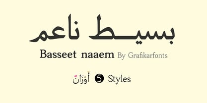
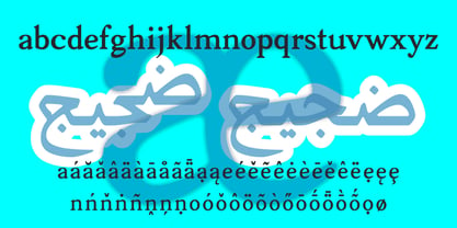
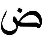
Basseet Naaem is the rounded variant of Basseet, the Arabic + Latin typeface by GrafikarFonts inspired by the classical Naskh calligraphic tradition.
While retaining the structural integrity of its predecessor, Basseet Naaem introduces softer, rounded terminals and curves that lend the typeface a warmer, more approachable character — perfect for applications where a gentle, friendly touch is desired alongside authentic calligraphic roots.
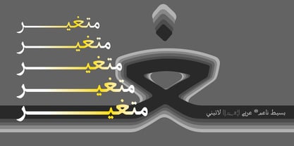
The font stays true to the Naskh heritage, with letterforms that flow naturally through extensive ligatures and contextual positioning. A comprehensive set of stylistic alternates (ss01, ss02, and more) gives you the freedom to customize the appearance and add personality to your text, while advanced OpenType features (subs, sinf, sups, numr, dnom, frac, rlig, dlig, locl, clig, and more) provide professional-grade typographic control.
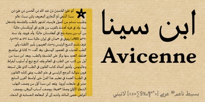
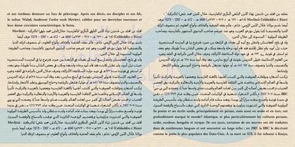
Whether used for headlines or body text, Basseet Naaem balances legibility with aesthetic richness — maintaining clean, rounded proportions while offering the same typographic flexibility that made Basseet a reliable choice for designers.
Typographic Features
subs sinf sups numr dnom frac rlig dlig locl liga ss01 ss02 calt clig — and more.
Ideal for: branding, editorial design, packaging, web, and publishing — especially projects that call for a softer, more welcoming typographic voice.
Classification: Naskh-inspired Arabic & Latin typeface (Rounded Variant)
Glyph Coverage: Over 2 100 glyphs — Extended Arabic character set + Latin, supporting multiple Arabic-script languages
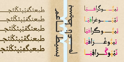
Scripts: Arabic (Arabic, Persian, Urdu, and more) + Latin
Design Details
The font's calligraphic foundation is rooted in traditional Naskh script, renowned for its clarity and elegance. The rounded adaptation softens the edges without compromising legibility — curves are gently smoothed, corners are rounded, creating a friendly, inviting texture that stands out in display settings while remaining comfortable for extended reading at appropriate sizes. Through advanced contextual behavior, letterforms adapt dynamically based on their position and neighboring characters, ensuring a natural cursive flow throughout the text.
The Latin glyphs have been carefully harmonized to visually complement the Arabic weight, rhythm, and rounded treatment — creating a cohesive bilingual reading experience. The typeface offers broad multi-script support, covering Arabic, Persian, Urdu, and other languages written in the Arabic script.
Recommended Usage
Headlines and display typography that benefit from a softer character
Editorial and publishing projects (at appropriate body-text sizes)
Brand identity and logotype design
Print and digital interfaces
Packaging and product design where warmth and approachability matter
Our fonts are regularly updated to add new features and improve functionality — ensuring that your investment continues to grow in value over time.