My mother was a calligrapher and wielded a brush to create wonderfully creative showcards. My father was a typesetter and ran a very successful printing business. I grew up with letterpress, the clank of metal type and the smell of ink and paper. I love typography. I had little choice.
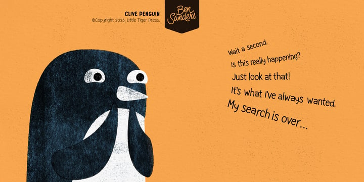
After studying graphic design at university and completing advertising school, I pursued freelance illustration. I have completed projects for Cadbury, Harrods, General Motors, Wall Street Journal, The Washington Post and The Guardian. I have written, designed, illustrated and created custom typography for many children’s books. Publishers include, Thames & Hudson, Hachette and Little Tiger. To my surprise, some of these projects have won awards.
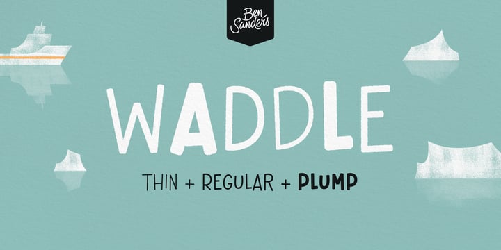
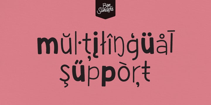
Custom typography is a key feature of many of my illustration and design projects, so it was inevitable that some of the lettering would end up becoming typefaces. It’s not that there isn’t a lot of great fonts around to choose from, it’s just that sometimes there is a specific shape and feel that can only be captured by designing a set of letters specifically for that project. It’s nice when it all works so perfectly.
My typography is part mid-century, part contemporary, and feels at home on a children’s book cover just as much as a jazz album jacket or chocolate wrapper.