
Skip to content
Skip to main content

Bencanto

by insigne
Individual Styles from $35.00 USD $24.50 USD
30% Off
Complete family of 48 fonts: $199.00 USD
The Bencanto Font Family was designed by Jeremy Dooley and published by insigne. Bencanto contains 48 styles and family package options. More about this family

About the family


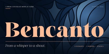
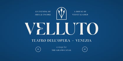
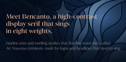
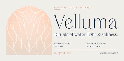
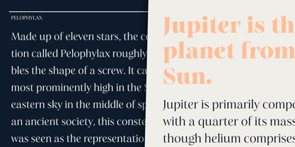
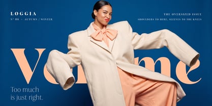
Bencanto is a high-contrast display serif for luxury brands, couture fashion, fine hospitality and premium packaging.

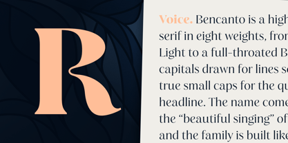
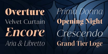
Its name comes from bel canto, the Italian art of beautiful singing. The letters carry the same poise: hairlines drawn to a whisper, strokes of deep, sculpted weight, crossbars that turn into small loops, and terminals that finish in a clean flare. Nothing is loud, and everything is deliberate.

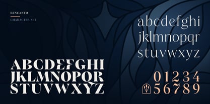
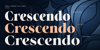
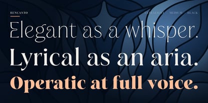
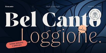
The family has eight weights, from Extra Light to Black, in three widths: Condensed, Normal and Extended. Every style has a true italic, drawn for its own rhythm. That makes 48 styles, plus a single variable font that moves freely across weight, width and italic.

For the largest sizes, titling capitals refine the uppercase. Paired with small caps, they make quiet, distinguished logotypes: a capital leads and the rest of the word follows at an even height.

Each style also includes:

  • Titling capitals, small caps and caps to small caps

  • Stylistic alternates, a stylistic set and historical forms

  • Ornaments

  • Oldstyle and lining figures, proportional and tabular

  • Fractions, superscripts and ordinals

  • Support for 296 Latin-script languages

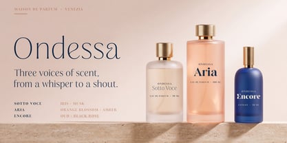
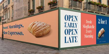
Bencanto belongs on a perfume carton, a wine label, a resort's signage, a magazine cover or a wedding invitation. Wherever the work should feel considered, it sets the tone in a single word.

Designers: Jeremy Dooley

Foundry: insigne

MyFonts debut: Oct 15, 2026

Bencanto

About insigne

“Type is very much like music,” says Jeremy Dooley. “It is linear, and the notes or phrases have to fit the theme or song.” Jeremy, owner of the one-man foundry, insigne, is a self-taught type designer and a true self-made success story. His label is home to over a hundred font families, many of which have seen great success. Aviano has made our Best of the Year list not just once, but twice and has been featured in Hollywood blockbusters. You may have noticed various iterations of Aviano in Wall Street, Harry Potter, and Thor, and it was used for the branding of Robin Hood. Jeremy considers type to be the foundation of advanced visual communication. One form of communication that the Chattanooga-based designer is drawn to is branding. In 2011, Jeremy, took on the enormous project of coming up with a typeface that would communicate the tone and feeling of his hometown; a font that would effectively brand the city. In 2013, the result, Chatype, was named the official typeface of Chattanooga TN. “Every city needs a brand,” he says, “as every city needs to highlight its own distinctive offerings.” Like many designers, his creations are often the result of his interests. “I especially like seeing my typefaces in movies, on luxury packaging, and for technology companies,” he says. “These are interests of mine, and I often design fonts with those specific applications in mind. It’s very interesting to me that I frequently see fonts used in exactly the way I originally envisioned.” Since he began selling his first font on MyFonts in 2004, the man who will tell anyone who asks, “I’m not really from anywhere,” has continuously drawn inspiration from his many experiences gained from living all over the globe. Want more of Jeremy? The designer sat down with us for an in-depth interview in this issue of Creative Characters.

Read more

Read less