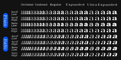
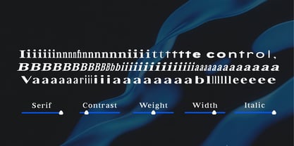
Bia Serif High Light Ult Condensed
Bia Serif Low Light Ult Condensed
Bia Serif Low Light Ult Condensed Ital
Bia Serif High Light Ult Condensed Ital
Bia Serif High Ult Condensed
Bia Serif Low Ult Condensed
Bia Serif Low Ult Condensed Italic
Bia Serif High Ult Condensed Italic
Bia Serif Low Medium Ult Condensed
Bia Serif High Medium Ult Condensed
Bia Serif Low Medium Ult Condensed Italic
Bia Serif High Medium Ult Condensed Italic
Bia Serif High Se Bold Ult Condensed
Bia Serif Low Se Bold Ult Condensed
Bia Serif Low Se Bold Ult Condensed Ital
Bia Serif High Se Bold Ult Condensed Ital
Bia Serif Low Bold Ult Condensed
Bia Serif High Bold Ult Condensed
Bia Serif Low Bold Ult Condensed Italic
Bia Serif High Bold Ult Condensed Italic
Bia Serif Low Light Condensed
Bia Serif High Light Condensed
Bia Serif High Light Condensed Italic
Bia Serif Low Light Condensed Italic
Bia Serif Low Condensed
Bia Serif High Condensed
Bia Serif Low Condensed Italic
Bia Serif High Condensed Italic
Bia Serif High Medium Condensed
Bia Serif Low Medium Condensed
Bia Serif Low Medium Condensed Italic
Bia Serif High Medium Condensed Italic
Bia Serif Low Se Bold Condensed
Bia Serif High Se Bold Condensed
Bia Serif Low Se Bold Condensed Italic
Bia Serif High Se Bold Condensed Italic
Bia Serif Low Bold Condensed
Bia Serif High Bold Condensed
Bia Serif Low Bold Condensed Italic
Bia Serif High Bold Condensed Italic
Bia Serif Low Light
Bia Serif High Light
Bia Serif Low Light Italic
Bia Serif High Light Italic
Bia Serif Low
Bia Serif High
Bia Serif Low Italic
Bia Serif High Italic
Bia Serif High Medium
Bia Serif Low Medium
Bia Serif Low Medium Italic
Bia Serif High Medium Italic
Bia Serif Low Se Bold
Bia Serif High Se Bold
Bia Serif Low Se Bold Italic
Bia Serif High Se Bold Italic
Bia Serif High Bold
Bia Serif Low Bold
Bia Serif Low Bold Italic
Bia Serif High Bold Italic
Bia Serif High Light Expanded
Bia Serif Low Light Exp
Bia Serif Low Light Exp Italic
Bia Serif High Light Exp Italic
Bia Serif High Expanded
Bia Serif Low Exp
Bia Serif High Exp Italic
Bia Serif Low Exp Italic
Bia Serif High Medium Expanded
Bia Serif Low Medium Exp
Bia Serif Low Medium Exp Italic
Bia Serif High Medium Exp Italic
Bia Serif High Se Bold Expanded
Bia Serif Low Se Bold Exp
Bia Serif Low Se Bold Exp Italic
Bia Serif High Se Bold Exp Italic
Bia Serif Low Bold Expanded
Bia Serif High Bold Expanded
Bia Serif High Bold Exp Italic
Bia Serif Low Bold Exp Italic
Bia Serif Low Light Ult Exp
Bia Serif High Light Ult Exp
Bia Serif Low Light Ult Exp Italic
Bia Serif High Light Ult Exp Ital
Bia Serif Low Ult Exp
Bia Serif High Ult Exp
Bia Serif High Ult Exp Italic
Bia Serif Low Ult Exp Italic
Bia Serif Low Medium Ult Exp
Bia Serif High Medium Ult Exp
Bia Serif Low Medium Ult Exp Italic
Bia Serif High Medium Ult Exp Italic
Bia Serif Low Se Bold Ult Exp
Bia Serif High Se Bold Ult Exp
Bia Serif Low Se Bold Ult Exp Italic
Bia Serif High Se Bold Ult Exp Italic
Bia Serif Low Bold Ult Exp
Bia Serif High Bold Ult Exp
Bia Serif Low Bold Ult Exp Italic
Bia Serif High Bold Ult Exp Italic
Bia Sans Low Light Ult Condensed
Bia Sans High Light Ult Condensed
Bia Sans Low Light Ult Condensed Italic
Bia Sans High Light Ult Condensed Italic
Bia Sans Low Ult Condensed
Bia Sans High Ult Condensed
Bia Sans Low Ult Condensed Italic
Bia Sans High Ult Condensed Italic
Bia Sans Low Medium Ult Condensed
Bia Sans High Medium Ult Condensed
Bia Sans Low Medium Ult Condensed Italic
Bia Sans High Medium Ult Condensed Italic
Bia Sans Low Se Bold Ult Condensed
Bia Sans High Se Bold Ult Condensed
Bia Sans High Se Bold Ult Condensed Ital
Bia Sans Low Se Bold Ult Condensed Italic
Bia Sans Low Bold Ult Condensed
Bia Sans High Bold Ult Condensed
Bia Sans Low Bold Ult Condensed Italic
Bia Sans High Bold Ult Condensed Italic
Bia Sans Low Light Condensed
Bia Sans High Light Condensed
Bia Sans High Light Condensed Italic
Bia Sans Low Light Condensed Italic
Bia Sans Low Condensed
Bia Sans High Condensed
Bia Sans High Condensed Italic
Bia Sans Low Condensed Italic
Bia Sans Low Medium Condensed
Bia Sans High Medium Condensed
Bia Sans Low Medium Condensed Italic
Bia Sans High Medium Condensed Italic
Bia Sans Low Se Bold Condensed
Bia Sans High Se Bold Condensed
Bia Sans High Se Bold Condensed Italic
Bia Sans Low Se Bold Condensed Italic
Bia Sans Low Bold Condensed
Bia Sans High Bold Condensed
Bia Sans Low Bold Condensed Italic
Bia Sans High Bold Condensed Italic
Bia Sans Low Light
Bia Sans High Light
Bia Sans High Light Italic
Bia Sans Low Light Italic
Bia Sans Low
Bia Sans High
Bia Sans High Italic
Bia Sans Low Italic
Bia Sans Low Medium
Bia Sans High Medium
Bia Sans High Medium Italic
Bia Sans Low Medium Italic
Bia Sans High Se Bold
Bia Sans Low Se Bold
Bia Sans High Se Bold Italic
Bia Sans Low Se Bold Italic
Bia Sans Low Bold
Bia Sans High Bold
Bia Sans High Bold Italic
Bia Sans Low Bold Italic
Bia Sans High Light Exp
Bia Sans Low Light Exp
Bia Sans High Light Exp Italic
Bia Sans Low Light Exp Italic
Bia Sans High Exp
Bia Sans Low Exp
Bia Sans Low Exp Italic
Bia Sans High Exp Italic
Bia Sans Low Medium Exp
Bia Sans High Medium Exp
Bia Sans High Medium Exp Italic
Bia Sans Low Medium Exp Italic
Bia Sans High Se Bold Exp
Bia Sans Low Se Bold Exp
Bia Sans High Se Bold Exp Italic
Bia Sans Low Se Bold Exp Italic
Bia Sans Low Bold Exp
Bia Sans High Bold Exp
Bia Sans High Bold Exp Italic
Bia Sans Low Bold Exp Italic
Bia Sans Low Light Ult Exp
Bia Sans High Light Ult Exp
Bia Sans High Light Ult Exp Italic
Bia Sans Low Light Ult Exp Italic
Bia Sans High Ult Exp
Bia Sans Low Ult Exp
Bia Sans High Ult Exp Italic
Bia Sans Low Ult Exp Italic
Bia Sans High Medium Ult Exp
Bia Sans Low Medium Ult Exp
Bia Sans High Medium Ult Exp Italic
Bia Sans Low Medium Ult Exp Italic
Bia Sans Low Se Bold Ult Exp
Bia Sans High Se Bold Ult Exp
Bia Sans Low Se Bold Ult Exp Italic
Bia Sans High Se Bold Ult Exp Ital
Bia Sans Low Bold Ult Exp
Bia Sans High Bold Ult Exp
Bia Sans High Bold Ult Exp Italic
Bia Sans Low Bold Ult Exp Italic
Bia Variable Bold Serif Low