


Skip to content
Skip to main content

Biotrip Sans

by deFharo
Individual Styles from $10.00 USD
Complete family of 14 fonts: $117.00 USD
The Biotrip Sans Font Family was designed by Fernando Haro and published by deFharo. Biotrip Sans contains 14 styles and family package options. More about this family

About the family


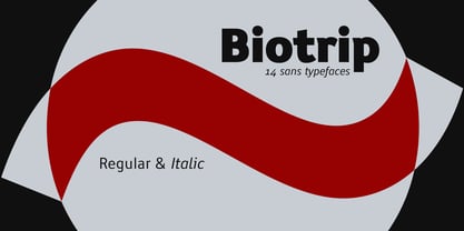
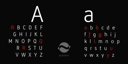
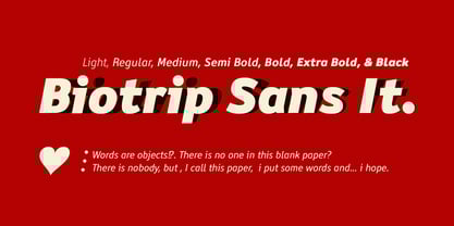
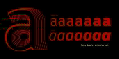
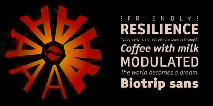
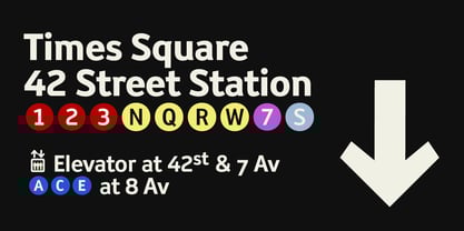
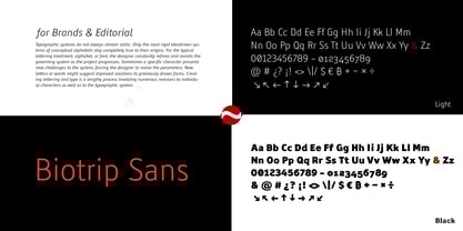
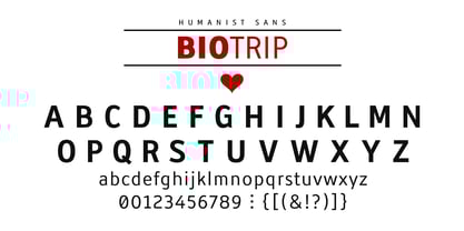
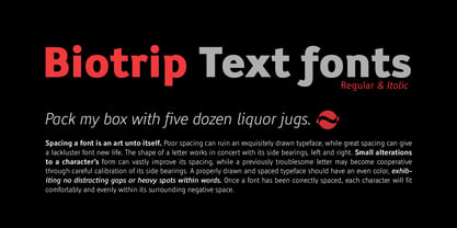
Biotrip Sans is a friendly typeface family that is, above all, a journey. A journey (Trip) from the purity of geometry to the warmth of the organic (Bio). I designed Biotrip Sans from that impossible point of equilibrium between reason and impulse, between the precise line of the vector and the unpredictable stroke of the hand. It's a humanist sans-serif, a category that lives on that fascinating edge where the geometric softens, where rational proportions give way to the humanity of gesture. There's no mechanical rigidity here, nor the coldness of grotesque fonts. Although its structure stems from geometry, its spirit is organic, alive. There is no mechanical rigidity here, nor the coldness of grotesque fonts. Every curve was designed to be experienced, not just read. Every curve was designed to be experienced, not just read. The open, neutral forms and balanced rhythm make it a warm, versatile, and naturally legible font, even at the smallest sizes. Biotrip Sans comprises 14 methodically designed fonts, distributed across 2 styles (Regular and a genuine, flowing Italic) and 7 weights, ranging from the ethereal elegance of Light to the powerful impact of Black. I built Biotrip Sans to be a versatile and powerful tool, a complete system that will allow you to tackle any design challenge with precision and style. Biotrip Sans is a multipurpose font family. Designed to move seamlessly between editorial, corporate, and experimental settings. It shines in texts, headlines, visual identities, posters, packaging, or as a corporate typeface.

Designers: Fernando Haro

Foundry: deFharo

MyFonts debut: Nov 27, 2025

Biotrip Sans

About deFharo

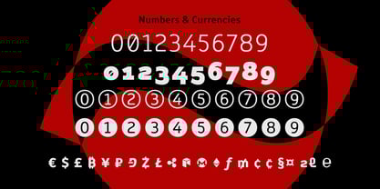
deFharo is the independent type foundry of Spanish graphic and type designer Fernando Haro. With more than 30 years of experience in graphic and advertising design and over a decade devoted to typeface design, Fernando Haro has developed an eclectic body of work that ranges from editorial and corporate typefaces to expressive display, geometric, technological, retro and experimental designs. His approach combines visual character with typographic functionality. Every typeface begins with drawing, proportion and a clear visual idea, and evolves through meticulous work on spacing, metrics, kerning, optical corrections and OpenType features. Rather than following a single recognizable style, deFharo explores different typographic territories according to the personality and purpose of each project. Some families are designed for long-form reading and editorial systems; others are built for branding, headlines, packaging, signage or highly expressive graphic compositions. A strong interest in vector drawing, typographic systems and functional design runs throughout the collection. Alternative characters, small caps, Petite Caps, fractions, numerals, ligatures, symbols and extended language support are frequently developed as integral parts of the typeface rather than as afterthoughts. The result is a growing collection of typefaces designed to be both distinctive and useful — fonts with personality, but also with the technical precision required for professional graphic and editorial work. deFharo typefaces are designed by Fernando Haro and published independently from Spain.

Read more

Read less