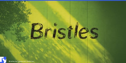
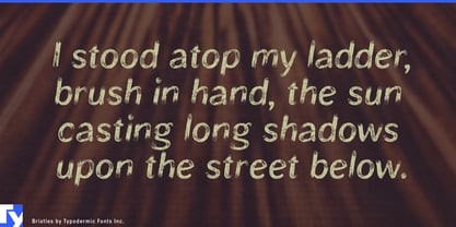
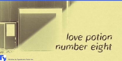
New typography can look conspicuously new when everything around it has already been weathering for decades. A restored warehouse, motor lodge, workshop, marina, or railway building may have brick, timber, painted steel, faded signs, and patched surfaces; a crisp digital headline dropped into that environment can feel pasted on. Bristles solves that problem with lettering that looks like painted signage gradually losing its grip on the surface rather than a generic grunge effect.
That makes Bristles particularly useful for adaptive-reuse hospitality. Converted factories, warehouses, dock buildings, railway properties, old schools, and industrial structures turned into hotels, restaurants, markets, and event spaces often need graphics that feel native to the building. Restaurant names, bar identities, room names, wall lettering, event-series titles, merchandise, temporary signs, and campaign headlines can inherit some of the physical history already present in the space.
Roadside and outdoor hospitality provide another strong setting. Renovated motels, cabin resorts, campground properties, marinas, lakeside lodges, surf hotels, ski lodges, and park-adjacent destinations can use Bristles for entrance graphics, cabin names, rental-shop signs, seasonal programs, merchandise, restaurant identities, and promotional headings. Its weathering suggests sun, repainting, abrasion, and exposure rather than theatrical destruction.
Bristles also fits businesses built around restoration. Classic-car specialists, restomod builders, heritage motorcycle shops, vintage 4×4 companies, boat restorers, historic racing events, and workshops dealing with older machinery can use it for build-series names, garage walls, vehicle graphics, event titles, parts packaging, apparel, and documentary material.
Heritage workwear and rugged goods can use the same visual language selectively. Denim and canvas collections, field jackets, boots, motorcycle luggage, tool rolls, and outdoor equipment can carry Bristles on hangtags, patches, packaging bands, retail displays, collection names, and campaign graphics.
Film, television, games, and experiential production have an even more practical reason to use it. Period street sets, roadside locations, industrial environments, historical games, and themed attractions may need dozens of fictional shop names, garage signs, warning notices, wall markings, and environmental graphics that all appear naturally aged. Bristles can generate changing text inside that weathered world without requiring every new line to be distressed by hand.
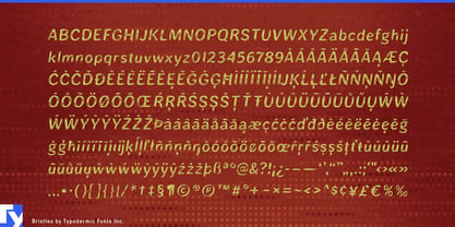
Bristles began with softened sans-serif letterforms, then received a separate weathering process built from painted marks, layered damage, and simulated film grain. Pair substitutions introduce variation where repeated combinations might otherwise reveal the digital mechanism too quickly. The underlying forms remain comparatively calm, so the decay reads as paint loss and exposure rather than aggressive destruction.