Skip to content
Skip to main content

Doradani

by Typodermic
Individual Styles from $13.95 USD
Complete family of 10 fonts: $169.95 USD
The Doradani Font Family was designed by Ray Larabie and published by Typodermic. Doradani contains 14 styles and family package options. More about this family

About the family


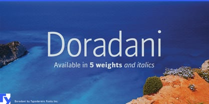
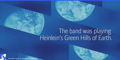
Recreating the first smartphone era is harder than it looks. Pixel fonts point too far backward, shiny Y2K display lettering exaggerates the period, and today’s neutral technology typography immediately gives the game away. Doradani comes from the quieter corporate technology world of the mid-2000s. Commissioned for Research In Motion advertising in 2006, it offers period typography with a genuine connection to the enterprise-mobile era rather than a contemporary imitation of it.

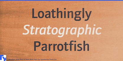
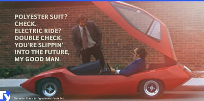
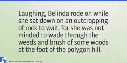
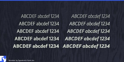
That makes Doradani especially useful for film and television productions set around 2005–2012. A fictional telecom company, handset manufacturer or enterprise-software business may need airport posters, trade-show walls, business-magazine ads, handset brochures, annual reports, office signage, presentation slides and product-launch graphics that all belong to the same period. Doradani’s five weights and matching italics let an art department build that entire corporate system instead of relying on one conspicuously retro display face.

Documentaries about the smartphone transition, wireless communication and early mobile work provide another natural role. Doradani can handle chapter titles, dates, quotations, timelines and reconstructed advertising without reducing the period to green terminals, scanlines or arcade imagery. Corporate archives and anniversary projects can use it in heritage exhibitions, retrospective websites, investor-event timelines and internal museums when the 2000s need a distinct voice of their own.

The family also suits fictional corporations in games and interactive entertainment. Telecom headquarters, airport business lounges, research campuses and suburban office parks set in the 2000s need plausible directories, brochures, advertisements, forms and presentation graphics. Doradani’s restraint is useful here: it looks like typography a serious company might actually have chosen rather than an exaggerated shorthand for retro technology.

Contemporary products that revive the focused, task-oriented side of early mobile computing can draw on the same character. E-paper notebooks, compact keyboards, rugged handheld devices and other products positioned as tools rather than entertainment portals can use Doradani in campaign graphics, product-family names and launch material when a subtle memory of enterprise technology is useful. Doradani is not trying to outcompete every contemporary humanist sans; its strength is giving designers a complete, restrained family for portraying the first smartphone era with considerably more accuracy than the usual retro-tech clichés.

Designers: Ray Larabie

Foundry: Typodermic

Original Foundry: Typodermic

MyFonts debut: Feb 13, 2006

Doradani

About Typodermic

Welcome to Typodermic Fonts, a spirited type foundry rooted in Nagoya, Japan, started by the Canadian typeface designer, Raymond Larabie in 2001. Our library brims with 500+ diverse typefaces to fuel creativity in graphic design, advertising, web, and app development. As digital type pioneers, we adopted web fonts and app licensing early, consistently pushing the design envelope. With Canadian heart and Japanese precision, we're your global partners in extraordinary typography. Explore Typodermic Fonts—where creativity meets character.

Read more

Read less
