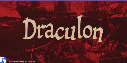
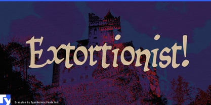
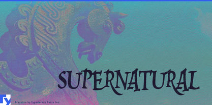
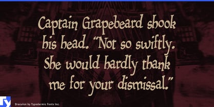
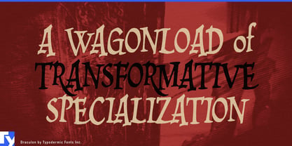
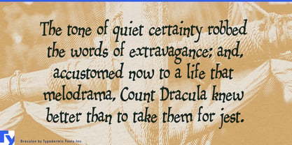
Fantasy typography often lands in familiar territory: disciplined blackletter on one side, distressed horror lettering on the other. Draculon takes a stranger route. Its old-world structure is bent into lopsided polygons, jutting corners and rough-cut curves, creating historical fantasy lettering that feels theatrical, unstable and mischievously dangerous.
Draculon began with Mikadan, whose ancestry reaches back through William Dana Orcutt’s Humanistic to late-15th-century Italian manuscript forms. Those orderly foundations were deliberately distorted, traced into coarse polygons, bitmapped and retraced until the Renaissance flavor had become cartoonishly unruly. The result can suggest a vampire’s castle, pirate tavern or crooked medieval village without settling completely into any one of them.
That ambiguity makes Draculon especially useful for fantasy games and premium tabletop publishing. It can establish a game title, expansion name or faction identity, then continue into quest headings, achievement graphics, card names and short pieces of lore. Mixed case gives designers more room to build hierarchy than an all-caps fantasy display face.
Draculon also fits immersive entertainment: haunted attractions, dark rides, fantasy resorts, escape attractions and theatrical hospitality environments. Attraction names can share a visual language with room names, directional graphics, tickets, queue signs and short environmental messages.
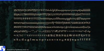
Repeated characters receive alternate forms, preventing obvious duplication in double letters and repeated numerals. That helps names, signs, labels and short headlines retain the impression of lettering individually hacked into shape.
Beyond entertainment, Draculon suits supernatural publishing, collector’s-edition fantasy books, graphic-novel chapter titles and story-driven beverage packaging. Dark rum, spiced spirits, mead, bitters and herbal liqueurs can use its rough historical flavor without falling into conventional pirate lettering.
Draculon works best when a project needs history with the corners knocked loose: recognizably old-world, easy to push toward darkness or adventure, and eccentric enough to keep fantasy from becoming formal.